When CyberSmart started working with Outfly, they were an early stage startup with a clear mission: to make cybersecurity accessible and affordable for small businesses. What wasn’t so clear was their brand. In a nascent yet heavily crowded market, they were competing against a glut of cybersecurity startups while trying to penetrate an audience unaware of the need for their solution. Their visual identity was complicating matters further, built with tired industry tropes (like a padlock logo) that made it difficult for CyberSmart to stand out and communicate their genuinely unique value proposition.

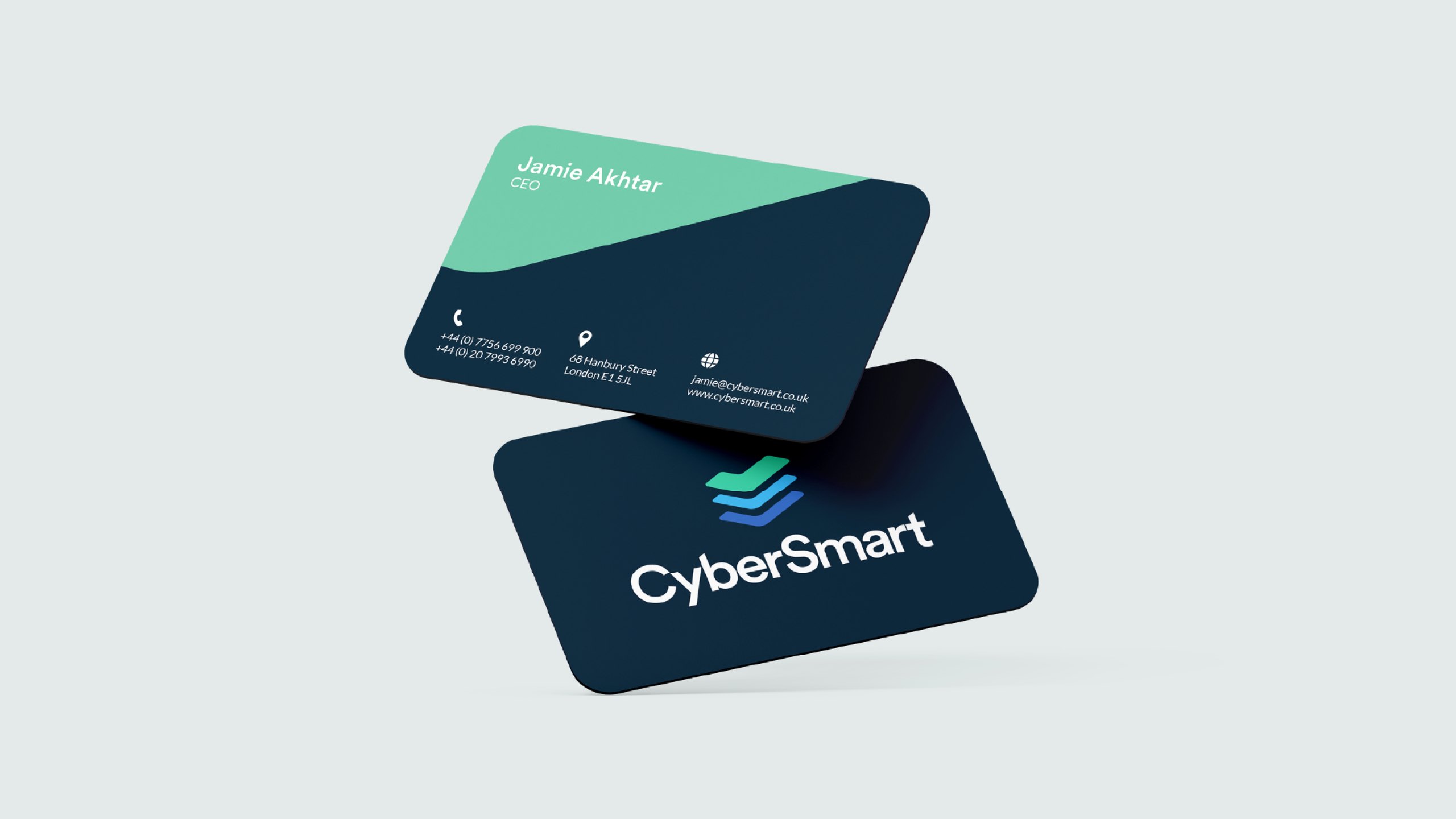
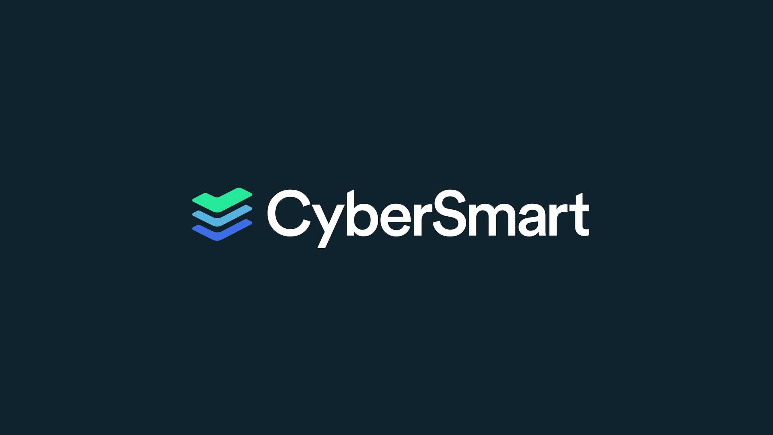
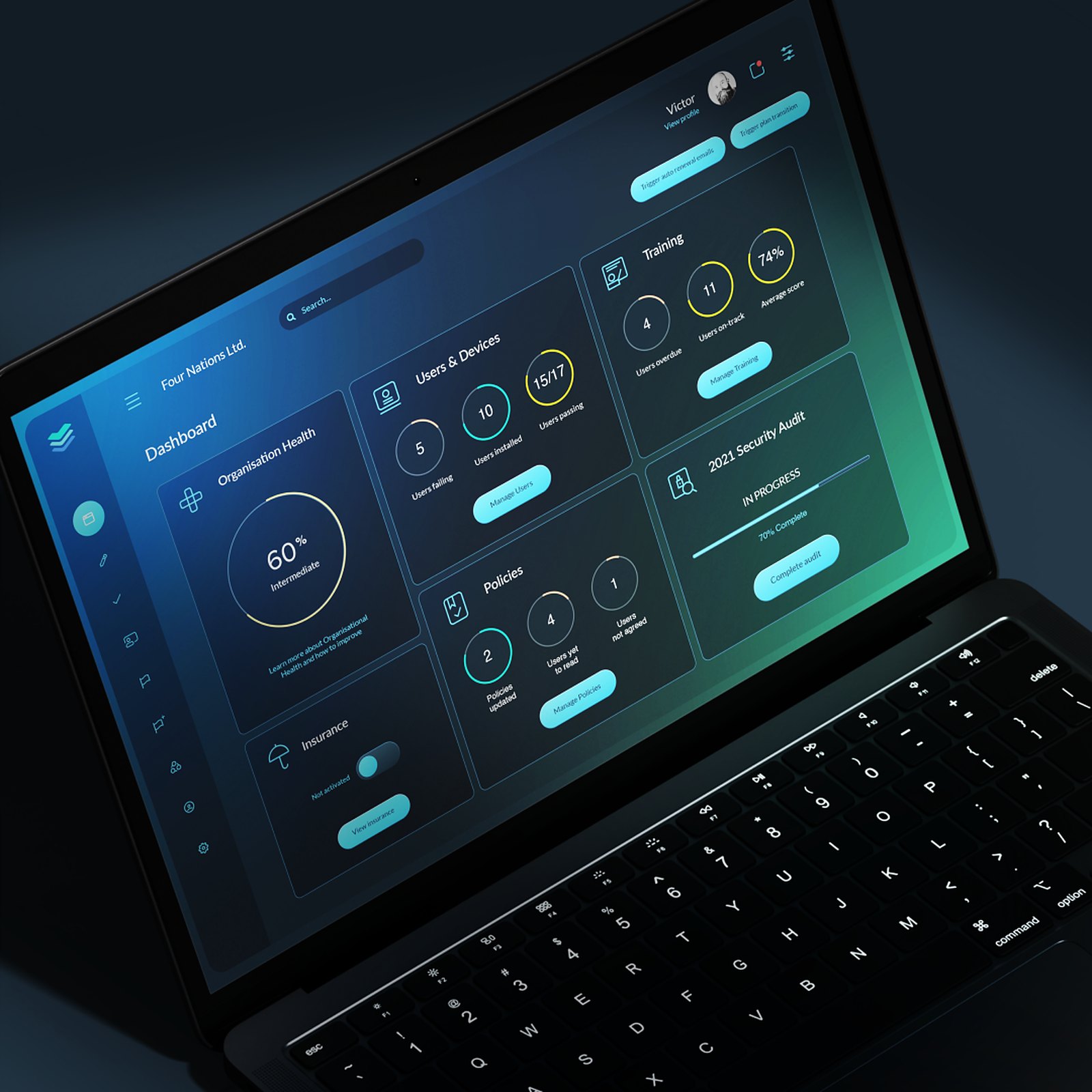
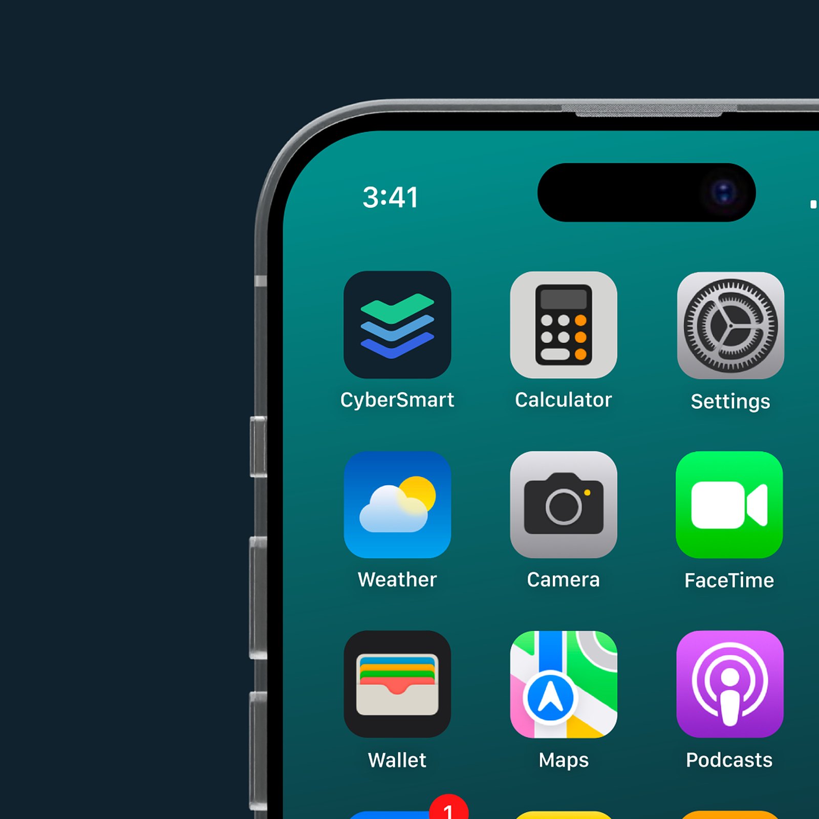
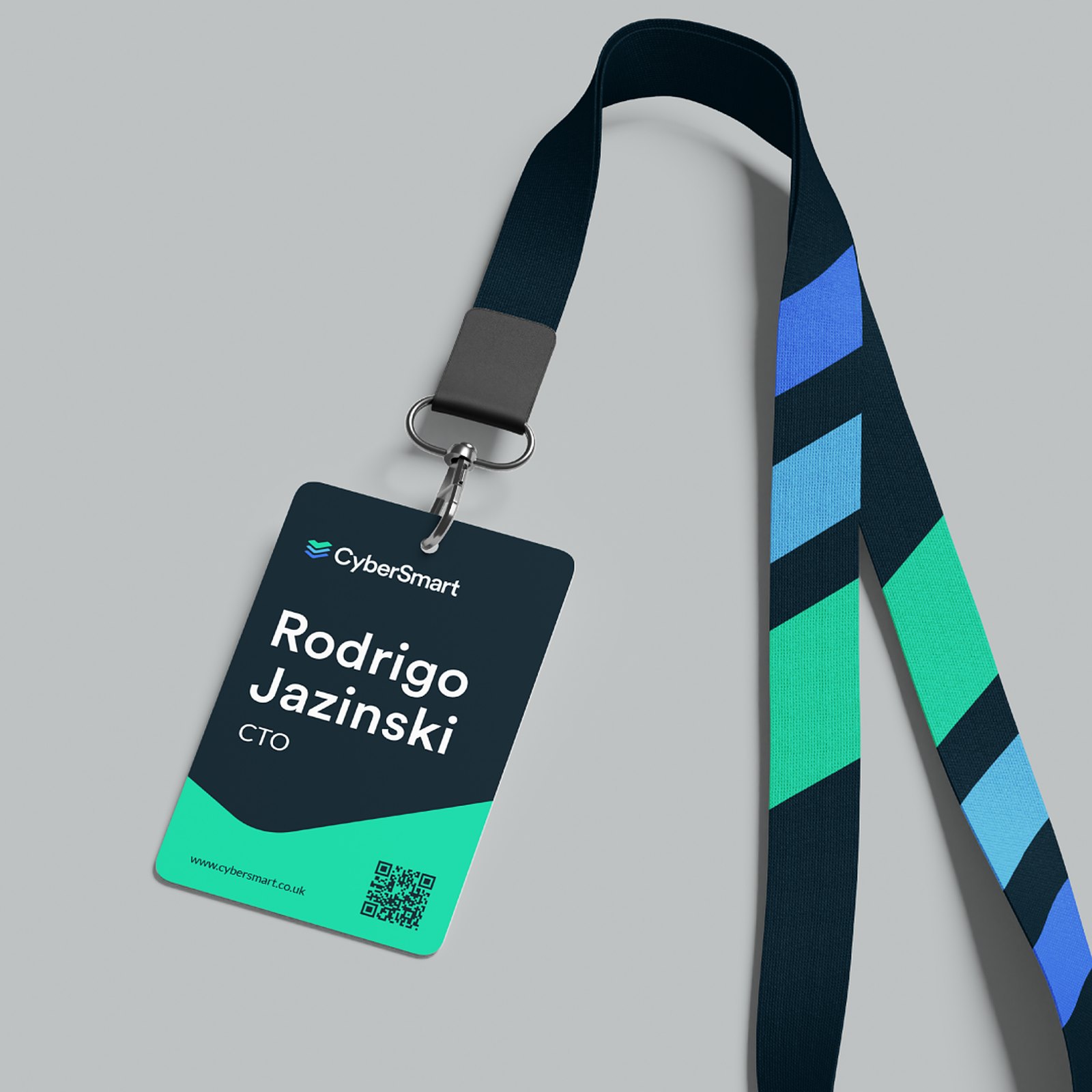
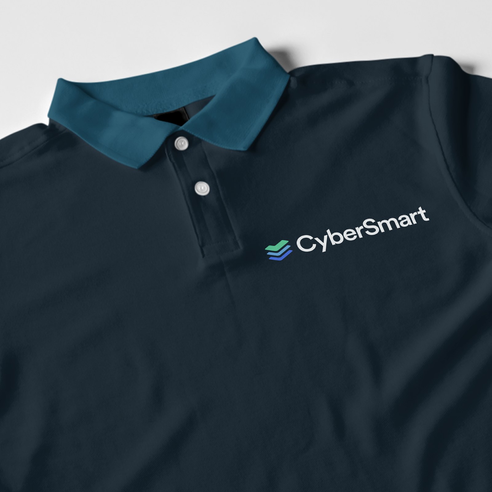
Outfly’s strategists developed a brief to infuse the brand with a distinctive personality based on the core value CyberSmart offers its SME customers: clarity. Stepping away from the padlock, our design team considered CyberSmart’s services themselves, landing on a new logo: three ticks in complementary shades of blue and green. As universal symbols of assurance, the form of the ticks was inspired by stacked servers and CyberSmart’s three core services, with colours chosen to instil professionalism, trustworthiness and accessibility. This anchored the rest of the brand: type, imagery, messaging and 4K 3D artwork, all coming together in an updated product UX/UI, website and animated explainer.

5x monthly recurring revenue in two years, reaching £3.5 million ARR by May 2022. Raised $10 million in Series A investment. One identity unifying three core services. Trusted by 4,000+ small businesses, with partners including Starling Bank, Aviva and Vodafone.

I couldn’t speak any more highly of the creativity, dedication, problem-solving and customer support Outfly is capable of. Definitely defying the concept of working with a branding, marketing and design agency.
Sam Soares, Chief Growth Officer, CyberSmart
Following the rebrand, CyberSmart has cemented its position as one of the UK’s most recognisable cybersecurity brands for small business. The clarity-first identity now scales across a growing product suite, from Cyber Essentials certification to active protection and team training. The three-tick mark has become shorthand for trust among the thousands of businesses that rely on CyberSmart every day, and the brand system continues to flex across new campaigns, partnerships and markets without losing its distinctive voice.
Outfly, a London brand, marketing and product agency, led CyberSmart’s rebrand and app redesign in 2019.
Brand strategy and positioning, a new visual identity and logo, an app UX/UI redesign, and communications.
Monthly recurring revenue grew 5x in two years, reaching £3.5 million ARR by May 2022, alongside a $10 million Series A raise.
In a crowded market with a low-awareness audience, its brand didn’t yet signal the trust and clarity its mission required.