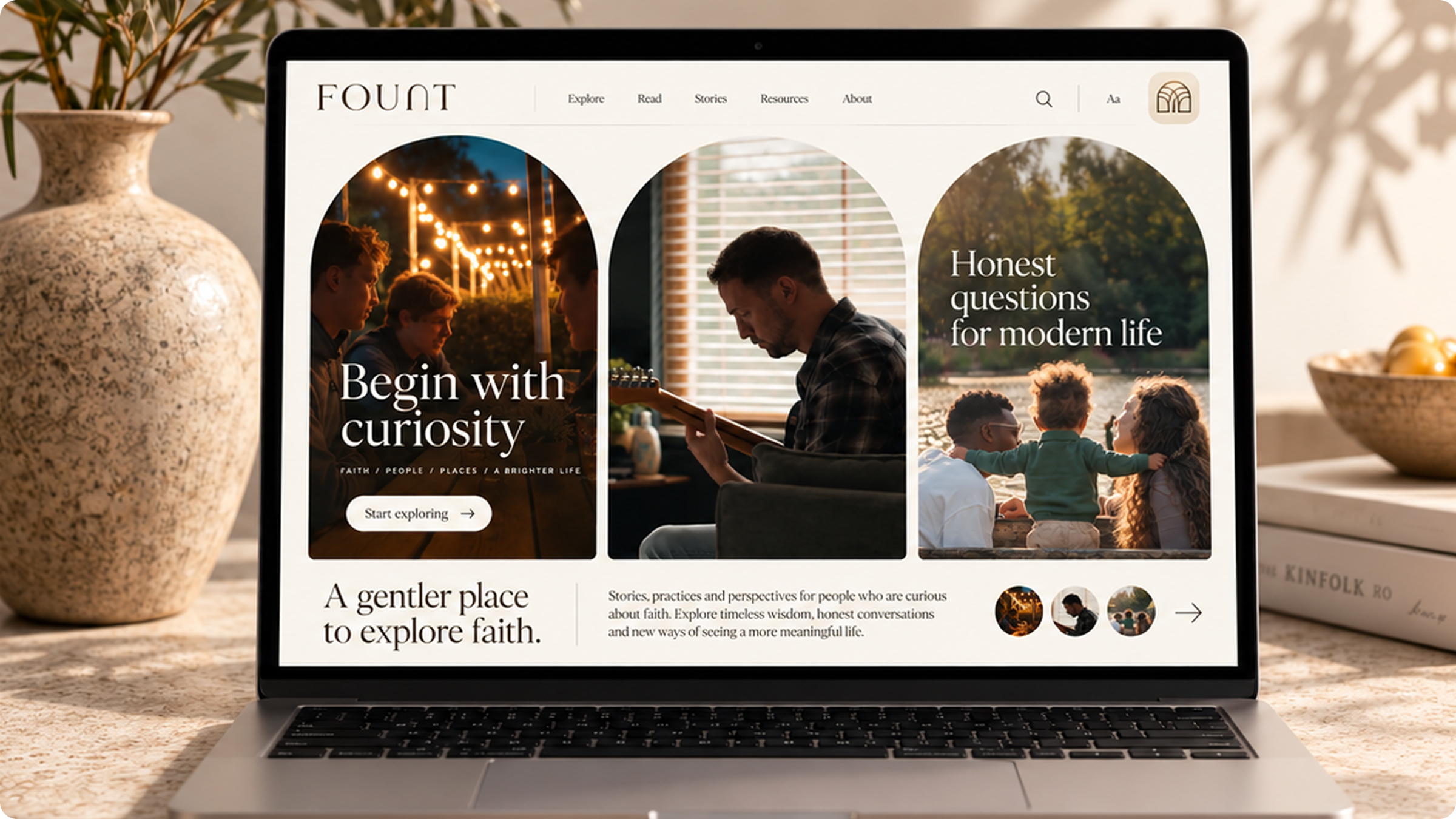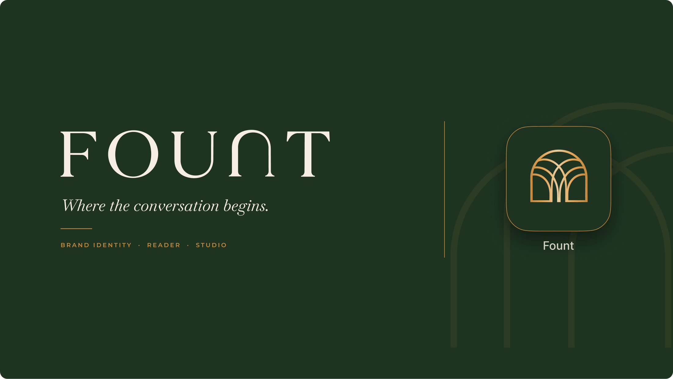
Faith content online tends to fall into two camps: institutional and formal, or loud and fleeting. FOUNT set out to build something else, a calm, welcoming place to read scripture alongside the people who live with it, with films of real voices sitting right beside the text. They needed a brand that could feel literary and human at the same time, one that would hold together on a printed book spine, a poster, a phone screen and a working publishing tool, without ever feeling like an institution.
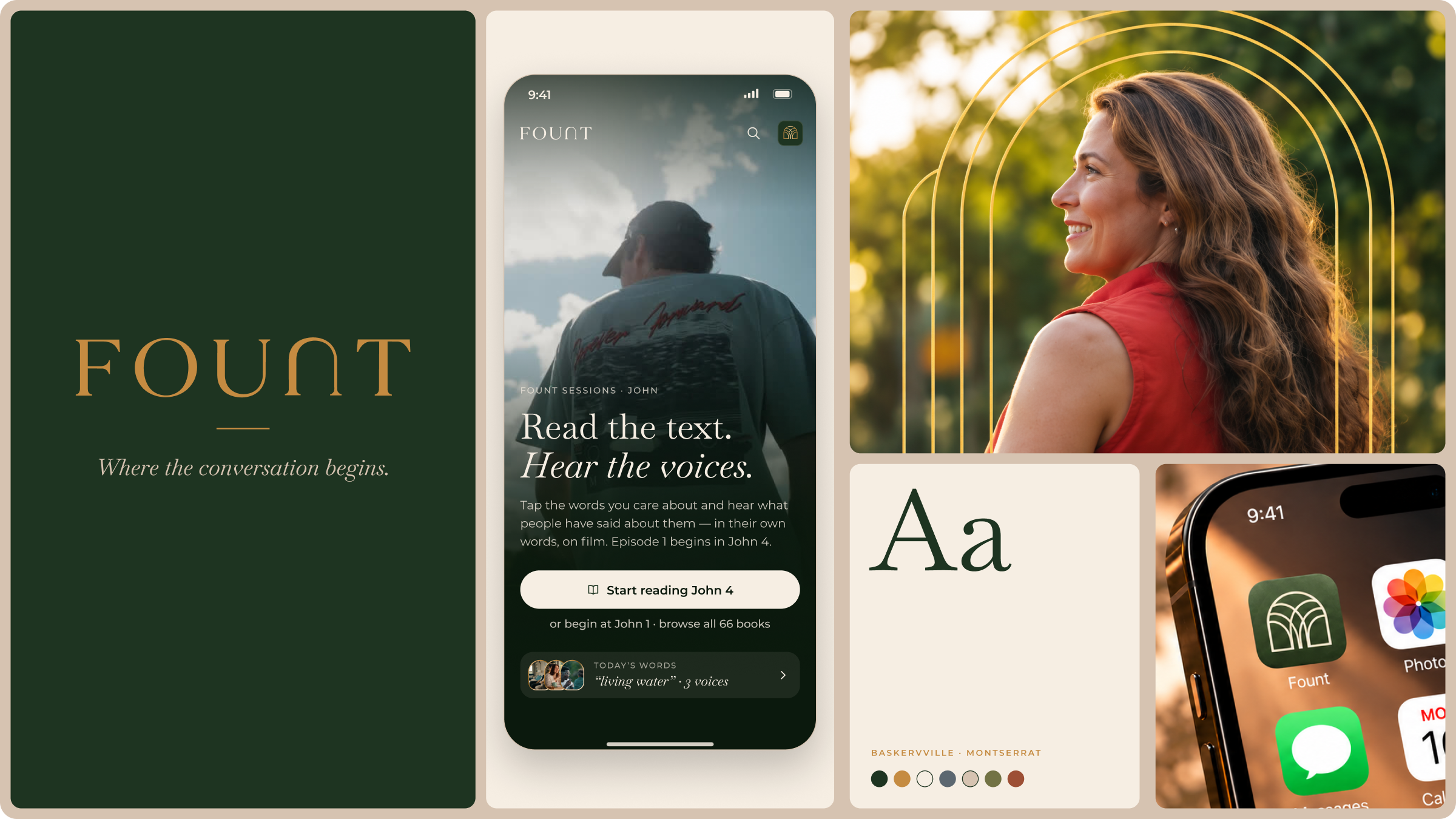
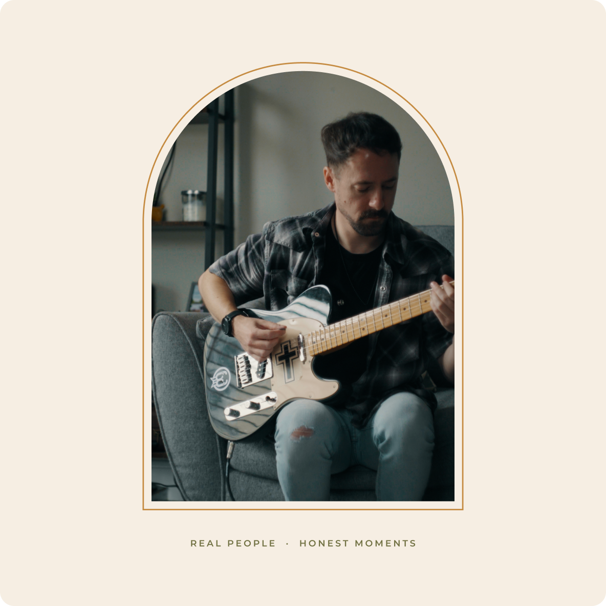
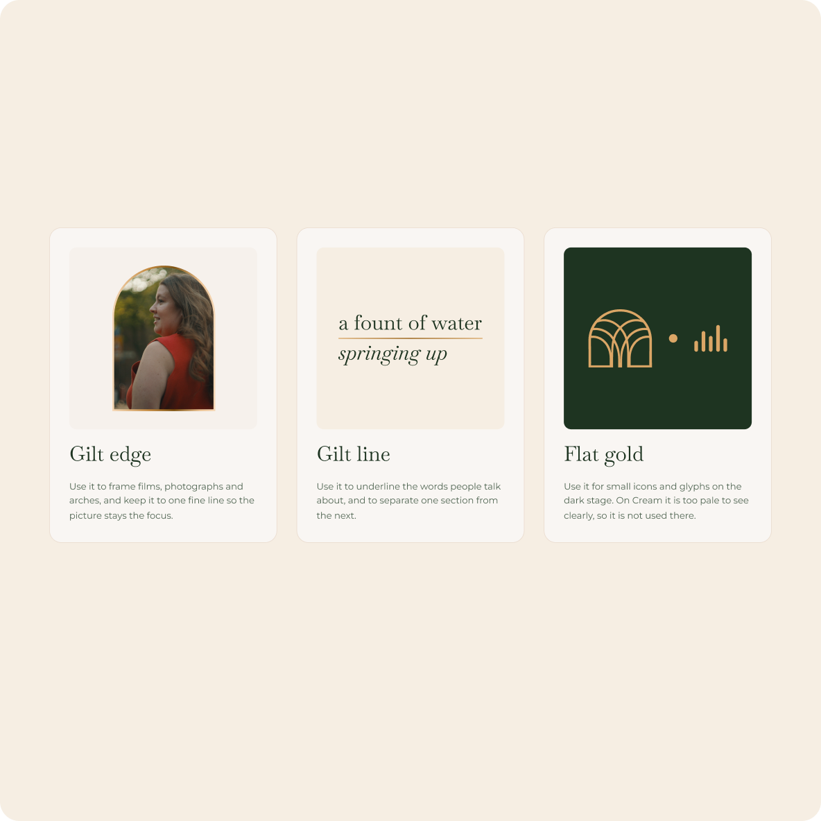
We began by asking what it feels like to arrive somewhere you are welcome. The answer kept coming back to doorways, gateways and thresholds, so the arch became the organising idea for the whole identity: an opening into new perspectives and deeper conversations. From there we set a few principles. Let real people and stories lead. Use a small palette with care. Give words room to breathe. Treat reading with the respect of a well-made book. Every decision in the system, from the wordmark to the Studio interface, was tested against them.
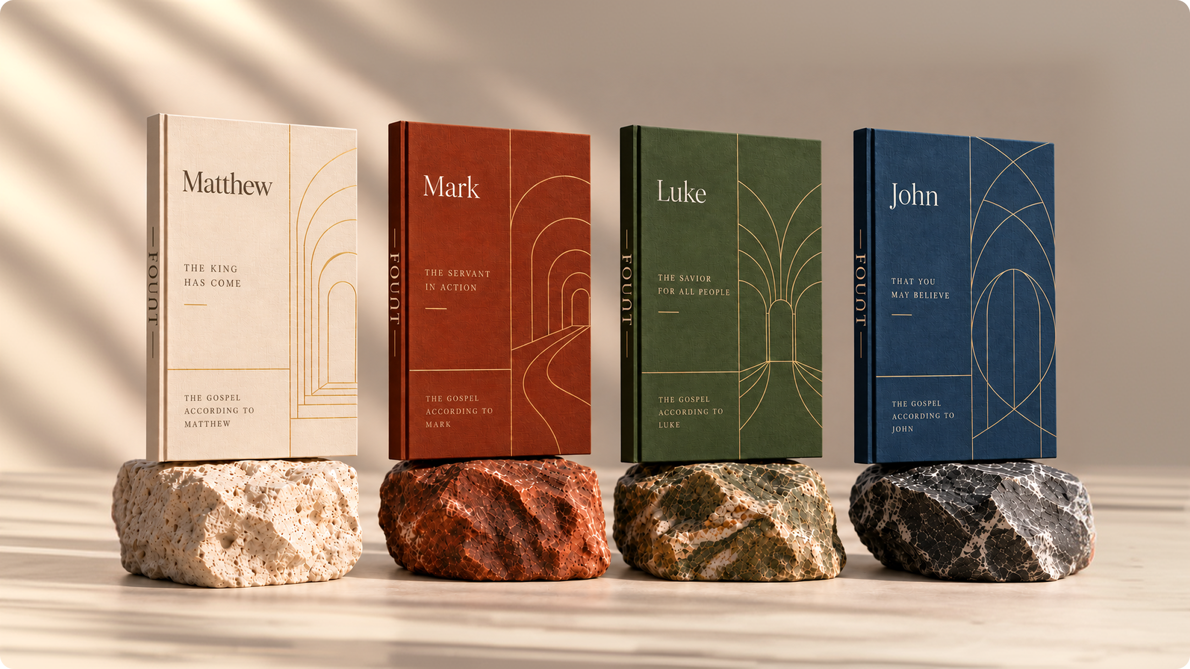
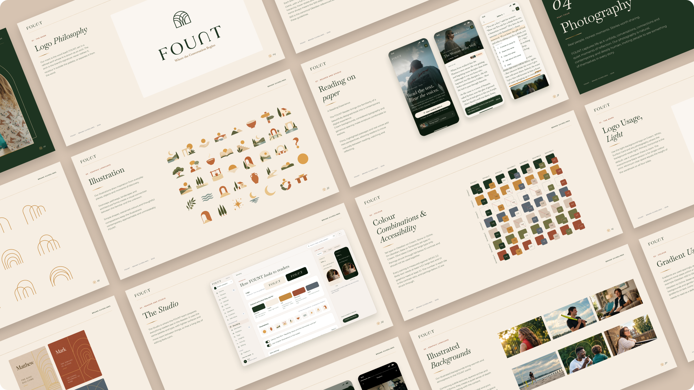
A complete identity and the guidelines to run it, carried all the way into two digital products. Here is how each part of the system came together.
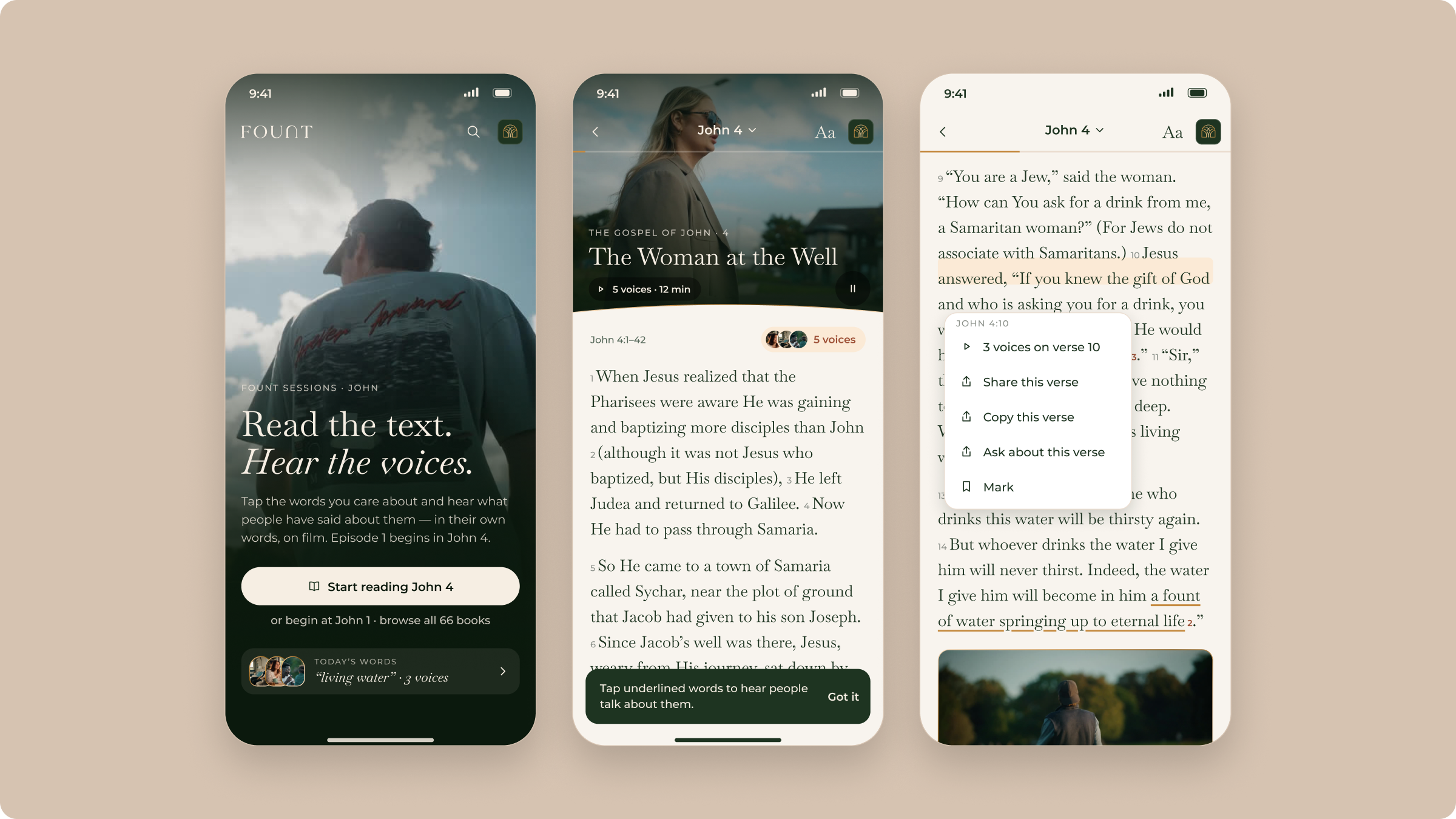
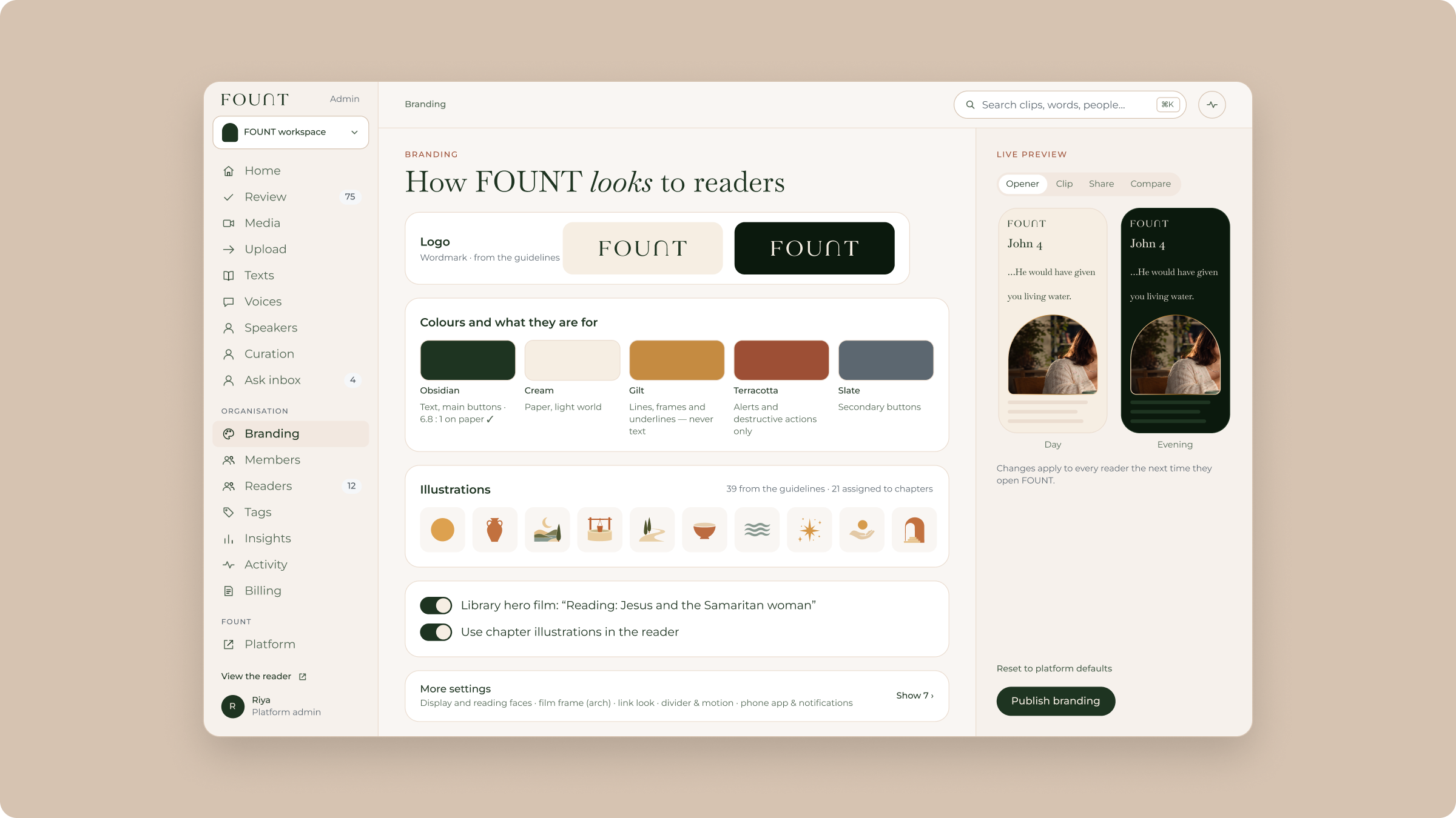
The Reader brings the familiarity of a beautifully designed book to the phone. Cream pages and generous spacing make scripture comfortable to explore, and a darker Obsidian stage takes over for film. The Studio is where the team curates it all, with lighter surfaces so a long day of editing feels calm.
FOUNT now has a single, connected world: an identity, a complete set of guidelines and a design system that feeds both the Reader and the Studio. The team has what it needs to grow the platform and its content with confidence, and every new piece of work starts from the same welcoming place.