North began with a plain observation from its founder during lockdown: the unknown was causing more anxiety than pain, and there was nowhere obvious for people to get immediate mental health support they could actually afford. The team behind it are qualified psychologists and clinical practitioners, building self-help courses that people can use on demand, whenever they need them.
They wanted to change how psychological support is seen, from a soft, mindfulness-led art to a science backed by expertise. The business was working under a temporary name, WithSto, and needed a name, an identity and a voice to match that ambition. It also had to speak to several audiences at once: people looking for support for themselves, employers looking after their teams, and clinicians supporting patients on waiting lists. A brand like that has to feel expert without feeling cold, and warm without promising a quick fix.

We started with a Brandscape, mapping who North is for and what it stands for, then moved on to the name. Our naming work explored four routes, Lightmind, Aralia, Bearing and North, and tested each against competitors, available web addresses, social handles and trademarks. North had always been one of our favourites. It suggests travelling onwards towards your north star, it has a stoic, resilient quality, and the line “Withstand the storm” carries the spirit of the working name.
From there we set out what North stands for and against. It stands for empowerment and action, science-backed guidance, non-judgement and safe spaces, and against wishy-washy advice, quick fixes, one-size-fits-all answers and jargon. The voice we wrote is calm, confident and down to earth, summed up in one line the team could hold on to: “military grade mental health you can hold in your hand”. Because language matters so much in mental health, the guidelines also set out person-centred language, so North talks about someone living with anxiety rather than calling them anxious.
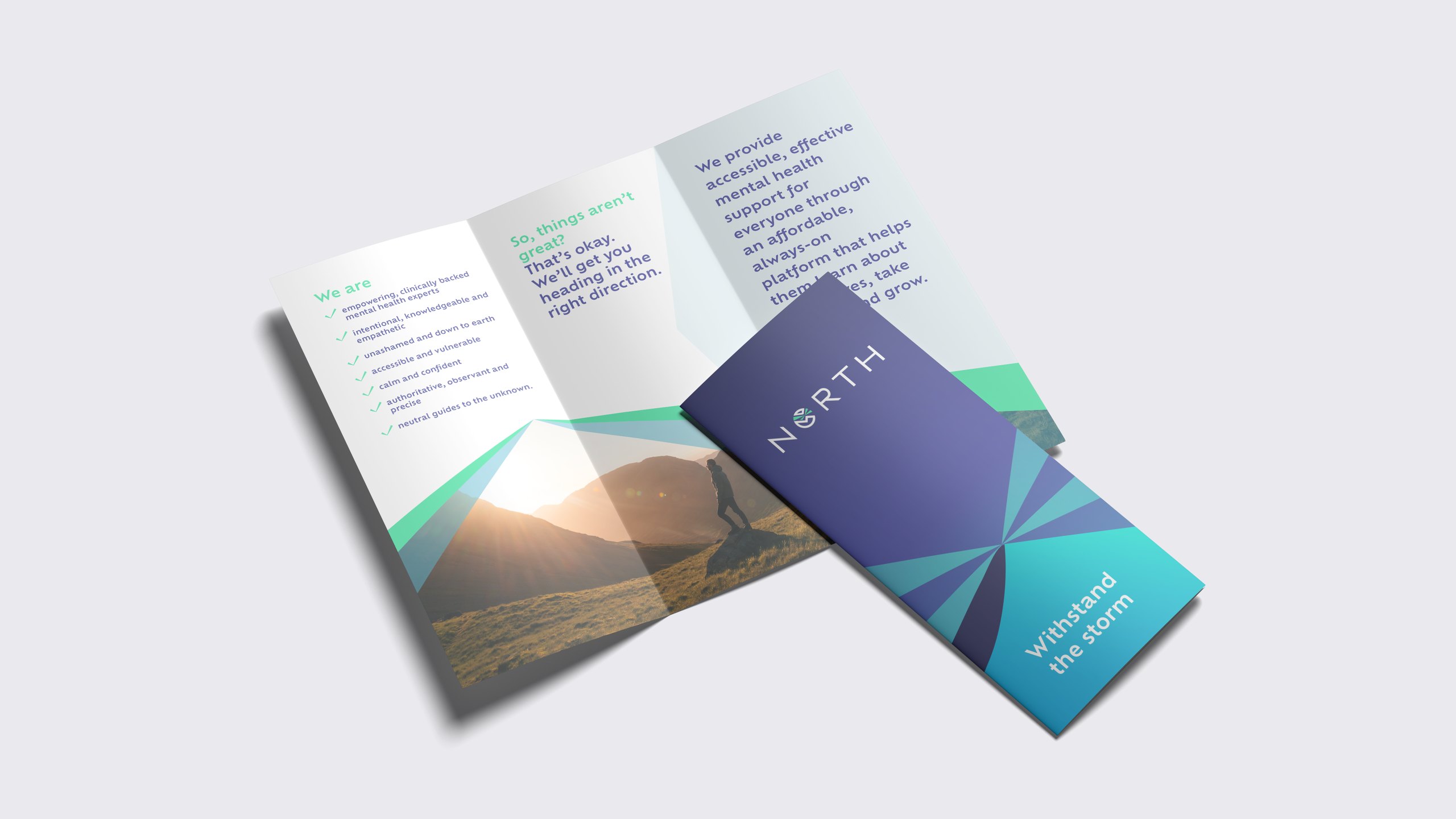
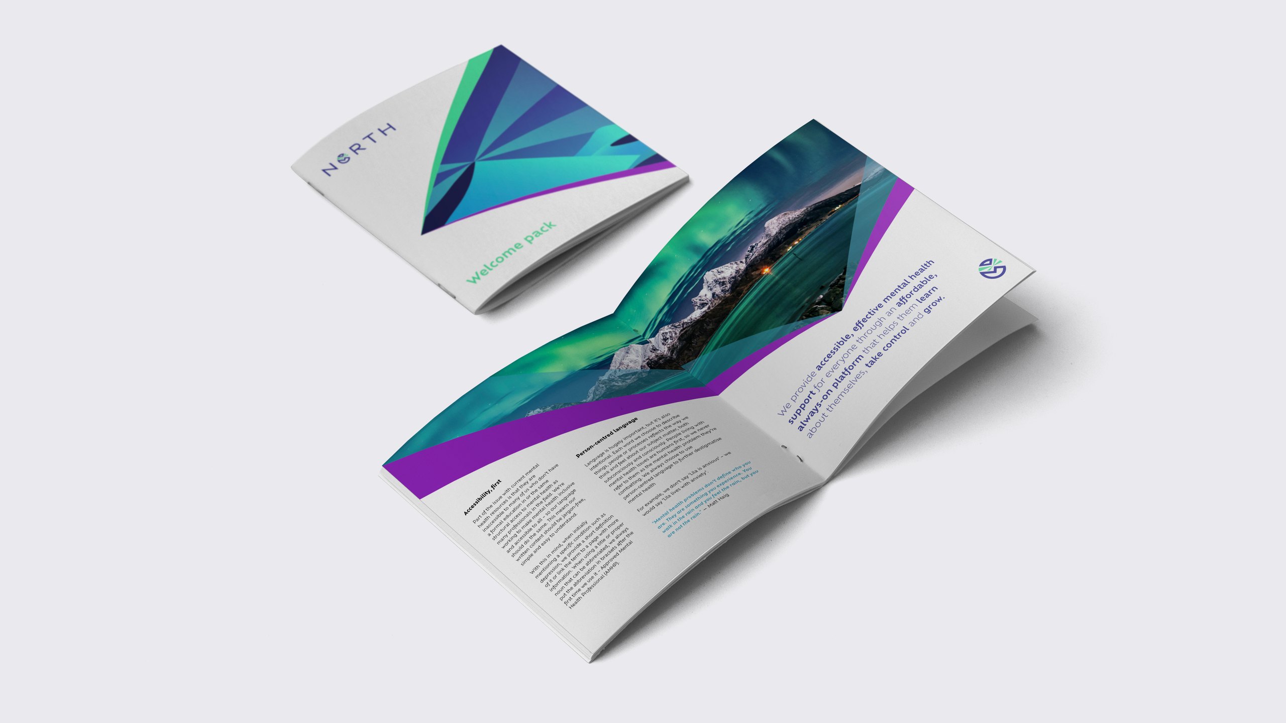
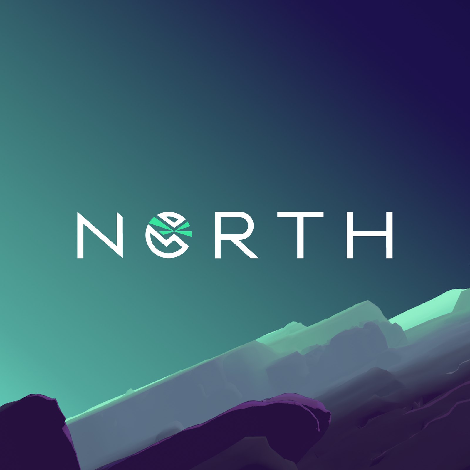
The identity takes its character from the logo, where sharp angles of light break through the O. That light-ray device runs through image masks, footers and watermarks, used delicately so it never shouts. The palette is blue and purple with a hint of turquoise, chosen to feel calm, dependable and quietly wise, with a dark mode for the app, website sections and covers, and Ofelia as the typeface throughout.
We also built North a world of 3D illustrations that always play darkness against light: a small boat breaking through ice under shafts of light, a climber on a moonlit cliff, a campsite glowing beneath the mountains, a lone figure walking towards a cave full of light. Illustration lets the brand relate complex emotions quickly and gently, and each piece gives a course or topic its own image, from anxiety to sleep and resilience.



I’m just blown away by your creativity, all the worlds that you’ve presented here. I’m getting more and more scared of my own potential. Honestly, it’s absolutely beautiful.
Ute Liersch, Founder, North
We then took the brand into the product. We wrote the website copy for three audiences, members, employers and healthcare providers, and designed the site around it, opening on a simple promise: mental healthcare for all. For members it starts gently, with “So, things aren’t great? That’s okay. We’ll get you heading in the right direction.” For providers, it presents North as immediate support for patients on waiting lists that works alongside their treatment.
In the app, we designed the UX and UI for courses, video lessons and a progress view with achievements, activity and reflections, all in the brand’s dark mode. Alongside it we produced a tone of voice guide covering social, blogs, the website and emails, a motion toolkit with an animated logo, titles and lower thirds for video, and further design work on North’s pitch decks.
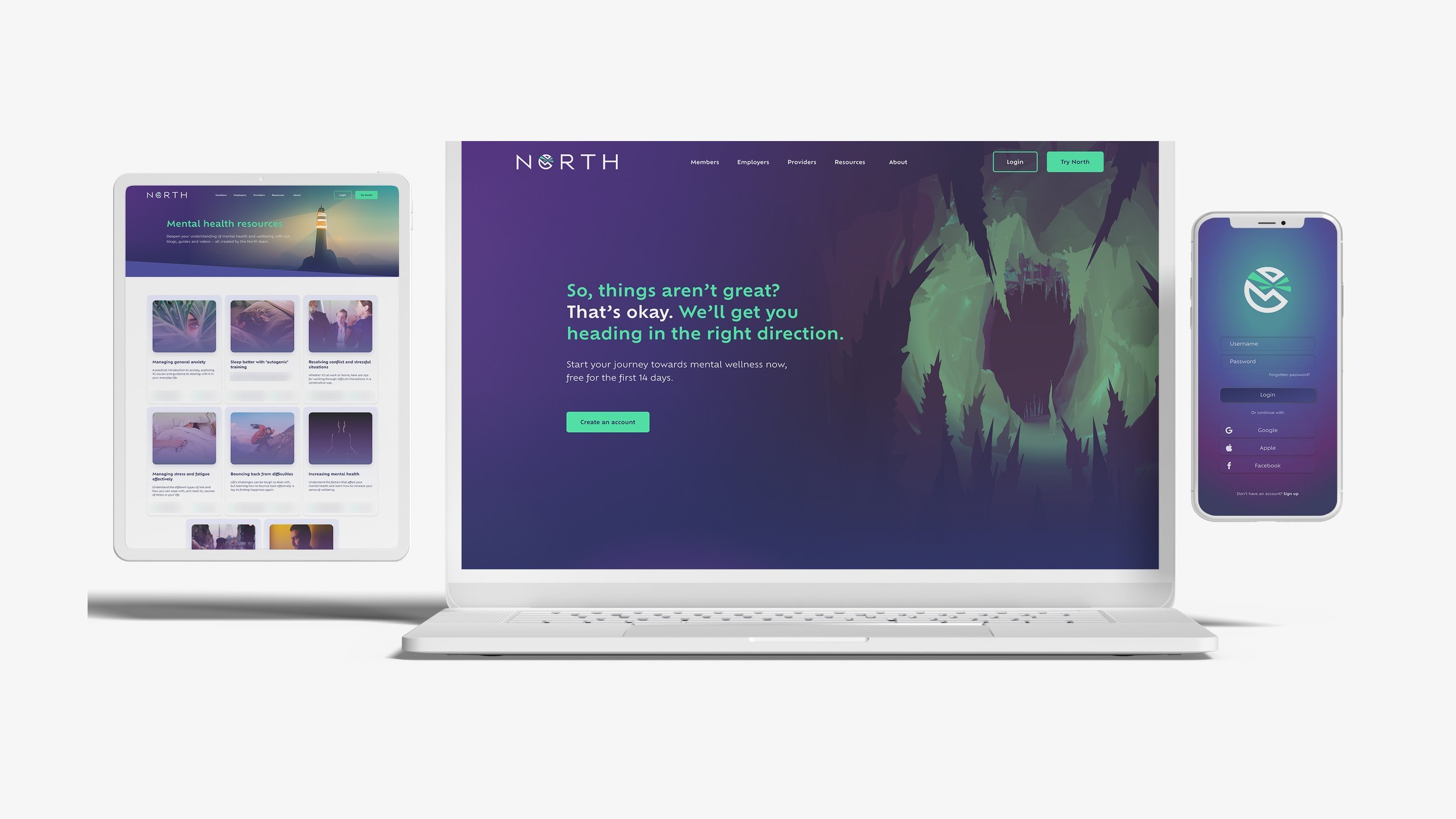
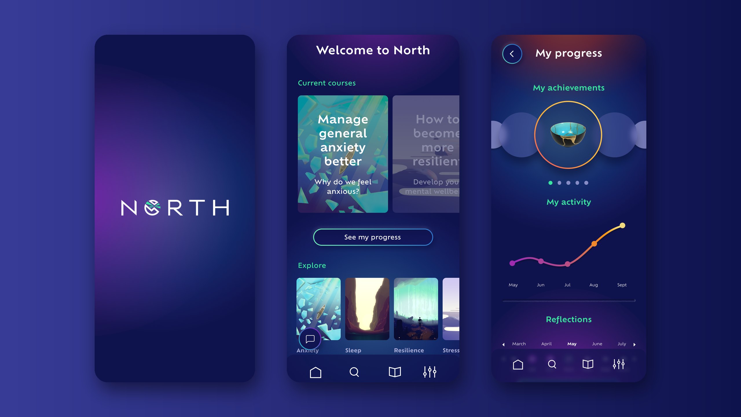
Outfly, a London brand, marketing and product agency, named North and created its brand strategy, visual identity, 3D illustration system and tone of voice, then wrote its website copy and designed its website and app.
North suggests travelling onwards towards your north star, and it has a stoic, resilient quality. It was one of four naming routes we explored and tested against competitors, web addresses, social handles and trademarks, and its line “Withstand the storm” carries the spirit of the original working name, WithSto.
North’s voice is calm, confident and down to earth, and it uses person-centred language: someone is living with anxiety rather than being called anxious, because mental health problems are something people experience, not who they are. The brand stands for science-backed guidance, non-judgement and safe spaces, and against quick fixes and jargon.
North is a psychologist-led mental health platform offering self-help courses created by accredited mental health professionals, for individual members, employers and healthcare providers.