XaaS had built a way for businesses to get on top of cyber security without hiring consultants. A short questionnaire looks at how a company behaves, gives it a score and turns the gaps into a step-by-step roadmap towards standards such as Cyber Essentials and ISO 27001. Its founders described it as a universal translator for the many security frameworks a business can be asked to meet.
The brand hadn’t caught up with the product. The name described a software model rather than what customers get, and the website opened in jargon: “XaaS is a Software as a Service (SaaS) platform…”. The people it needed to win, from small business owners to heads of compliance and the IT providers who would sell it on, mostly aren’t cyber experts. And as a start-up growing through partners and resellers, it had to look established enough to trust.

We began with a Brandscape, mapping the people XaaS had to convince: owners of small businesses who know they need cyber security but not where to start, security and compliance leads at larger organisations who need one view across many sites, and IT service providers looking for a simple way to offer cyber services. For each we set out what the platform gives them and what it protects them from.
Then came the name. Across two naming rounds we tested more than a dozen candidates, and Mobial came out of the second. It plays on the Möbius strip, a continuous loop you can twist through to reach the other side, which suits a product that finds a shorter path through compliance. Three rounds of brand sprints then shaped the symbol, wordmark, colour, sub-brands and a 3D brand world.
The voice follows the same idea. Mobial sells direction rather than protection: “Most cyber security products are like seatbelts, or brakes… We teach you to drive the car.” Analogies about journeys, paths and routes are on-brand, words like “maturity”, “controls” and “endpoint” are avoided, and everything sits under one line: Your path made clear.

The identity turns the path into a system. The M symbol is drawn as a maze, lit with a gradient from blue to lime green and set on dark slate, while fine line work runs through layouts like routes on a map. Sub-brands for Mobial’s products sit under the same mark, and brand guidelines hold it all together.
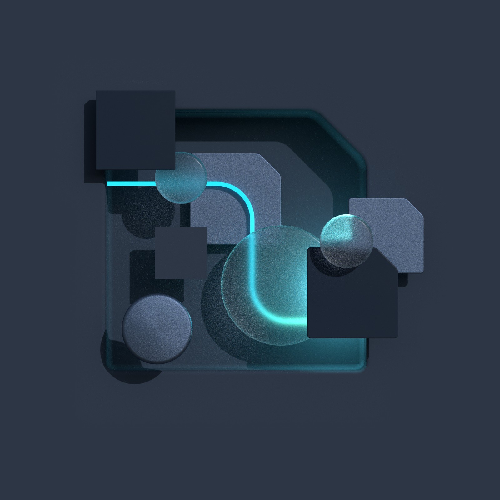
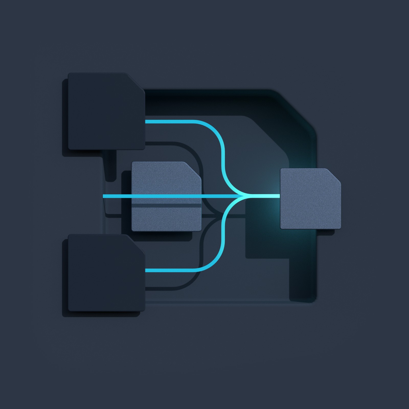
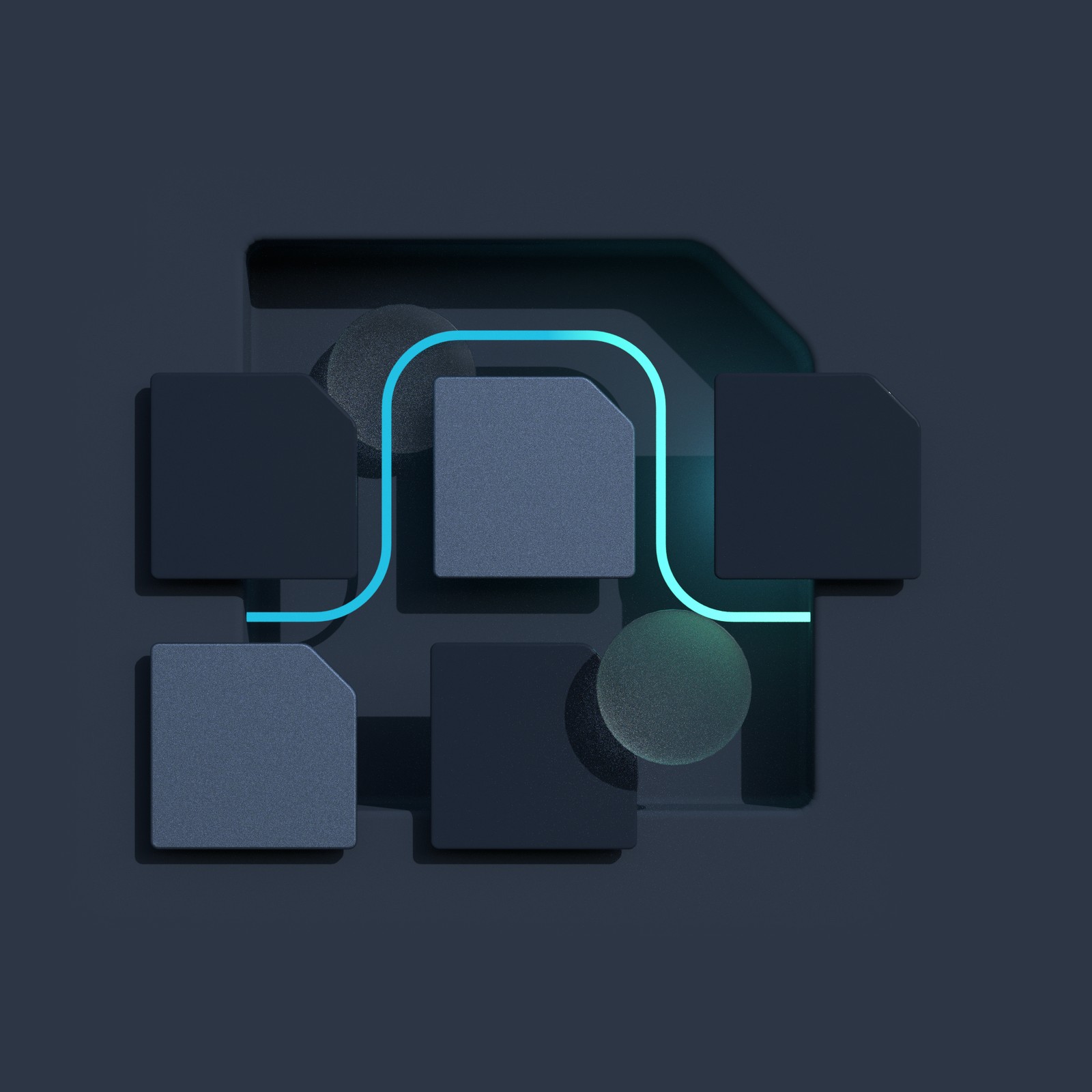
We created a 3D world in the same language. For the new website we made renders of solid blocks breaking open to let a glowing path through, and a set of dark illustrations where cyan lines find their way between panels. The idea of a clearer route is something you see before you read a word.

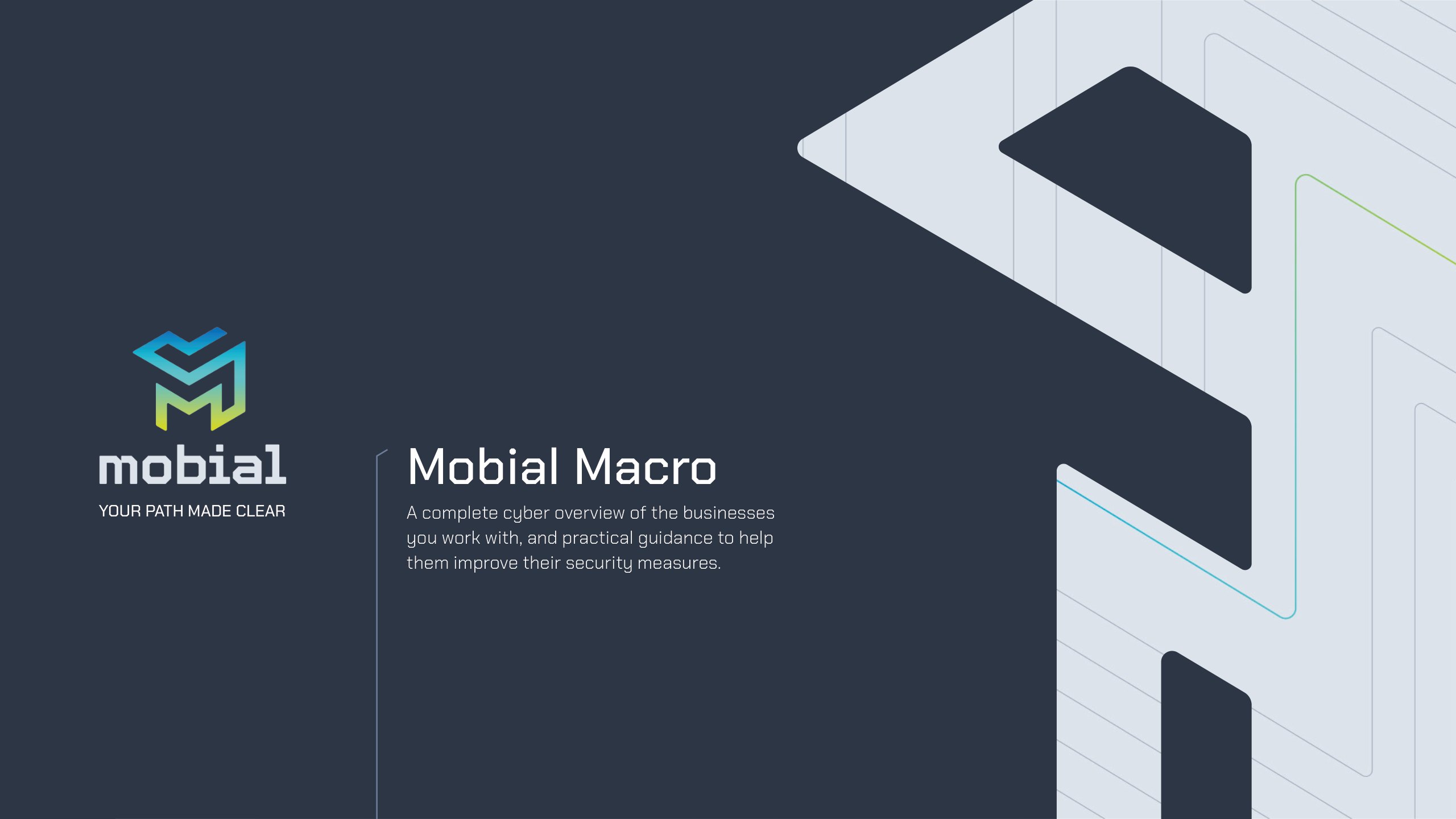
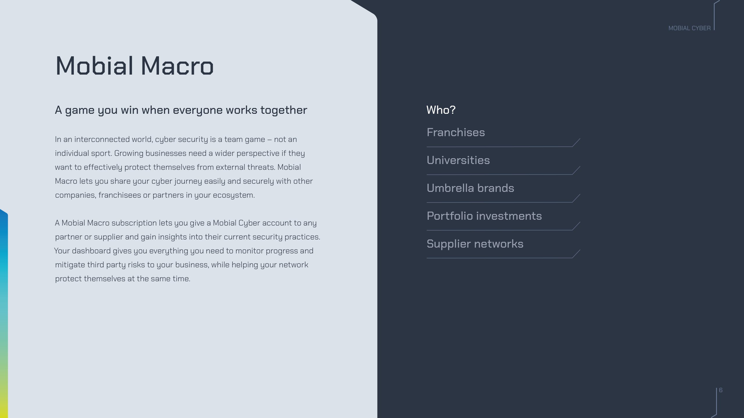
The voice and visuals carried straight into sales. We rewrote and redesigned the product brochures for Mobial Cyber and Mobial Macro, turning long, passive explanations into short, active copy. The Macro brochure takes a complex offer, one view of cyber risk across every franchisee, supplier or department, and opens it with a line anyone can follow: cyber security is a team game, not an individual sport.
We also developed a brand film, from proof of concept and storyboard through to animated previs. The script moves from a landscape where danger waits around every corner to a clear way forward, and ends on the Mobial logo and the line Your path made clear.
Outfly, a London brand, marketing and product agency, created the Mobial brand in 2022, including the name, brand strategy, visual identity, tone of voice, 3D imagery and product brochures.
Mobial is a cyber security platform. It turns compliance frameworks into a 10-minute questionnaire, a tailored roadmap and progress tracking, and Mobial Macro extends that view across franchisees, suppliers and partners.
It plays on the Möbius strip, a continuous loop you can twist through to reach the other side. Outfly proposed it in its second naming round for XaaS, as a name for a platform that finds a shorter path through cyber compliance.
Mobial’s tone of voice guide swaps technical words like “maturity”, “controls” and “endpoint” for plain language, uses short analogies about paths and routes, and writes in the active voice.