Untapped grew out of a simple frustration. Its two founders had seen how little support most employees get at work, so they built a way to give everyone an Untapped Accelerator: an emotional intelligence expert on the other end of the phone. Those conversations are analysed, giving people data about how they think and work so they can reassess their priorities.
When we met the team, the company was called 110%, and it had outgrown that name and brand. It wanted to change everything, and choosing a new name raised harder questions. Did Untapped stand for the employee or the company? Was it about empowerment, AI, data or acceptance? The brand had to answer them.
Untapped’s naming process set out rules the brand had to live by. It must not put off a corporate buyer. It must be disruptive, never sounding ‘appy’ or sitting in the muddy middle. It must empower the user, the team and the company, carry a hint of both human and tech, and work for a company with more than one product in the future. We used those rules as the brief.
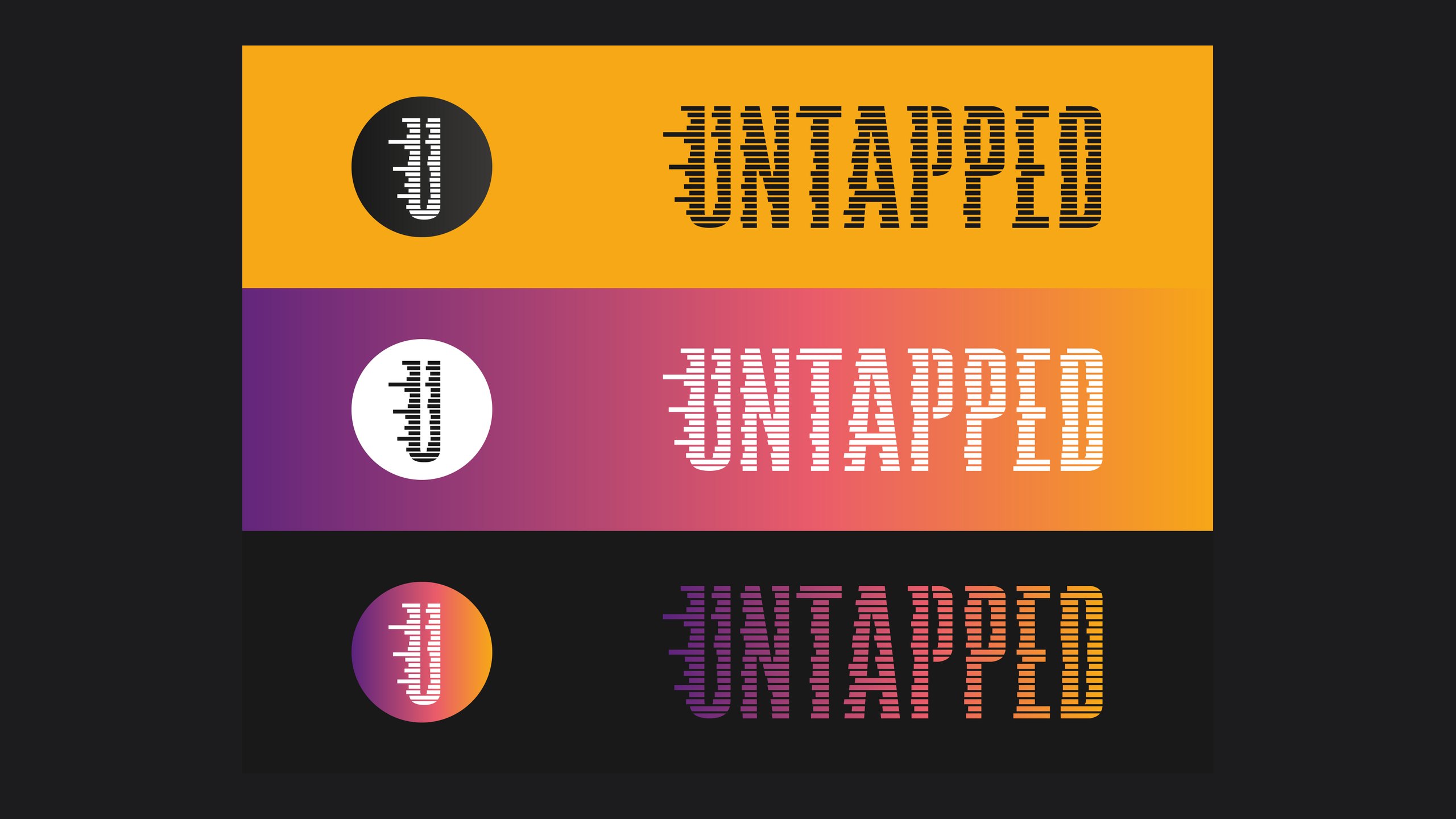
The message had to marry data and potential: inspire people to raise their expectations of themselves while signalling the natural language processing and AI that help them do it. The brand needed real energy, bold colour, a strong typeface and authentic people empowered by data. We built exemplar brands for the key territories, from youth and potential, to depth, nurture and emotion, to data-heavy and professional, so the team could see each position before choosing one. The final direction took the data-led route and gave it youth, vibrancy and colour, and we iterated on the wordmark until we cracked it.
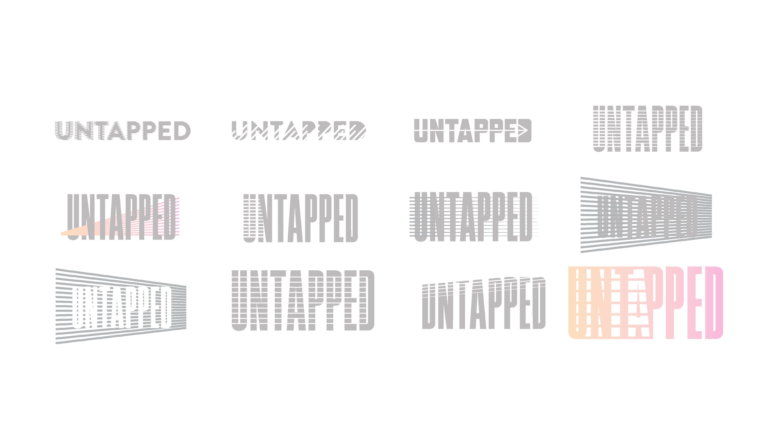
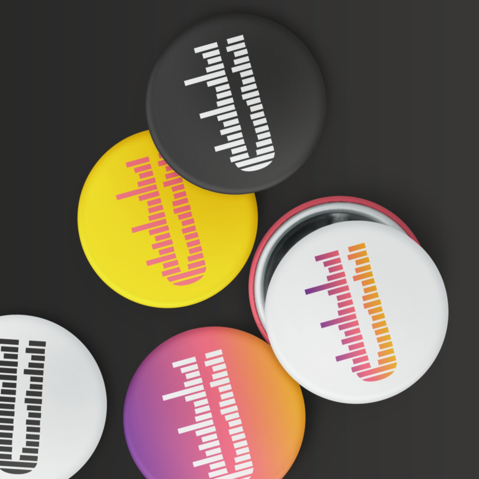
Untapped’s competitors sat in a calm, pensive, educational colour space, so we went the other way. The palette runs through yellow, orange, red and purple to show the spectrum of emotion, from depression to rage through joy, on a modern matte black gradient base. The wordmark is built from horizontal bars, and the U works on its own as a roundel for badges and avatars.
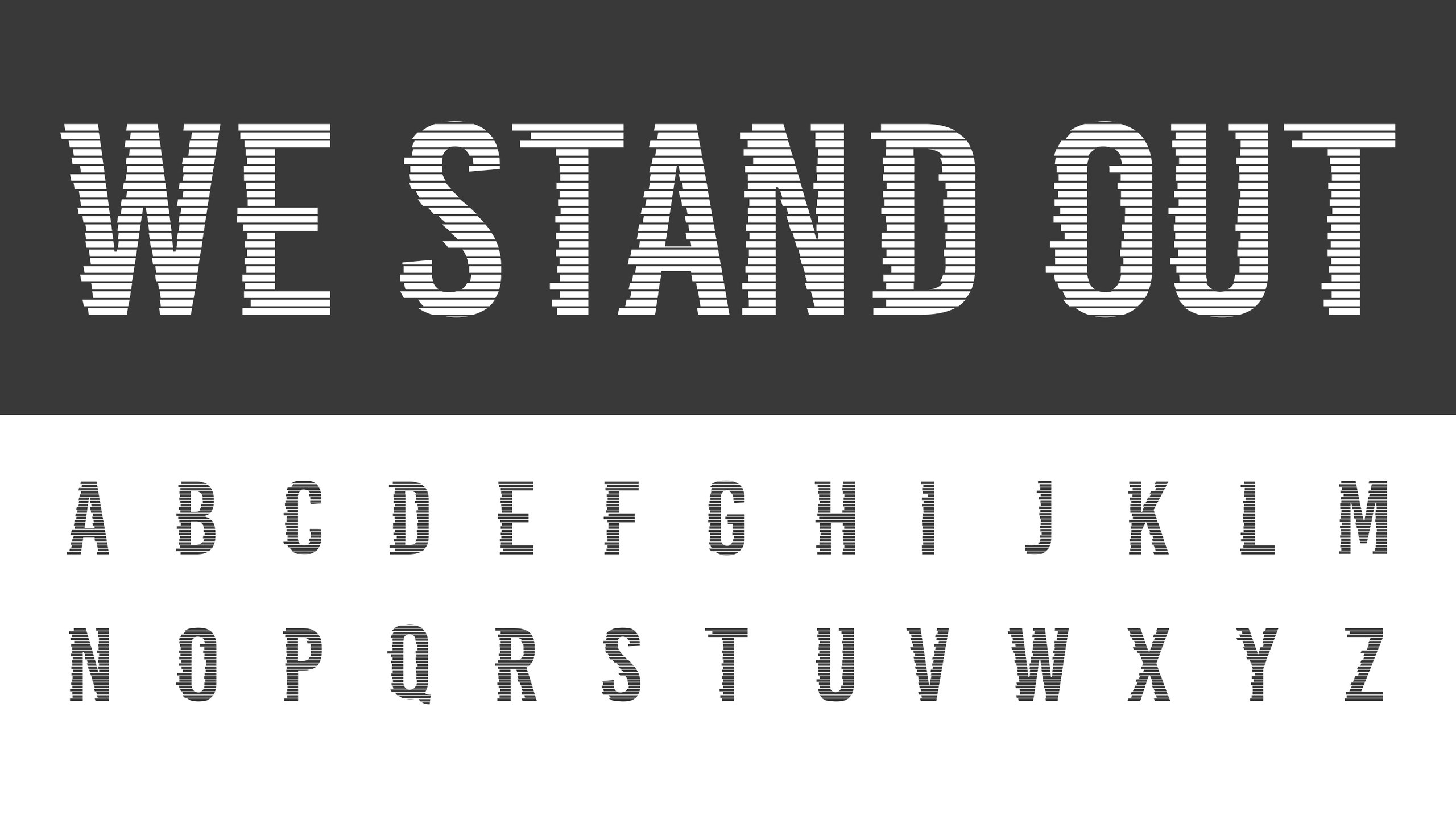
A brand this loud needed its own type, so we customised Bebas Kai into Bebas Kai: Untapped, giving the team a typeface to make their own marks with. Photography follows the mantra ‘embrace ugly’: passion, joy and defiance, unafraid of the raw human side. Brand guidelines set the rules, and we applied them across letterheads, business cards, notebooks, badges and social avatars.
For the website we started with the people it had to win over. In a UX workshop in March 2018 we built protopersonas for the buyers Untapped sells to, from a time-poor senior digital leader who arrives through a personal introduction to a budget-conscious head of learning and development who shops around. We mapped what each needed to know, feel and commit to, and charted their journey through the site.
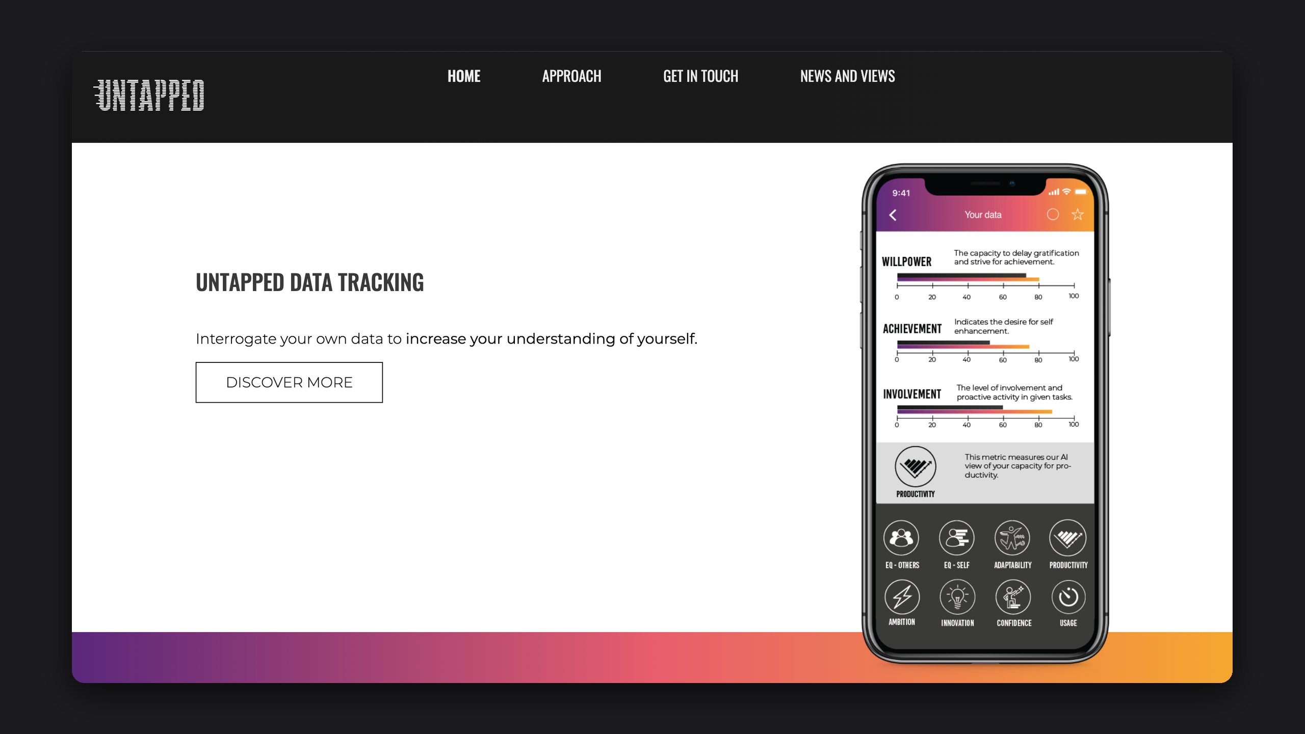
That work shaped the sitemap, a page-by-page copy framework for the Untapped team to write into, and the page designs themselves, set in the new identity. Alongside the site we created a UI look and feel for the app, from personal data tracking for traits like willpower, achievement and involvement to content handpicked and timed to fit a busy day.
Outfly, a London brand, marketing and product agency. We developed Untapped’s visual identity, a customised Bebas Kai typeface, brand guidelines, stationery and website design, plus a UI look and feel for its app.
A workplace coaching company that gives employees an Untapped Accelerator, an emotional intelligence expert on the other end of the phone, and analyses those conversations to show people how they think and work.
Rules from Untapped’s naming process: don’t put off a corporate buyer, be disruptive rather than sitting in the muddy middle, empower the user, the team and the company, carry a hint of both human and tech, and work for a multi-product company in the future.
Competitors sat in calm, pensive, educational colours, while Untapped wanted to energise and empower. The palette shows the spectrum of emotion, from depression to rage through joy, on a modern matte black gradient base.