Revive Biotech, the business that became Omula, was preparing to launch living moss walls and moss cladding for city buildings, designed to clean the air, help insulate and need no maintenance, with carbon-negative concrete and other sustainable building systems planned next. The business it wanted to become was bigger than moss: a nature-led architectural supplier and consultancy that brings the built environment into harmony with nature.
Selling that meant winning over people with very different worries, and our Brandscape mapped three of them. Victoria, an architect or interior designer, wants striking, sustainable designs but needs them certified, affordable and reliable. Rhys, the project manager who signs off, worries about budgets, timelines, fire ratings and a wall that dies, and he asks “Is this another greenwash?” Wolfgang, the investor, needs proof of demand and a technology he can protect. In an industry with a lot of greenwashing, the brand had to earn trust before it asked for attention.
We started with a brand immersion and the Brandscape, working through the products, competitors, buyers and where the business wanted to be in three to five years: the default way to build high rises and urban landscapes. From that we wrote a strategy statement around one line, “Harmonising the built environment with nature”, held up by four themes: harmony, balance, wellbeing and connection. The brief was just as clear about what not to do: no overkill on green or moss, and no words like “greenify”.
The tone of voice guidelines turned the strategy into words the team could use. They speak to architects, businesses, developers and investors, and they split developers in two. Forward-thinking developers need little convincing. Bottom-line developers need to trust that the product “won’t screw up their budgets or timelines” and is “just like any other kind of building material”. A short glossary swaps “eco-friendly”, “green” and “greenify” for “genuinely sustainable”, “nature-led” and “bringing back biodiversity”, and the guidelines ask for scientific proof and data behind product claims.
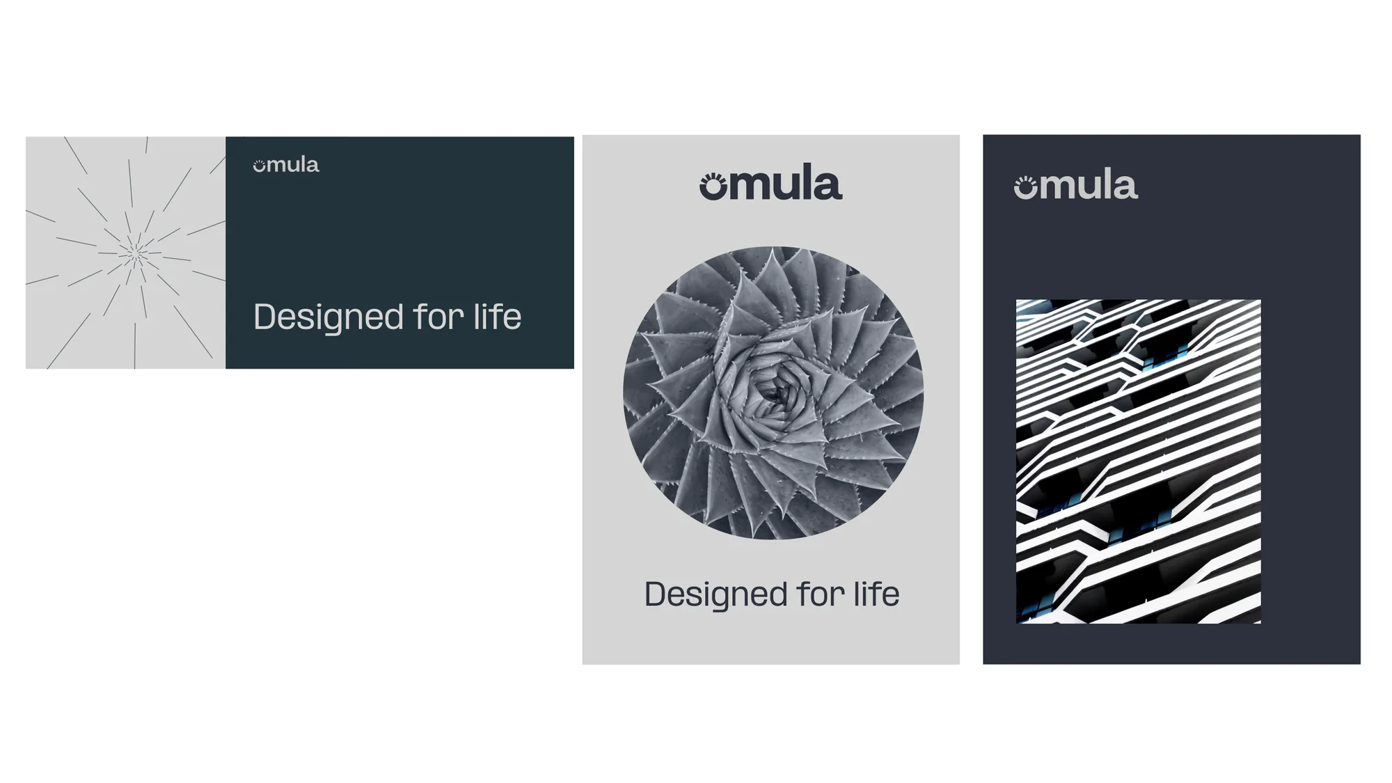
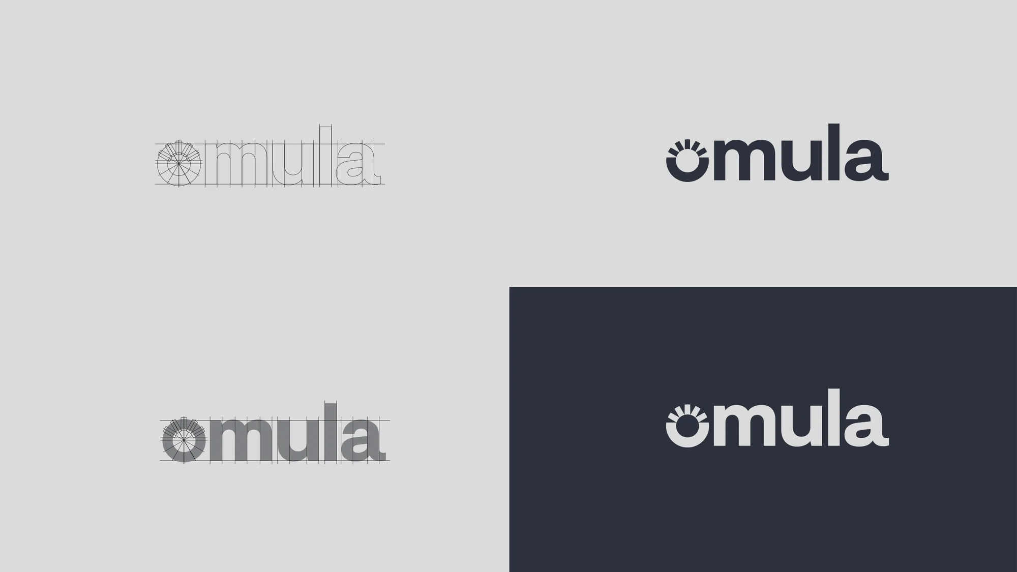
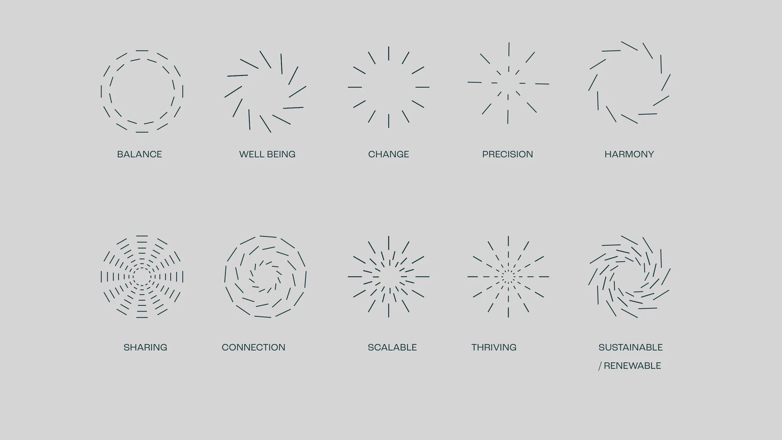
The visual identity grew from a tension the immersion named early: the drafted lines and diagrams of architecture against the rounded, organic forms of nature. The Omula wordmark is drawn on a constructed grid, and its o rises like a sun over a solid base, a sign of a new era for building. That o then becomes a dynamic identity, rebuilt from dots, dashes, pebbles and rays taken from textures in nature and in architecture, so each version reads as life growing on a concrete foundation.
The palette pairs lead grey, for knowledge and reliability, and stone grey, for calm and balance, with an earthy brown for the built and sap and olive greens for nature. Arimo is the primary typeface and Formula the secondary, and every text layout follows the golden ratio and the Fibonacci sequence.



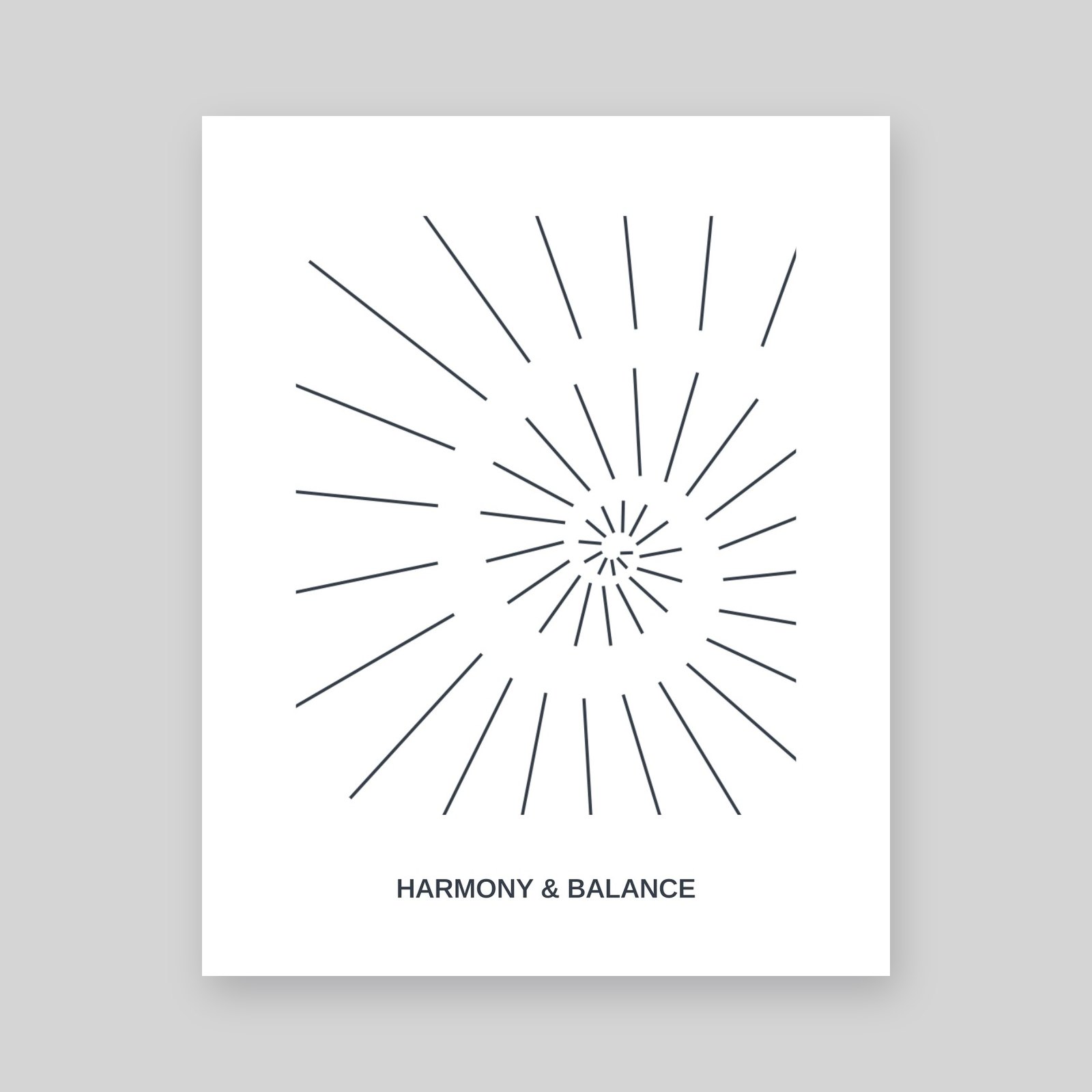
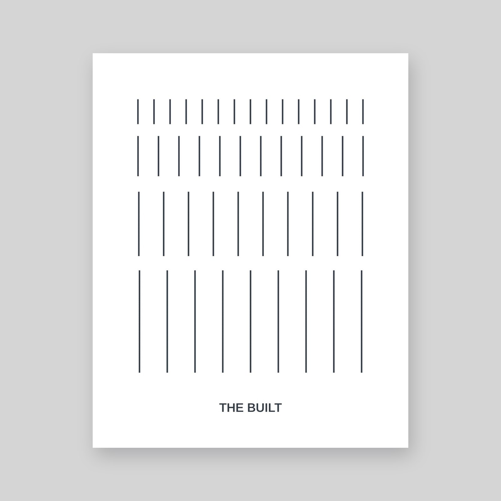
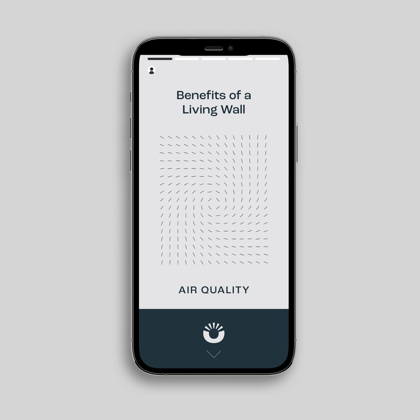
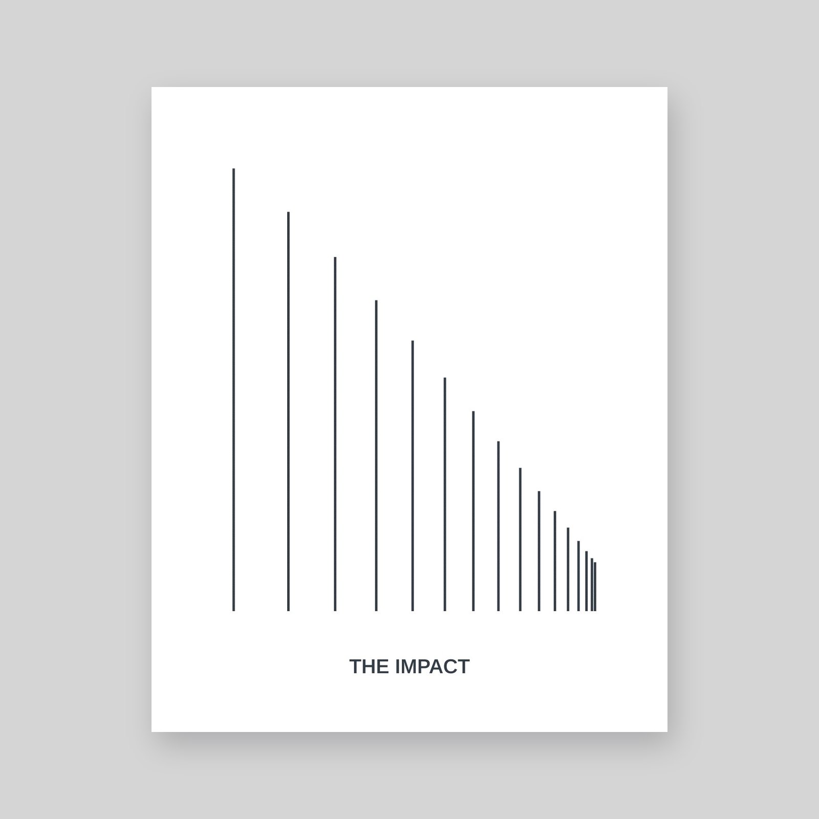
The visual language is built from clean drafted lines that shift from rigid grids into flowing fields, suggesting movement within stillness. We used it to turn Omula’s brand values and product features into a family of line icons, from balance and harmony to scalable and thriving, and into a series of animated posters on air quality, harmony and balance, health and wellbeing, the built and the impact.
The logo and textures were animated too, and we mocked the system up as a mobile story series on the benefits of a living wall. A holding page concept followed in May 2023.
Outfly, a London brand, marketing and product agency, created Omula’s brand strategy, tone of voice and visual identity in 2023, working through a brand immersion, a Brandscape of its audiences and a series of design sprints.
Omula, previously Revive Biotech, was set up as a nature-led architectural supplier and consultancy. Its planned launch products were internal moss walls and external moss cladding, with carbon-negative concrete and other sustainable building systems to follow.
Harmonising the built environment with nature. The strategy rests on four themes, harmony, balance, wellbeing and connection, and the identity expresses them by pairing the drafted lines of architecture with the organic forms of nature.
Be specific and back it up. Omula’s tone of voice guidelines swap vague words like ‘eco-friendly’, ‘green’ and ‘greenify’ for ‘genuinely sustainable’, ‘nature-led’ and ‘bringing back biodiversity’, and ask for scientific proof and data behind product claims.