Big infrastructure schemes run on more data than anyone outside the project team can read: engineering drawings, maps, timelines and BIM models from many disciplines. When the people affected can’t see what’s coming, misunderstandings and objections follow, and projects slow down. Geve’s team knew this first hand from London 2012 and HS2, where Phase 1 drew around 2,200 formal objections.
Geve’s answer was a Spatial Collaboration Solution that brings geographical and engineering data into one 3D virtual environment. Anyone from a local resident to a board member can explore a scheme in the first person and leave feedback pinned to a place. We started working with Geve in 2017, from the first logo concepts. Geve works in a highly technical field, so the brand had to sound professional and informed while speaking plain English to everyone a project touches.

The identity grew from an idea at the heart of Geve’s work: chaos theory, better known as the butterfly effect. Geve reads the connections between the environment, infrastructure and the people around them, so we drew the logo as an abstract wireframe butterfly. A master pattern of angled fractals in its top left wing feeds the rest of the system, from graphic overlays and image masks to the shapes in each layout, which keeps every piece of communication familiar.
We set the palette around a warm orange gradient, always run at 45 degrees, against a near-black Rangoon green, with Aktiv Grotesk and Kanit for type. A Brandscape workshop in 2018 sharpened the story: three buyer personas, a voice that is creative, experienced, transparent, visionary, reliable and passionate, and one brand promise, to build order from chaos. Our tone of voice guide kept it grounded: informed but not arrogant, confident but not authoritarian, and plain English over engineering jargon.

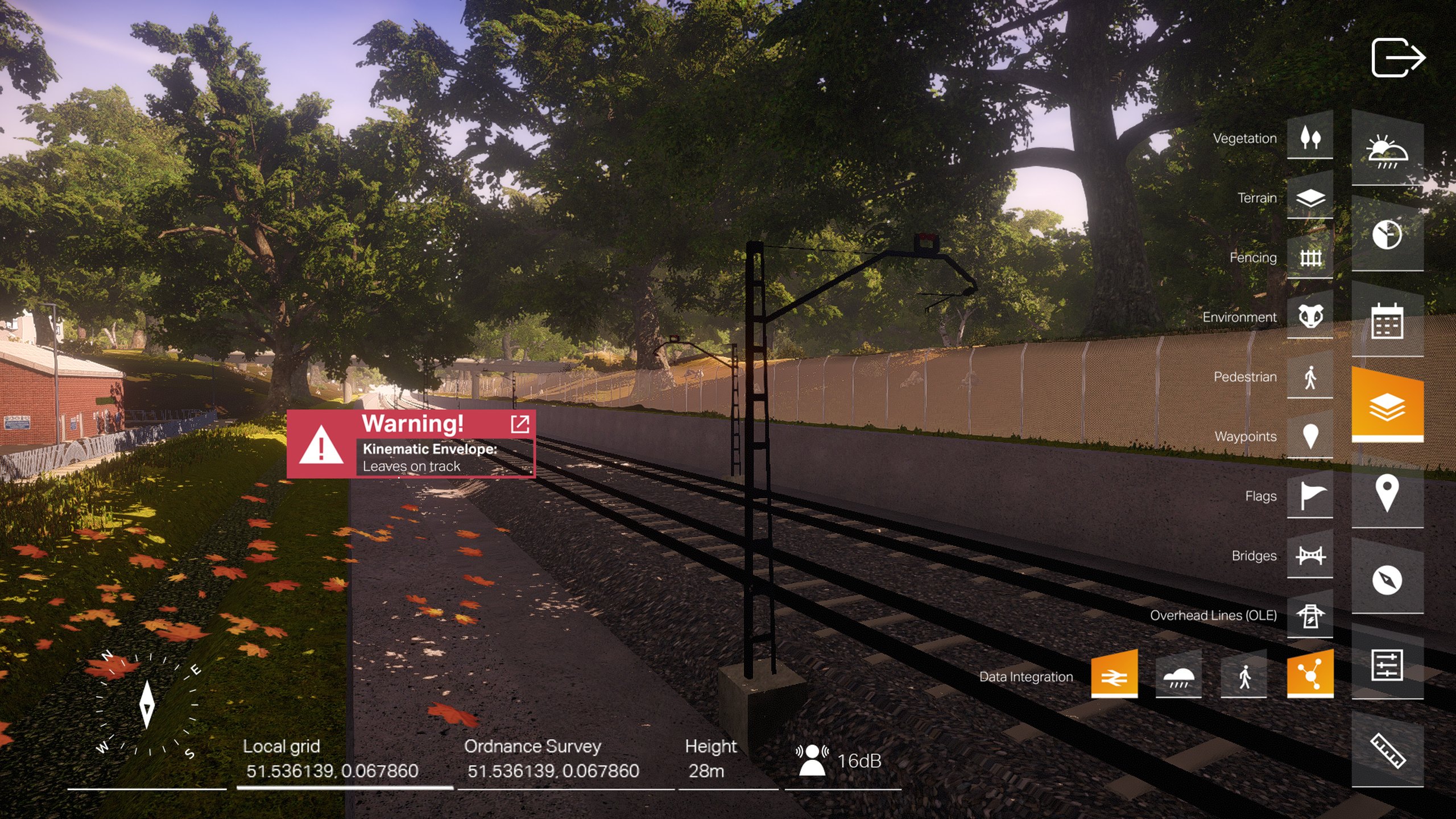
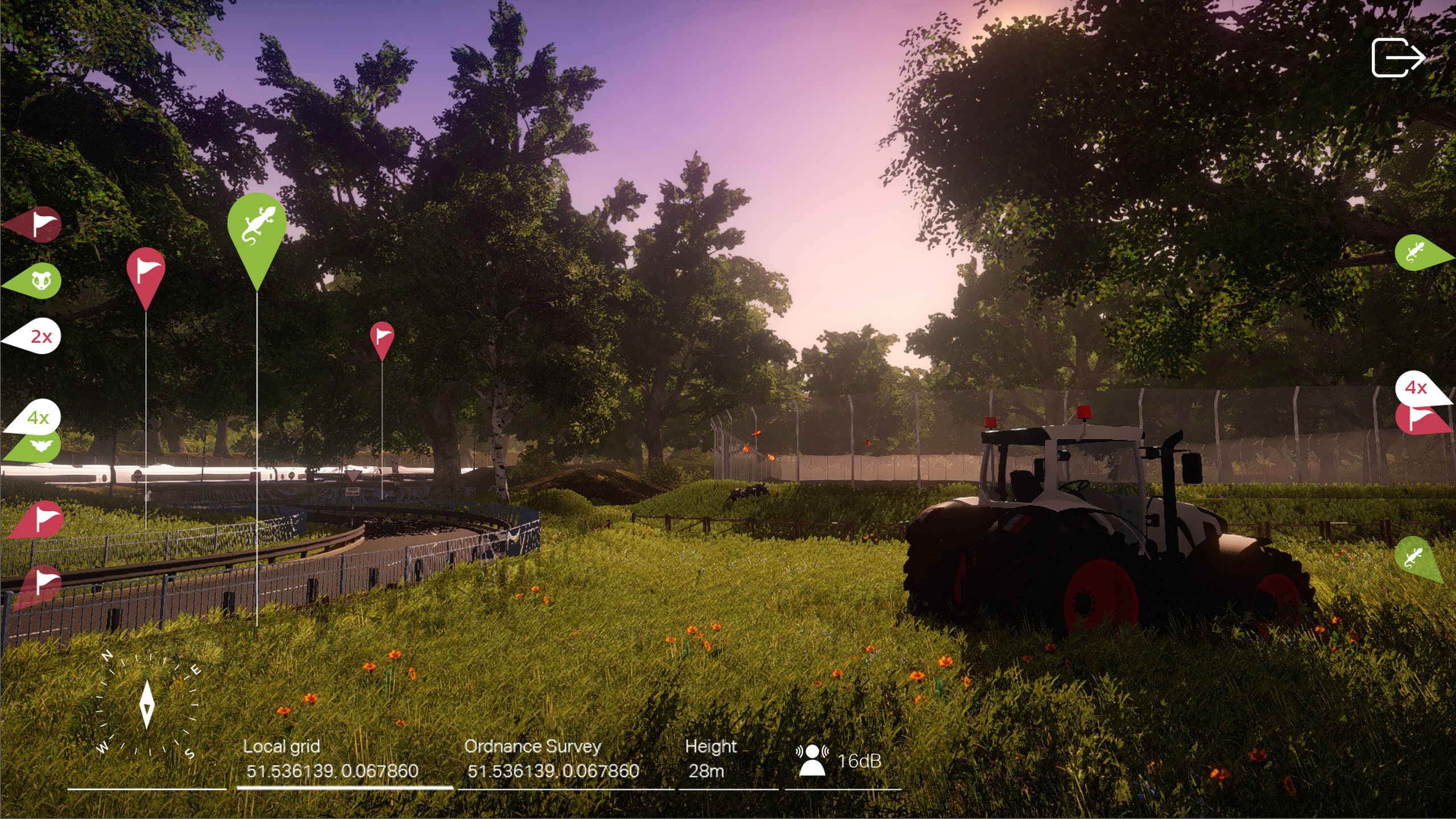
In early 2018 we designed a user interface pack for Geve’s 3D platform. Layer controls for vegetation, terrain, fencing, bridges and overhead lines run down one side, location pins and flags float in the scene, and warnings appear where they matter, all in the brand’s orange, black and white. We then storyboarded and made a film that moves through a modelled rail corridor to show the platform at work, with BIM models, pins and data appearing in place.
Around it we built the tools Geve needed to sell: social profiles and covers, a presentation deck, a fact sheet for its Spatial Collaboration Solution and an HS2 case study deck. In 2019 we gave Spatial Messenger, Geve’s location-based messaging tool, its own sub-brand logo and a product film.
By 2022 Geve was taking Spatial Messenger to highway authorities, and we designed the proposal deck it used to pitch the app to a city council. The idea was simple: an inspector finds a pothole, pins it to an exact location with a photo and notes, and the contractor, the council and everyone else who needs to know can follow it until it’s fixed. Councils have to be able to prove they deal with hazards on time, which is why a shared, dated record at each location matters.
In 2023 we designed the app’s user journeys and key screens. We began with a workshop on user personas and journeys, then mapped with Geve and the council how inspectors and contractors report and sign off repairs. A meeting with the council’s team shaped the details: a Category 1 defect jumps to the top of a contractor’s list with a two-hour deadline, and a job can’t be closed without a dated photo. We worked tablet first, then carried the key screens to mobile and desktop in light and dark, with a UI style built on the Geve brand, custom icons, map styling, layers and journey times.
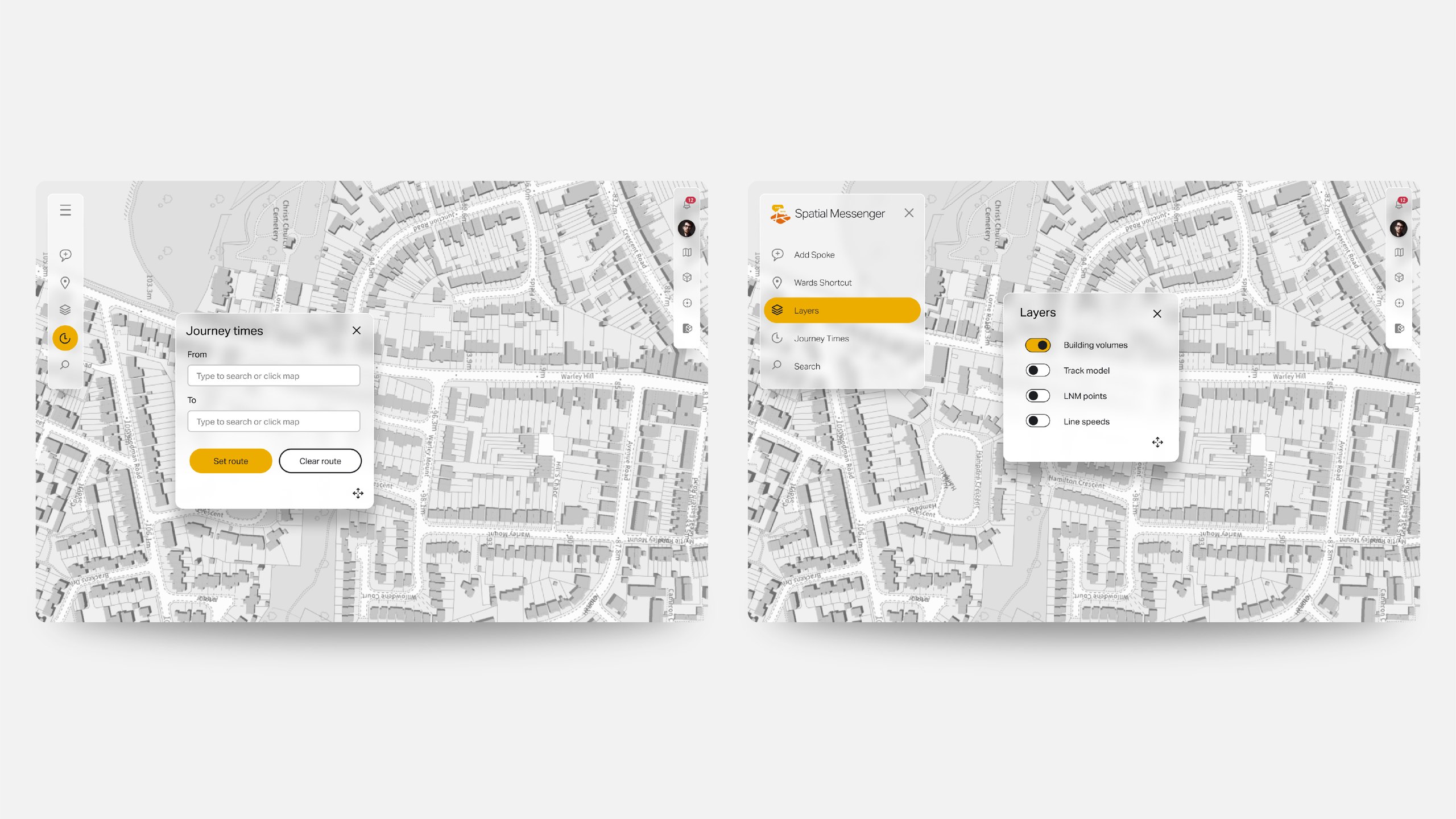
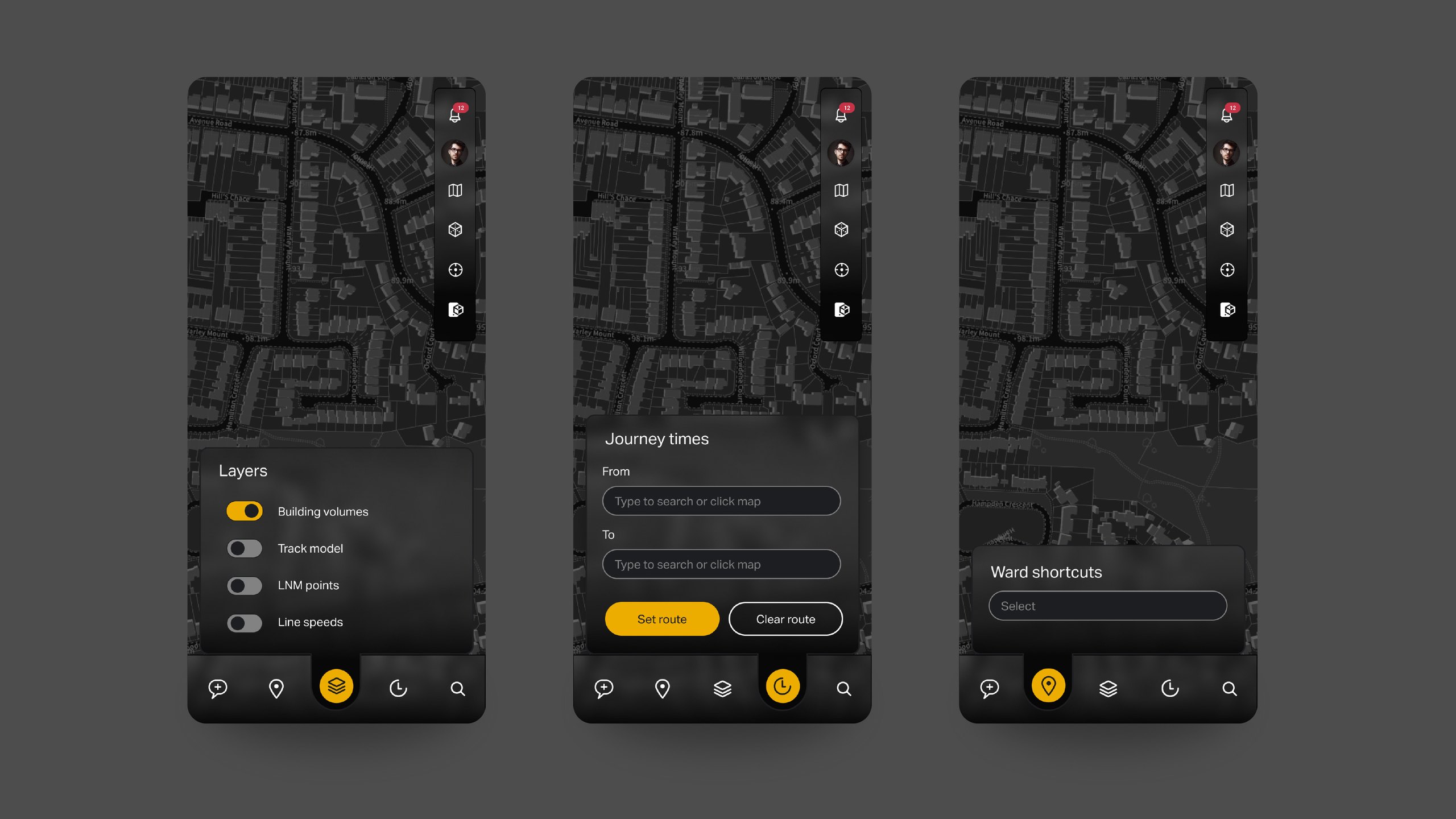
Outfly, a London brand, marketing and product agency. We created Geve’s identity, brand guidelines and tone of voice, designed a user interface pack and a film for its 3D platform, and designed the user journeys and screens for the Spatial Messenger app.
The butterfly effect. Geve’s brand draws on chaos theory, so the logo is an abstract wireframe butterfly, and a master pattern of fractals from its top left wing shapes the rest of the visual system.
A Geve app that lets inspection teams pin road damage to an exact location, add photos and notes, and start a conversation about it with the people who fix it, keeping a history at each location.
Start with how they work. We ran a workshop on personas and user journeys, mapped with Geve and a council highways team how inspectors and contractors report and sign off repairs, designed tablet first, then adapted the key screens for mobile and desktop.