
One brand, changing training across industries
VIVIDA sought to change the way companies did learning and development. Their storytelling expertise and ambition made working together a dream. Through our workshops together we uncovered a core goal, to make learning matter so it sticks.
Their challenge was to help them make sense of and future-proof the main brand to match their ambition for the company. Starting with such a high quality base meant that we could push boundaries even further and together create some awesome experiences, most of which we can’t yet show here.

Solution
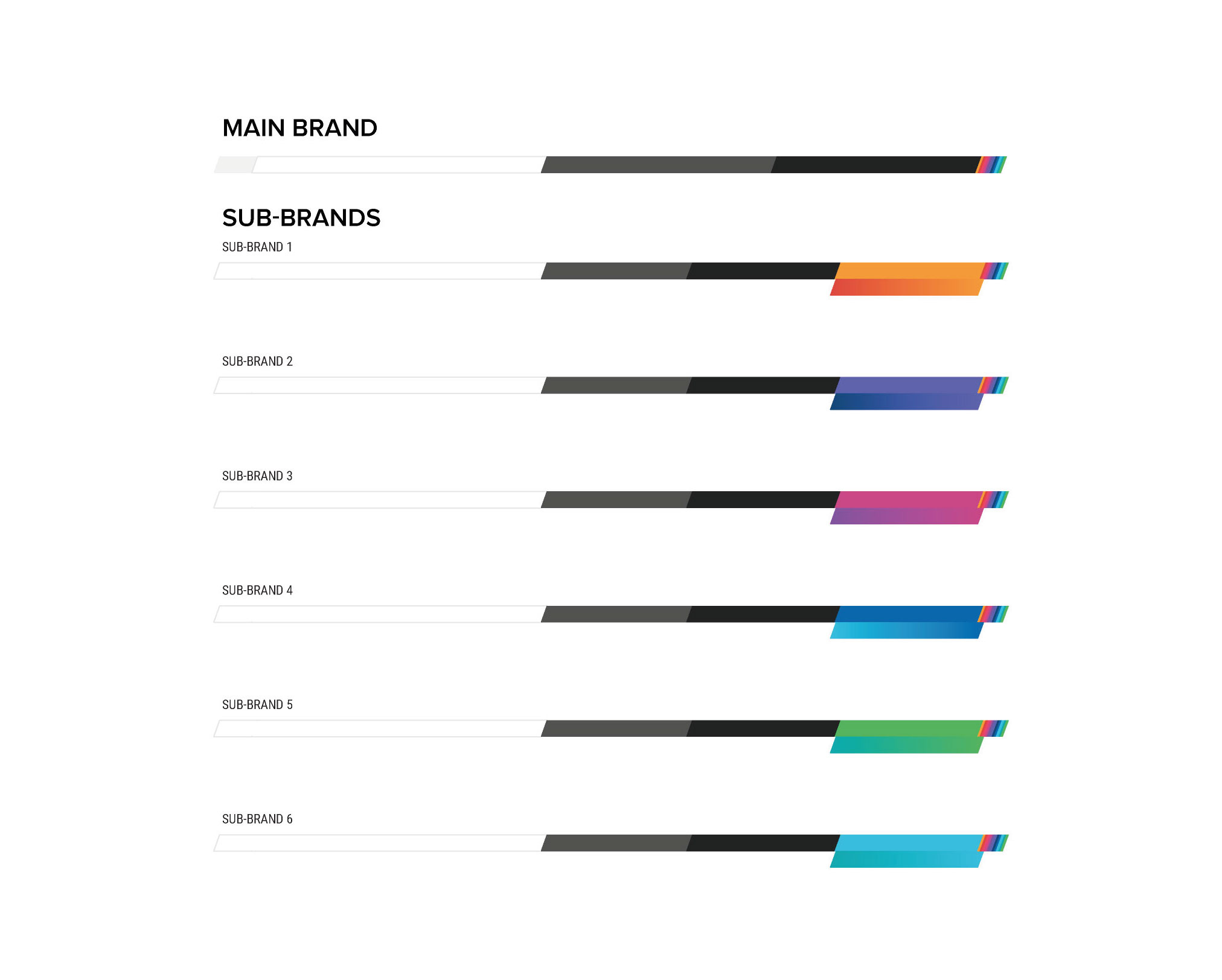
Parent brand / sub brand
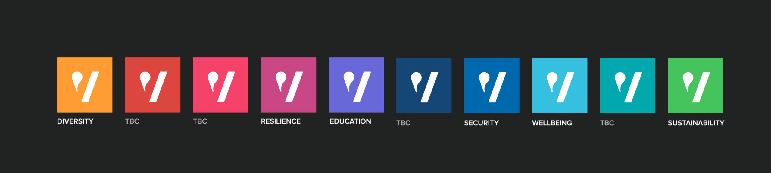
To maximise the brand’s longevity across new sectors, we designed a broad and versatile palette, pairing the psychology of each colour with each sector.

Concept development
Storytelling
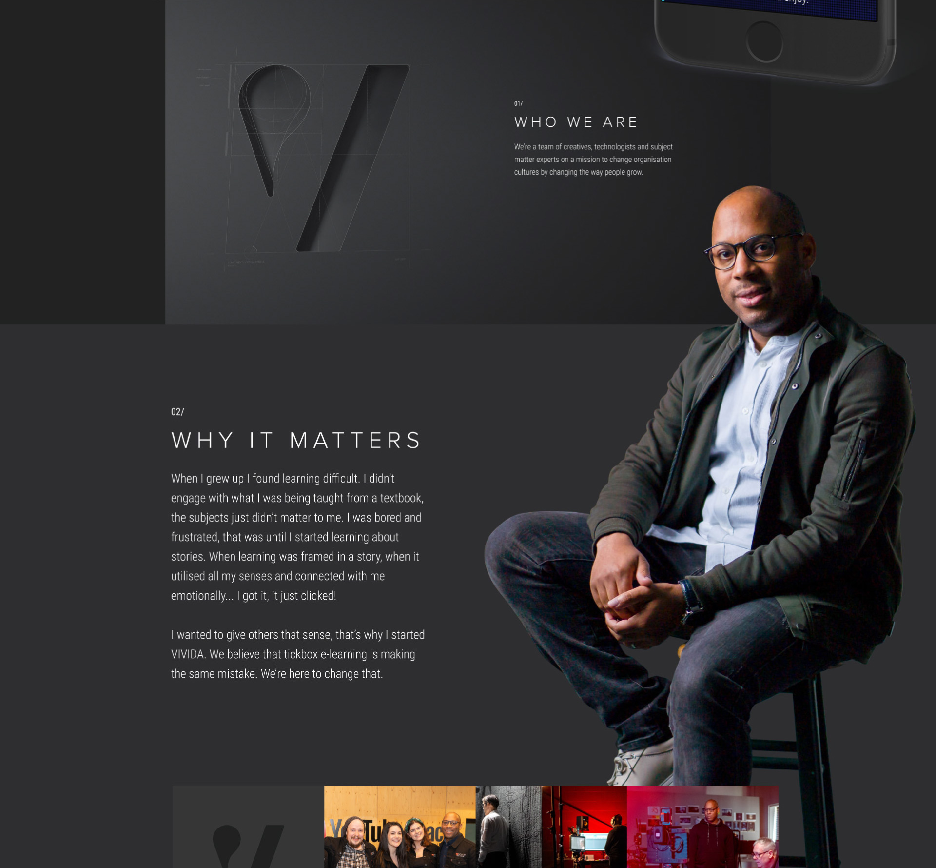
Let’s take a step back. To get to this point we had to start with the core questions of brand: who, what and why are VIVIDA? Our workshops helped them uncover their core values and translate them visually. Through all their benefits, immersion, excitement, quality, empathy, and learning, the thing that kept coming back was simple: story.
Doing different
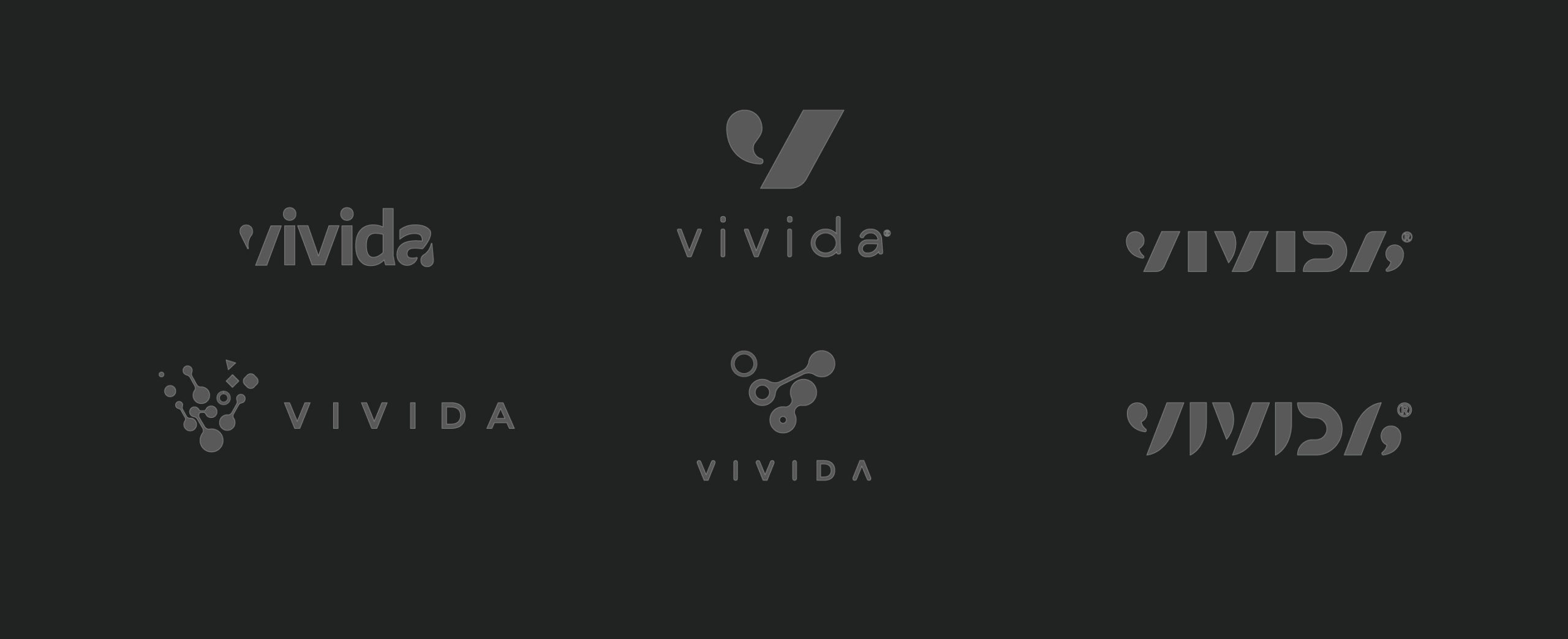
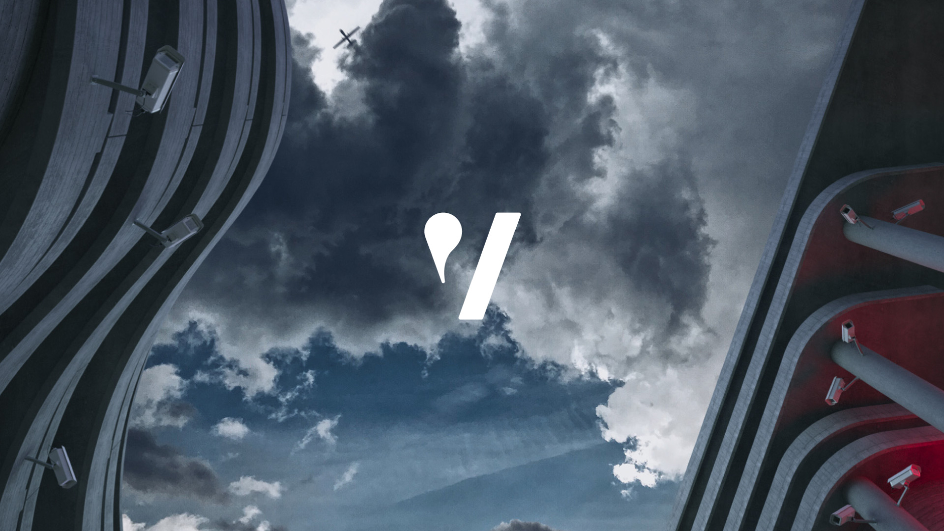
A lens, a portal
VIVIDA clarify subjects by contextualising them and making them real. We had the initial idea (as anyone would) of lenses and portals to other worlds, but it had been done before, so we couldn’t stop there.
Working with VIVIDA’s creative storytelling ability allowed us to consider how we could not only build an engaging brand family, but literally build new worlds together.


Final concept
Rationale
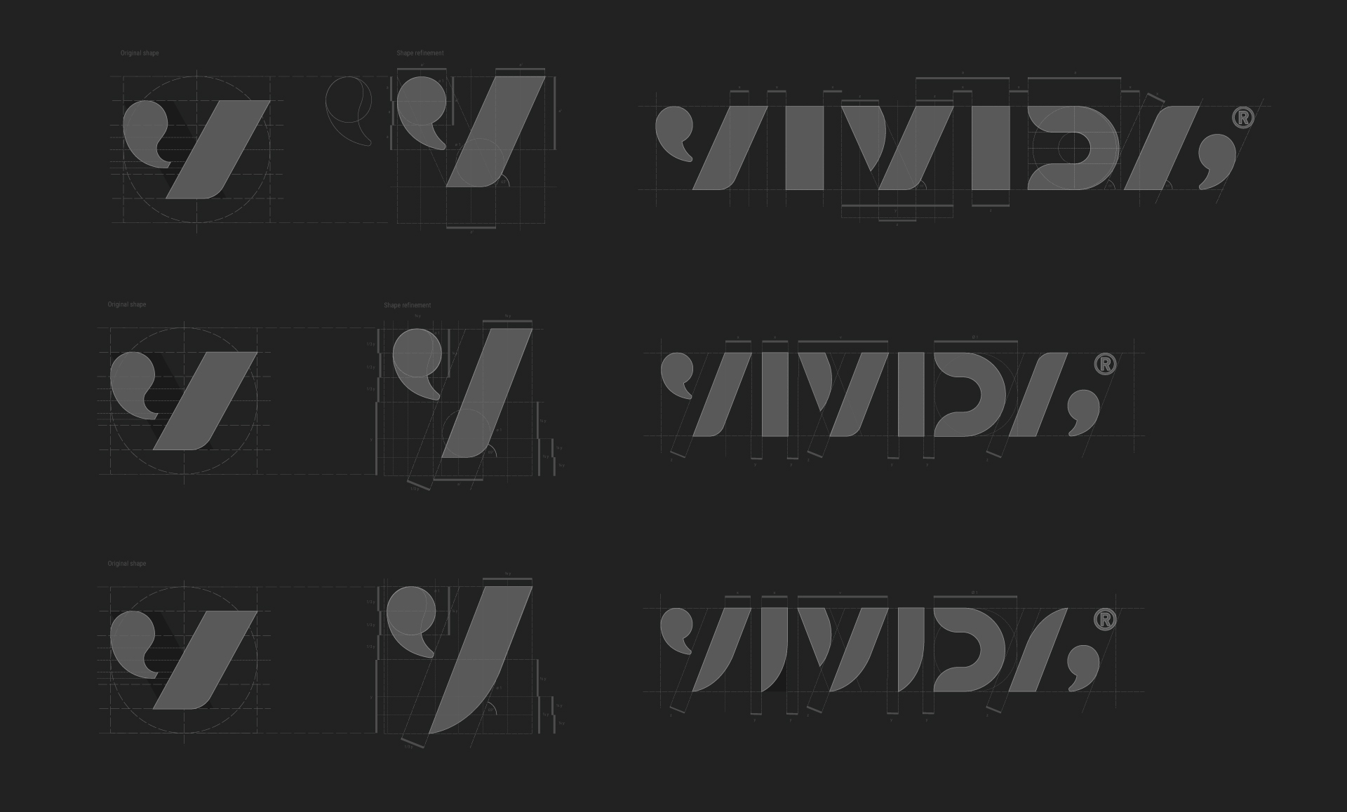
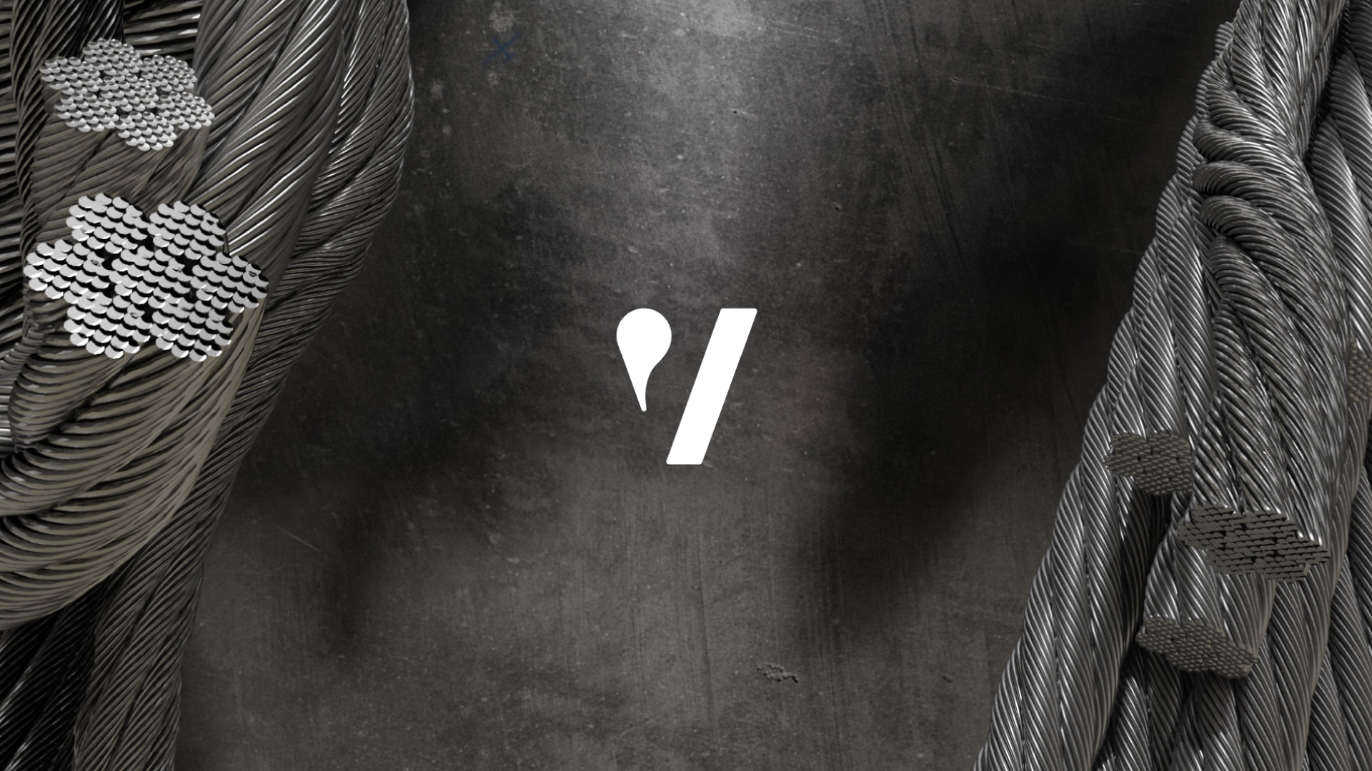
VIVIDA needed to be more than a lens. They needed to be a step above. VIVIDA was the script, and the story itself. The parent brand needed to be refined, formal and above all, cool. The quotation marks gave us the story, and the refined font of the wordmark gave the flexibility to apply itself across industries.
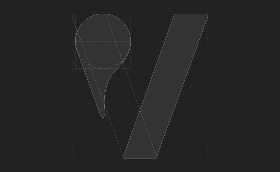
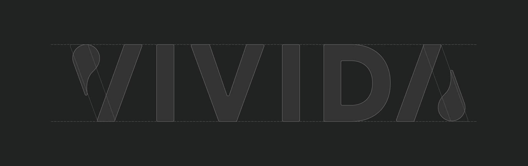
The second half of the ‘V’ lent itself to sub-branding. VIVIDA: Cyber became VIVID/cyber. From there we expanded out and built the brand family.


Roll out
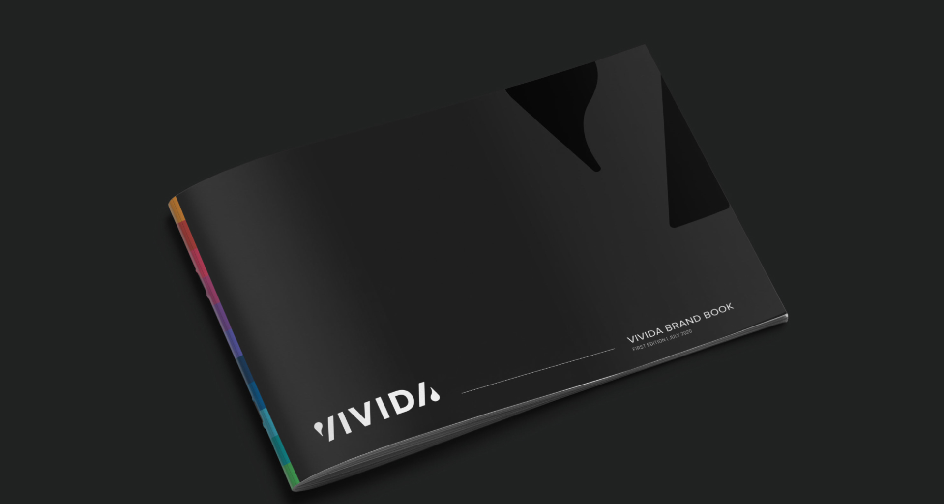
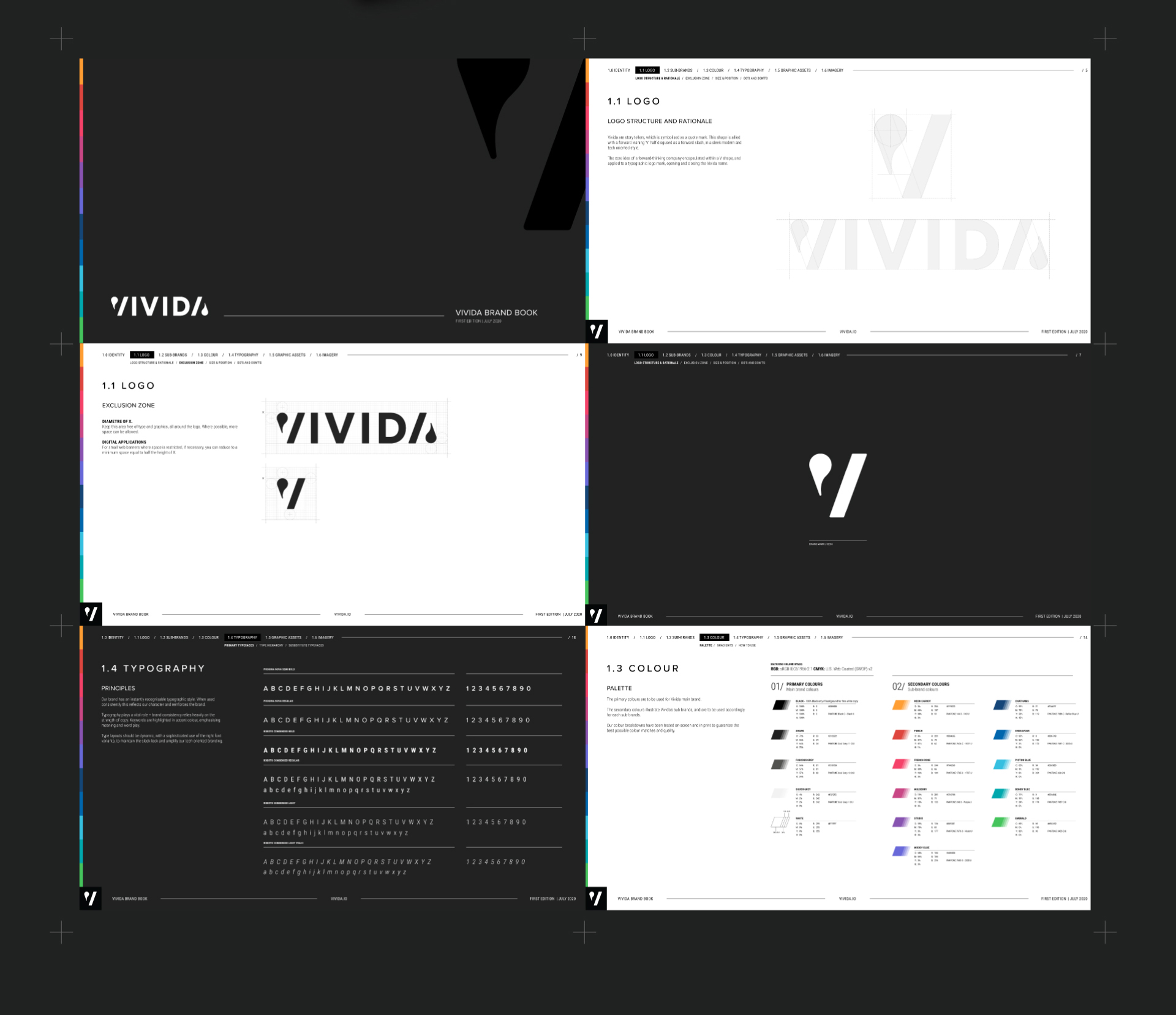
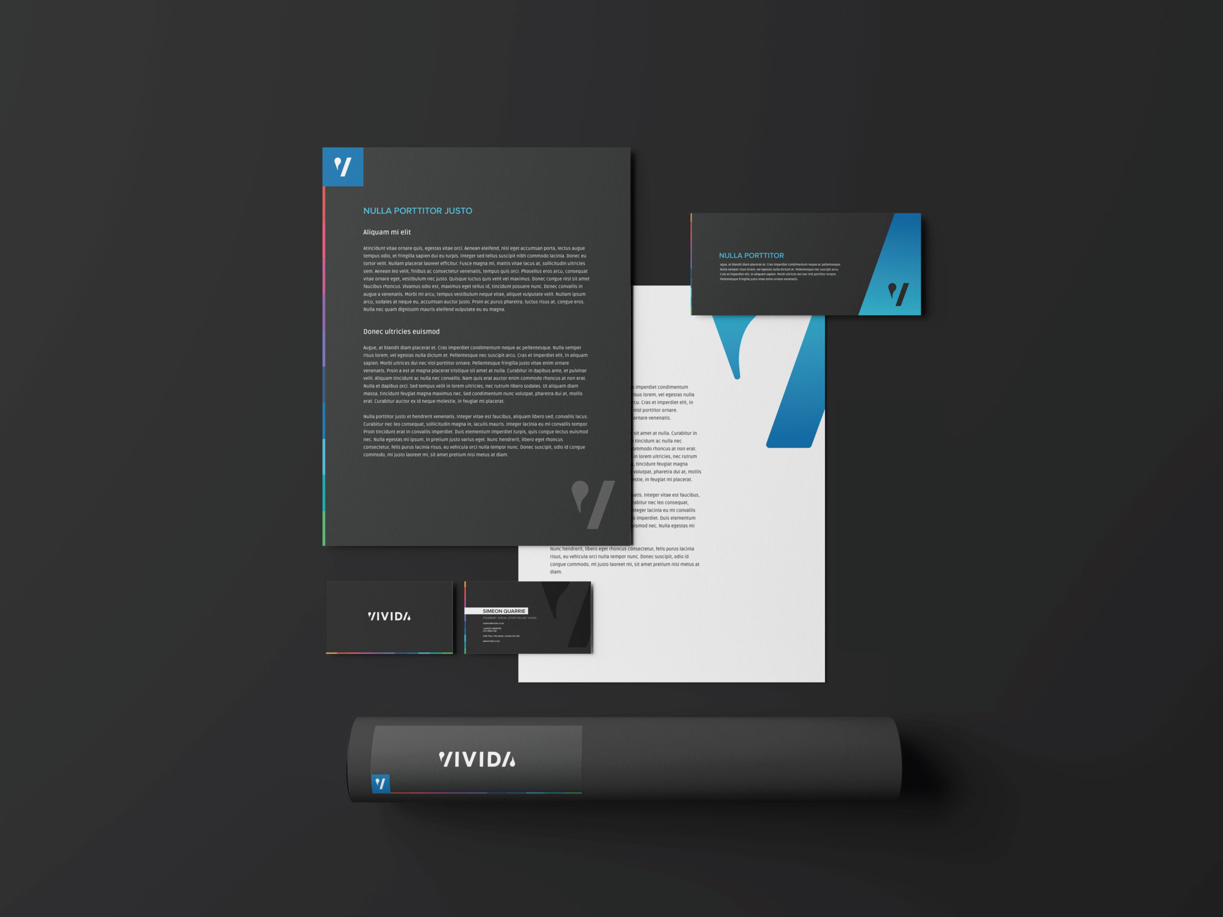
Brand guidelines

Sub Brands
Colour hierarchy
Each area needed its own highlight colour. We knew some of the areas that VIVIDA was expanding into, and left space in our gradient palette for others.

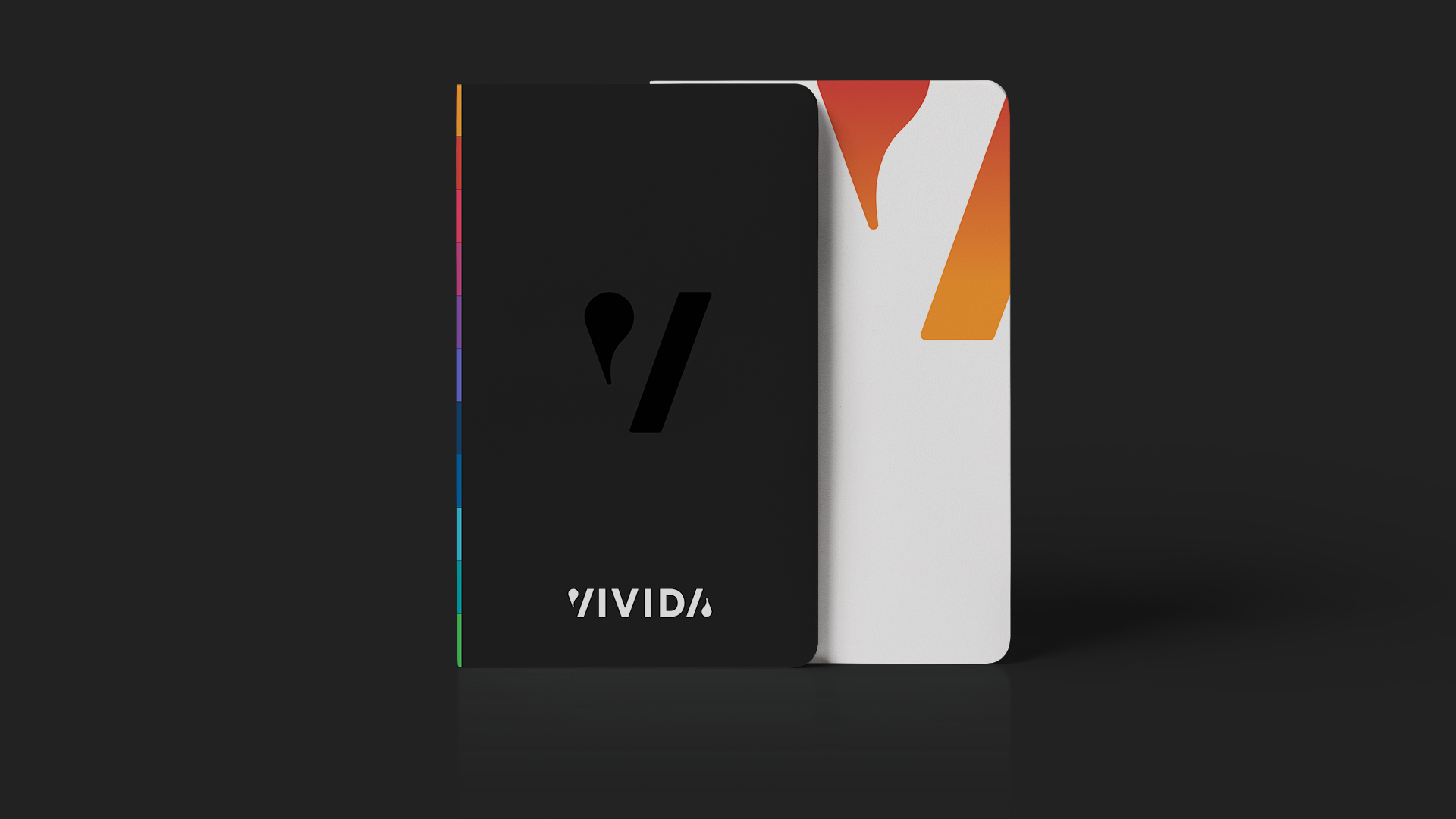
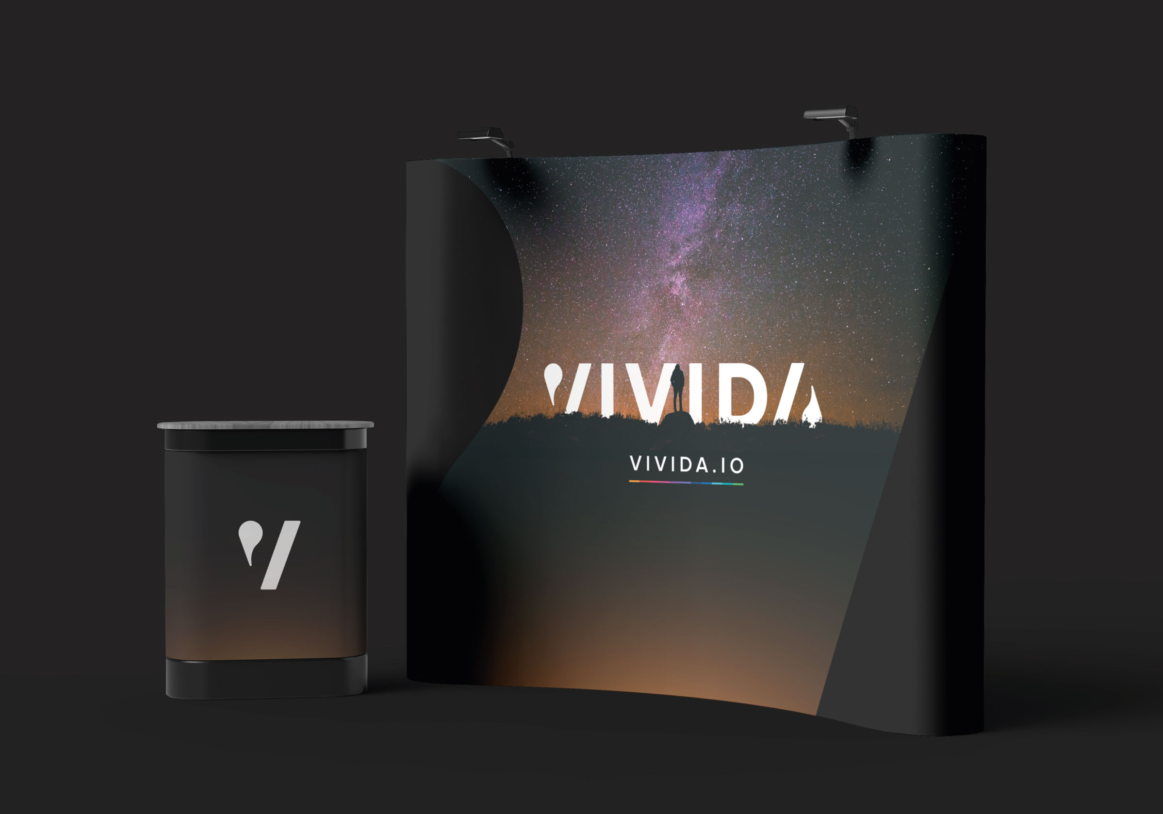
Application
Digital and print
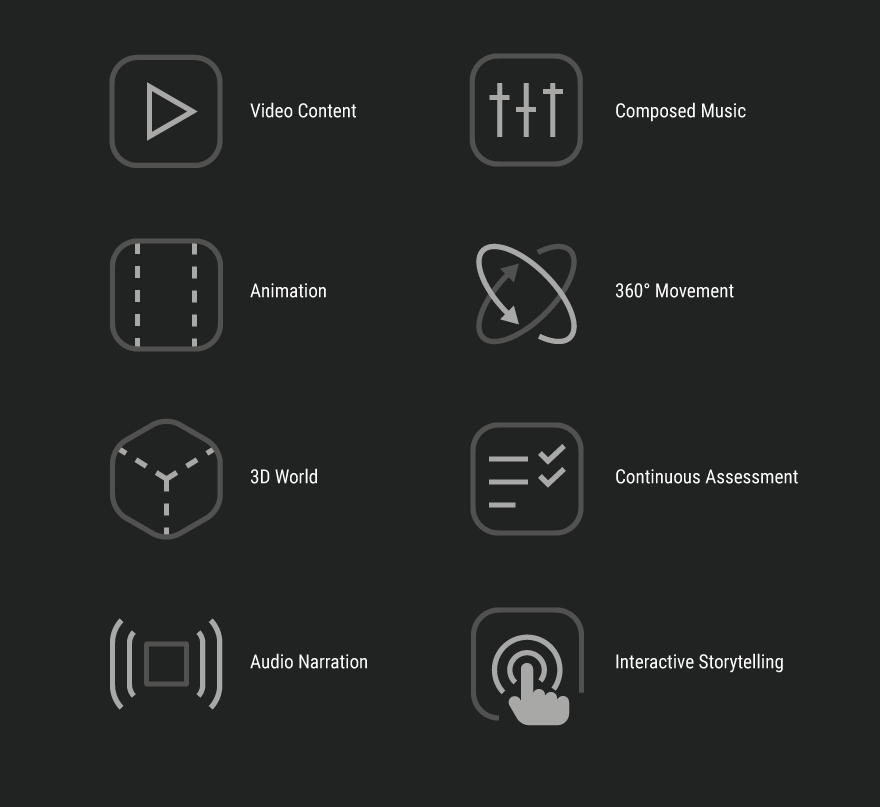
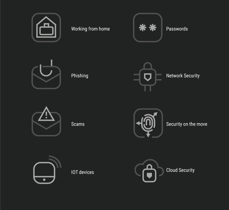
No brand is complete without icons and buttons. These were built to be minimal but angular and defined, a design philosophy that we’d take through to their UI.
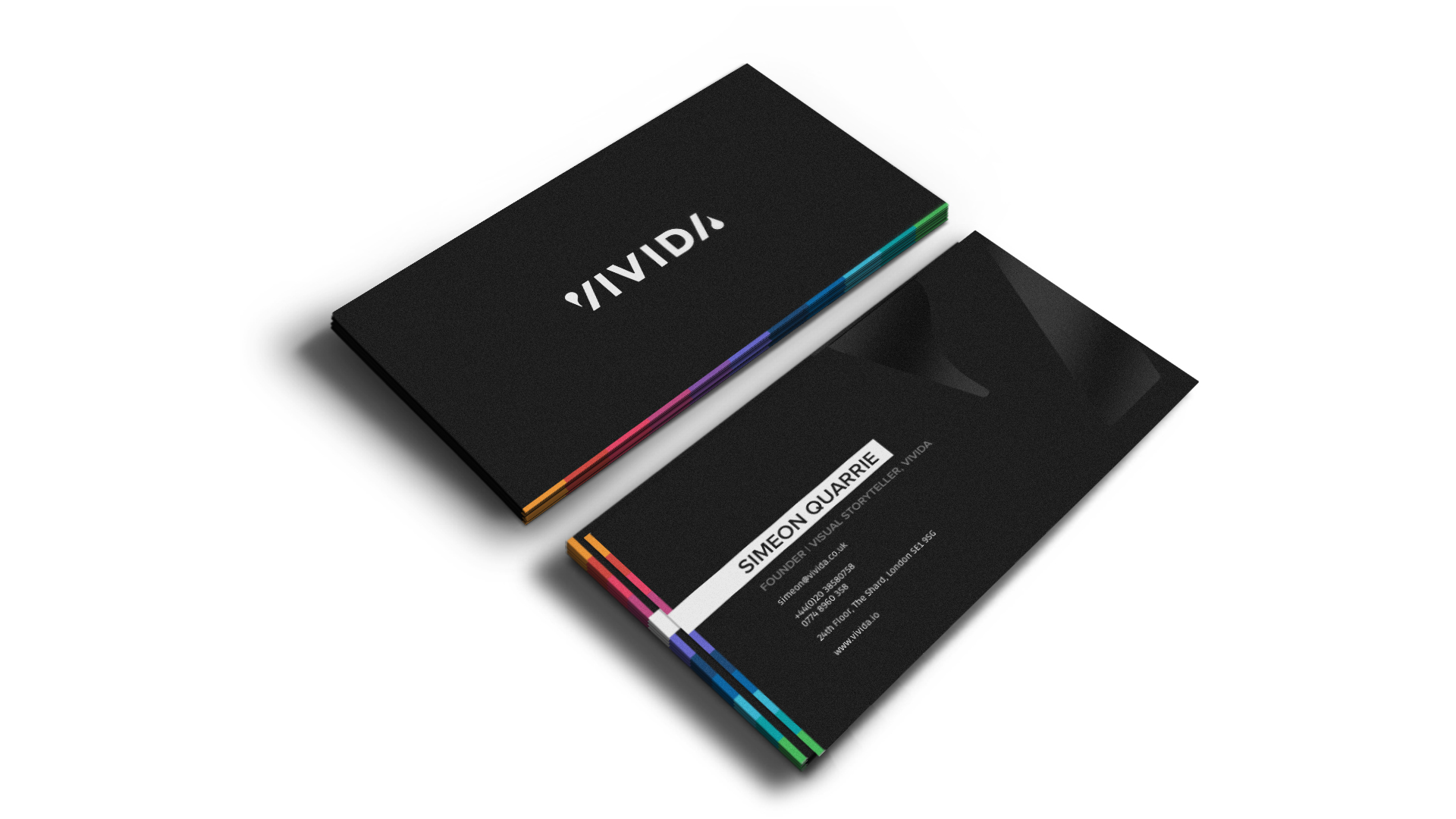
In print, the V of VIVIDA becomes the background. The shape of the quote and the slash, leaves a subtle impression of the “story, and you”, flexible to a range of business areas.


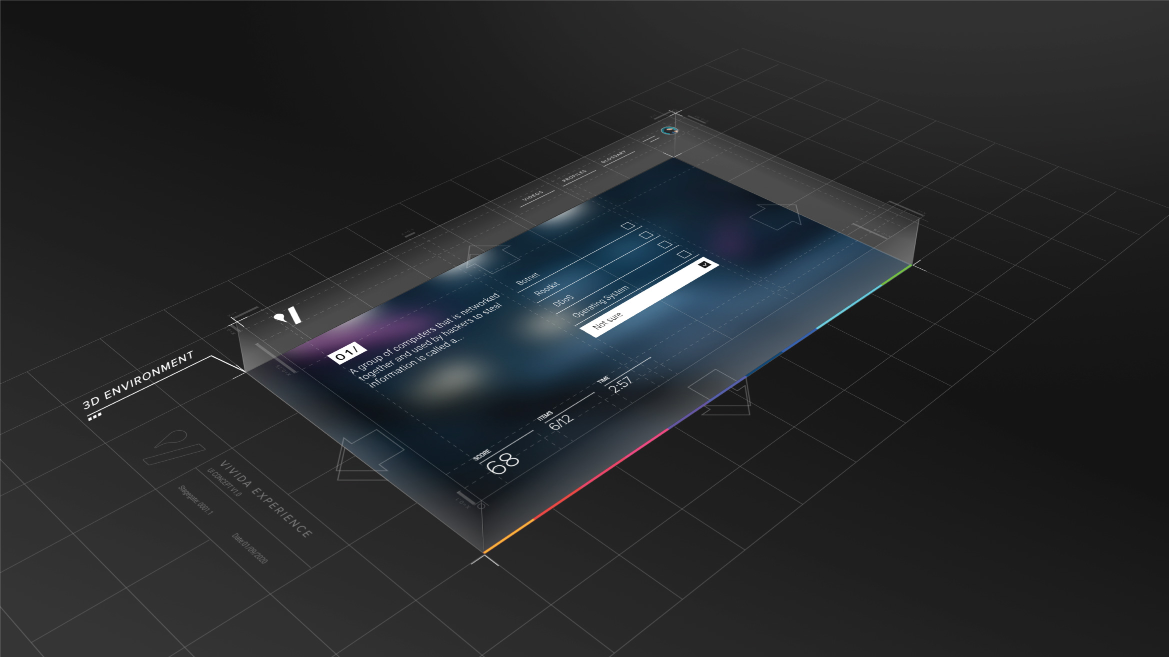
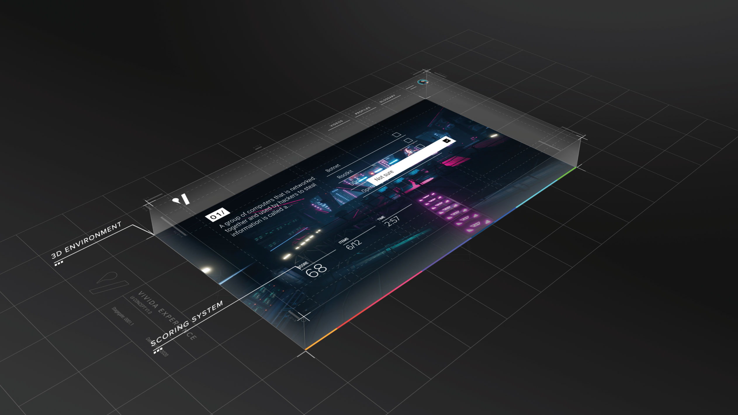
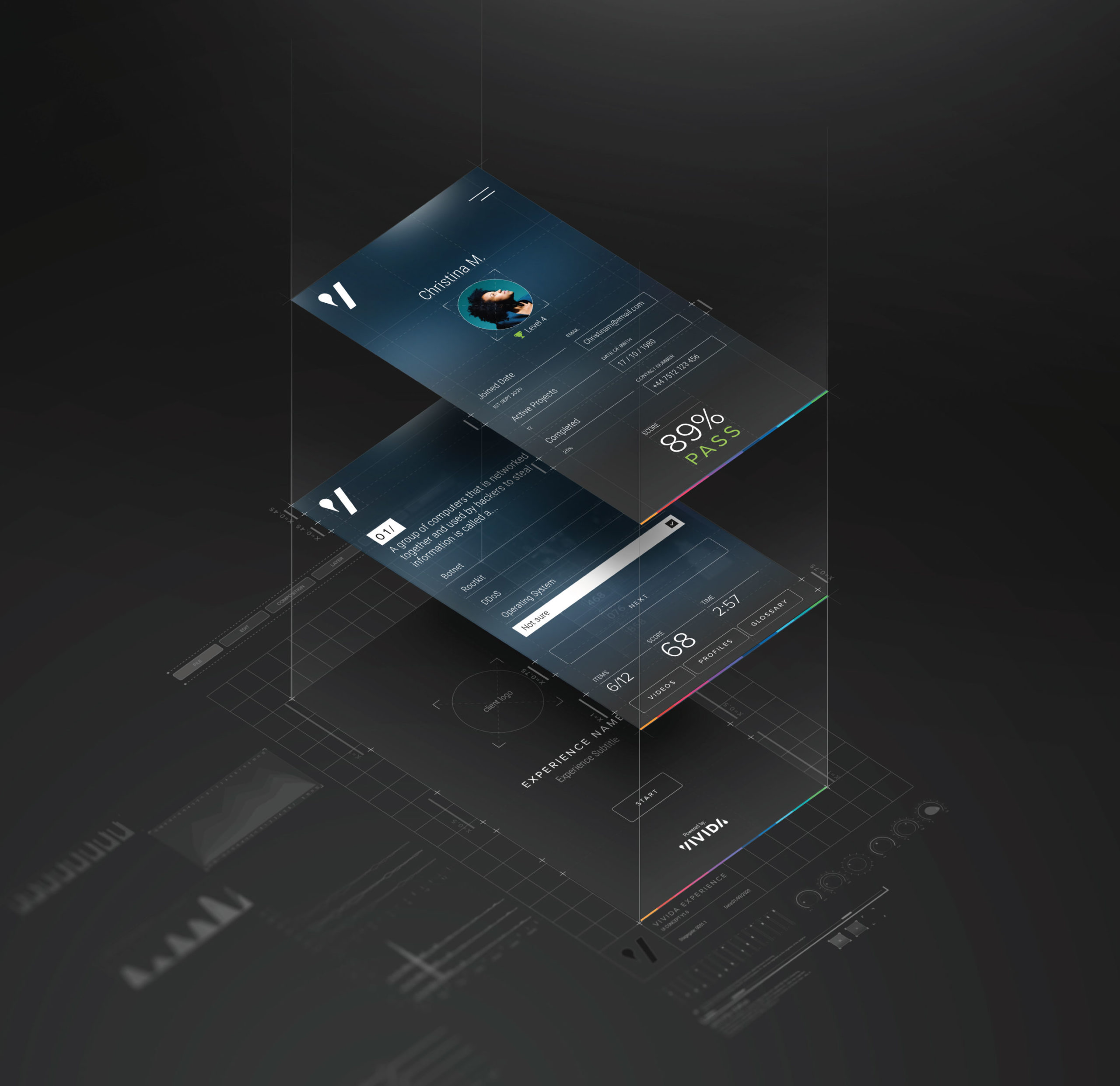
With a brand like this, the UI created itself, with a little bit of help from us.
We started with the incredible gaming environment that VIVIDA had created and designed a bespoke UI guide to compliment the environment, visualising how each of the layers of functionality worked together to create a unique, immersive experience.
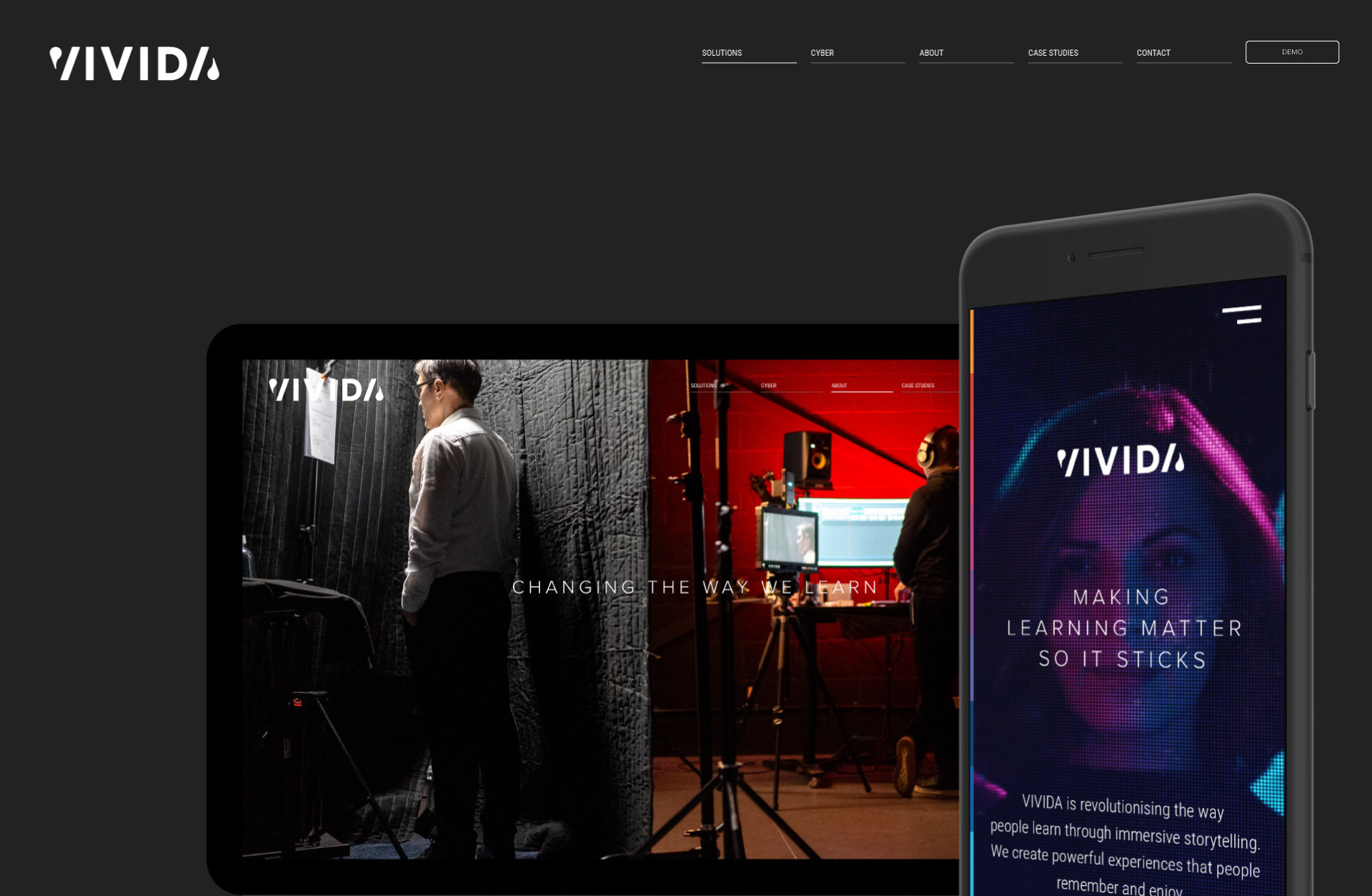
The website needed to speak to the end user and the buyer from each individual industry. It needed to be designed to grow iteratively, starting in cyber, then expanding out into other subject areas, existing as separate landing pages for each audience.
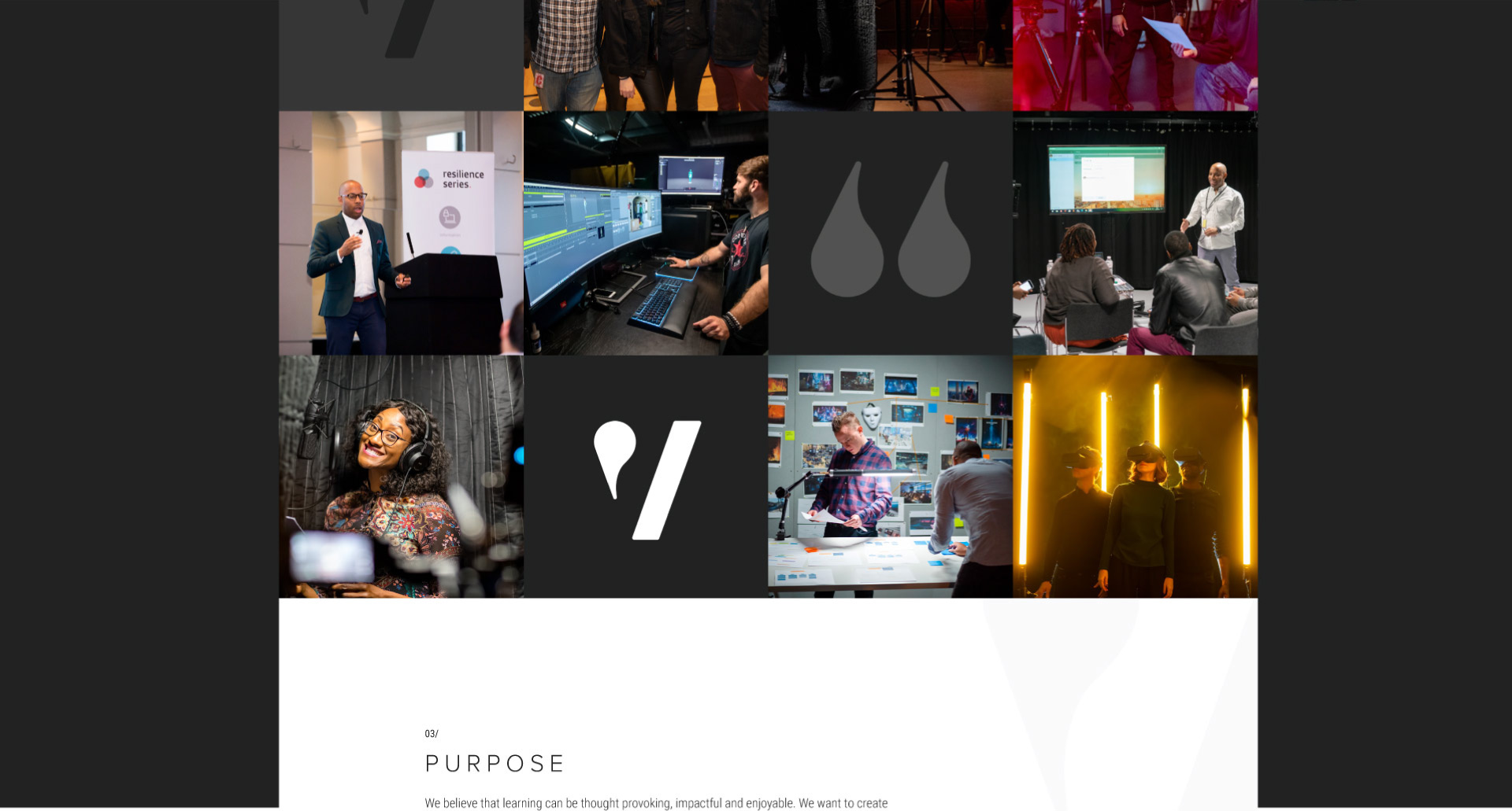
It needed to showcase VIVIDA’s unmatchable production quality with their mission; the reason they exist. It’s vivida.io, check it out.
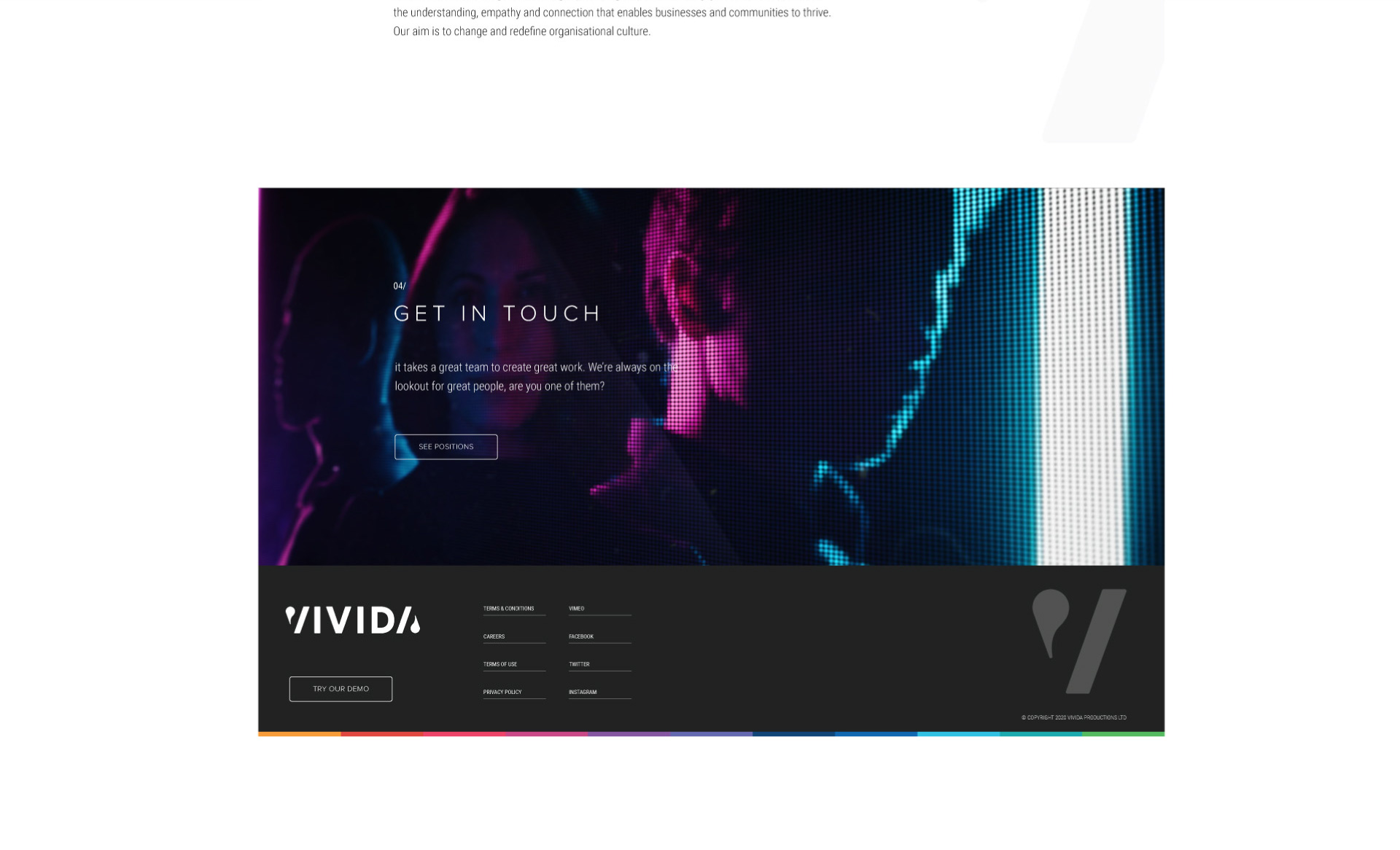
Do you have a brand that needs elevating, or a story that needs telling? We’re Outfly, a design innovation agency built for disruptive startups, innovators and game changers.
Give us a shout at hello@outfly.io