Most people go looking for financial help after something makes them stop and think: a new baby, a wedding, a bonus, sometimes the loss of a parent. Wealth Armour wanted to be there at that moment for the people the industry tends to overlook. Its brief put the problem plainly: getting financial advice is hard and has a high barrier to entry.
Wealth Armour works as an independent broker, partnered with more than 200 financial institutions, so clients can reach expertise from life insurance to investment strategy in one place. It sets no minimum, so nobody needs a large portfolio to get started, and it puts education first, so people understand the choices they make. What it needed was a brand that could carry that promise.
We ran a BrandStorm mini sprint, starting with a short brief session to agree who the brand was for and what it had to do. Two audiences came out of it: young families and professionals who have just reached a milestone, and established business owners at the point of scale, responsible for the futures of a family and a team. Both wanted the same things from Wealth Armour: confidence, peace of mind and security. The line that summed it up was “When life happens, we’re prepared”.
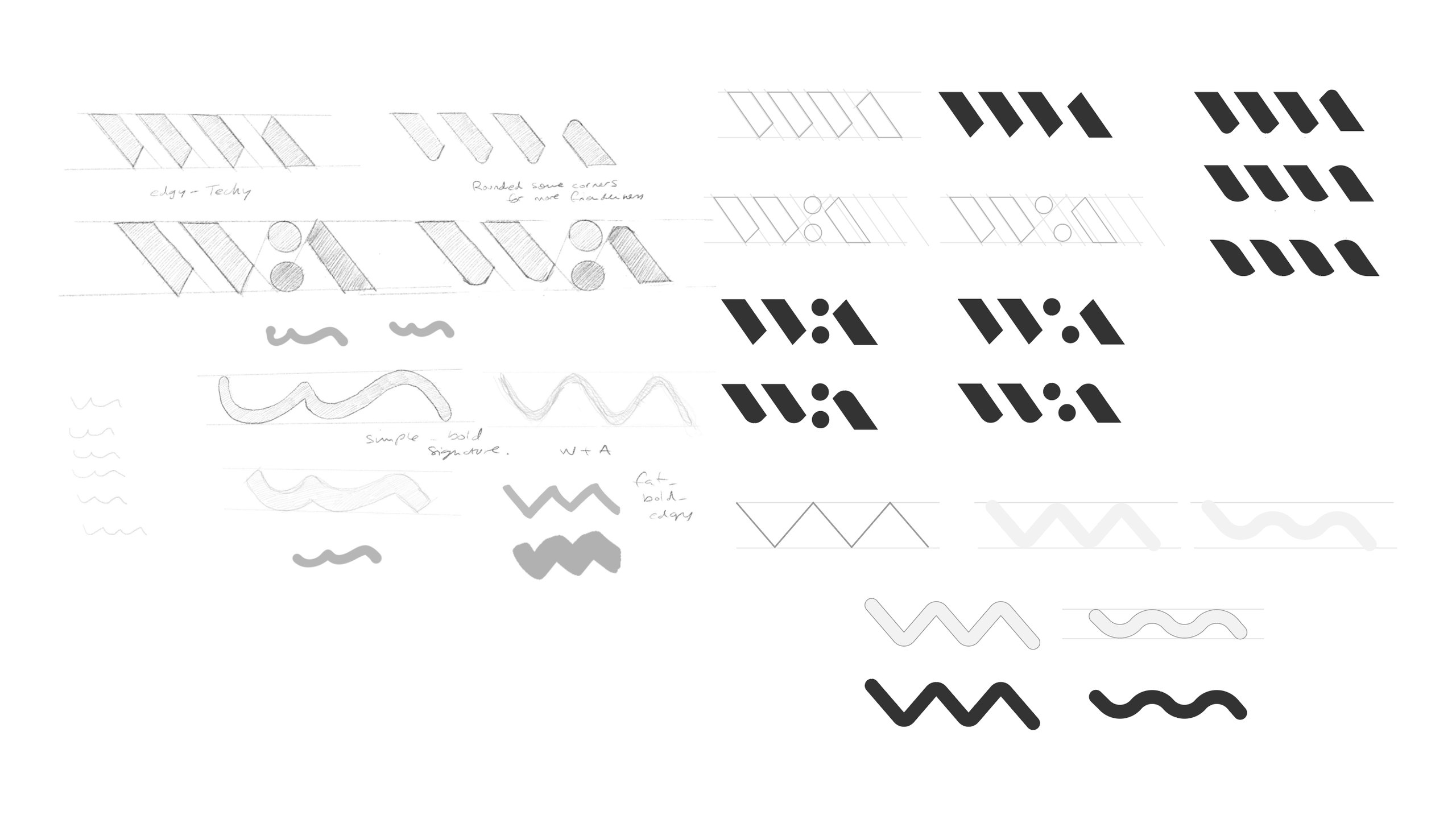
The brief set out a balance to strike. The brand had to feel accessible and modern without looking unprofessional, and secure, because it would be looking after people’s money. It also had to be original. Shields, serif crests, trees and handshakes were the obvious first ideas, so we set them aside. Several of our designers then sketched in parallel, from hand-drawn wordmarks to monograms built from slanted strokes, dots and waves.
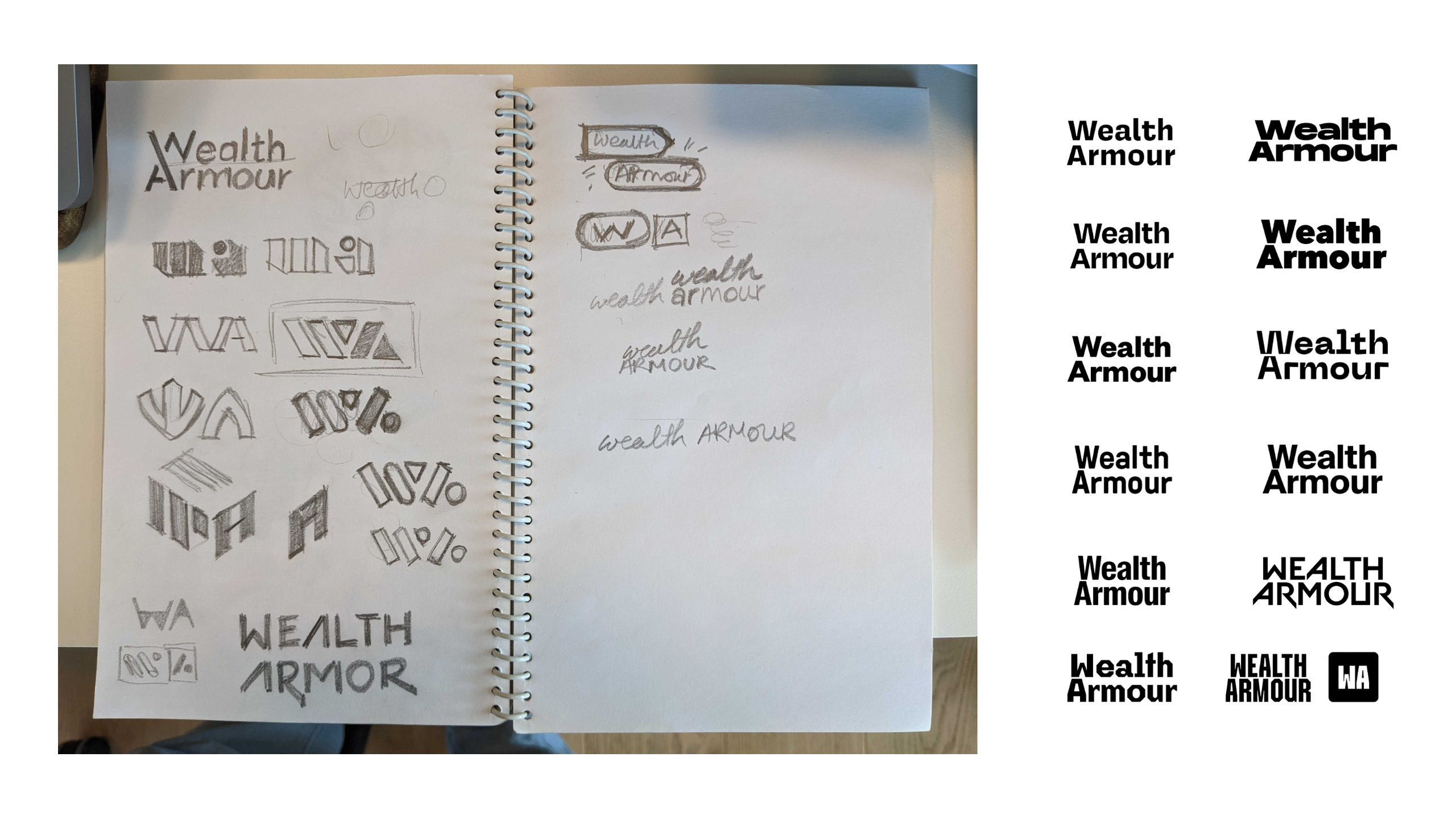
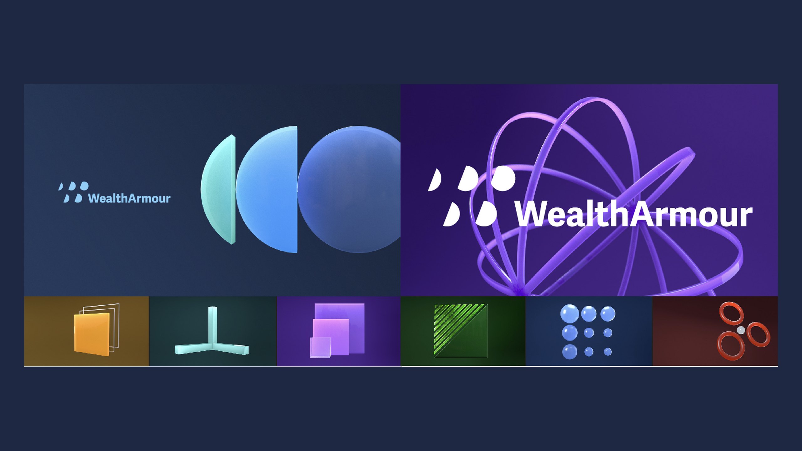
The sprint ended in Concept Round 01, six concept routes for Wealth Armour to react to. They ranged from typographic wordmarks, which let confident type do the work that shields and trees usually do, to symbolic marks built from simple shapes.
One route grew straight out of the sketches into a W and A monogram, where slanted strokes meet two round dots, pairing sharp and soft shapes. We showed it as a single-colour mark, in bright green on a deep purple, and as a repeating pattern the brand could use across its materials. Another route turned a cluster of half-round dots into a mark beside the wordmark, and we set it in 3D, with glassy discs and orbiting rings, to show how the brand could move.



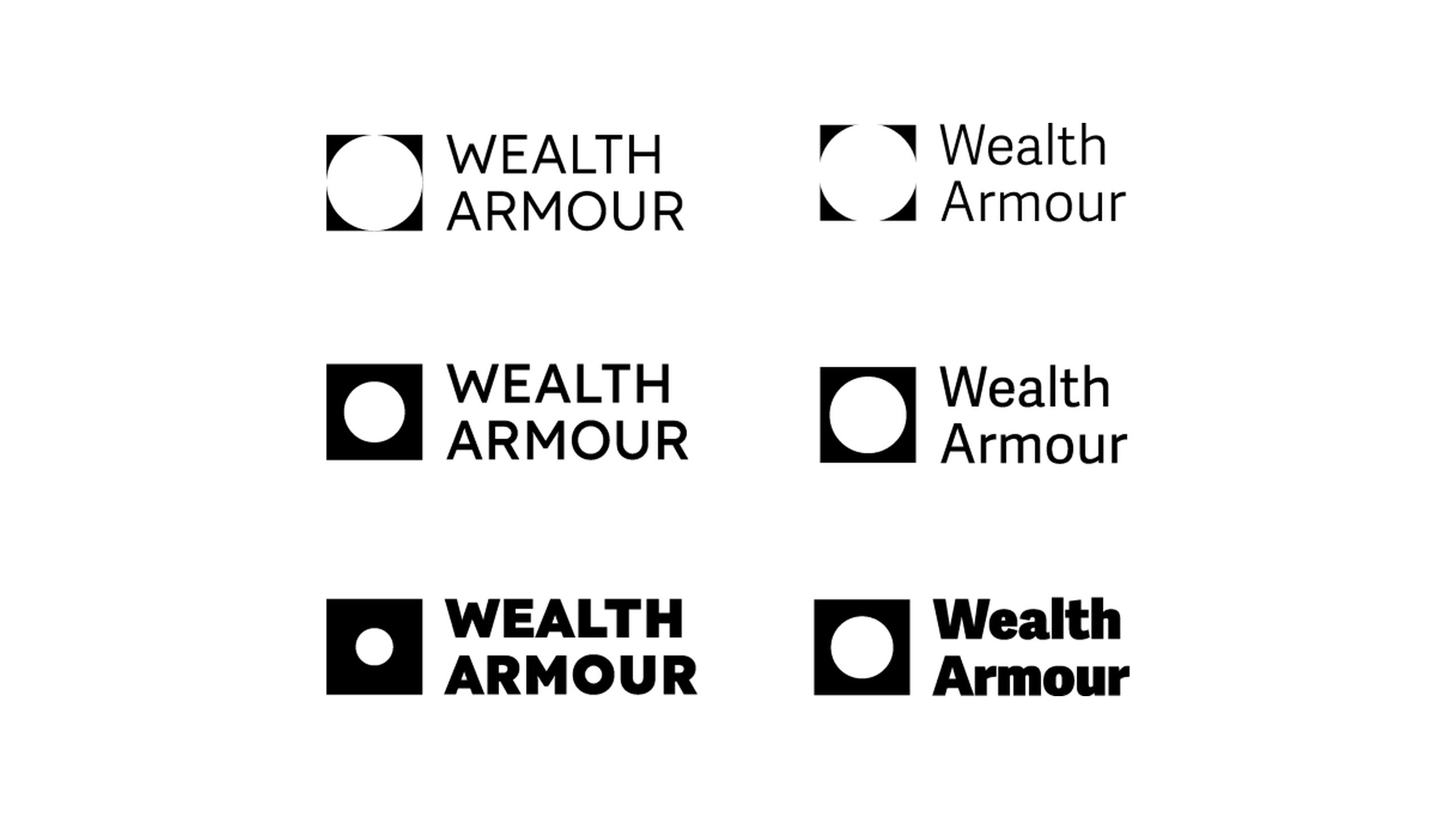
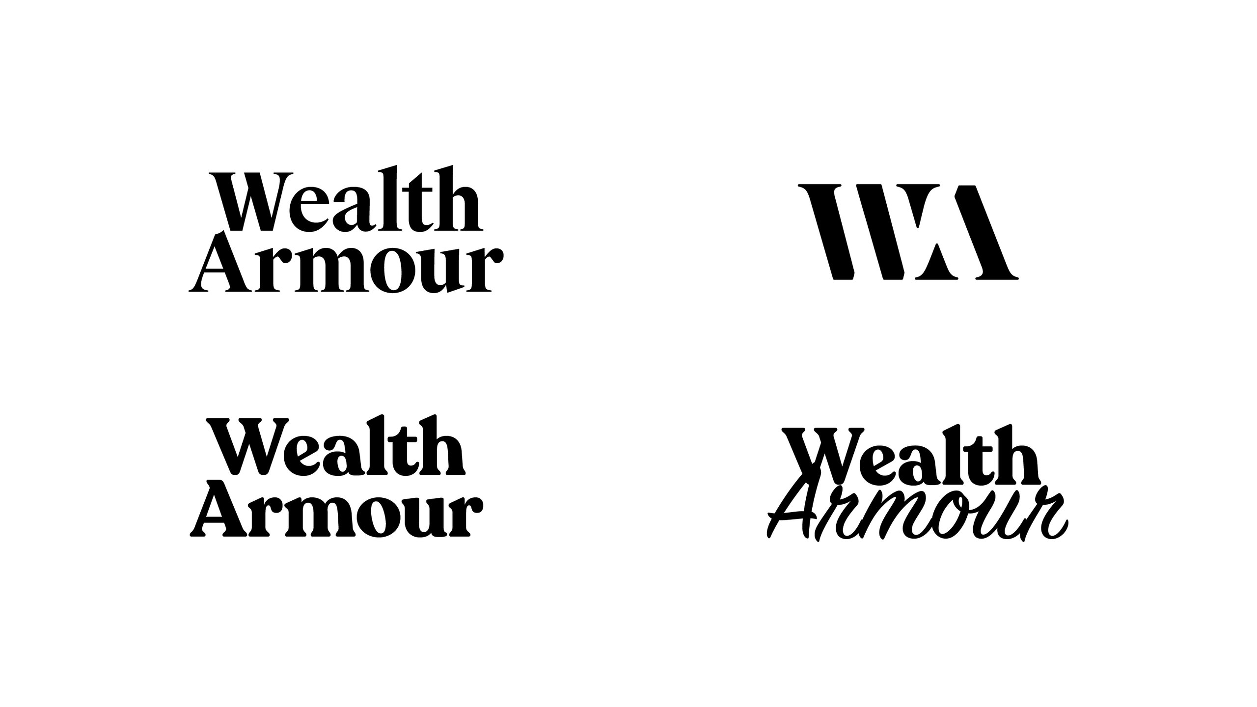
The other routes pushed the brief in different directions. One framed a circle inside a square, a nod to the vault idea from the brief session without spelling it out. Another turned a brushstroke wave and a single dot into a simple figure, drawn first by hand and then refined into a mark. A typographic set paired bold serif and script lettering with a heavy slanted monogram.
Seeing the routes side by side gave Wealth Armour a clear way to compare them: how each one balanced trust with approachability, and how far it could stretch, from a single mark to patterns and 3D.


Outfly, a London brand, marketing and product agency, ran a brand mini sprint for Wealth Armour and developed its first round of identity concepts.
A challenger financial services brand that works as an independent broker, partnered with more than 200 financial institutions, and sets no minimum, so people can get expert help whatever they have to start with.
Accessible without looking unprofessional, and secure, because it holds people’s money. Wealth Armour’s brief also ruled out the usual shields, trees and handshakes.
Young families, professionals and business owners who have reached a milestone in life and want to protect and grow what they’ve earned.