Synexus Solutions set out to be a consulting-led digital technology group that connects, engages and empowers communities across the UK. Its offer was broad: digital signage for schools and colleges, secure messaging for the emergency services, connectivity and digital services for local government, and funding for energy saving projects in the public sector. The buyers were just as varied, from headteachers and university staff to police, fire and rescue services and councils.
When we started working together in 2017, Synexus was a new brand with little presence on social media and few marketing assets to work with. It also shared its name with a much larger, unrelated company, which made it harder to stand out in search. It needed an identity that could hold a wide range of services together, and materials that would make its case to cautious public sector buyers.

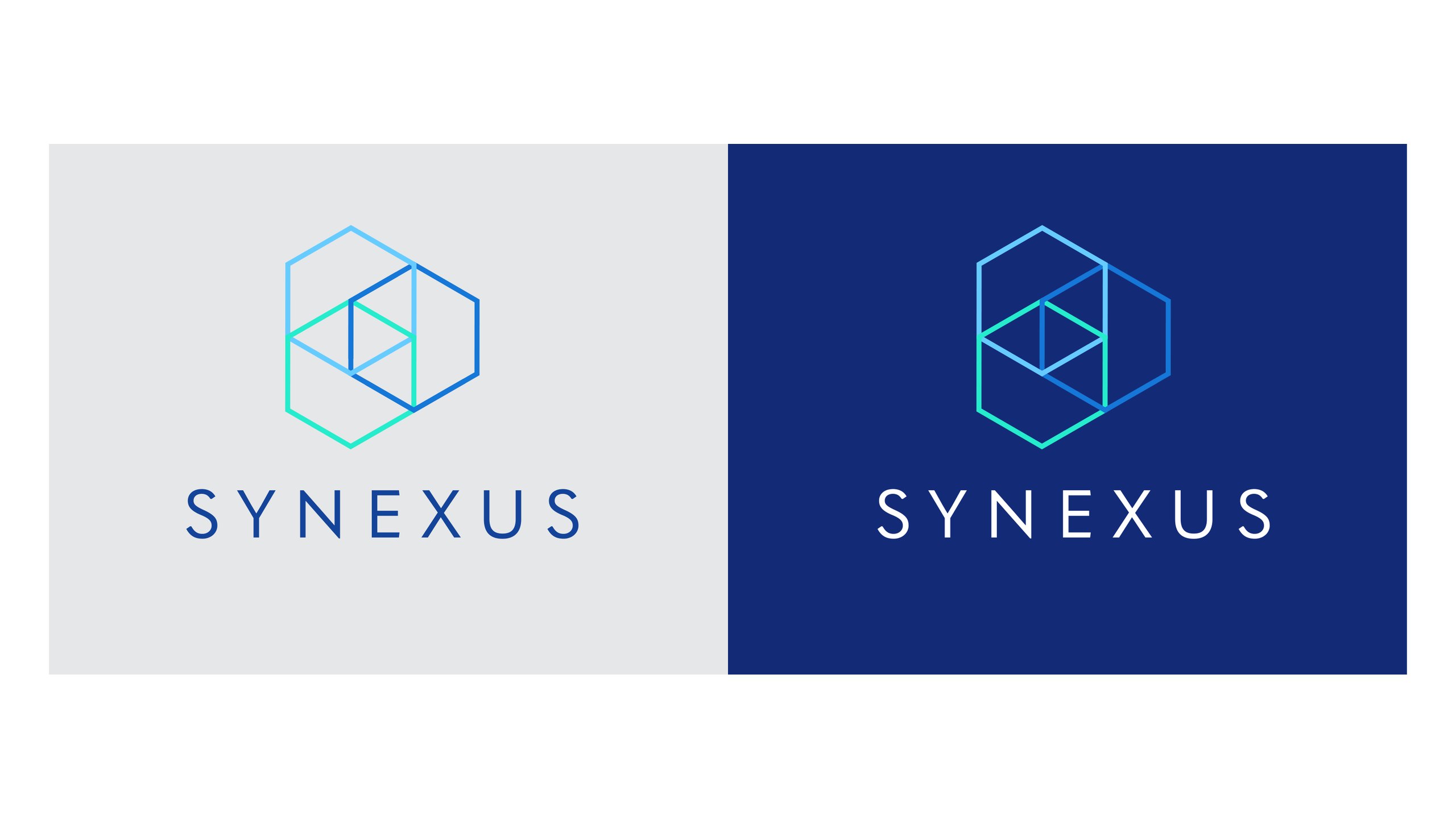
We explored several logo routes before settling on a mark built from overlapping hexagons that read as a cube. The idea, as the brand guidelines put it, is a pattern that represents the different facets of the company and the overlap between its services, stacked to suggest sturdiness and reliability. It gave a business with many offers one simple shape to rally around.
The hexagon became the backbone of the whole identity: a palette of deep navy, blues and turquoise, Quasimoda as the typeface, and a family of service icons for Solutions, Education, Eco, Connect, Community and Tech, each set inside its own hexagon. Because Synexus is about technology improving people’s lives, the guidelines steer away from pictures of technology on its own and towards people using it, framed by the hexagon. We pulled it all together in a set of brand guidelines covering the logo, colour, type, imagery and graphic assets.
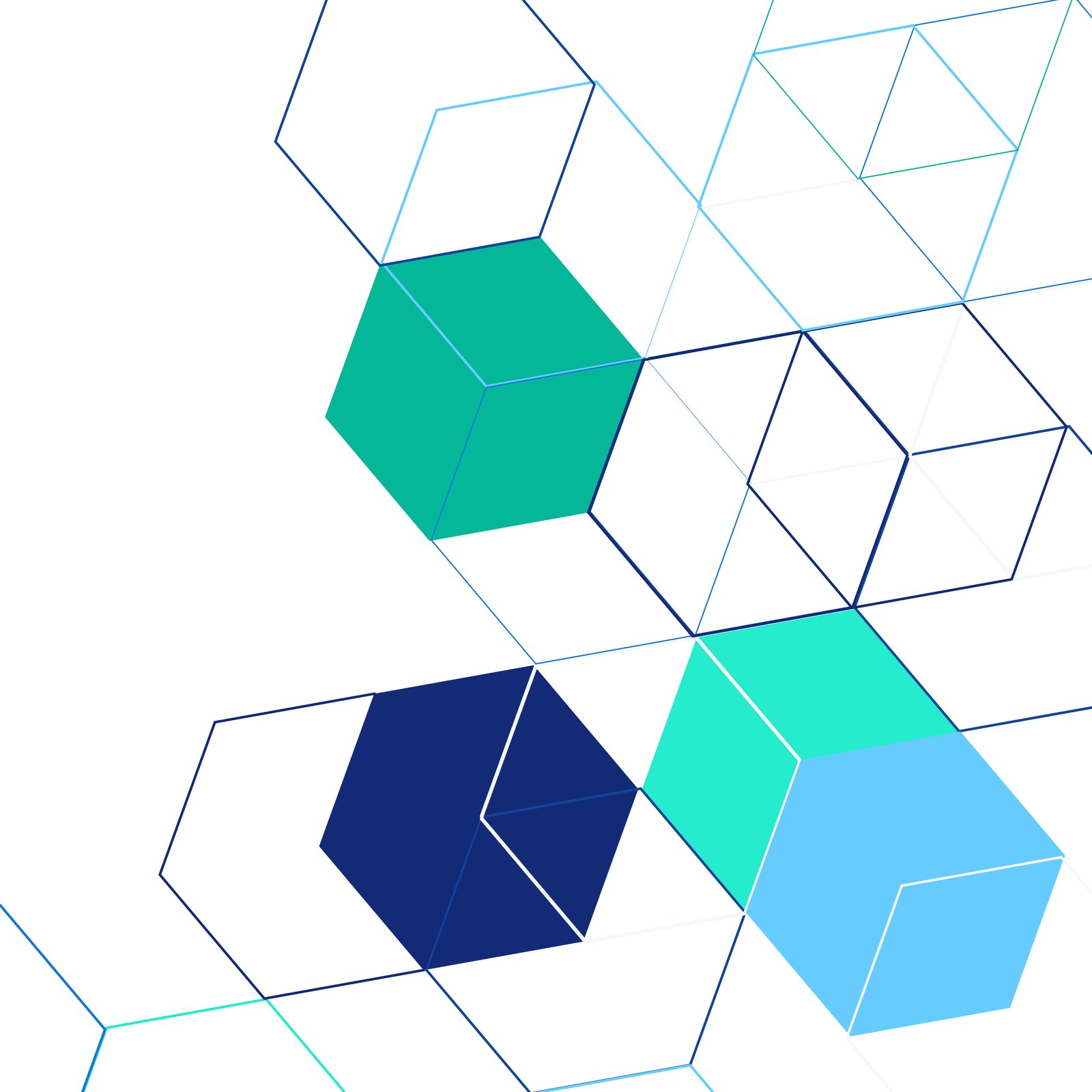
We created the look of the Synexus website around the new identity. Each service has its own header, a line icon in a hexagon on a block of brand colour, and the main pages pair photography of people at work and at home with large hexagon shapes. We also reworked the website copy so each service explains what it is and why it matters, in plain terms, for audiences as different as schools, emergency services and local government.
The identity then carried through to letterheads, business cards and social profiles, so Synexus looked like one business whether a buyer met it on screen, on paper or face to face.



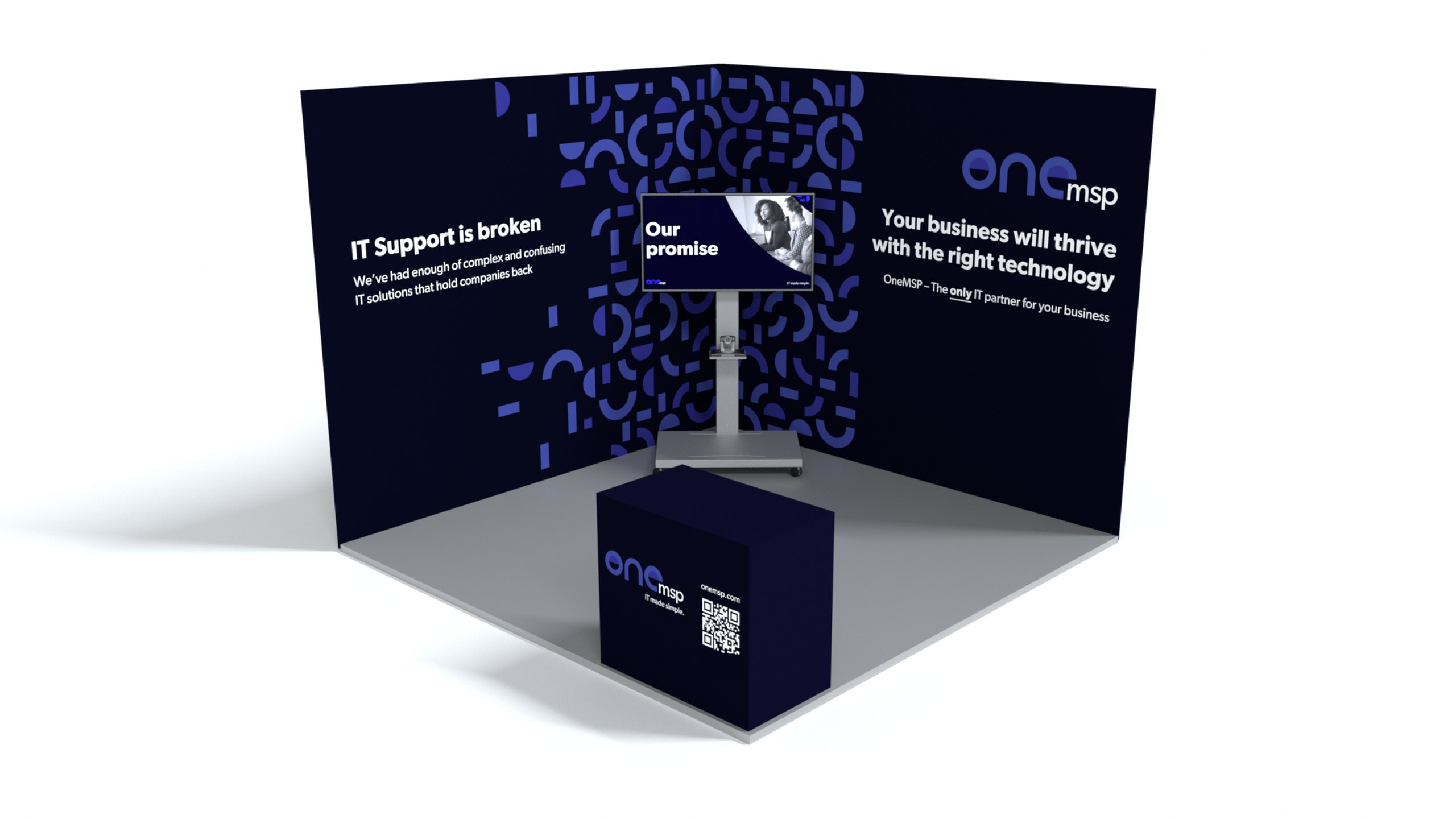
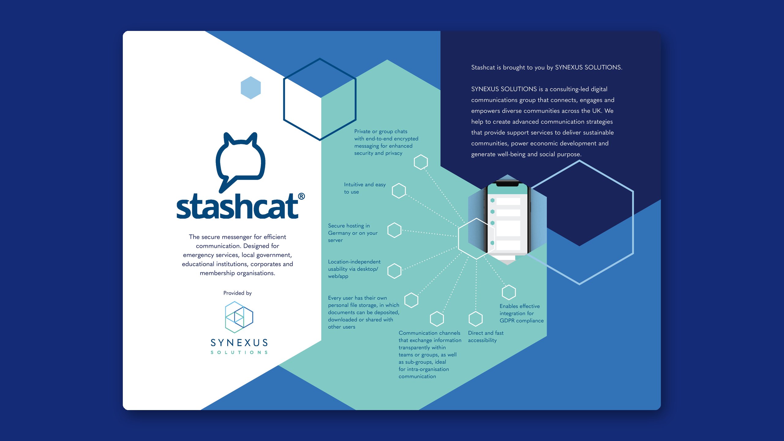
One of the products Synexus brought to UK public bodies was Stashcat, an end-to-end encrypted messenger designed for the emergency services and other high-security organisations, as easy to use as WhatsApp. We designed its sales materials, including A5 flyers for different audiences, a two-page fact sheet with a matching social graphic, and an exhibition banner stand for the Blue Light Innovation Summit in London in December 2018.
Around the summit we planned and wrote the social posts, counting down to the event and inviting delegates to the Synexus stand. The event brought 14 qualified leads, and online engagement rose by 19.4%, compared with a fall of 1.6% the year before. In the months before, we ran LinkedIn outreach on Synexus’s behalf to delegates from the previous year’s summit, growing the network from 397 connections in June 2018 to 1,031 in October.
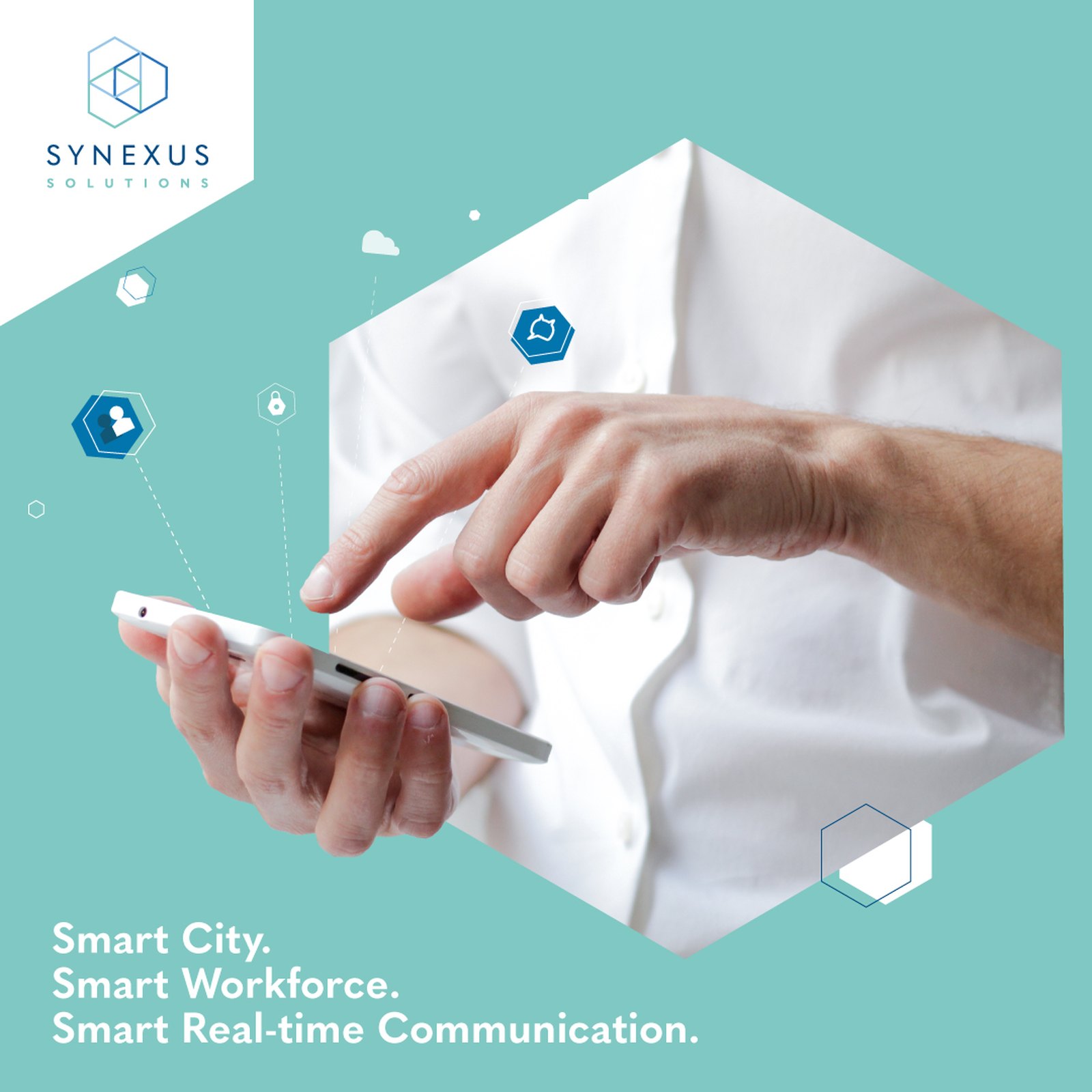
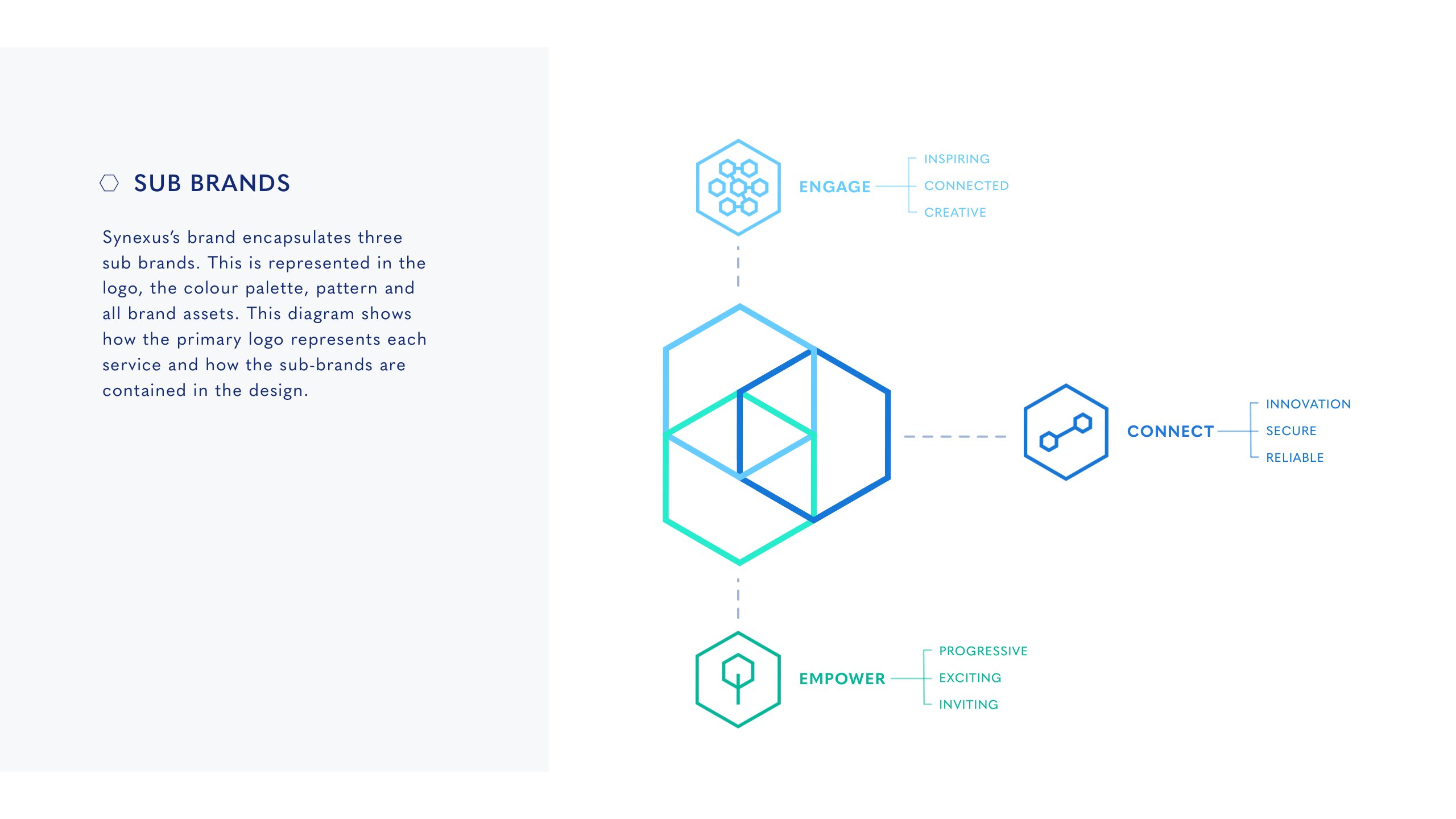
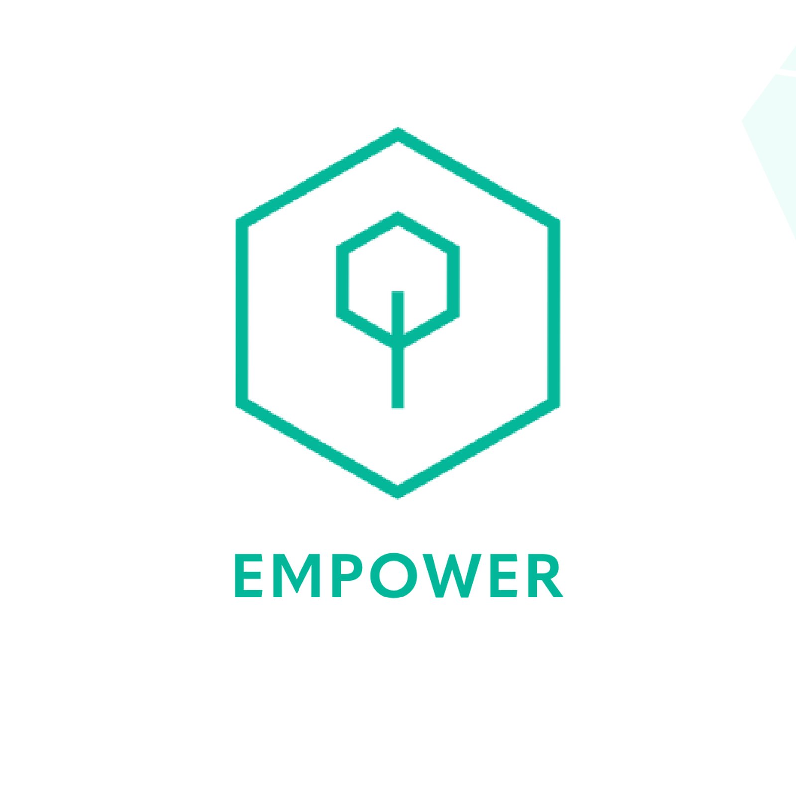
By 2020 Synexus had focused on three services: Energy, which helps public sector bodies win interest-free funding for energy saving projects, Communications, built around Stashcat, and cloud-based digital signage. In September 2020 we refreshed the brand guidelines to match, turning the three services into sub-brands within the hexagon logo. Empower uses fresh greens for energy, Connect uses deep blue for secure communications, with hexagons that can layer into a shield, and Engage uses light blue hexagons that echo the pixels of a digital screen.
We redesigned the website around the same three services, with copy that led with what each one does for the buyer. The energy copy led with “Go green for free” and explained how schemes such as Salix let schools pay for solar panels and LED lighting out of the savings they make, with Synexus managing the whole process and school case studies to show it worked.
Outfly, a London brand, marketing and product agency, created the Synexus Solutions identity in 2017, then designed the look of its website, Stashcat sales materials and event graphics, and refreshed its brand guidelines in 2020.
When Outfly worked with it, Synexus Solutions was a consulting-led digital technology group serving the UK public sector. Its services included funding for energy saving projects, secure communications through the Stashcat encrypted messenger, and cloud-based digital signage.
The logo is a cube of overlapping hexagons. The brand guidelines explain that the pattern represents the different facets of the company and the overlap between its services. In 2020 each main service became a sub-brand within the mark: Empower for energy, Connect for secure communications and Engage for digital signage.
Outfly designed the exhibition banner stand and Stashcat sales materials and wrote the social posts before and during the December 2018 summit in London. The event brought 14 qualified leads, and online engagement rose by 19.4%.