Christ Church Spitalfields has been home to a worshipping community since 1729, in one of the most creative and multicultural parts of London. The church that gathers there is young: students, families, professionals and people walking into a church for the first time.
It needed an identity that respected the building’s history but spoke to the East London around it. It also had to hold together a busy life of ministries, from kids and students to worship, midweek groups and courses, without every team inventing its own look.
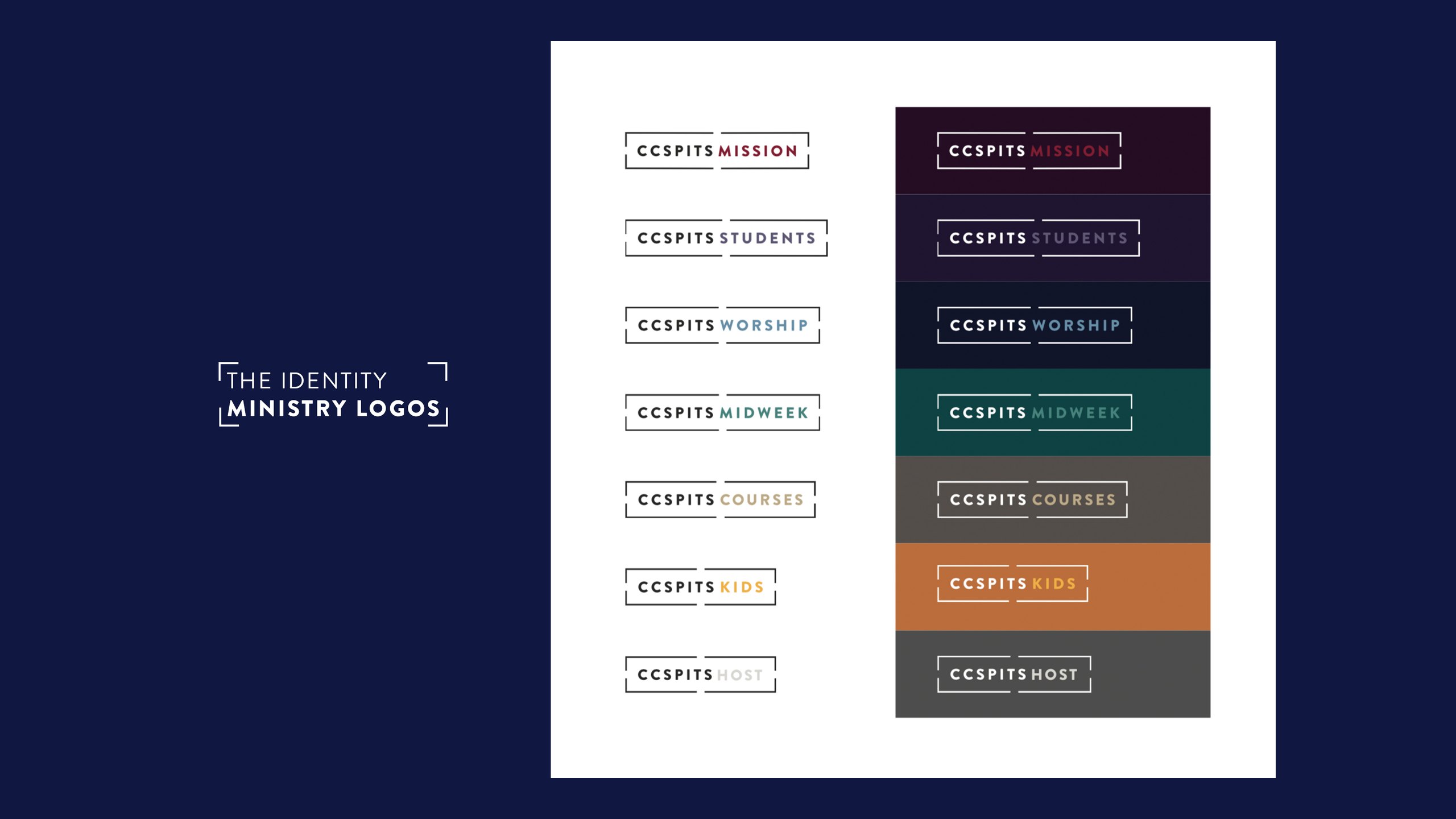
We built the identity as a system rather than a single logo. A bracketed wordmark, CCSPITS, sits alongside a full Christ Church Spitalfields version, and the same frame carries a logo for each ministry, starting with Mission, Students, Worship, Midweek, Courses, Kids and Host. Each ministry has its own colour set, drawn from one idea in the guidelines: our church is made up of many parts.
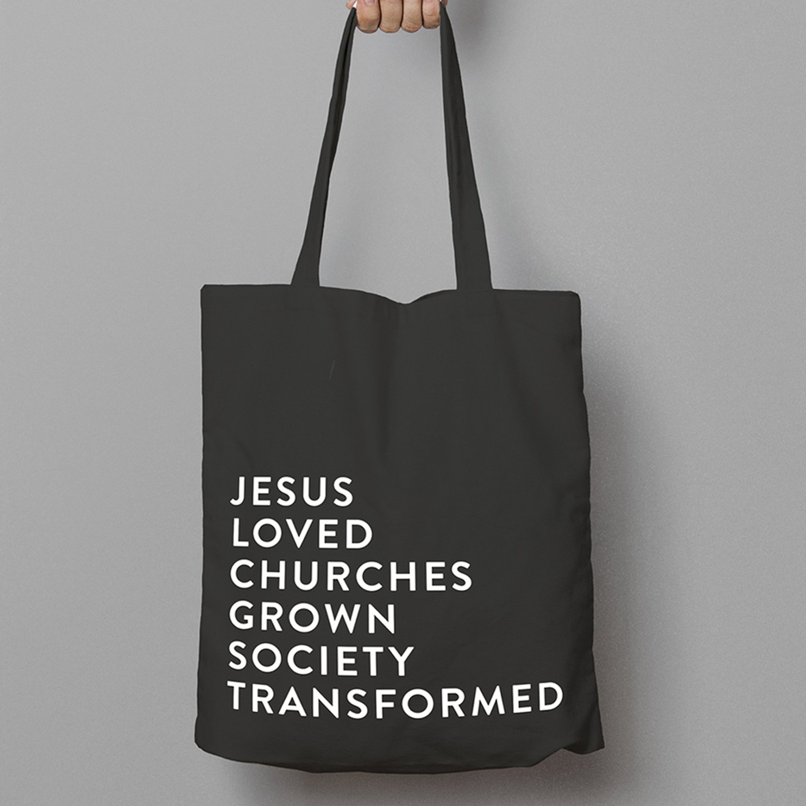
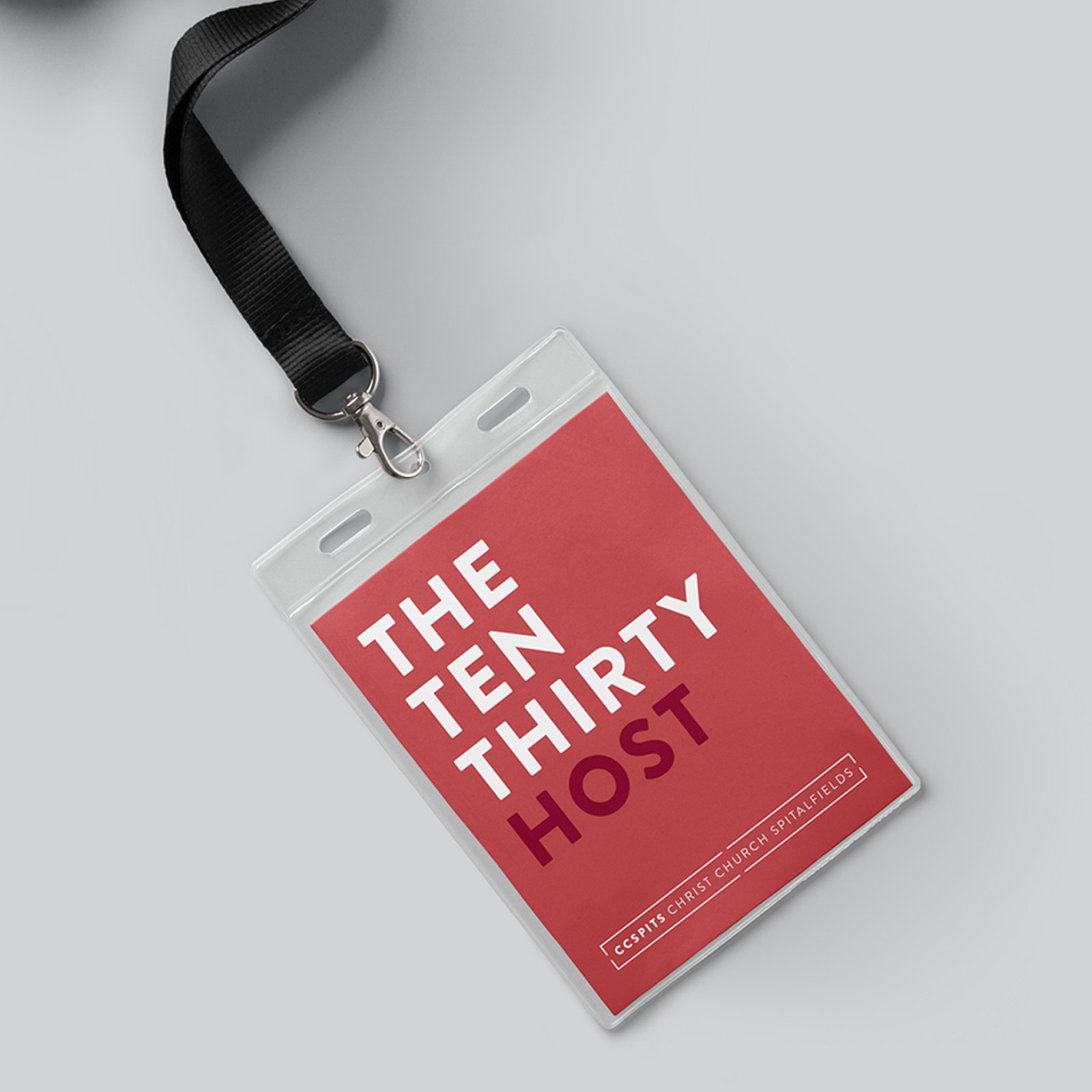
Brandon Grotesque in widely spaced capitals sets the headlines and Sofia Pro carries the reading text. Our guidelines made the system easy for staff and volunteers to use, with rules for photography, a simple grid, social media dos and don’ts, and print examples such as lanyards for the hosts at each service. The church’s vision, Jesus loved, churches grown, society transformed, became a line the brand could wear.
With the system in place, we designed the work that fills a church calendar, from Alpha invitations and Christmas to service slides, signage and print. Two briefs from 2020 show how far it could flex. Make a Difference asked the congregation to join a volunteer team, with a particular eye on people aged 18 to 30 and young people aged 11 to 18. We gave each of the four teams, Worship, Kids, Love Your Neighbour and Creative, its own colour, a black and white cutout and building block shapes, all under one line: Make a difference. Join a Team.
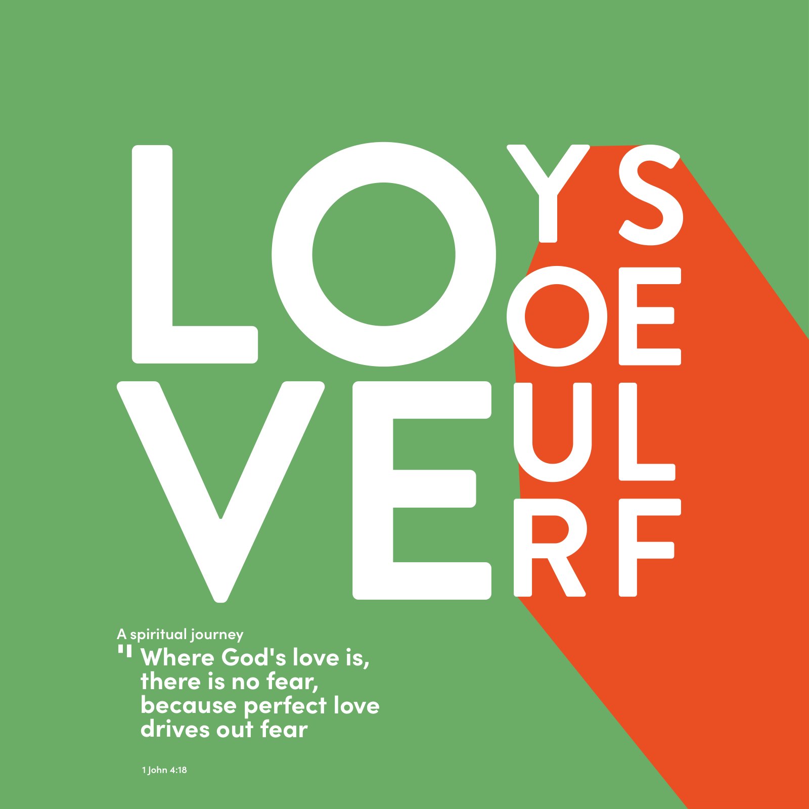
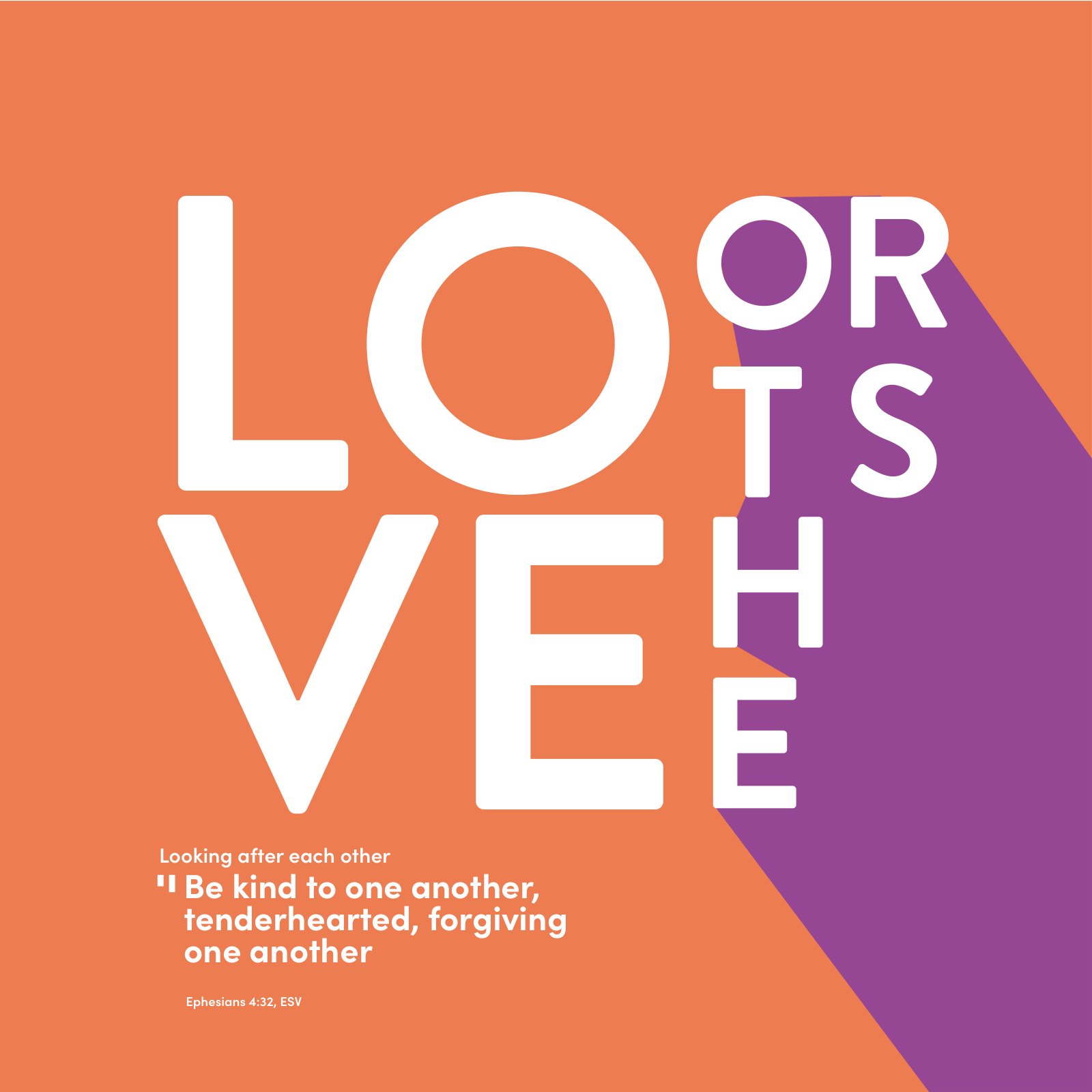
For the Living Room, a space in the building for first-time visitors and cultural events, we designed square banners for three zones, Love yourself, Love others and Love the world, each pairing a stacked LOVE with a line of scripture. For the online Alpha course that autumn, our banners played on the questions of 2020, from wearing glasses with a mask to Eat Out to Help Out, before inviting people to ask their big questions about life online. We also designed the church’s 2019 finance report.


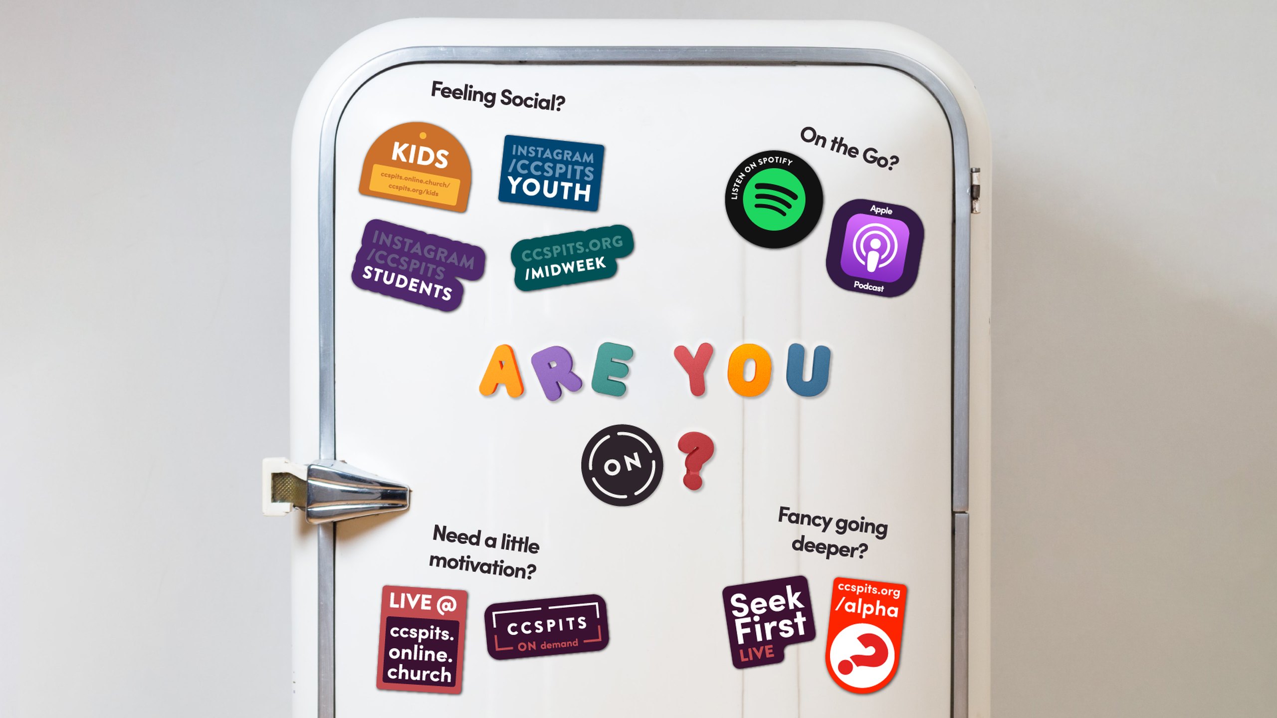
When the building closed in 2020, the brand had to work on screens. We created ON, a sub-brand for the church online, with a circular ON mark that sits beside the CCSPITS frame for services, worship, kids, youth, students and midweek groups, plus lower thirds for the live streams. A fridge covered in stickers showed people where to find everything, from live and on demand services to podcasts and online Alpha, and sermon series such as Reboot carried the same marks.
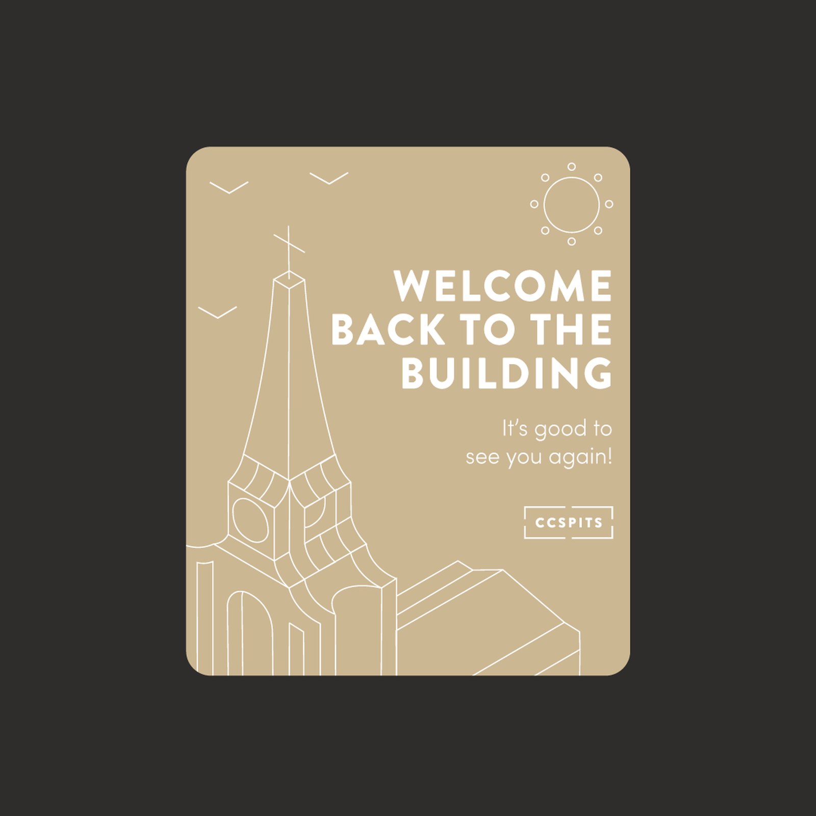
When the doors reopened, Back to the Building explained the new rules in the same warm voice: bring your own refreshments, save your seat, expect a temperature check, follow the yellow floor stickers and scan your ticket on arrival. Outside, Church is ON banners told passers-by they could join on Sundays at 11, in the building or online.

Outfly, a London brand, marketing and product agency. We created the CCSPITS identity and guidelines, including a logo for each ministry, then designed the church’s campaigns, signage and its ON sub-brand for church online.
A 2020 campaign inviting the congregation to volunteer, especially people aged 18 to 30 and young people aged 11 to 18. We designed it for four teams, Worship, Kids, Love Your Neighbour and Creative, under one line: Make a difference. Join a Team.
Build it as a system. For Christ Church Spitalfields, one bracketed wordmark frames every ministry name, from Kids and Students to Worship and Midweek, and each ministry has its own colour set, so every piece looks different but clearly belongs to the same church.
We created ON, a sub-brand for the church online, with its own mark, lower thirds for live streams and stickers pointing people to services, podcasts and online Alpha. When the building reopened, Back to the Building signage explained the new rules in the same warm voice.