Capslock set out to retrain adults as cyber security professionals in 16 weeks or more, taught live and online. Students could pay nothing upfront and instead repay a share of their income through an Income Share Agreement, only once they earn more than £27,000. Its first cohort was due to start in January 2021, and before then it had to win over students, employers and investors.
The company already had a logo, colours and fonts, but felt its brand lacked texture, professionalism and polish. Capslock described the feeling it wanted in its own words: professional but modern, accessible but selective, tech-focused but not scarily so. The logo was staying as it was, so everything we added had to work around it.

We started with a Brandscape workshop to agree who Capslock was talking to. The first audience was Fiona, a composite career changer: an office manager on around £22,000 who feels undervalued, worries about being left behind and finds cyber security intimidating. Acronyms, jargon and anything that looks like a gamified war room put her off. The second was Mark, the head of security at a large company, who wants work-ready people he can trust and sees straight through hype. Behind them sat the HR partners who shape his hiring, and the investors Capslock needed first.
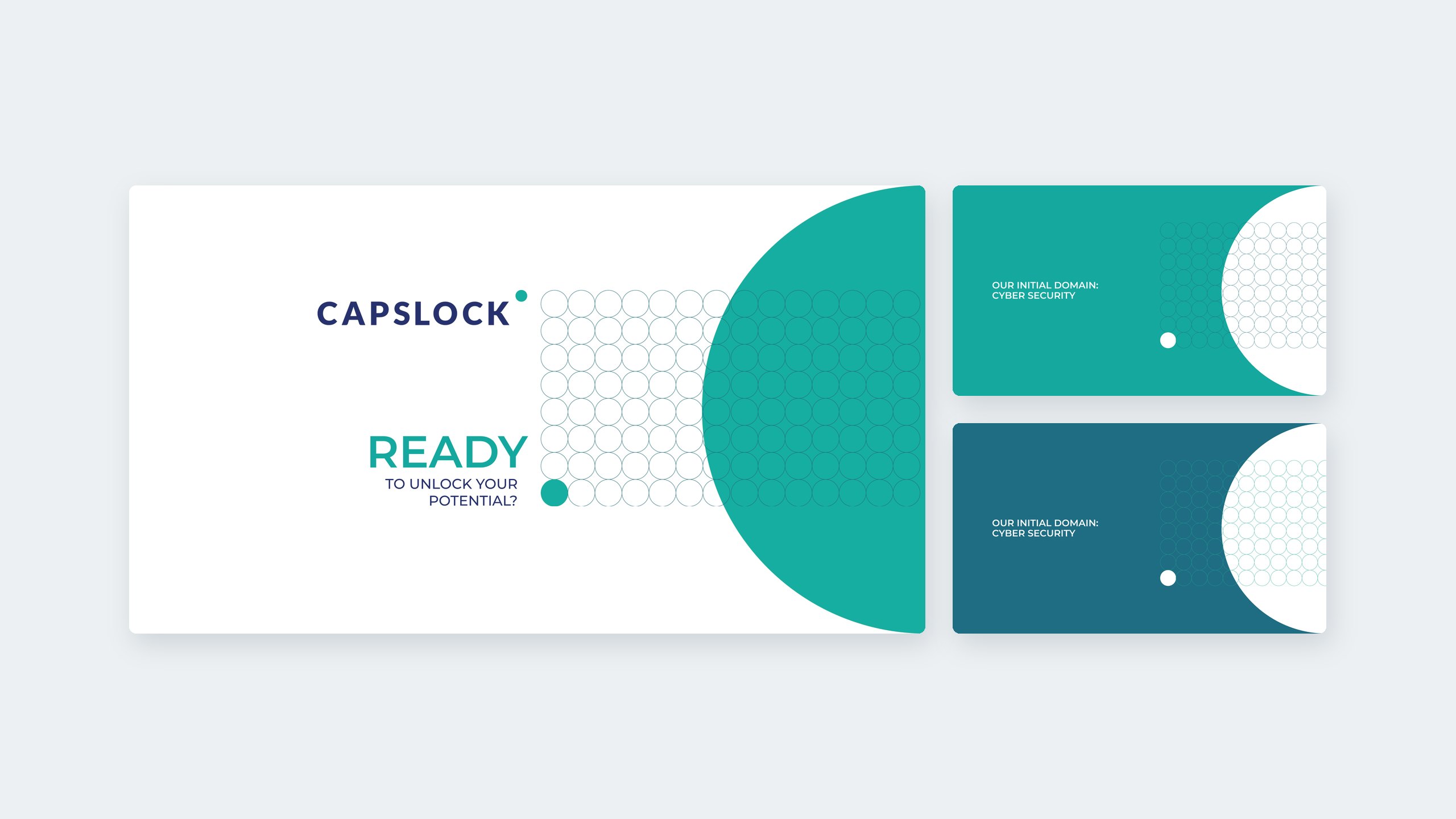
The workshop also gave each colour a job. Yellow carries optimism and energy for Fiona, blue the calm dependability Mark looks for, orange a touch of adventure and turquoise a sense of control. With the logo fixed, we began by exploring background assets that could carry those ideas. A grid of outlined circles and a large half circle, taking their cue from the dot in the logo, became a pattern that works across the whole palette.


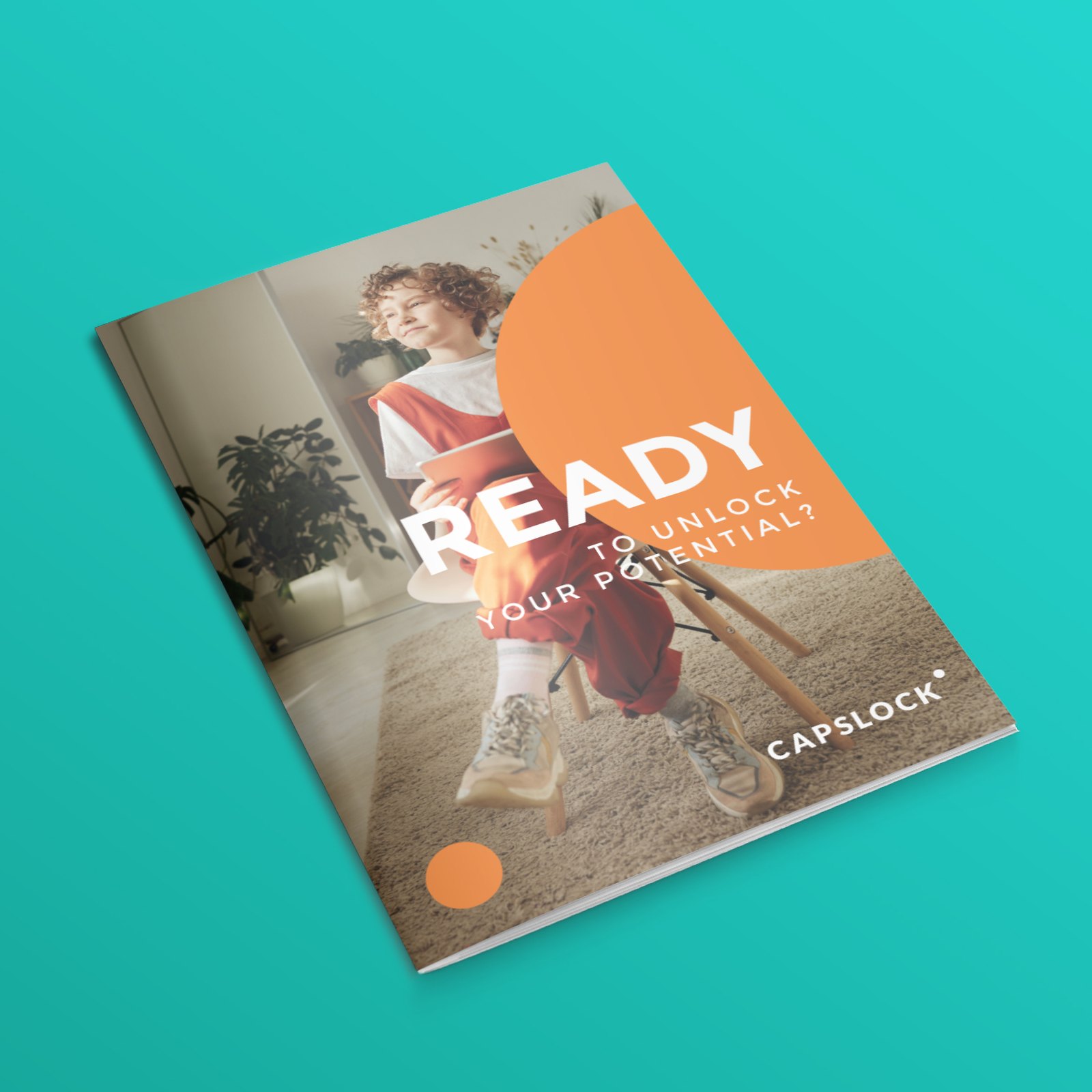
We rolled the pattern into the pieces Capslock needed straight away: a brochure title page, a letterhead and a set of Zoom backgrounds in deep blue, yellow, teal and orange. The exploration also tested campaign lines that speak to Fiona. They build on Capslock’s existing line, “Unlock your potential”, and lead with a question: “Ready to unlock your potential?” A second brochure cover answers her fear of the risk with “We invest in you”.
The brochure covers pair warm portrait photography with a single bold colour shape, so the first thing a nervous career changer sees is a person like them rather than circuitry or padlocks.

The last part of the brief was the deck. We redesigned key slides from Capslock’s investor presentation as templates, then carried the style across the whole story. The result is a 27-slide deck built on the same circles and half circles, with a set of teal line icons explaining how the model works and a curriculum wheel that maps the programme across technology fundamentals, risk, process, culture and impact skills.
We handed the templates over in September 2020, ready for Capslock’s £250k pre-seed round and its first cohort in January 2021. Capslock’s pre-seed funding later reached £1.04 million, raised in two tranches during 2021, and it has since supported more than 1,300 learners.
Outfly, a London brand, marketing and product agency, ran a Brandscape workshop with Capslock and then built a circle pattern and visual toolkit around its existing logo. Outfly designed brochure covers, a letterhead and Zoom backgrounds, and restyled Capslock’s investor deck as a set of templates.
A cyber security retraining programme of 16 weeks or more, taught live online by instructors. Students could pay nothing upfront and instead repay 15% of their income over 36 instalments through an Income Share Agreement, only once they earn more than £27,000.
Leave the logo alone and build a system around it. For Capslock, Outfly took its cue from the dot in the logo to create a grid of outlined circles and a large half circle, then used them on brochure covers, Zoom backgrounds and the investor deck so every piece reads as part of one brand.
Mainly career changers like Fiona, the persona from the Brandscape workshop: people who feel stuck, find cyber security intimidating and can’t afford to pay upfront. It also had to reassure the heads of security who hire, and the investors Capslock needed first.