Brand, Digital, Product Design, Communications, 3D & Motion
Rebrand and app redesign for one of the UK’s leading cybersecurity scaleups.
When CyberSmart started working with Outfly, they were an early stage startup with a clear mission: to make cybersecurity accessible and affordable for small businesses.
What wasn’t so clear was their brand. In a nascent yet heavily crowded market, they were competing against a glut of cybersecurity startups while trying to penetrate an audience unaware of the need for their solution. Their visual identity was complicating matters further, built with tired industry tropes (like a padlock logo) that made it difficult for CyberSmart to stand out and communicate their genuinely unique value proposition.
Outfly’s strategists developed a brief to infuse the brand with a distinctive personality based on the core value CyberSmart offers its SME customers: clarity.
The visual identity had to bring together the overlapping layers of the business, from accessible and simple to deep and technically credible. Stepping away from the visualisation of the end result (the padlock), our design team instead considered Cybersmart’s services themselves.
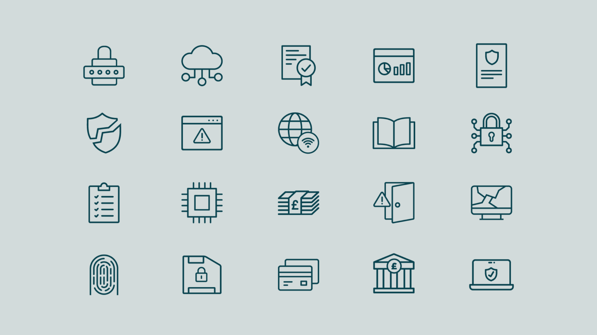
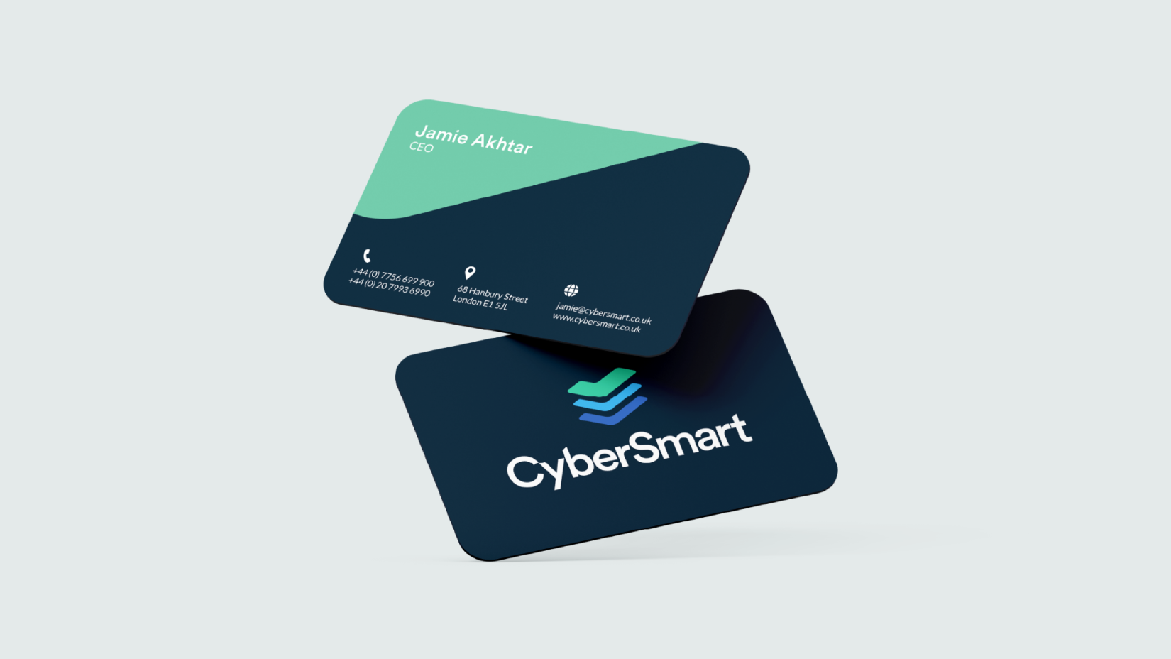
Through this approach we landed on a new logo; three ticks in complementary shades of blue and green. As well as being universal symbols of assurance and positivity, the form of the ticks was inspired by stacked servers and Cybersmart’s three core services, while the colours were chosen to instil a feeling of professionalism, trustworthiness and accessibility.
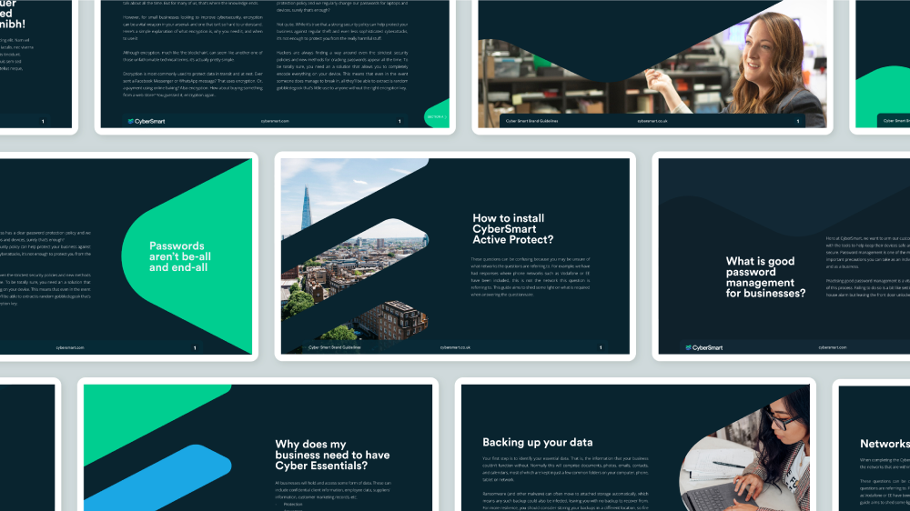
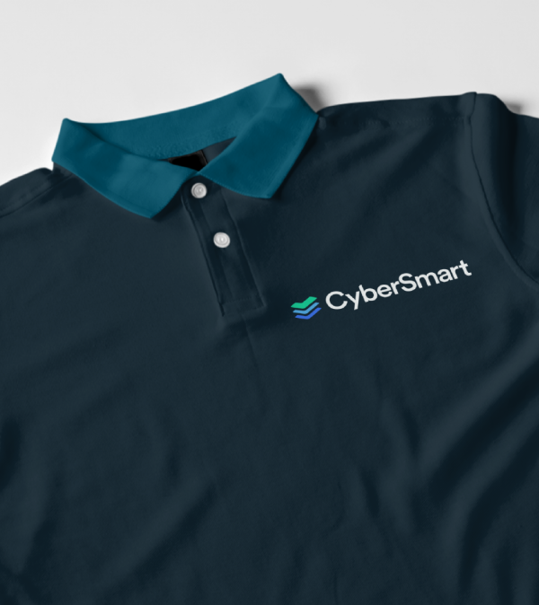
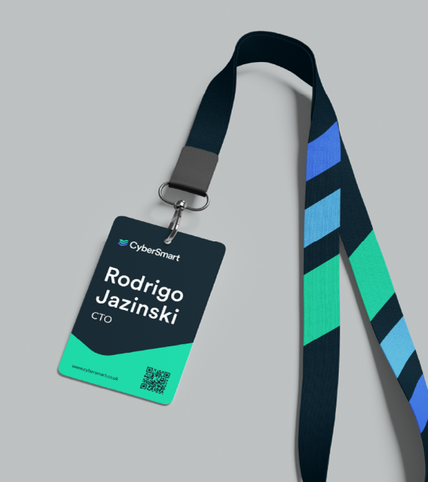
The designers used this as an anchor for the rest of the brand, from type, imagery and messaging to 4K rendered 3D artwork that gave a tactile, personal touch to the identity.
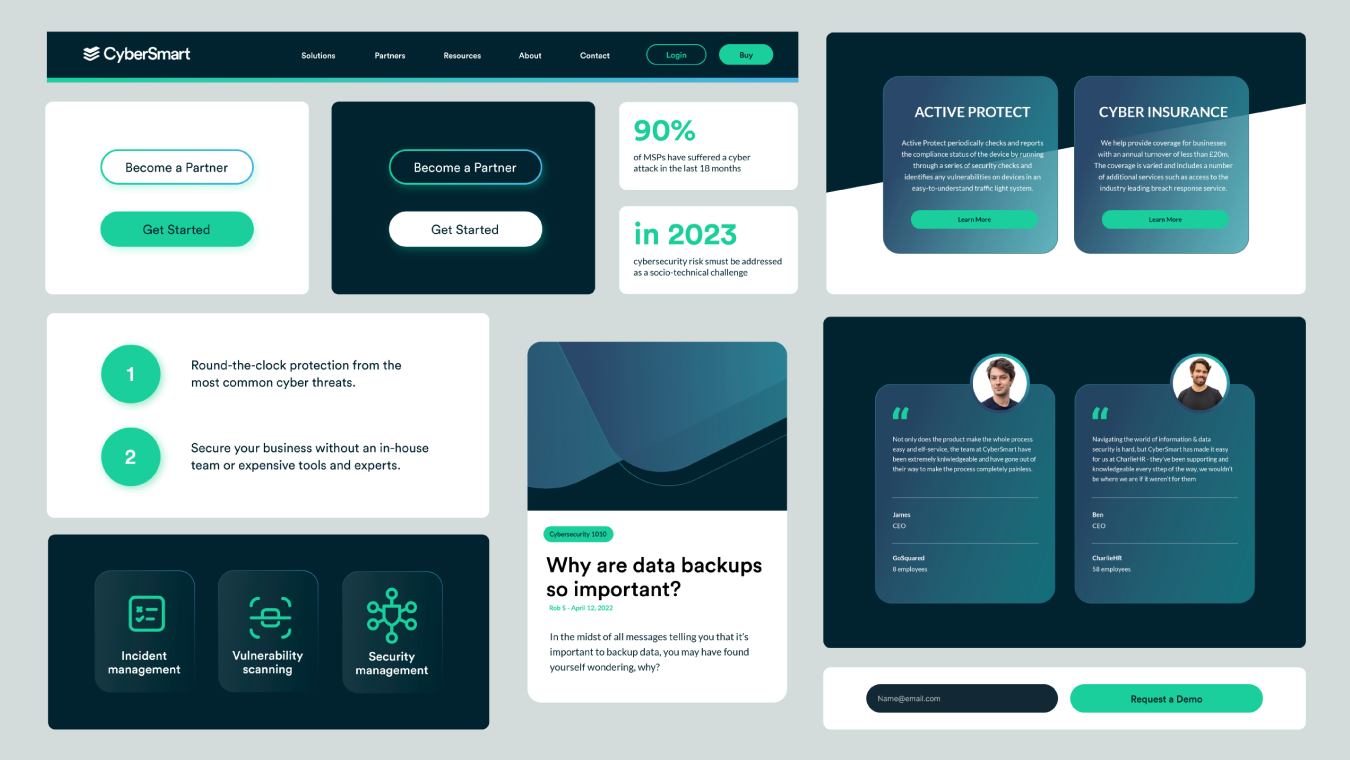
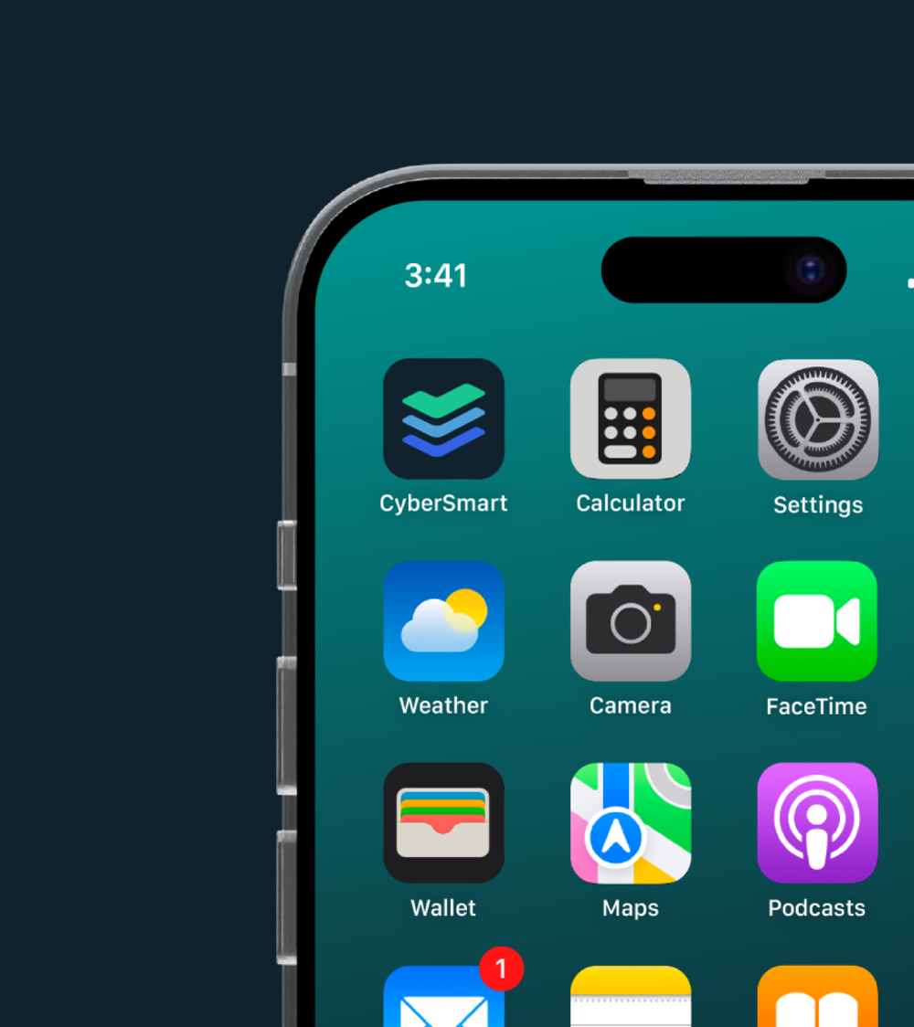
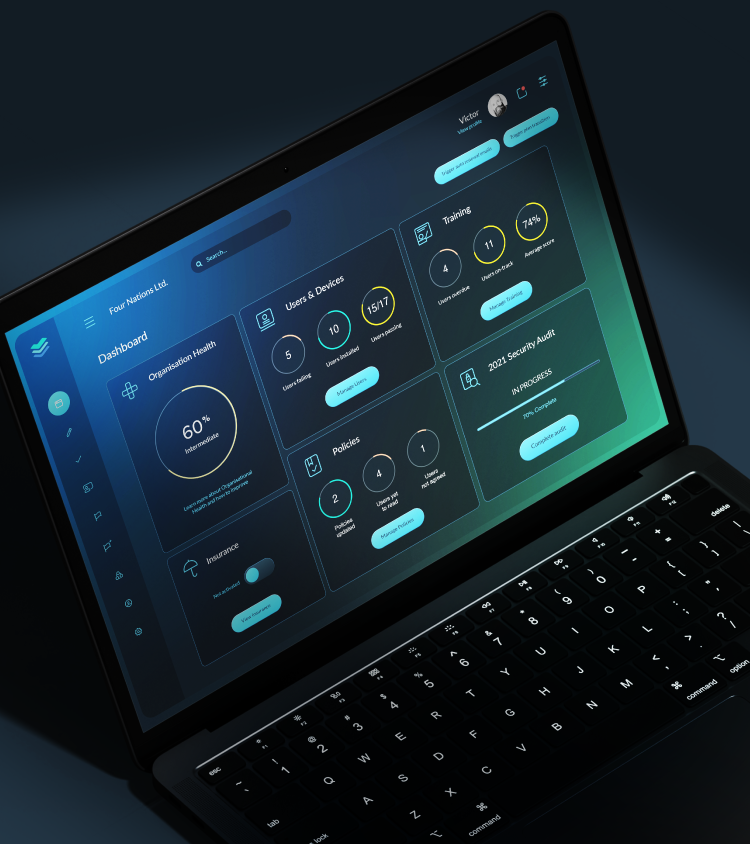
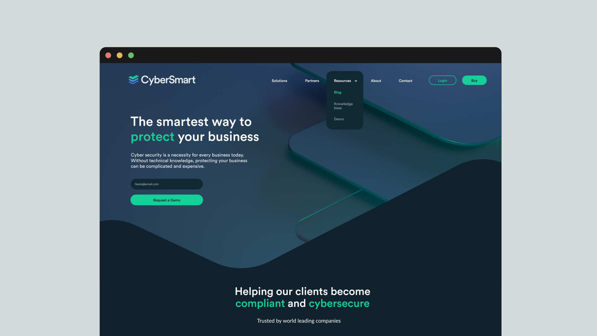
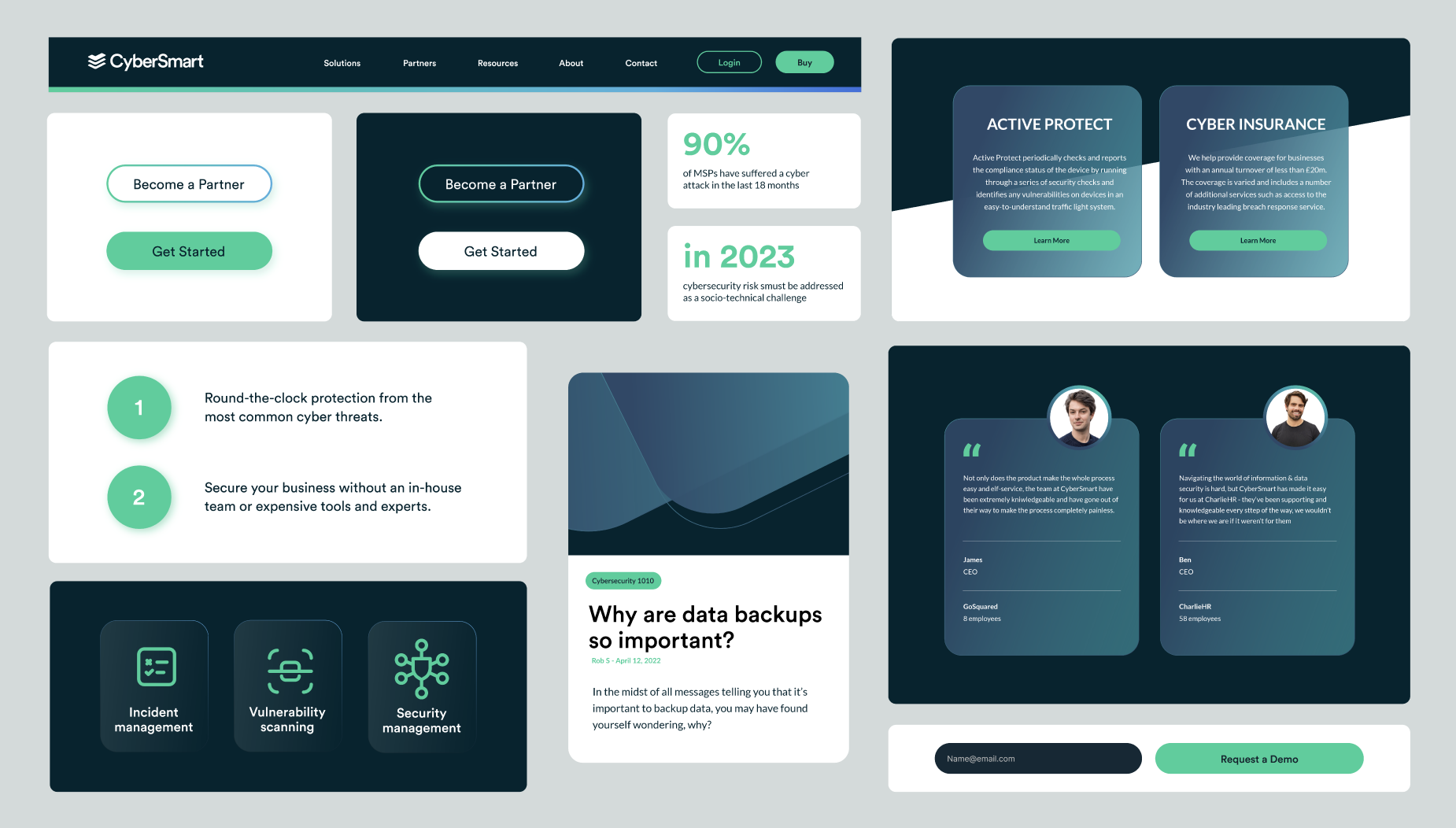
Everything came together in the brand’s updated product UX/UI, website and animated explainer video. The outcome was a sleek cybersecurity offering perfectly positioned towards SMEs.
Since the rebrand, CyberSmart has gone from strength to strength, growing revenue 5x per year and raising £10 million in Series A investment. The new brand is also supporting the execution of the scale-up’s two pronged go-to-market strategy; CyberSmart is trusted by over 4,000 small businesses and has partnered with major players including Starling Bank, Aviva and Vodafone.
CyberSmart
Brand, Digital, Product Design, Communications, 3D & Motion
Rebrand and app redesign for one of the UK’s leading cybersecurity scaleups.

“CyberSmart makes cybersecurity accessible and affordable for small businesses.”


“They were trying to penetrate an audience unaware of the need for their solution.”

“The visual identity had to bring together the overlapping layers of the business, from accessible and simple to deep and technically credible.”

“The form of the logo was inspired by stacked servers and Cybersmart’s three core services.”
“Since the rebrand, CyberSmart has gone from strength to strength, growing revenue 5x per year and raising £10 million in Series A investment.”


Get in contact with us
CyberSmart
Brand, Digital, Product Design, Communications, 3D & Motion
Rebrand and app redesign for one of the UK’s leading cybersecurity scaleups.
When CyberSmart started working with Outfly, they were an early stage startup with a clear mission: to make cybersecurity accessible and affordable for small businesses.
What wasn’t so clear was their brand. In a nascent yet heavily crowded market, they were competing against a glut of cybersecurity startups while trying to penetrate an audience unaware of the need for their solution. Their visual identity was complicating matters further, built with tired industry tropes (like a padlock logo) that made it difficult for CyberSmart to stand out and communicate their genuinely unique value proposition.
Outfly’s strategists developed a brief to infuse the brand with a distinctive personality based on the core value CyberSmart offers its SME customers: clarity.
The visual identity had to bring together the overlapping layers of the business, from accessible and simple to deep and technically credible. Stepping away from the visualisation of the end result (the padlock), our design team instead considered Cybersmart’s services themselves.
Through this approach we landed on a new logo; three ticks in complementary shades of blue and green. As well as being universal symbols of assurance and positivity, the form of the ticks was inspired by stacked servers and Cybersmart’s three core services, while the colours were chosen to instil a feeling of professionalism, trustworthiness and accessibility.
The designers used this as an anchor for the rest of the brand, from type, imagery and messaging to 4K rendered 3D artwork that gave a tactile, personal touch to the identity.
Everything came together in the brand’s updated product UX/UI, website and animated explainer video. The outcome was a sleek cybersecurity offering perfectly positioned towards SMEs.
Since the rebrand, CyberSmart has gone from strength to strength, growing revenue 5x per year and raising £10 million in Series A investment. The new brand is also supporting the execution of the scale-up’s two pronged go-to-market strategy; CyberSmart is trusted by over 4,000 small businesses and has partnered with major players including Starling Bank, Aviva and Vodafone.