Playstation, Font Porn and Not Staying Silent
Every week, our team gathers for what we used to call ‘Show and Tell’ — but then we got all cool and called it our ‘Outlook’. The team sends in badass, inspirational, funny designs and creations that they’ve seen throughout the week, and we spend the morning discussing how we can learn from them and how they might apply to our current projects. We’ve seen just about every cool designer-y, funny, inspir-y thing out there, and we decided it’s about time to let you guys in on the fun.
Below are our top 5 entries for this week, and one we thought was awful enough to share on top. First up, the fail…
Playstation reveals a product that doesn’t exist
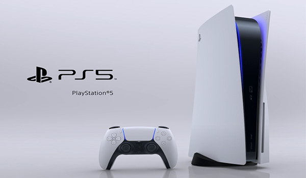
Those of us who’ve surrendered our eyes, thumbs and sanity to Sony since Playstation One, accompanied by a new generation of gamers, all longingly awaited the reveal of the PS5, which finally dropped this month. Well…
“Expectation is the root of all heartache” –
William Shakespeare
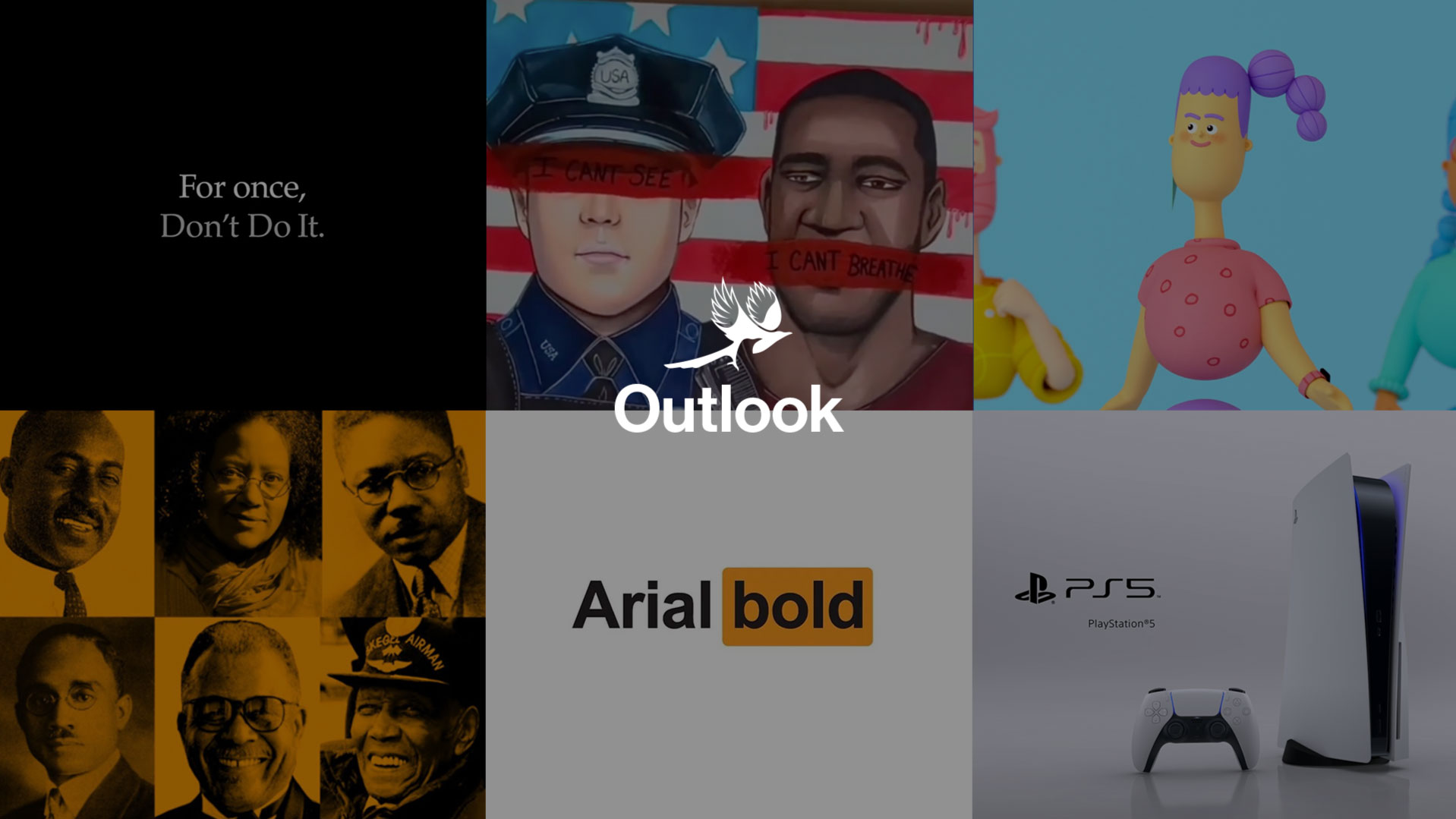
Design is art with purpose. It needs to be tied to a feature or goal. The event’s baffling reveal sequence was, unfortunately, a classic example of form over function. Not only did it go on forever, it had nothing to do with the product.
It was a beautiful abstract piece in its own right, don’t get us wrong, but it left us cold when the camera pulled back and we realised that the actual console looked nothing like what we’d just seen. Teaser videos are meant to tease, to build up to a reveal, not leave us disappointed. We all agreed. The striking creative in the reveal—the mass of black rubber balls with ominous blue light melding into Mondrian-esque tableaus—felt so much cooler than the final design itself.
Font porn
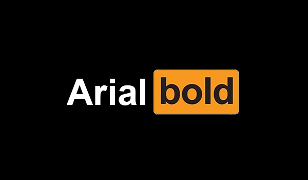
Our team came across this collection of designs, then found the gram they came from. The artist has replaced the text from famous logos with the name of the font used. I mean, so we’re design nerds right, but this has to be interesting to everyone, doesn’t it??
We loved it. Firstly (and most importantly) guessing the brand was fun. Secondly, by removing the name it brought to light the effectiveness and memorability of good brand design. It shone light on the key aspects of logo design: space, shape, colour, type. That’s all you need.
How many could you guess? Not to brag, but here at Helvetica Neue Agency, we got ‘em all :p
13 African American designers you should know about

This is an old piece we found when reflecting and researching after the events of the last few weeks. It uncovers the history of African American design, showcasing great pieces of work that have left an indelible mark within and beyond our craft. The artists on this list use their work to express problems in society, their history and of course, themselves.
The fight for rights, justice and equality sparked by Black Lives Matter today is the same fight fought by these artists to have their voices heard. So take time to have a look through their work, and give them their long-overdue applause and recognition.
It’s the ergonomy, stupid.
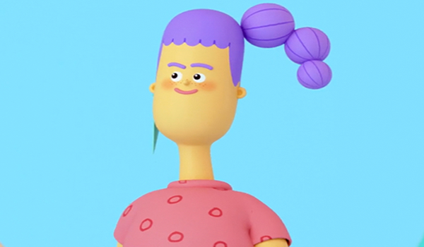
With more people than ever working from home, Logitech decided to update their ergonomics website in a fun, fresh and off-beat way.
Their designers got together (figuratively… *pandemic) and produced a series of animated loops, static images and props to go alongside their tips on working-from-home-wellness. We particularly like the style of the design and with the playfulness of the animation. Rather than simply focusing on the product, they communicate experiential work-from-home benefits that their products create.
*psst: if you’re a designer who is into ergonomics, you should definitely check out what the geniuses over at Massless are up to…
I can’t see, I can’t breathe
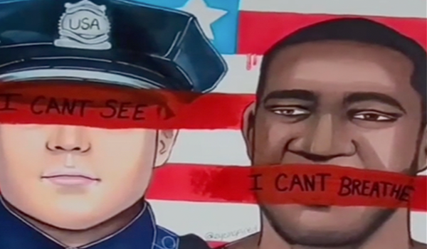
The last few weeks has been a soul searching time for all of us. Amid all the powerful art and information shared on social media, it’s hard to choose a piece that captured the situation, but we were particularly moved by this piece created by @eyeinspired.
Illustrating the murder of George Floyd in the US, it embodies the sentiment that the problem is not solely police officers who carry out extra-judicial killings against the black community, but also those who turn a blind eye to their colleagues and enable systemic racism to foster.
Simple, powerful and poetically accompanied by Childish Gambino’s ‘This is America”, this work is both furious and deeply saddening. It puts the spotlight on those who claim they “can’t see” — people who, in fact, are simply choosing not to.
Don’t Do It
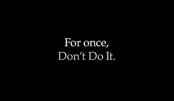
Just like their athletes, Nike always seems to take the lead. While many were still coming to terms with the horrifying murder of George Floyd and drafting public responses, Nike already knew where they stood and decided to join those refusing to stay silent about the systemic racism and injustice embedded in society.
Their powerful one minute video, went against their core brand ethos and said, “Don’t Do It” — referencing those turning a blind eye to what many like George Floyd have been experiencing.
In a move of solidarity, their greatest competitor Adidas retweeted and quoted the video, saying, “Together is how we move forward. Together is how we make a change.” This unprecedented level of unity continues to show that the movement is bigger than any one of us and that, when we stand together, we can all be part of the solution.
Get involved.
So, we hope you enjoyed our weekly round-up of cool design! Think you’ve seen something that would make this list? Send it in to hello@outfly.io, and stay tuned to see if it’s chosen next week.


