Fries, Football Kits and Funky Facemasks
Enter the retro swordsmith ⚔️
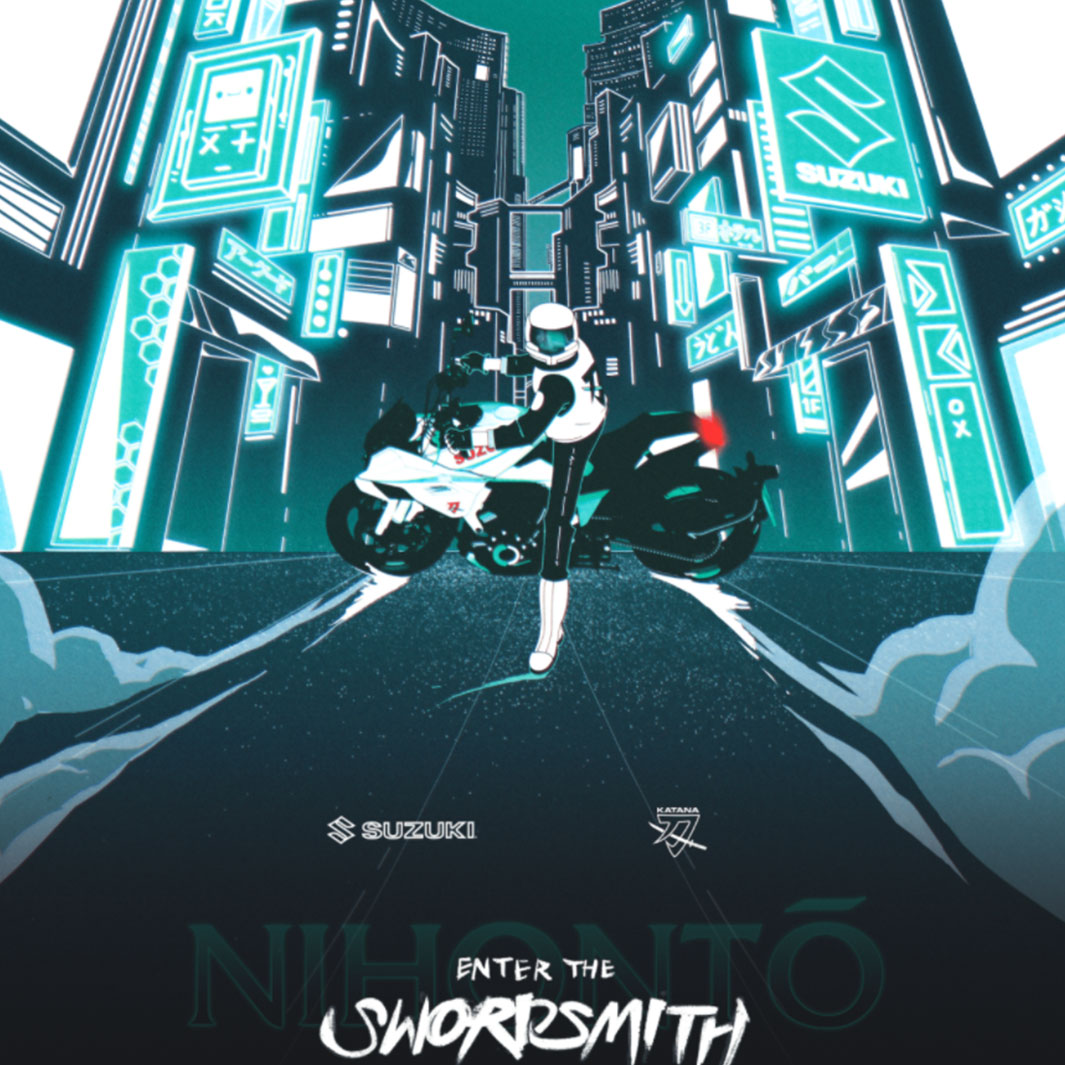
The Suzuki Katana is to motorcycle fanatics what Microsoft Paint is to designers. That’s right, an unquestionable legend. To celebrate the rebirth of this legendary motorcycle, Iron & Air Media partnered with Black Math to make a film that pays homage to the past at the same time as creating excitement for the future.
Dripping in Akira-style retrofuturism, Enter the Swordsmith evokes the nostalgia of every turn, rev and skid. From the details in the protagonist’s jacket to the frame-by-frame screech of wheel against pavement, the execution is on point. This is Tron-meets-Tokyo heaven and you won’t regret watching it.
A New Day for Nissan
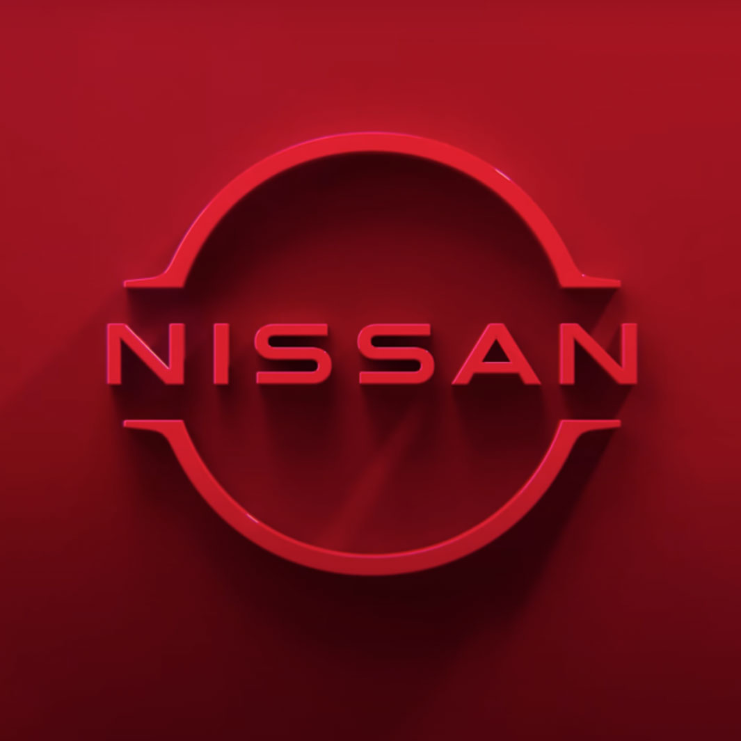
In a move that many will call five years too late, Nissan revealed its new logo, joining the long list of companies saying bye to skeuomorphic design and hello to a flat, minimalist look. The rebrand has mainly involved replacing the chrome badge with a thin, monochromatic version and the ‘Nissan’ font with a now straighter sans-serif affair. It’s not just the rebrand that gets a huge thumbs up. It’s the logo reveal.
At first glance, we weren’t the biggest fans. It just felt like a move in the shadows of the likes of BMW, using the minimalist design to look more modern but failing to communicate a truly new direction. Then, they brought it to life. A one-minute cinematic trailer, filled with beautiful textures and motion, showing the logo in different environments, each with its own subtle Japanese essence. It shows that this isn’t just a new logo for Nissan — it’s a new day.
Are you a fry guy?
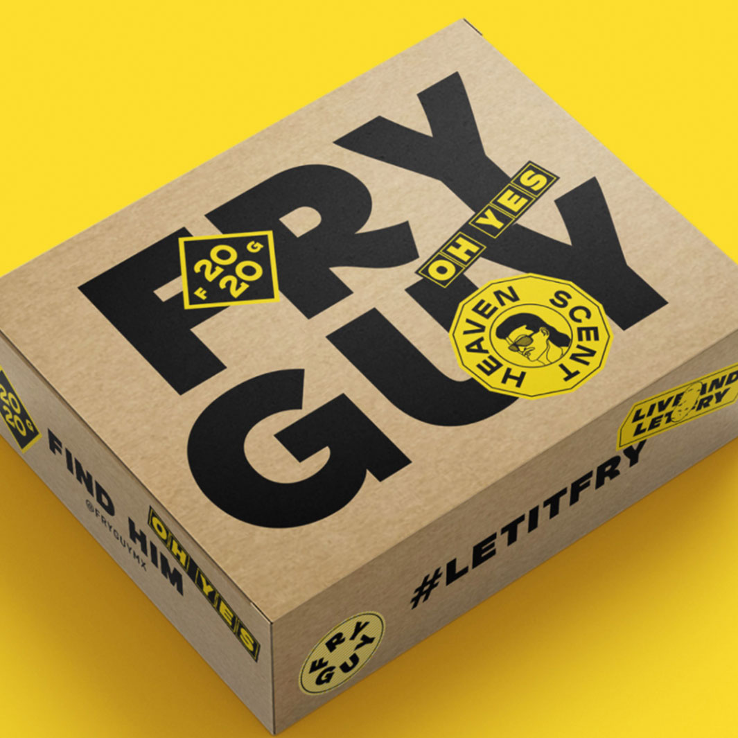
There are a few things that are universally loved; good branding, meaningful design and… fries. This month we came across all three; thanks to the guys at FryGuy, who realised that chips are too often overlooked and under-appreciated. The unheralded hero of thousands of meals, they rarely make it into the limelight and are always labelled as a side order. So, how do you turn an iconic side into an entire meal in its own right? Ah, of course, branding.
At the heart of the brand is a versatile fry pattern that could — and does — go everywhere; posters, stickers, packaging, website and especially social media. It goes with anything, just like fries do. They’ve also been smart and thought hard about how colour psychology could be tailored to their product; yellow evokes happiness and joy, but it also matches the shade of perfectly cooked fries. Tasty.
Maurten Brand… We think 🤨
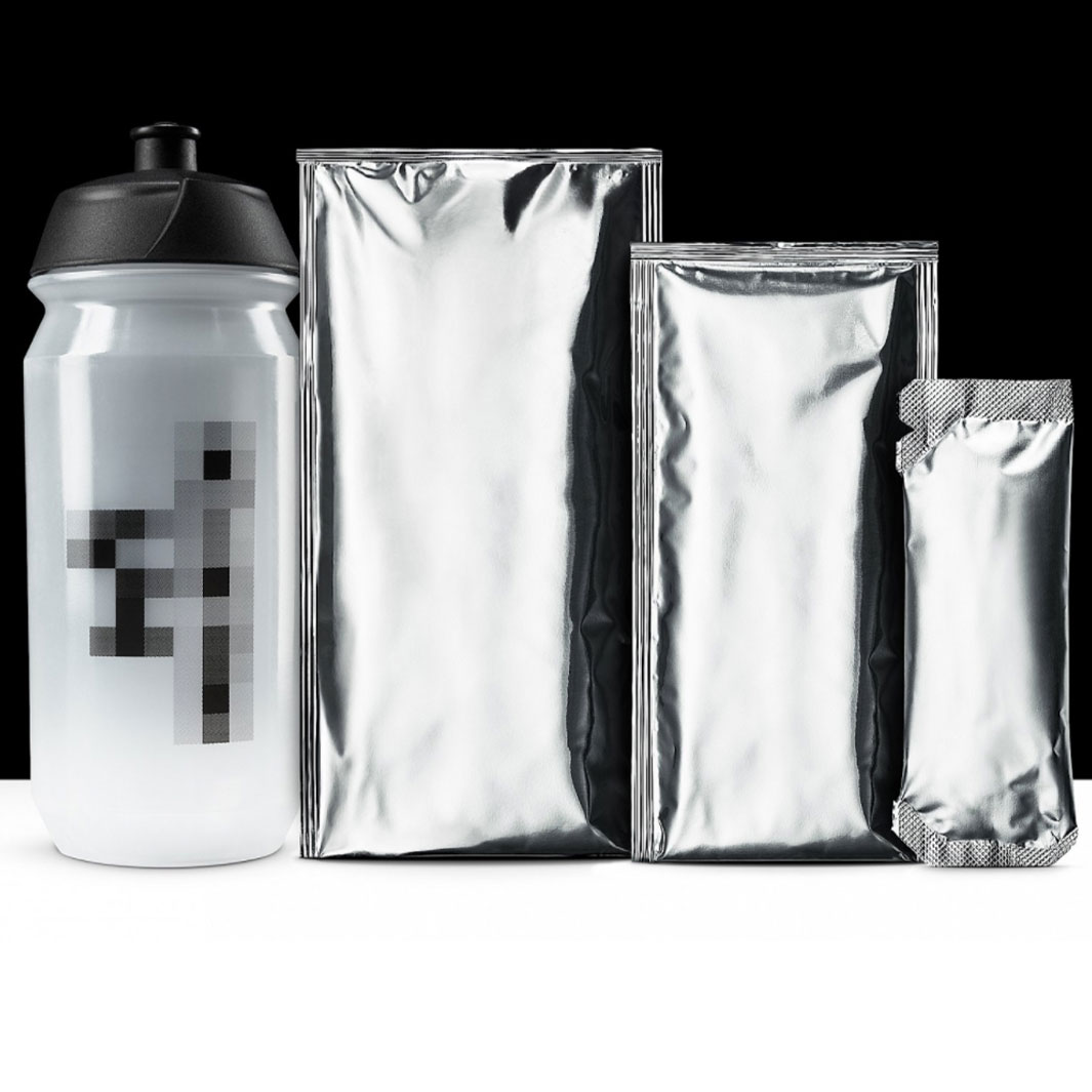
When top athletes sign exclusive sponsorship deals with monoliths like Nike and Adidas, they lose the right to be seen using anything else. This can suck, especially if you’ve taken the deal for the money rather than the product. So what do athletes do? They buy and use products in secret.
Enter the cheeky chaps at Maurten, who caught onto this trend and transformed it into a powerful and original campaign. So athletes could use their products whenever they wanted, Maurten removed all the branding and created the unofficial range; a brand without a brand.
This concept was extended into an impactful tagline; “We always put the athletes first, even if it means covering up our own logo.”
Nice. What we love most about this is the way Maurten listened to a unique pain point experienced by its customers — and addressed it in a way no one else has done before.
Iceland Football Team – From Players to Warriors

Iceland’s football teams haven’t made too much noise over the years, but absolutely no one could forget the thunderous Icelandic clap, heard around the world during the 2016 European Championship. It’s at that tournament that they truly made their mark, kickstarting their journey to establishing a new image on the world stage.
To complement the football team’s newfound reputation, Iceland’s football association recently unveiled a striking visual identity. Drawing on ancient folklore and traditional arts and crafts, the new branding brings Iceland’s rich history and warrior-like competitiveness to the fore. It features the four ‘guardian spirits’ of Iceland: a bull, a giant, a dragon and an eagle — all symbols of unfaltering solidarity which hark back to the nation’s heritage and formative history.
As we always say, a brand is more than just a logo, and we look forward to seeing this new identity being embodied by the Iceland players in the years to come.
Funky Facemasks

Creatives Tim Tadder and Mike Campau decided to make the best out of a bad situation. They asked the question; what if your mask didn’t hide you, but expressed the real you? Whether that’s stuffing your face with some gummy worms, smoking a cigar, or just having a big o’l smile, a mask shouldn’t have to hide who you are. Especially when a raging, largely illogical debate is going on about the use of masks; this creative work hopefully helps emphasise how humane and vital their use really is.
The sad news is that you can’t find these in your local corner shop. They were made using Photoshop, which allowed the designers to jokingly match facial expressions with people who may not fit the profile. So, folks, remember to continue wearing your mask. But don’t let that stop you from being creative and showing the world how you feel.
Get involved.
So, we hope you enjoyed our weekly round-up of cool design! Think you’ve seen something that would make this list? Send it in to hello@outfly.io and stay tuned to see if it’s chosen next week.
