Fresh off the back of their success with the creation of Level39 in Canary Wharf, Entiq came to us with our biggest challenge yet: to create a new innovation centre for creative and tech companies, as part of the London 2020 Olympic Legacy.
We had been introduced to Entiq by Here East, having come in with our own ambitions to build an incubator for entrepreneurs and startups, and we soon realised that our values matched perfectly. So, an incredible partnership was born.

The brand
The first challenge was the brand. Many had already tried and failed to meet the strictest criteria we’d ever come across: a gender-neutral, easy to spell, maximum 6-letter name which had to have depth of meaning, be completely available (domains, company, etc.), and most importantly, hadn’t been used anywhere in the world, trademarked or otherwise.
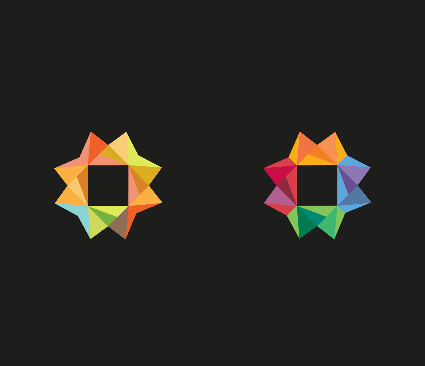
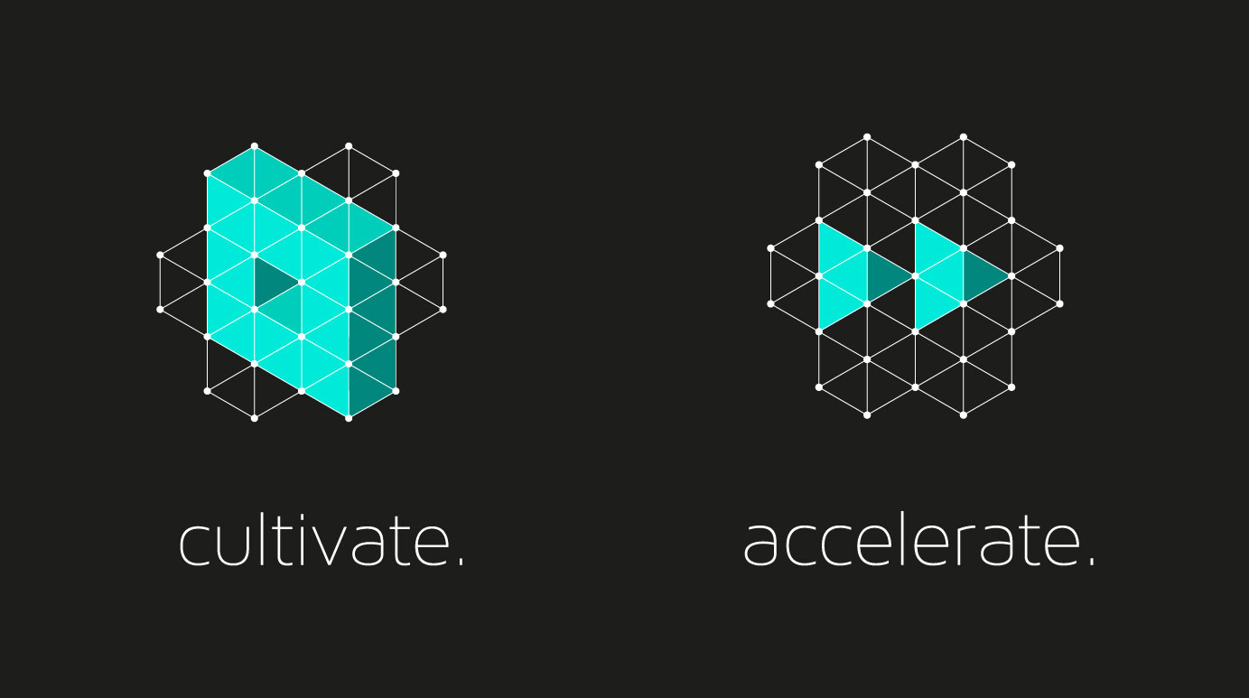
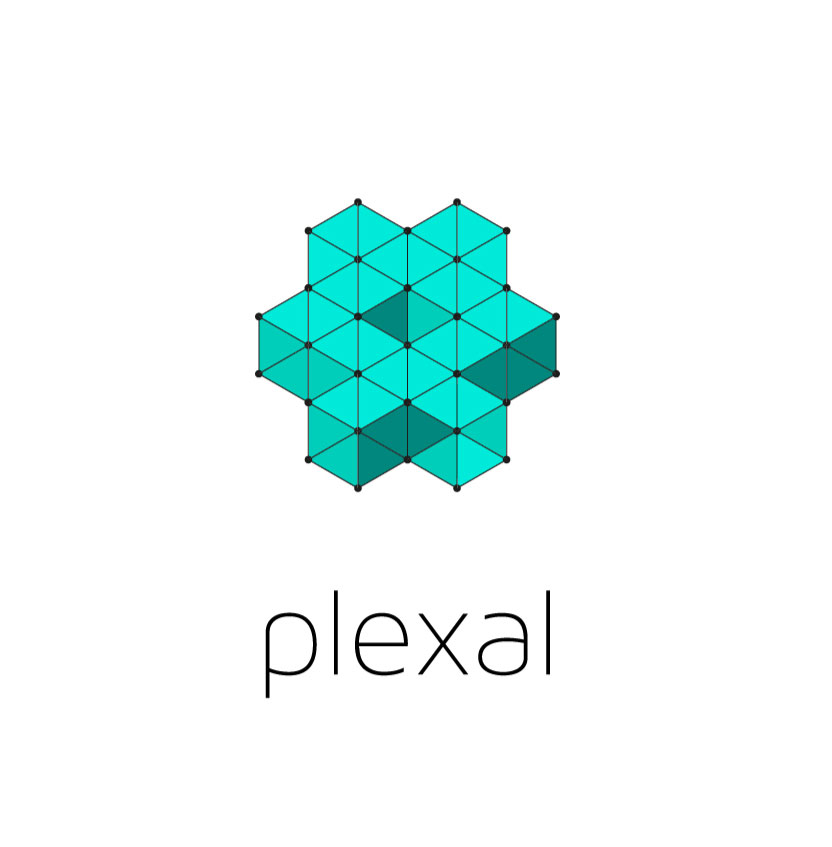
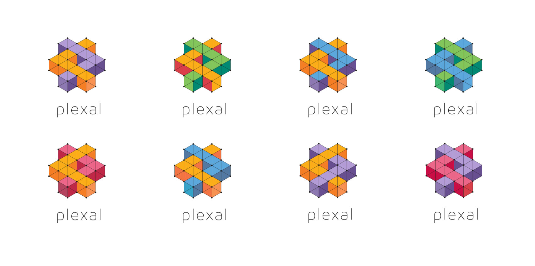
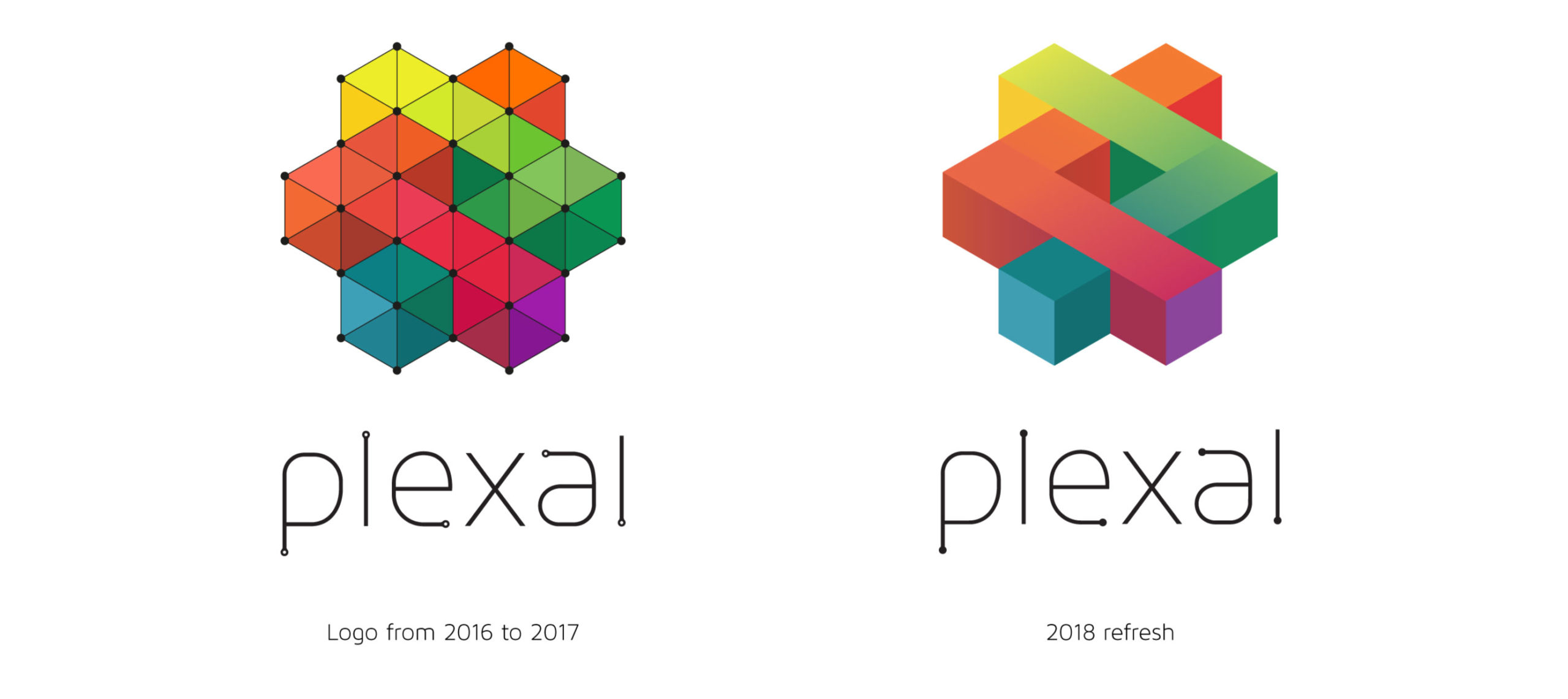
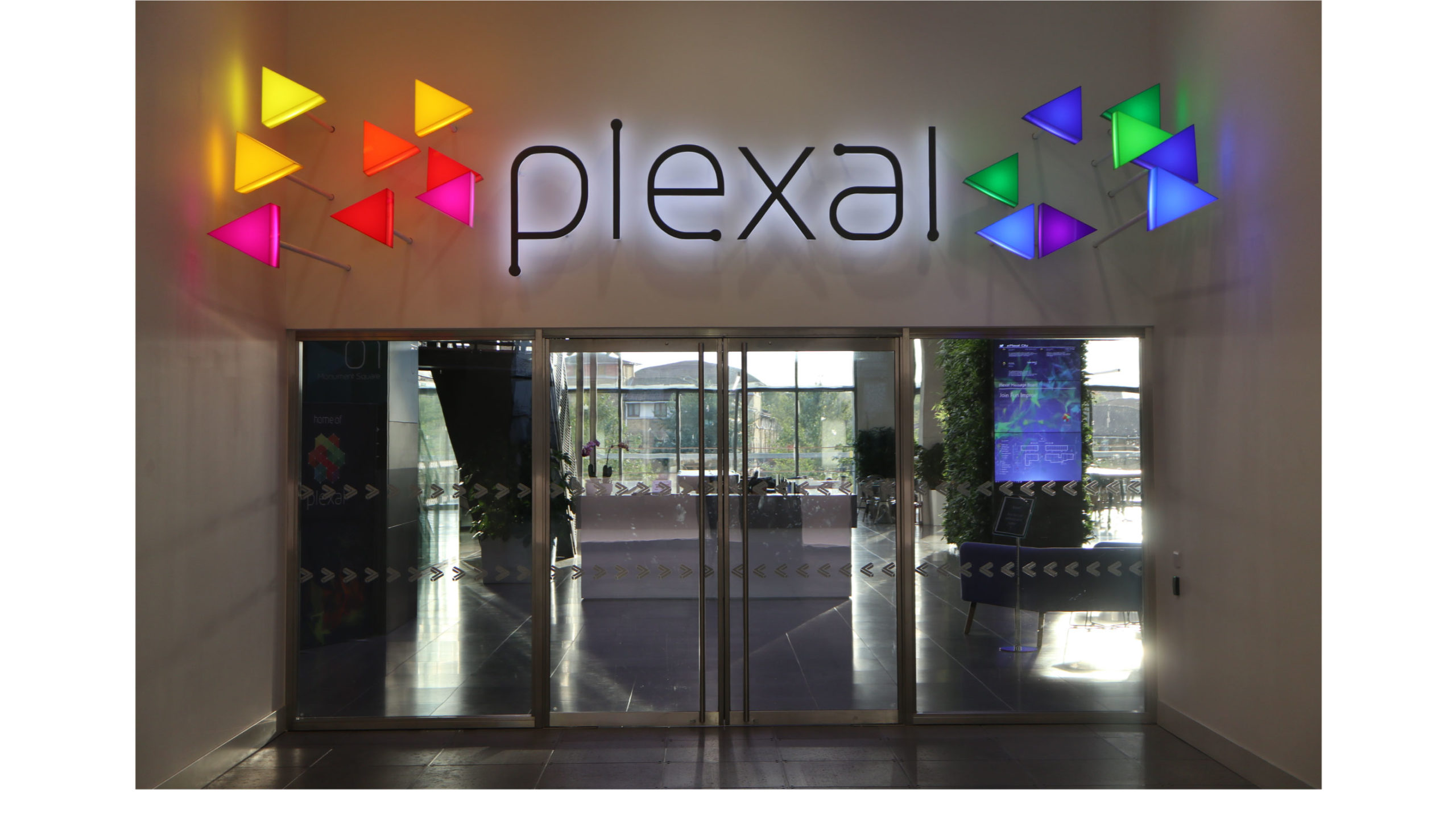
Not only that, but the brand had to stand for and show what the new centre aimed to do, which was to allow creativity and tech to collide and to create exciting new opportunities for innovation and growth for its members. This was symbolised by the pictorial mark being made up of a tech ‘grid’, filled with creative, coloured ‘pixels’, which formed two arrows colliding together.
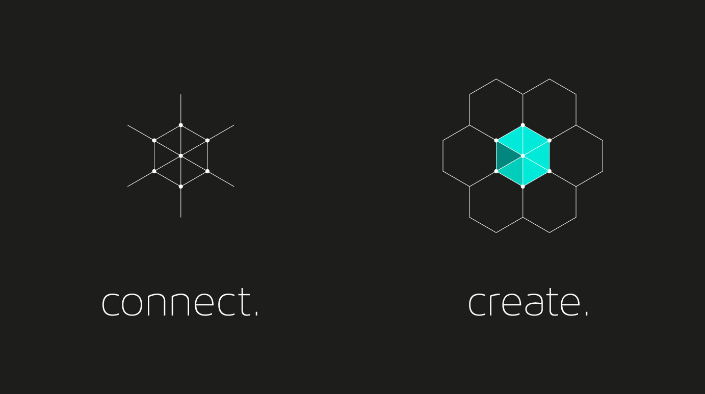


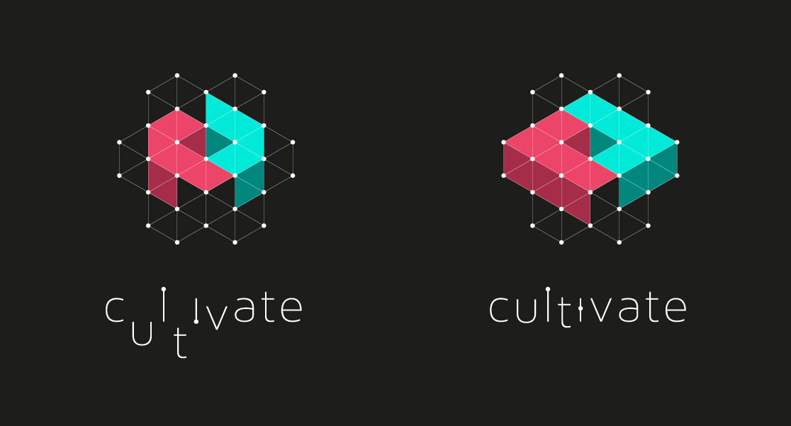
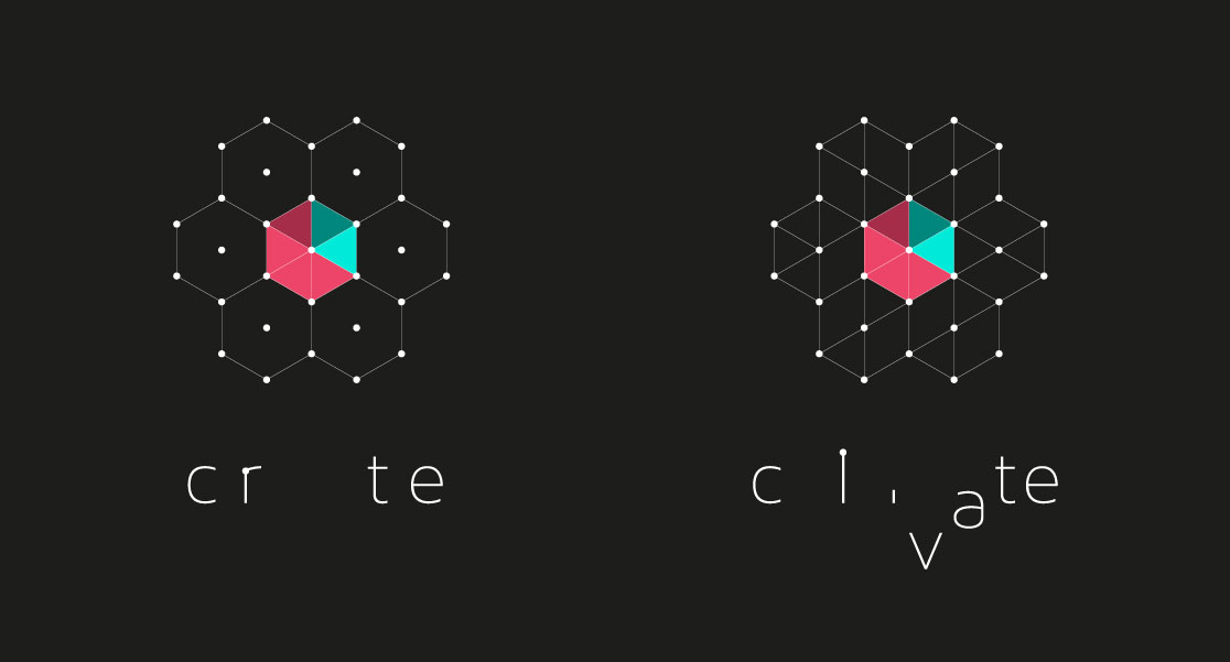
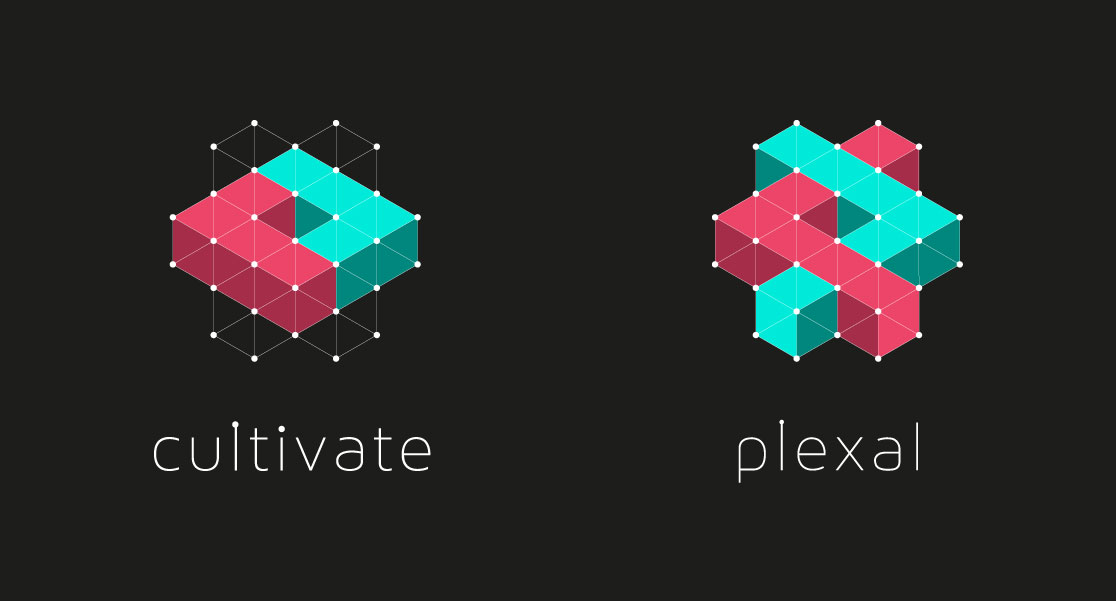
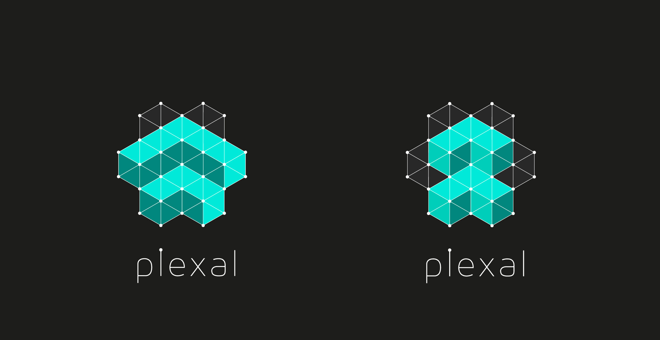
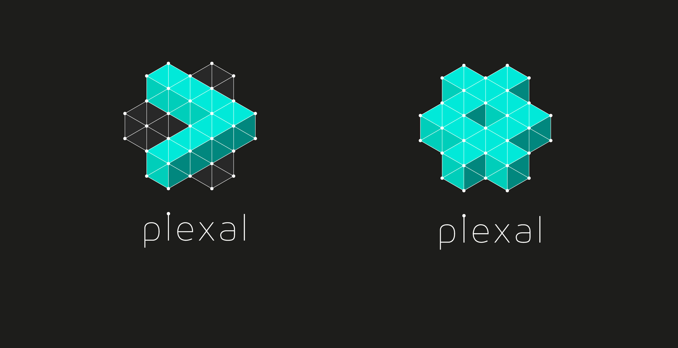
After many brand presentations, we finally settled on Plexal; a biological central nervous system that symbolises the mental synapses and social network that make the human connections to technology possible. It captured our mutual philosophy of the connected collective, and the creative and economic potential within these technology clusters.

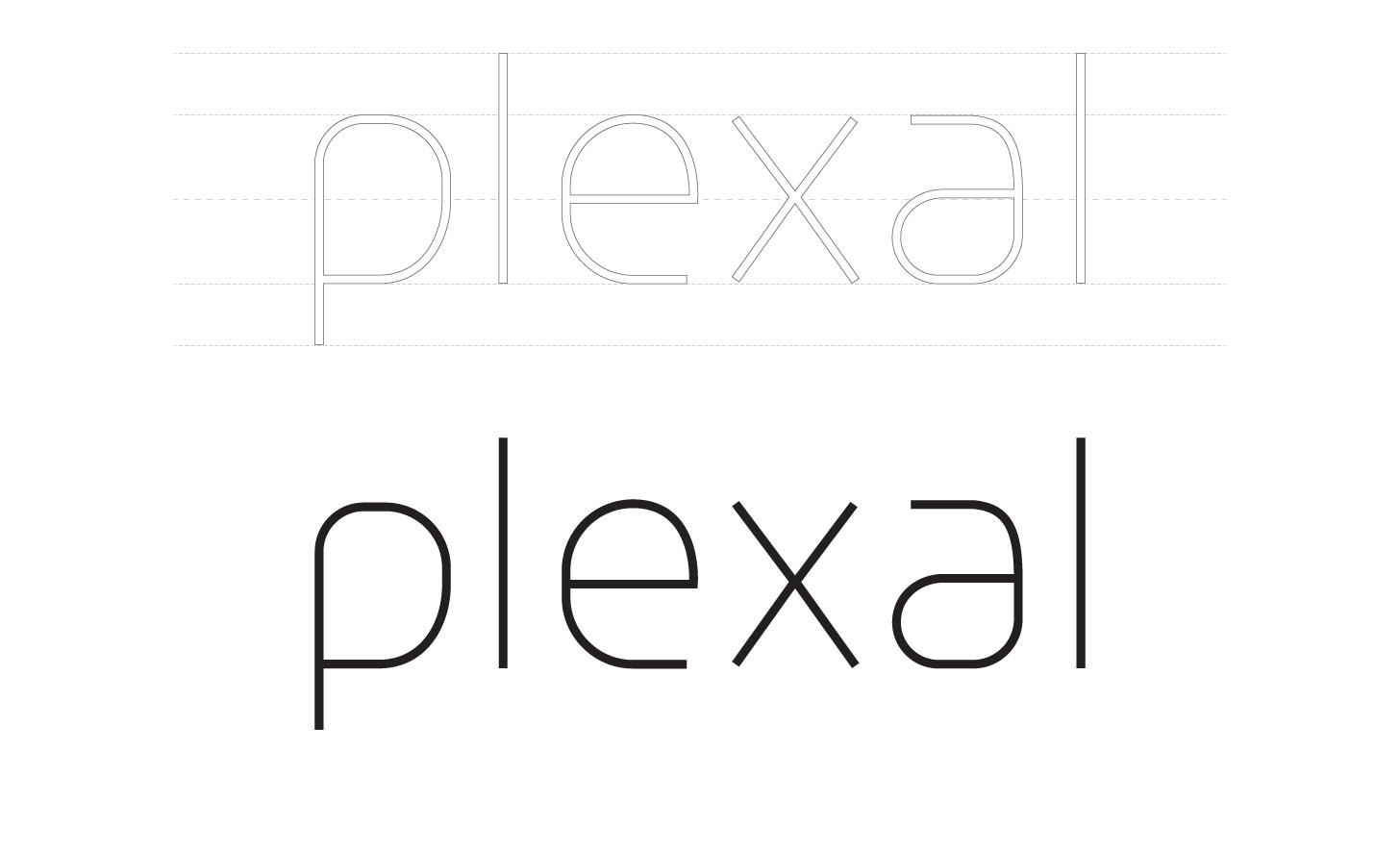
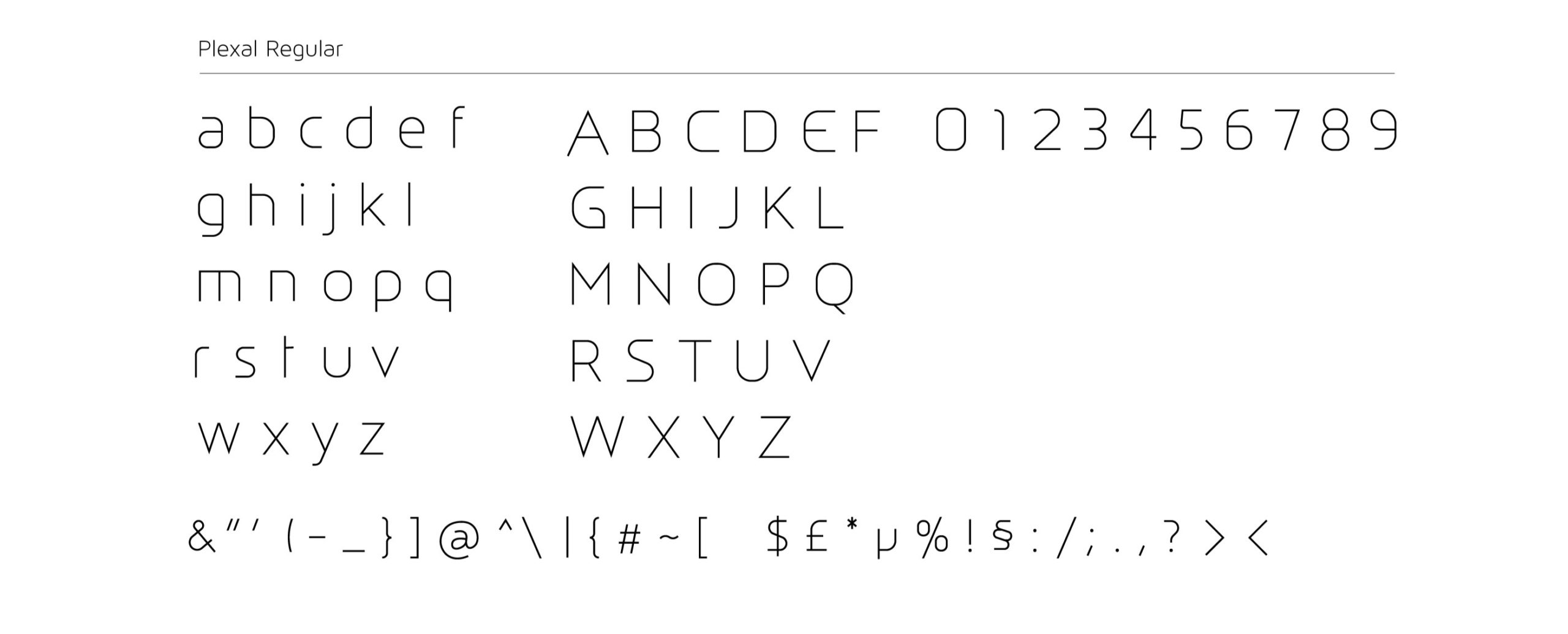
Bespoke font
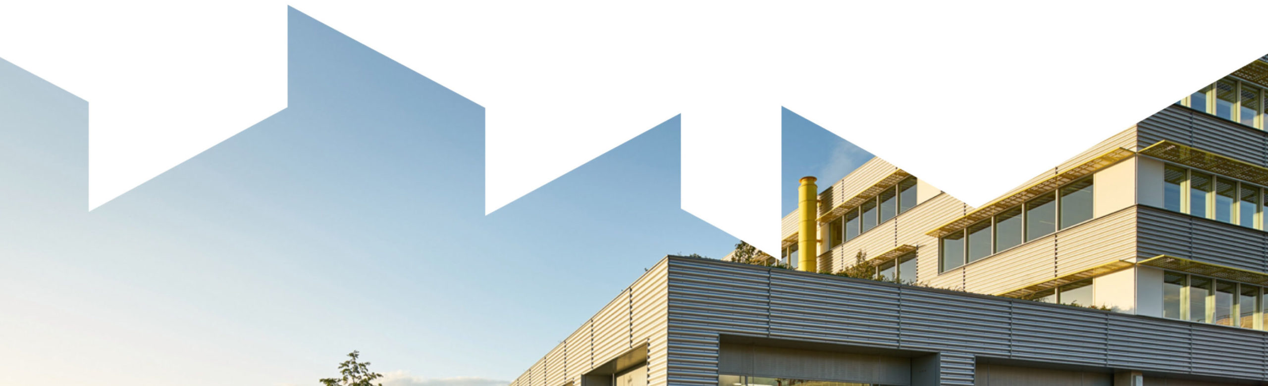
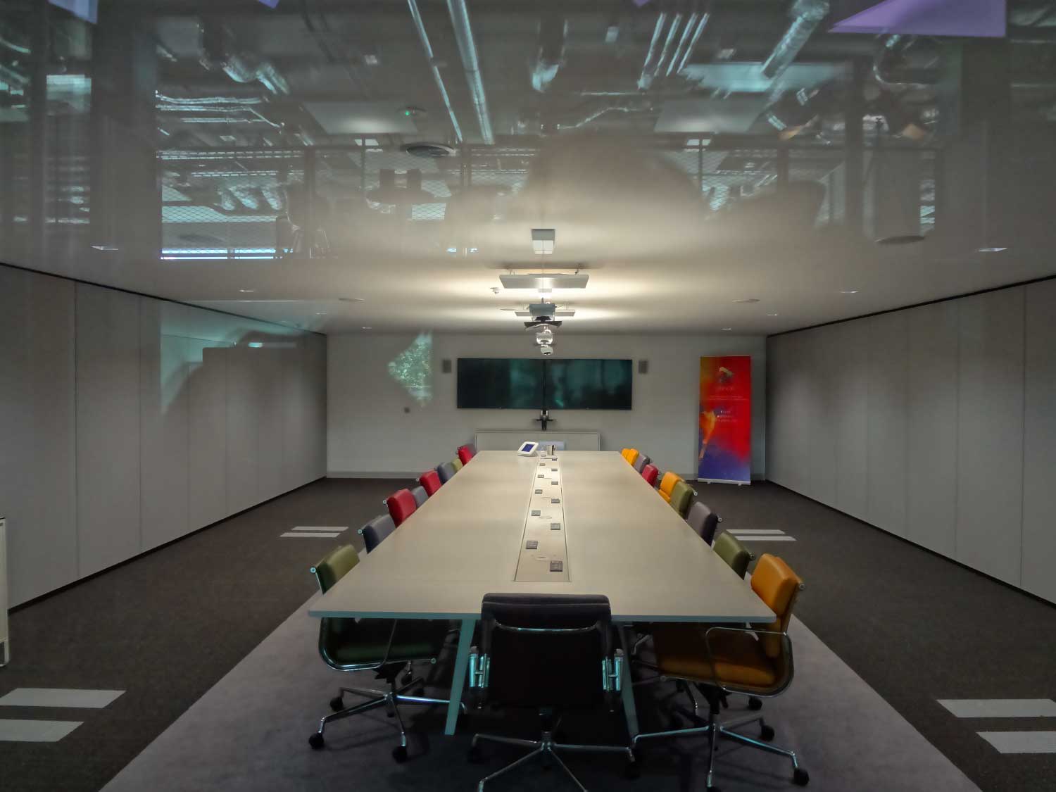
The Plexal space
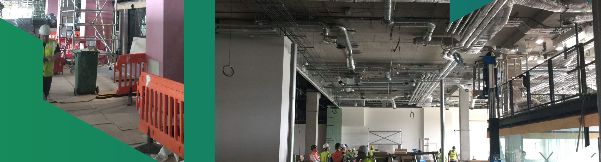
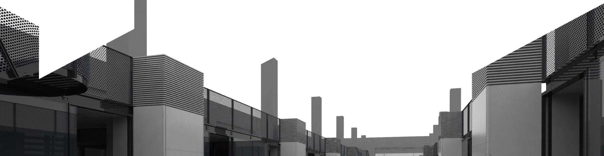
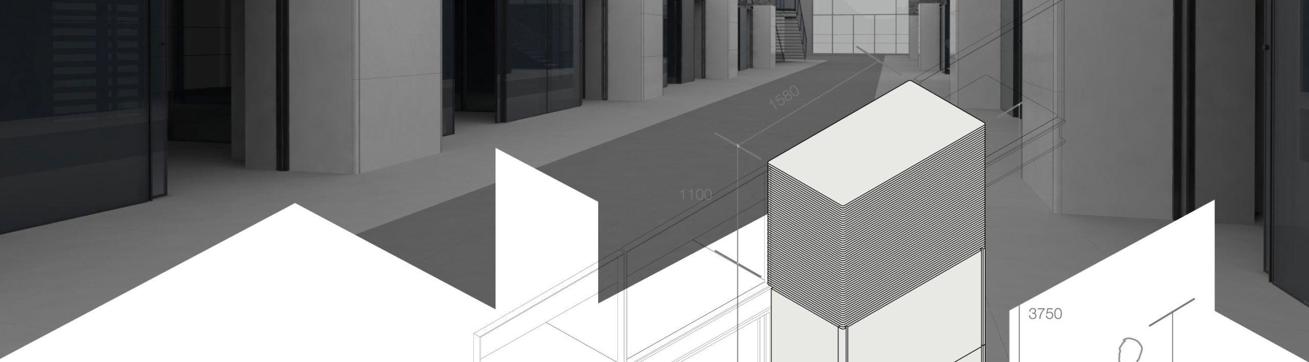
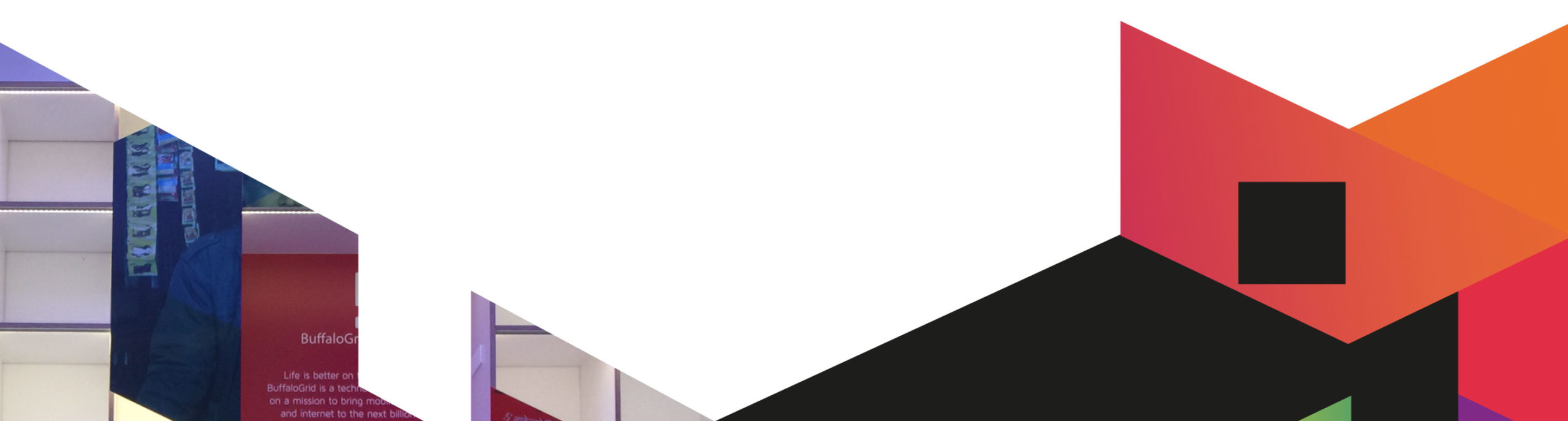
When work started on the architectural design, we were asked to consider how the brand would ‘integrate’ into the space. As the scope of the project grew, so did our involvement, but we never expected that we would end up working alongside Grimshaw Architects, to together build an innovation mini-city like no other.
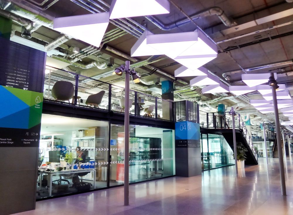
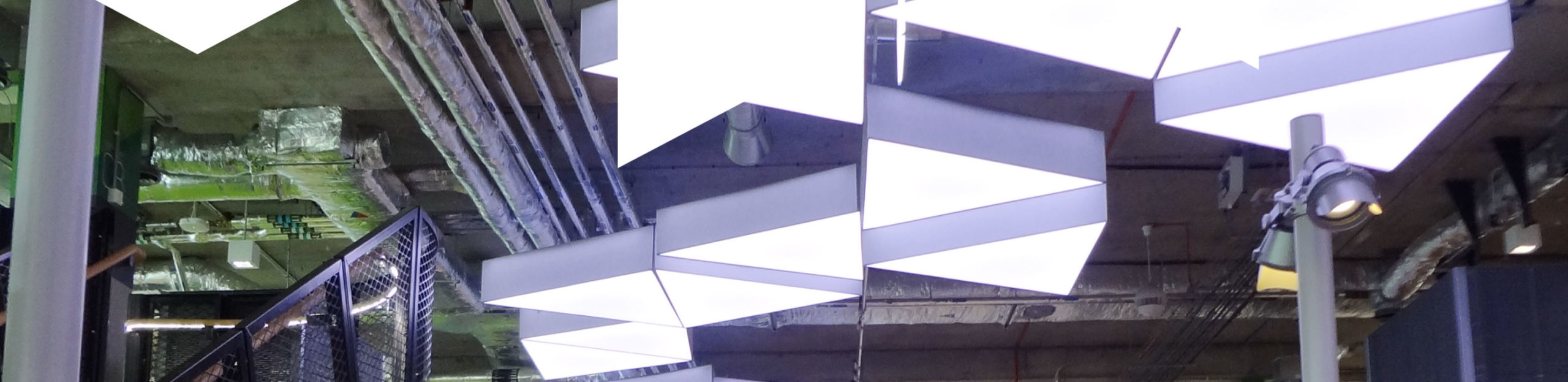
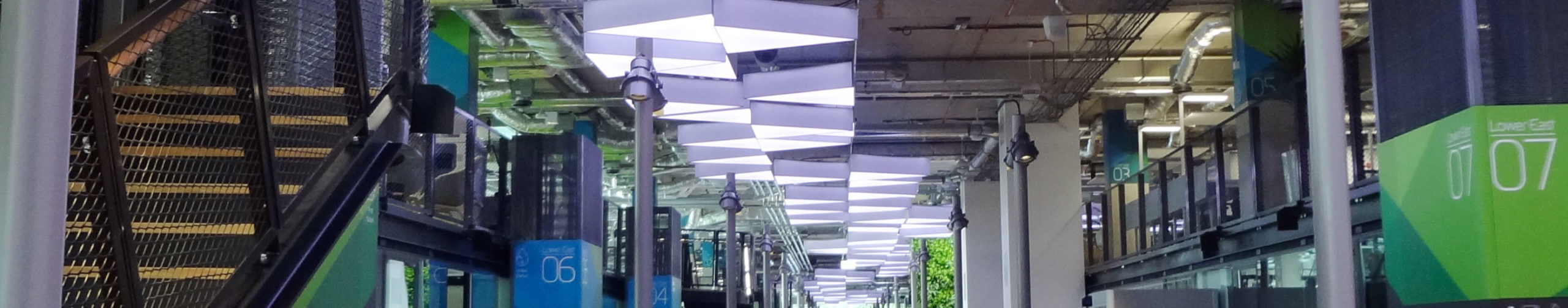
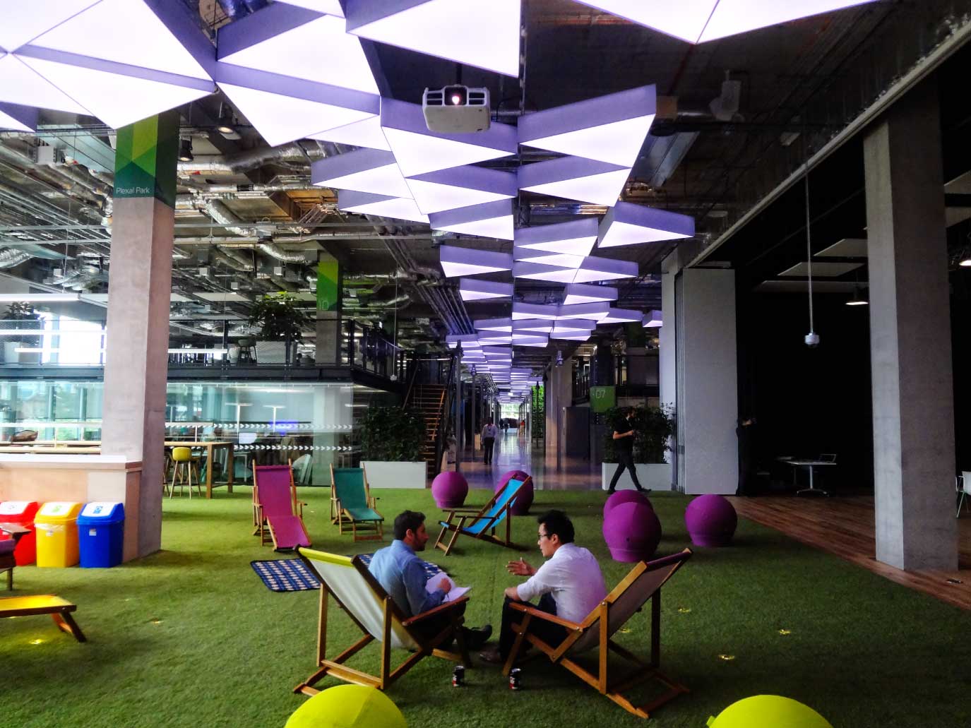
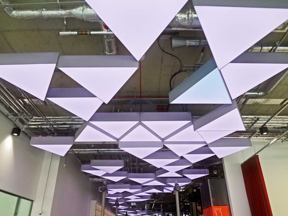
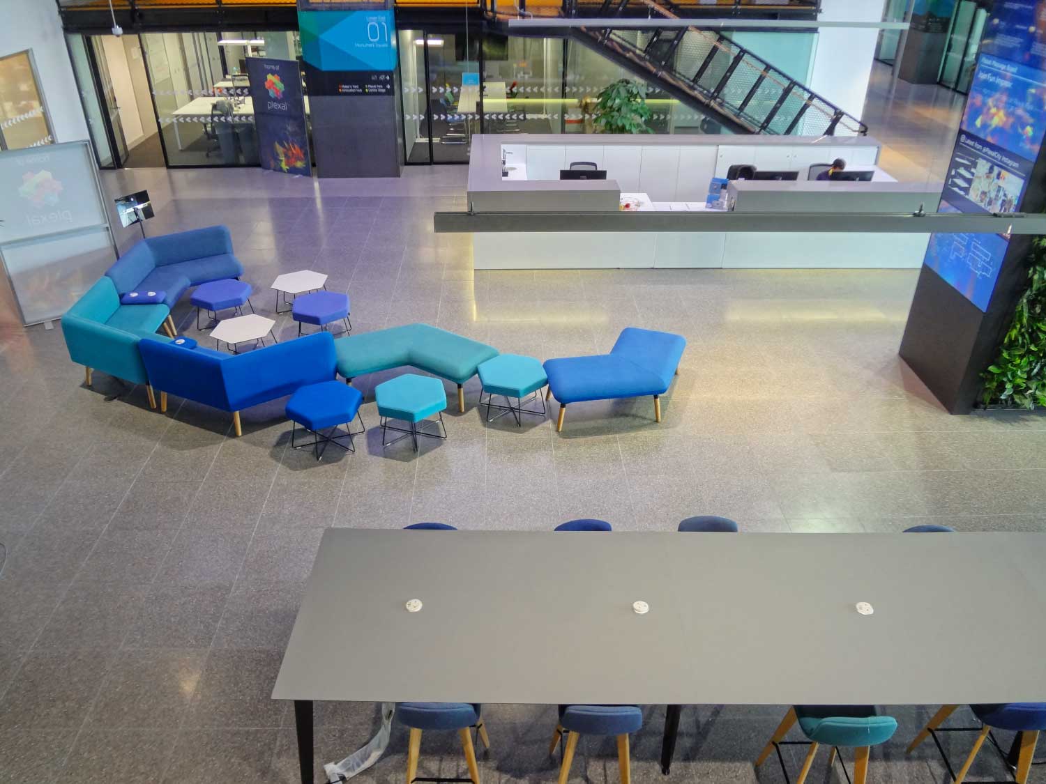
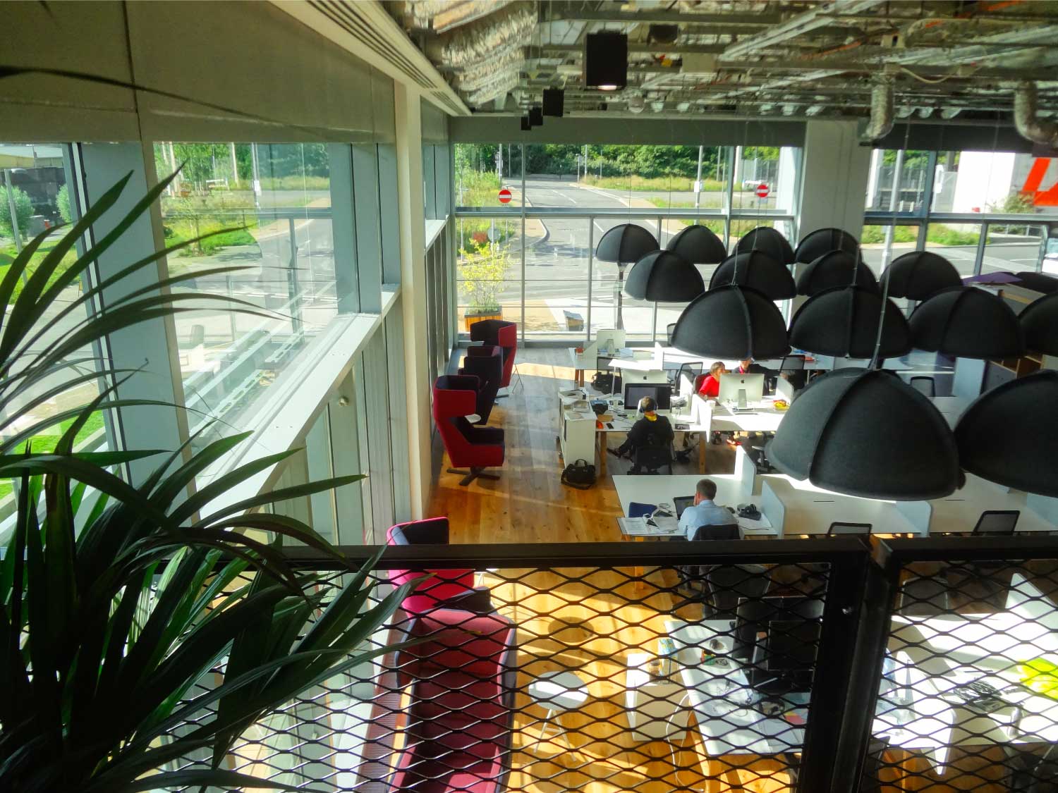
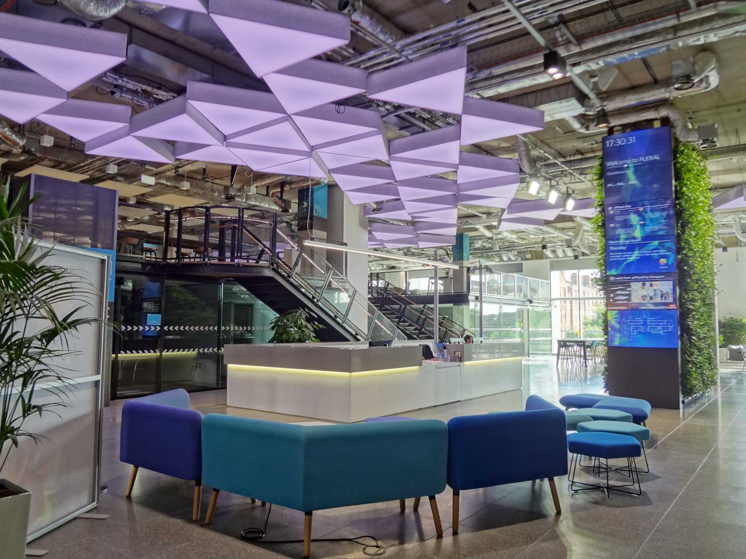
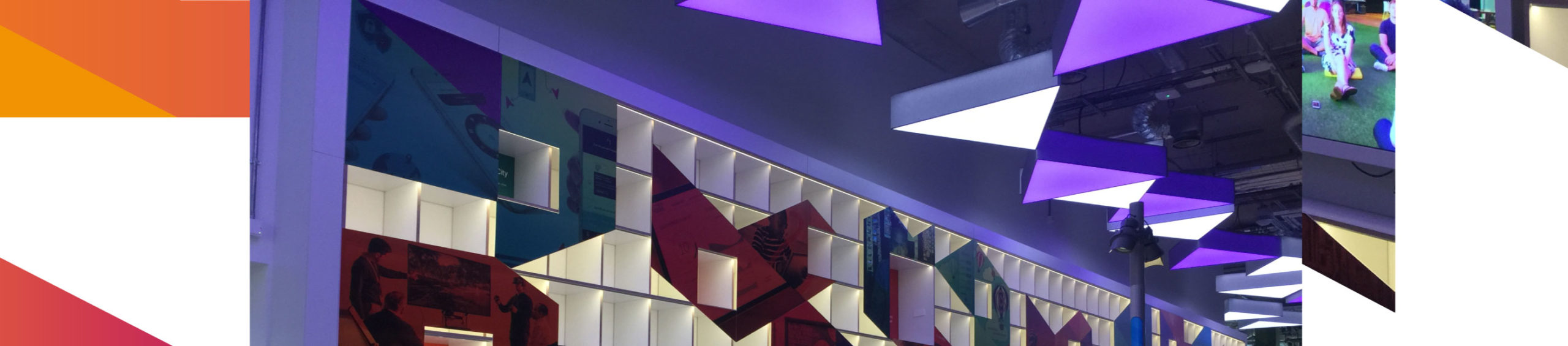
We ended up using our team’s architectural and interior design background alongside our unique design thinking methods to build service design into each and every element of what was dubbed ‘Plexal City’. From integrated functional lighting systems that promoted productivity and emotional wellbeing through to unique, intuitive wayfinding: even the fixtures, fittings and furnishings held service design at their core.

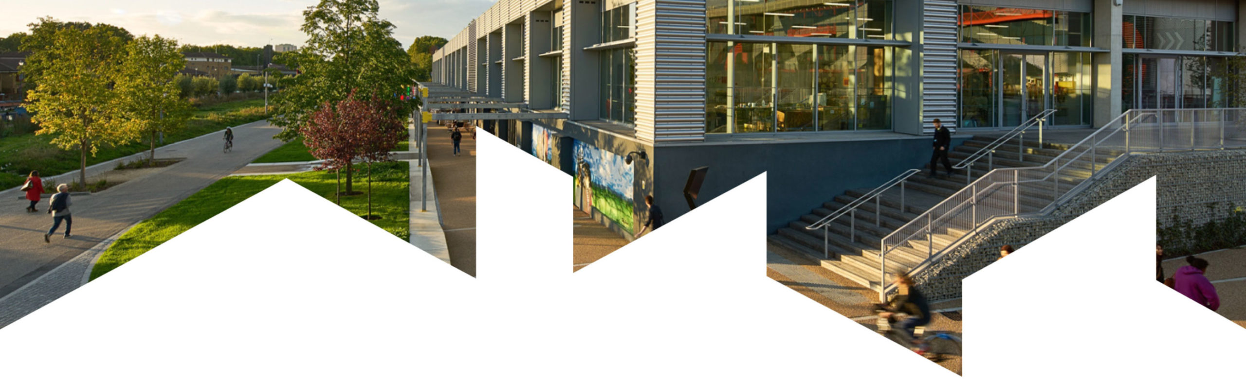
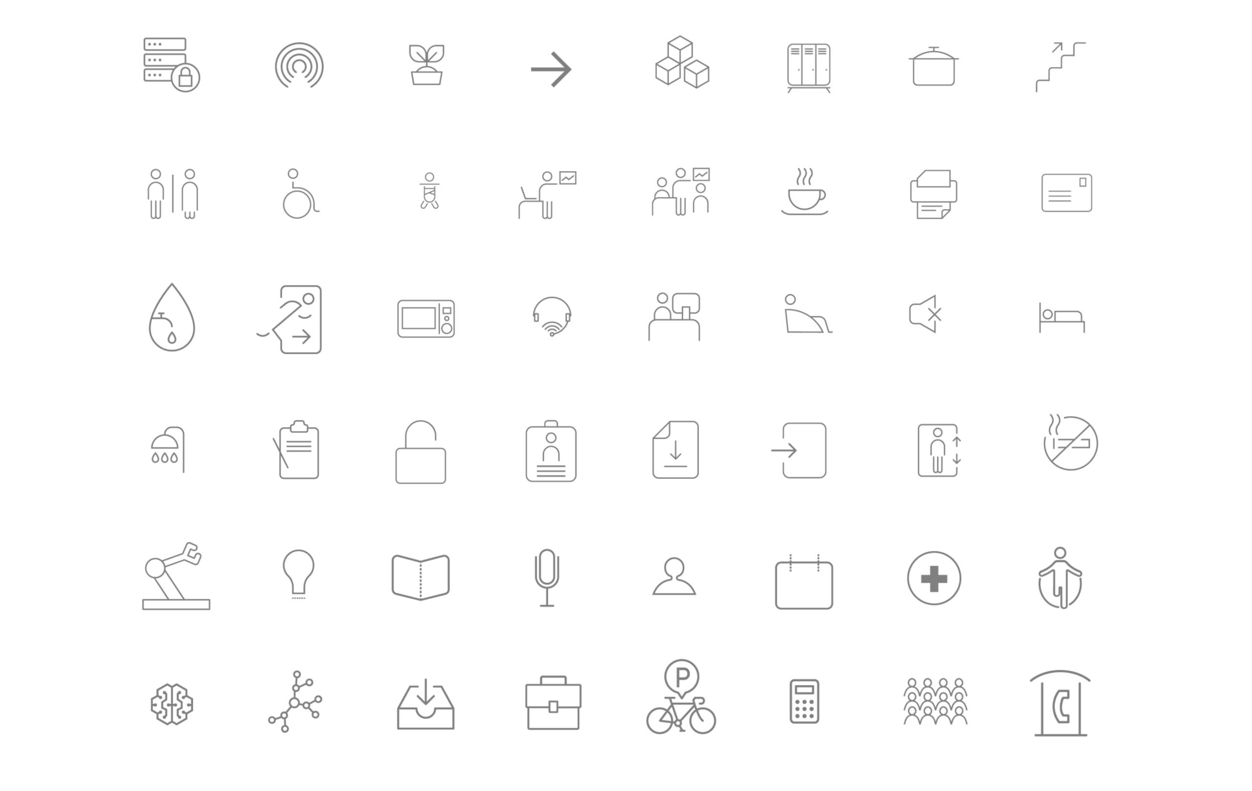
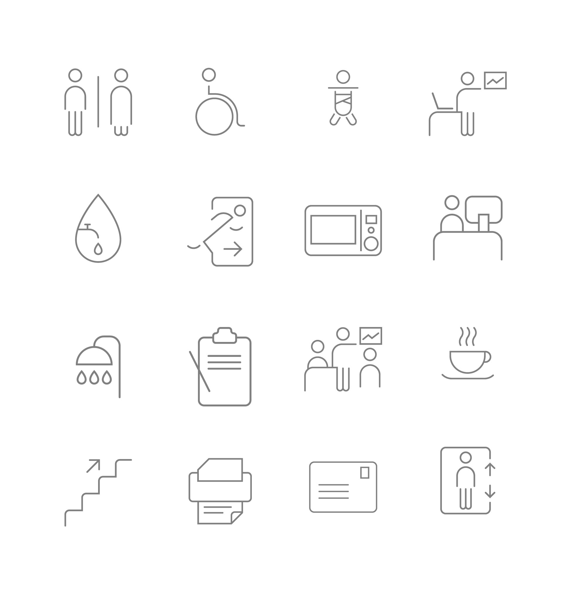
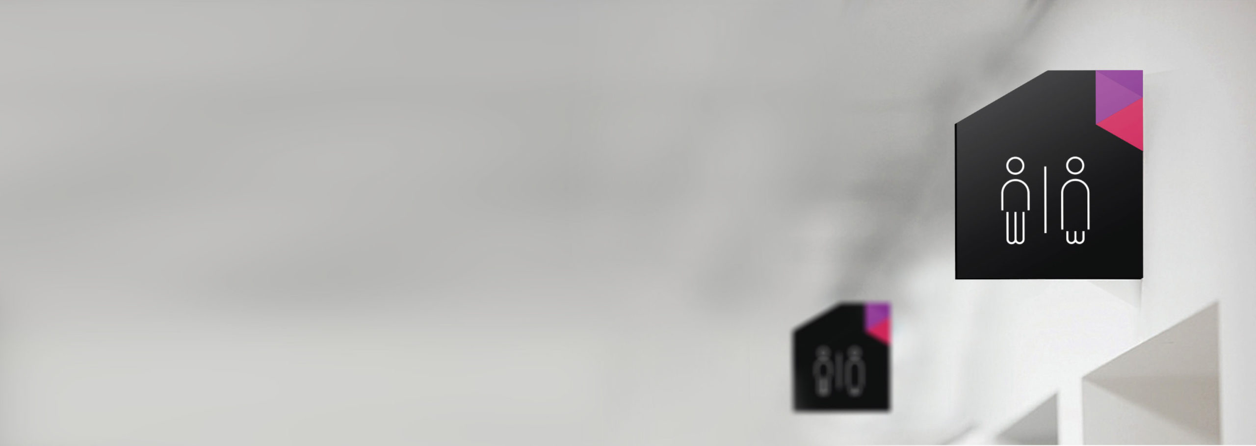
Wayfinding and iconography
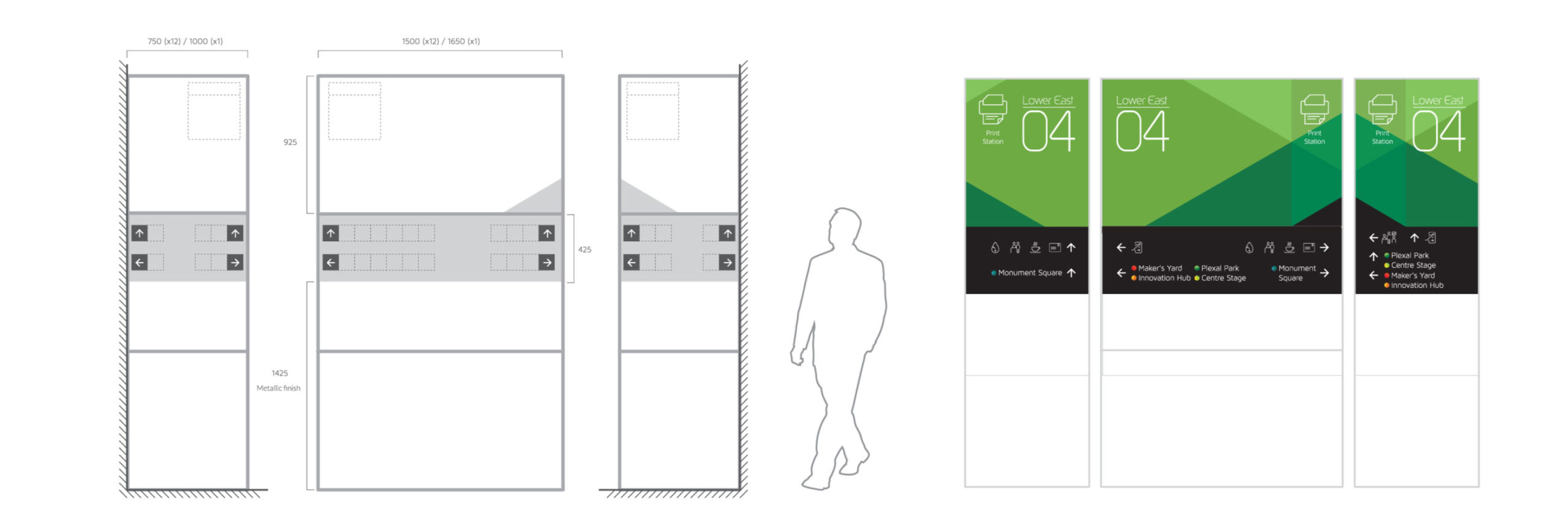
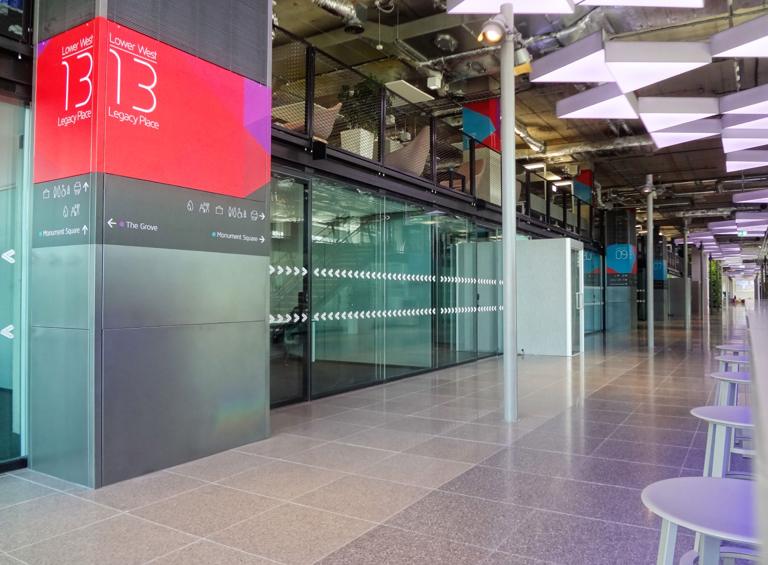
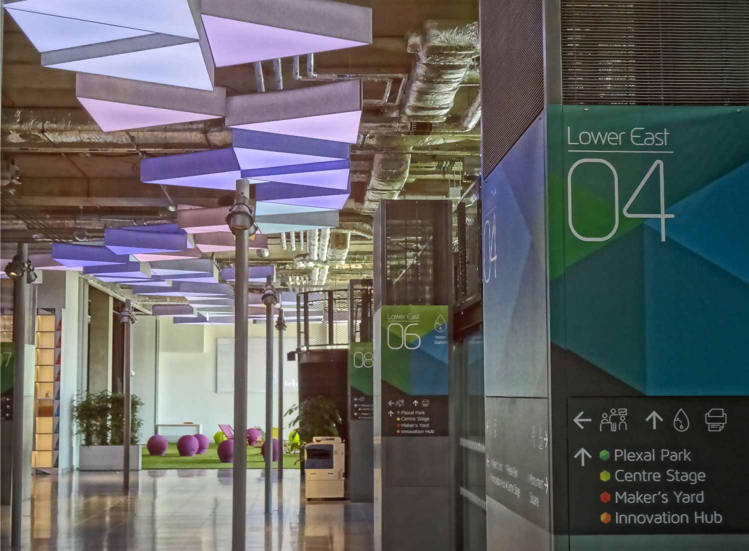
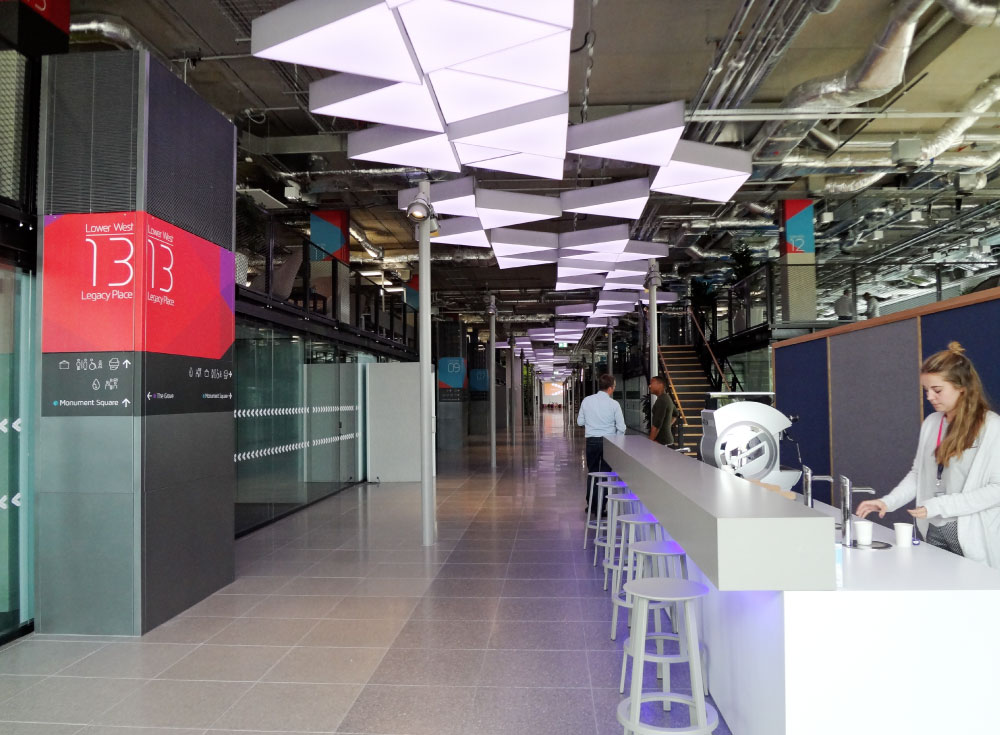
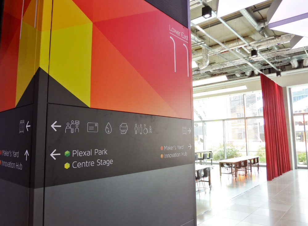
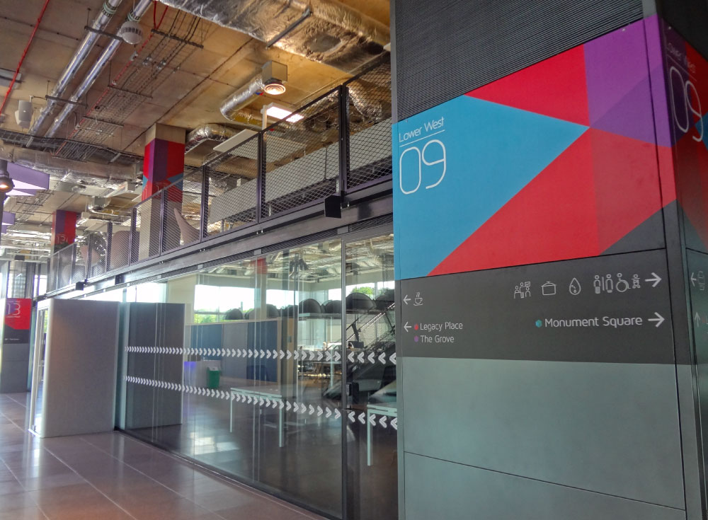
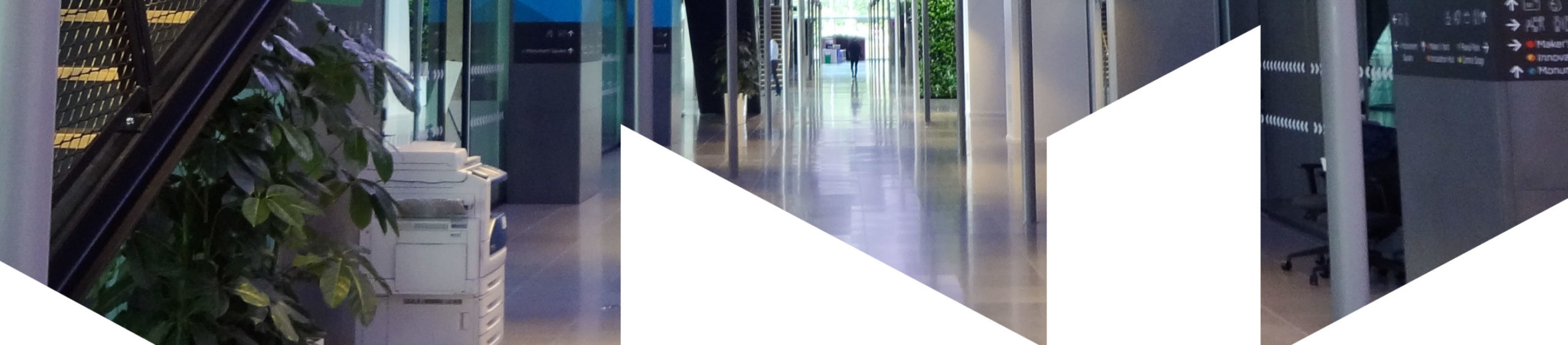
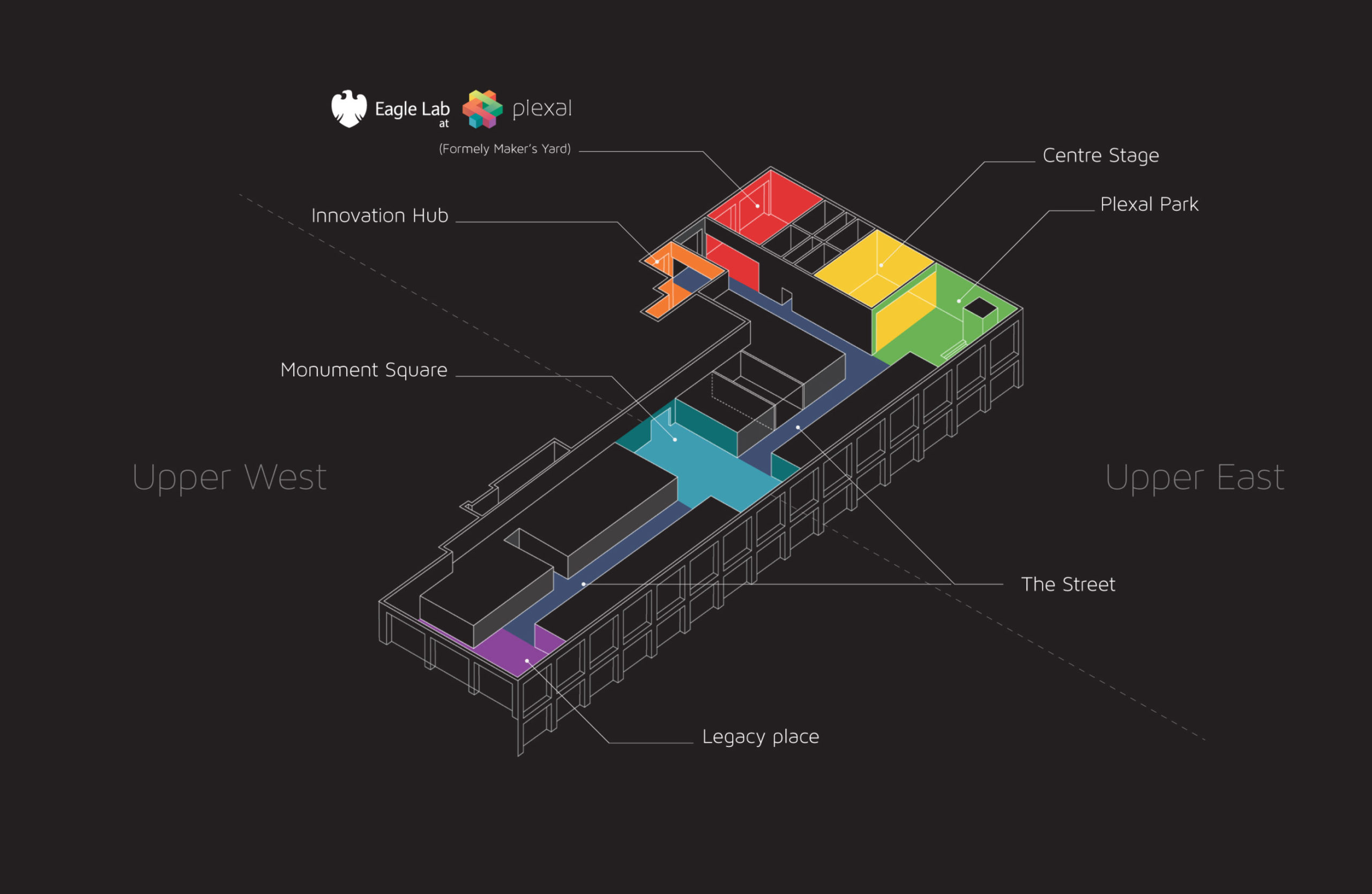
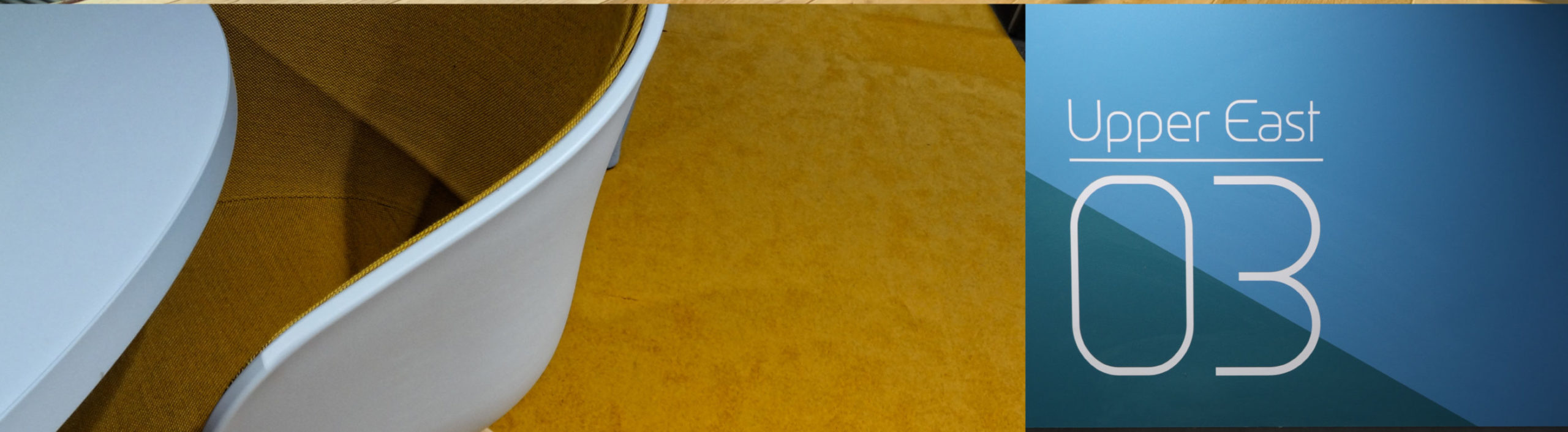
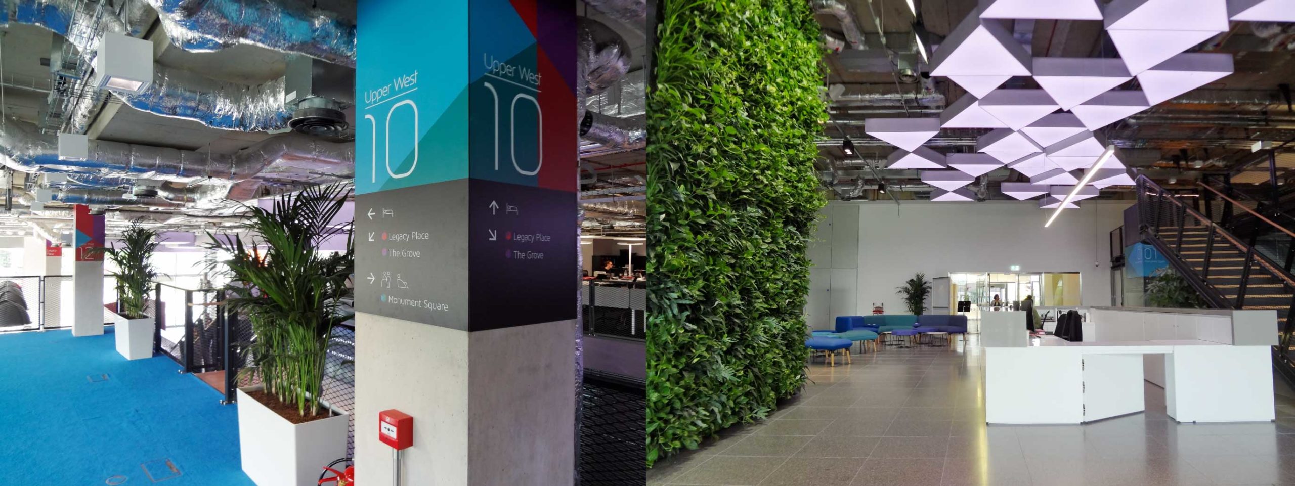
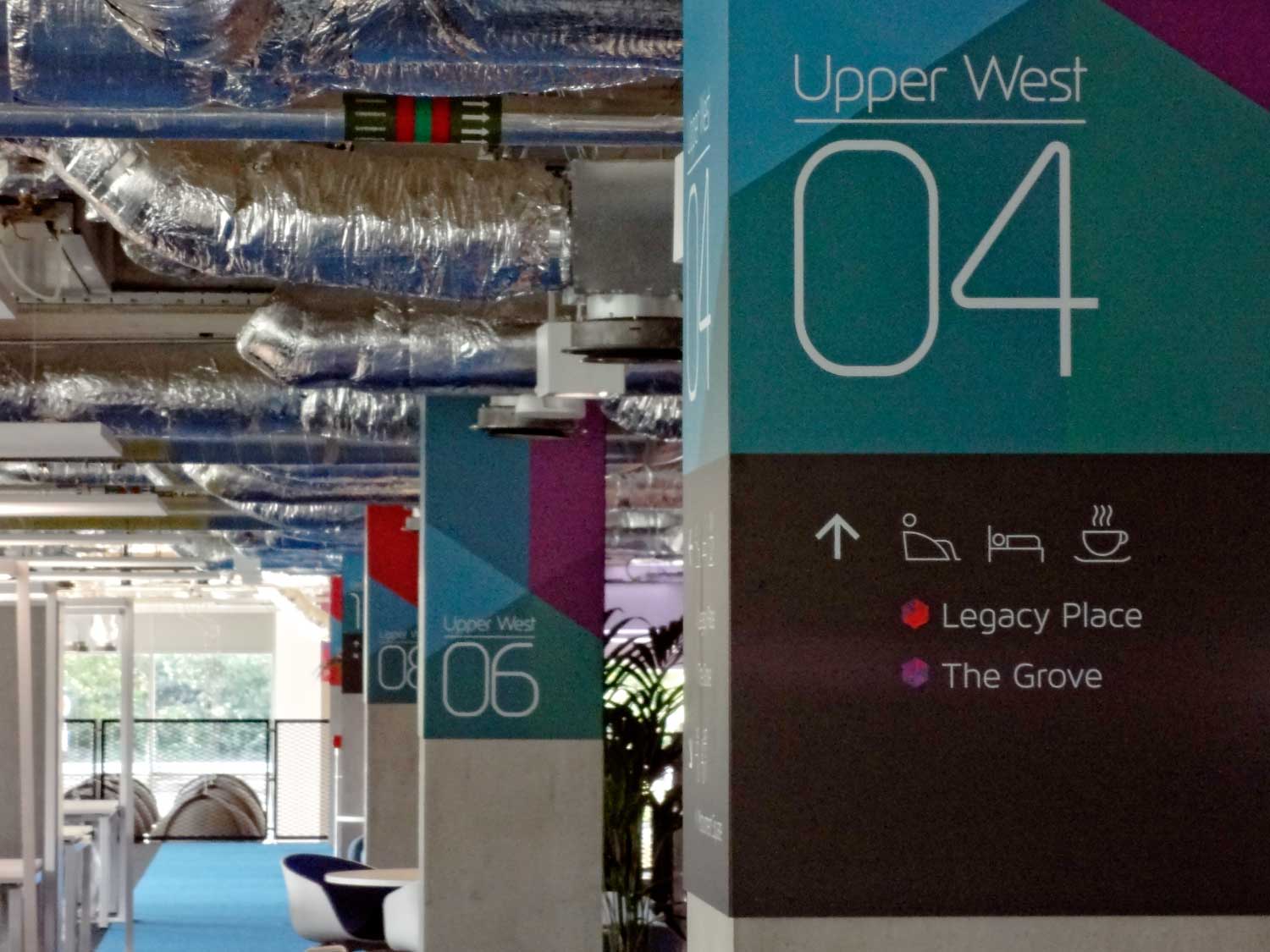
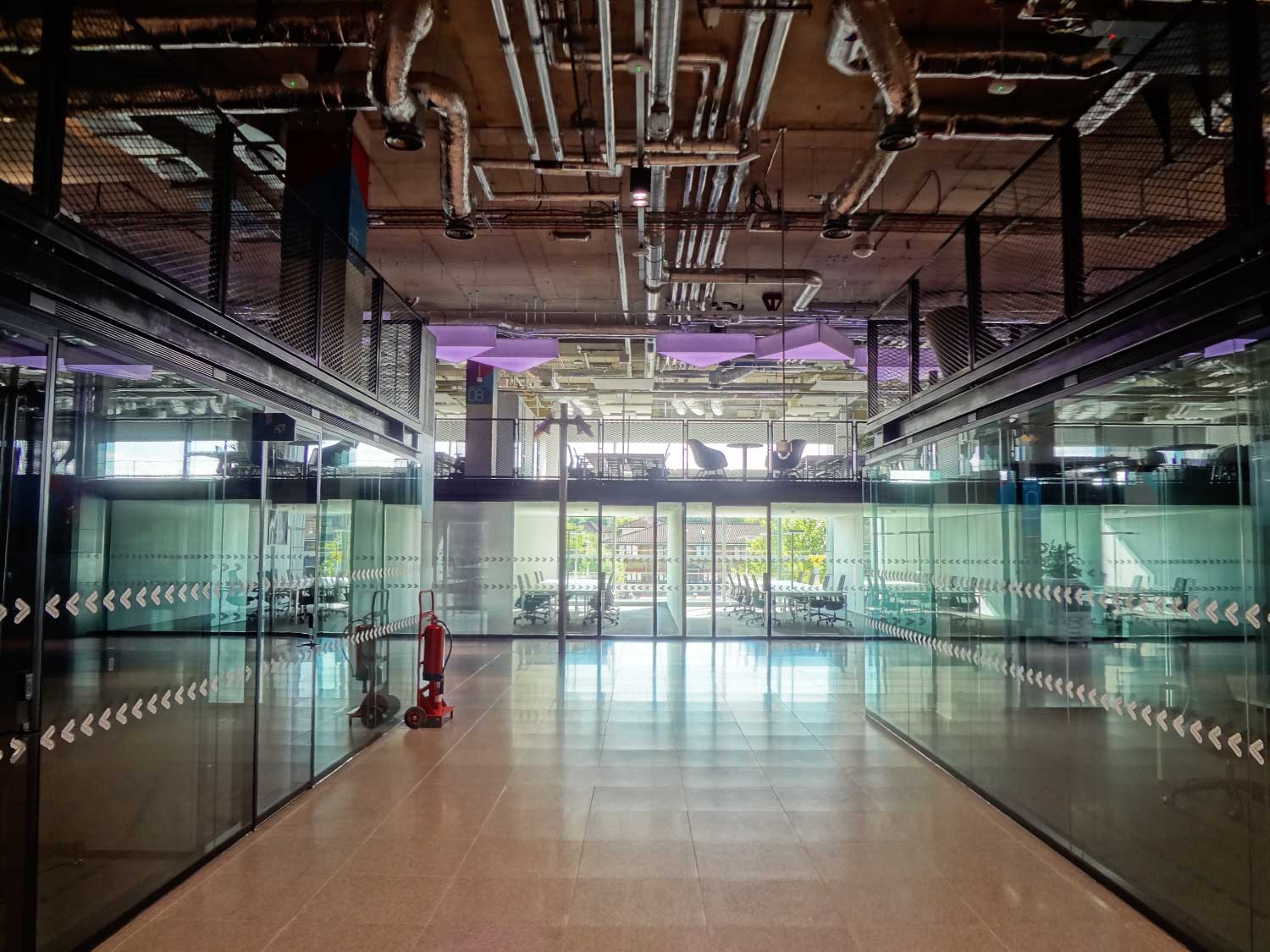
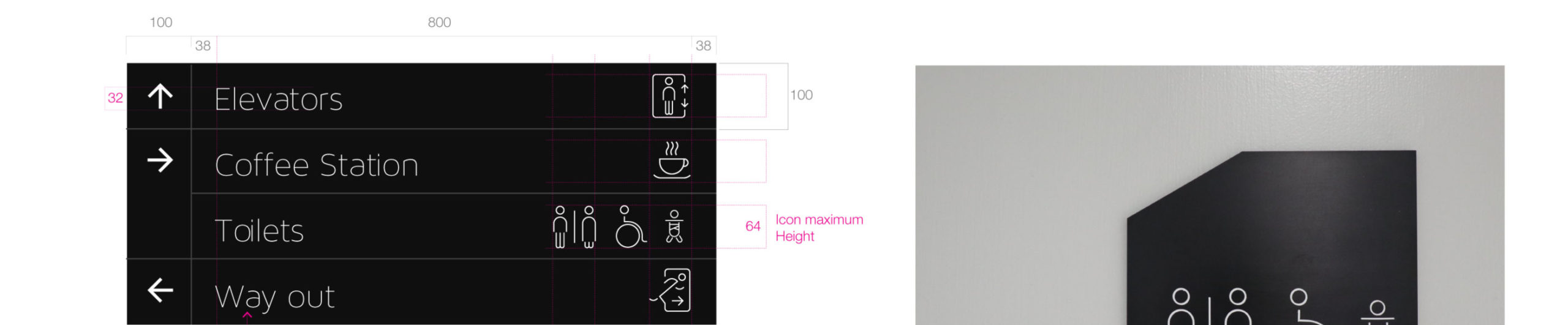
One of the biggest challenges was to build a wayfinding system that was inclusive, accessible and most importantly, would prevent anyone from getting lost in this 62,000 sq. ft. mini-city. We began by conducting research into the wayfinding used in the largest global cities, before determining that Plexal would draw inspiration from Manhattan, with its own East and West Side. Following the introduction of mezzanines, an Upper and Lower East and West Side were born.
We then turned our attention to the numbering system. We didn’t want an overly ‘Americanised’ system, so we introduced the UK street numbering system to split the North and South sides of the building into odd and even numbers. We even designed the layout of what would become ‘Monument Square’, our dramatic entrance, to take on the common characteristics of major world cities, with a big digital column (‘The Monument’), food stalls, green walls and even a classic Piaggio kitchen.
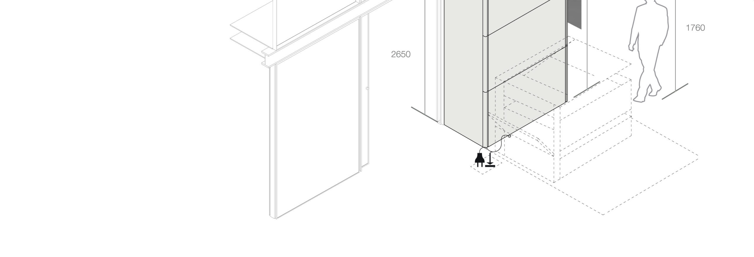
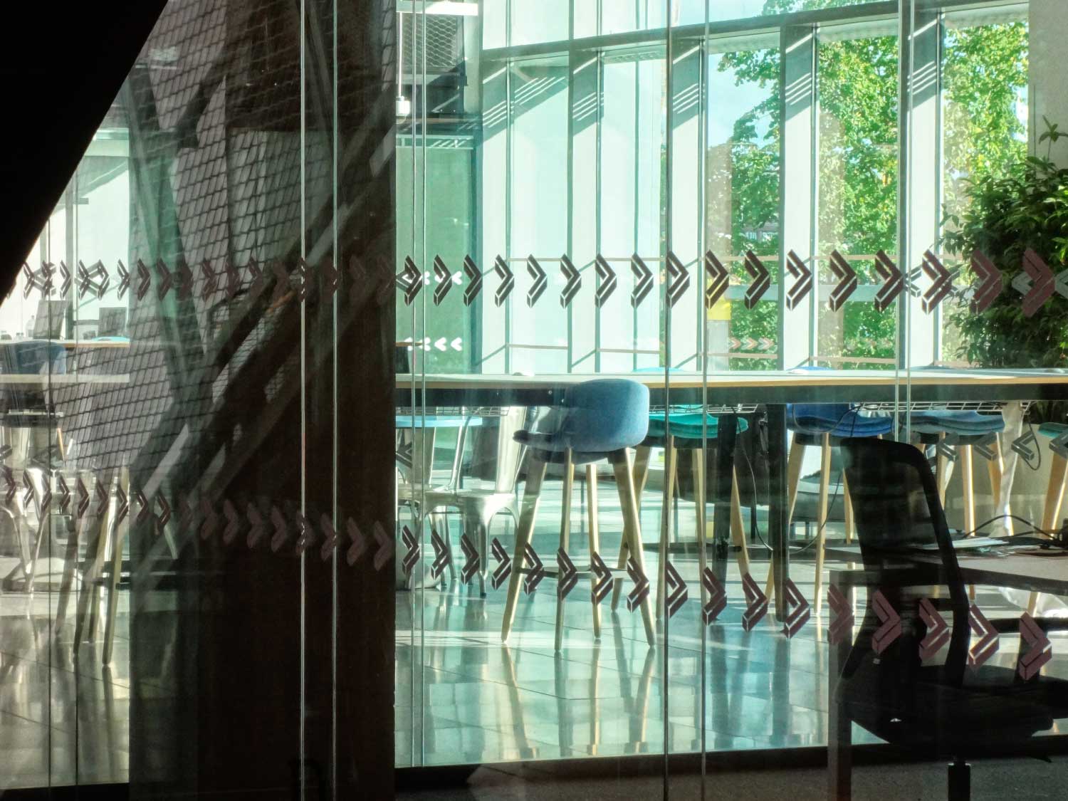
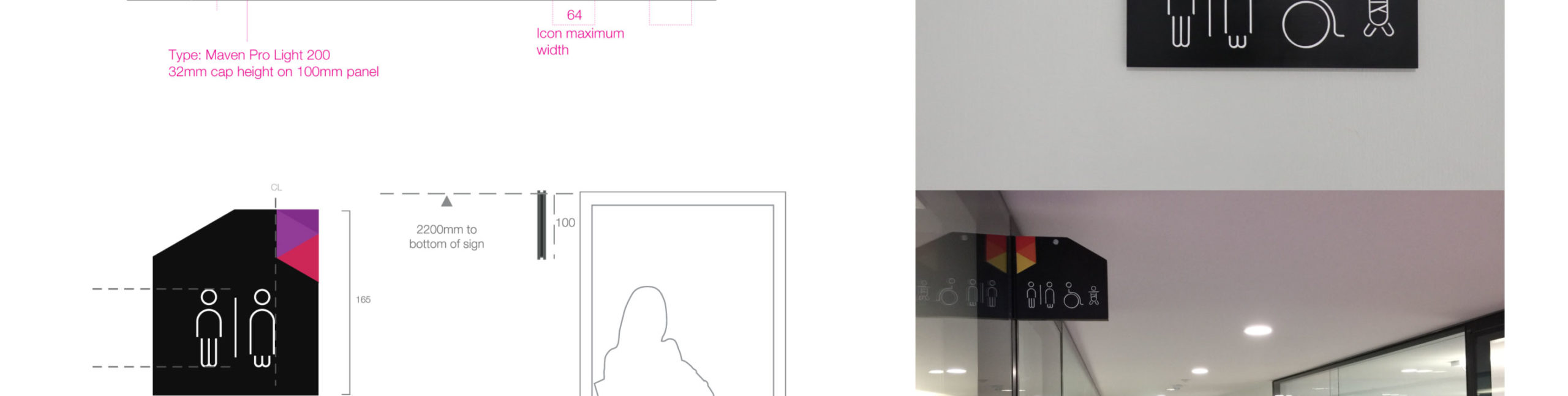
To deliver this, we needed a robust and consistent set of iconography, along with innovative wayfinding solutions that took into account the needs of the visually impaired.

Downflow units


Space denomination
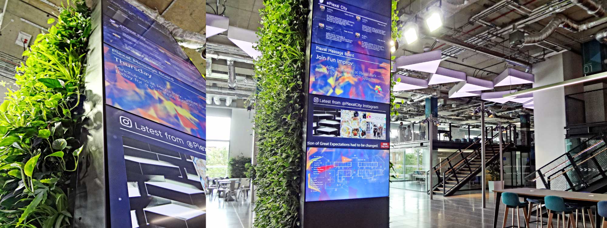
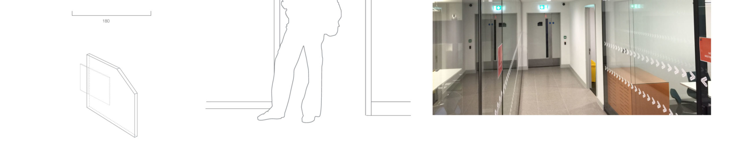
We decided to use the more functional elements of the architecture to our advantage, turning each downflow unit and column into our wayfinding canvas. This not only allowed us to create three-dimensional directional signage, but also reduce costs.
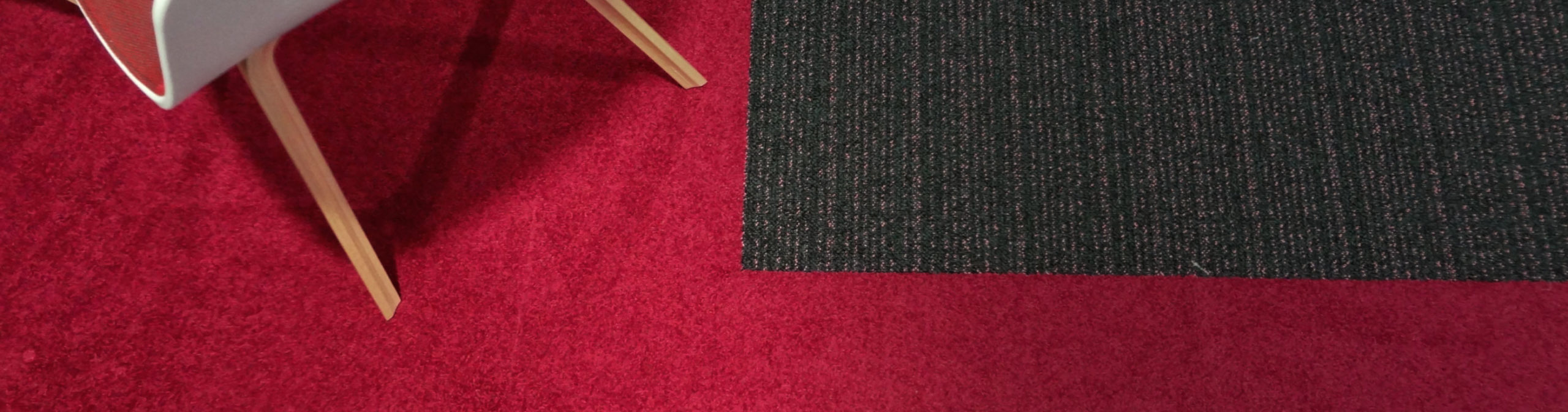
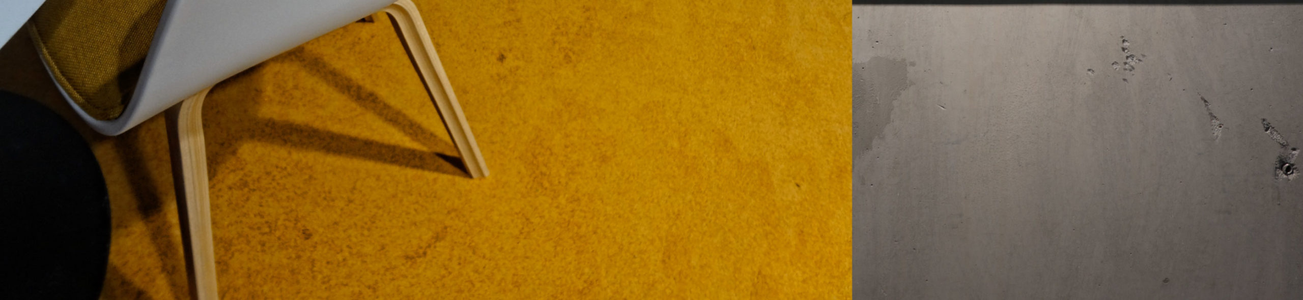
A graduated colour scheme was implemented from East to West, ensuring that if the member was visually impaired (or simply in a rush), they could navigate by colour zone as well as by number. Each area was matched to a colour using the subliminal psychology associated with that tone, which also created a location-specific palette for all furnishings.
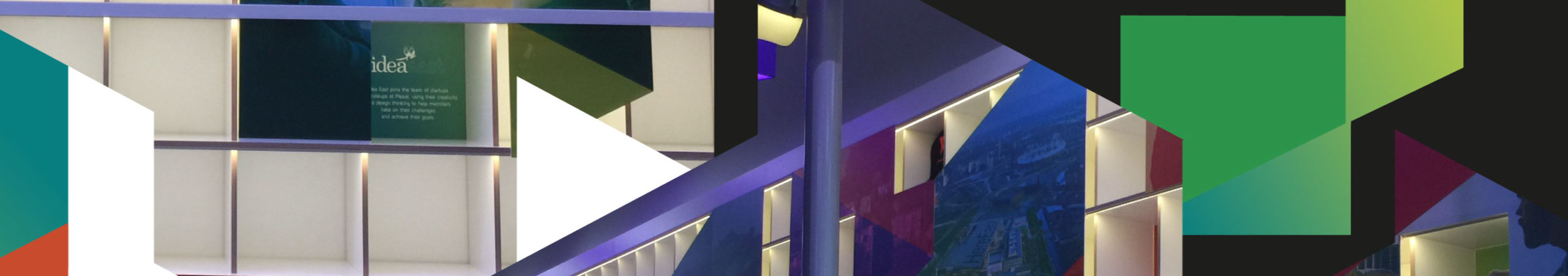
Interior design
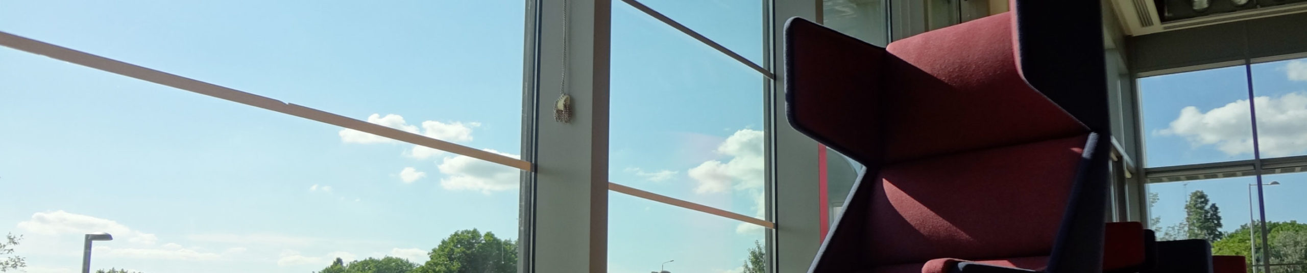
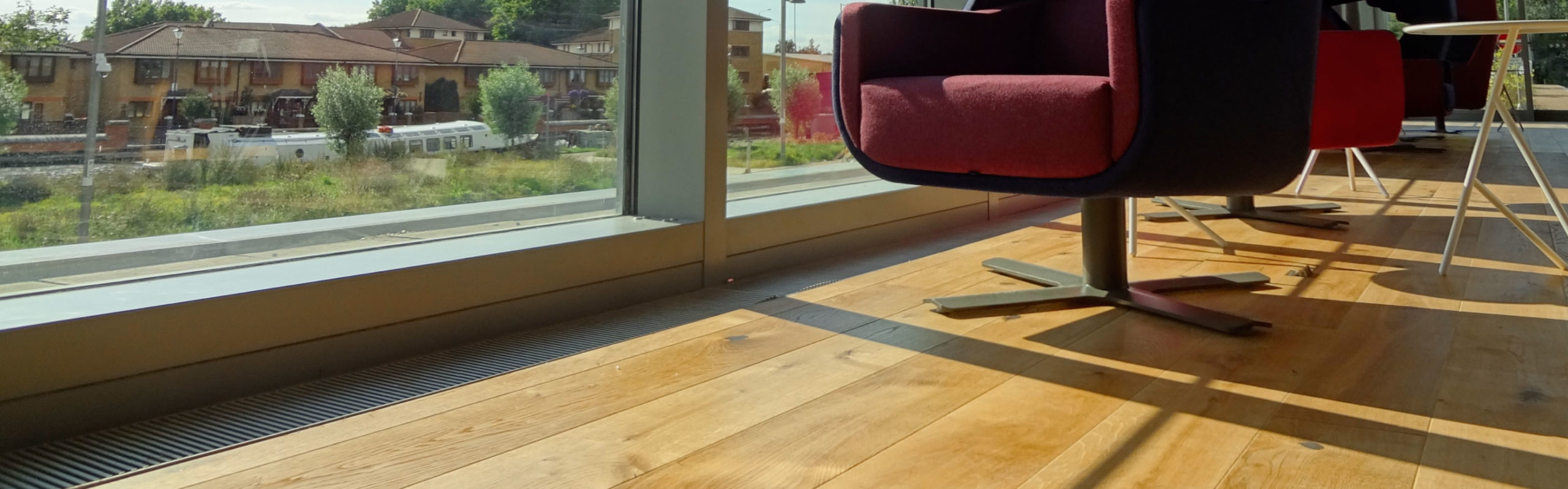
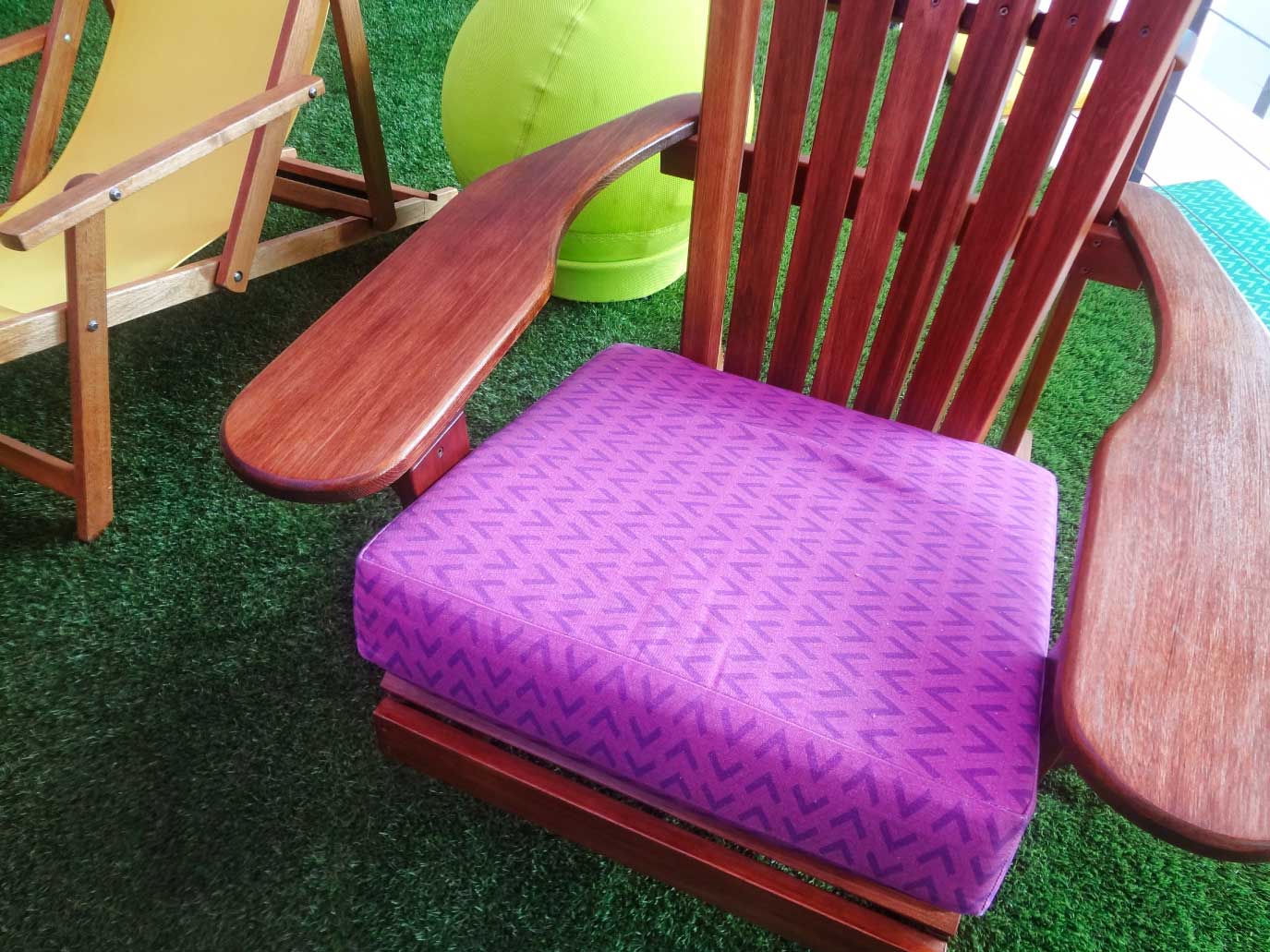
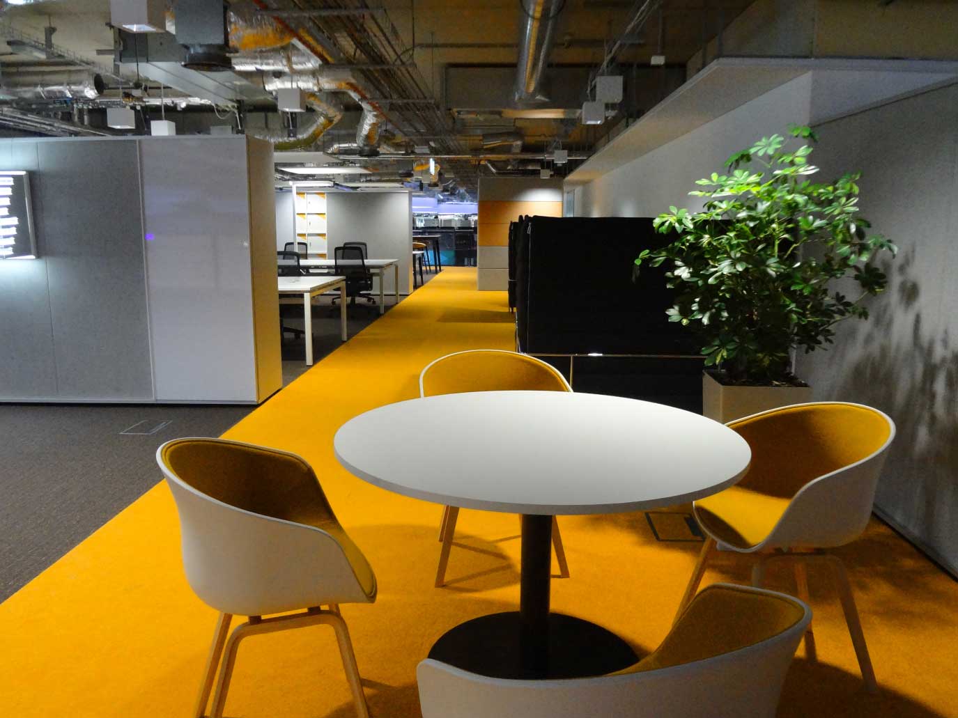
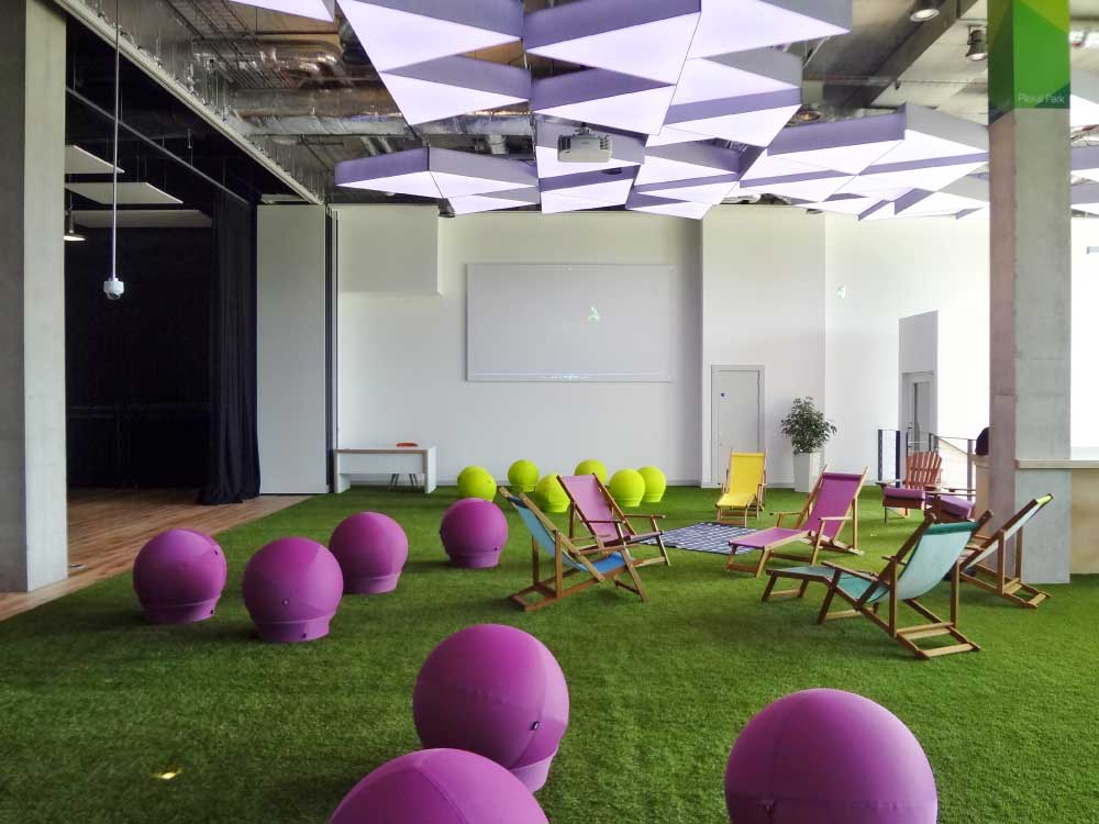
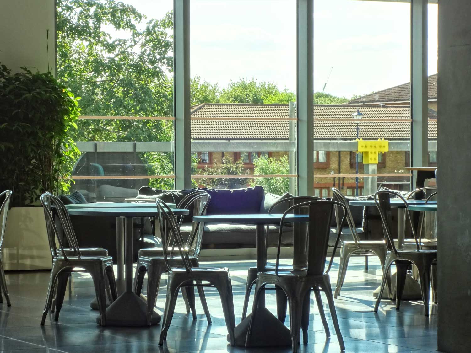
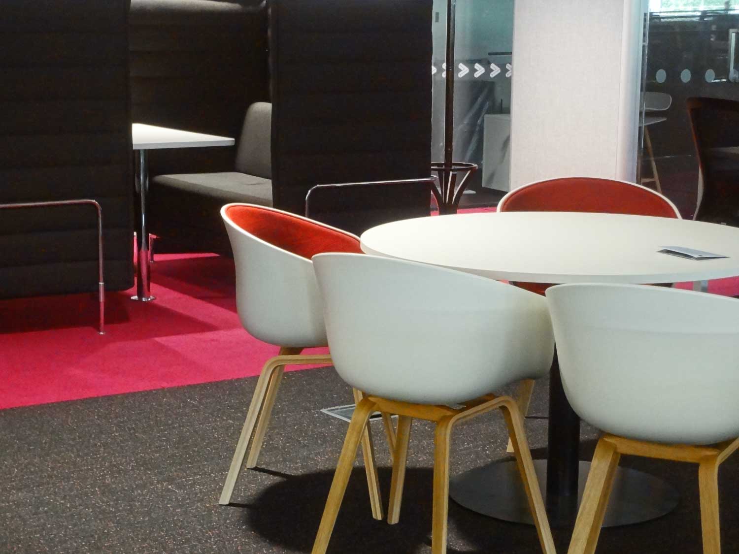
With the majority of the budget being allocated to furnishings, priorities had to be made. The first was comfort and wellbeing, with the finest desks and chairs being selected. Second was the ability to work in comfort, achieved by creating a range of quiet, collaborative meeting and focus spaces.
The physical material properties of each piece of furniture was considered from a service design perspective. In busier workspaces, noise-absorbing chairs were used to create privacy; in communal areas, we opted for swivel chairs to encourage serendipitous encounters and new conversations which might lead to future collaboration.
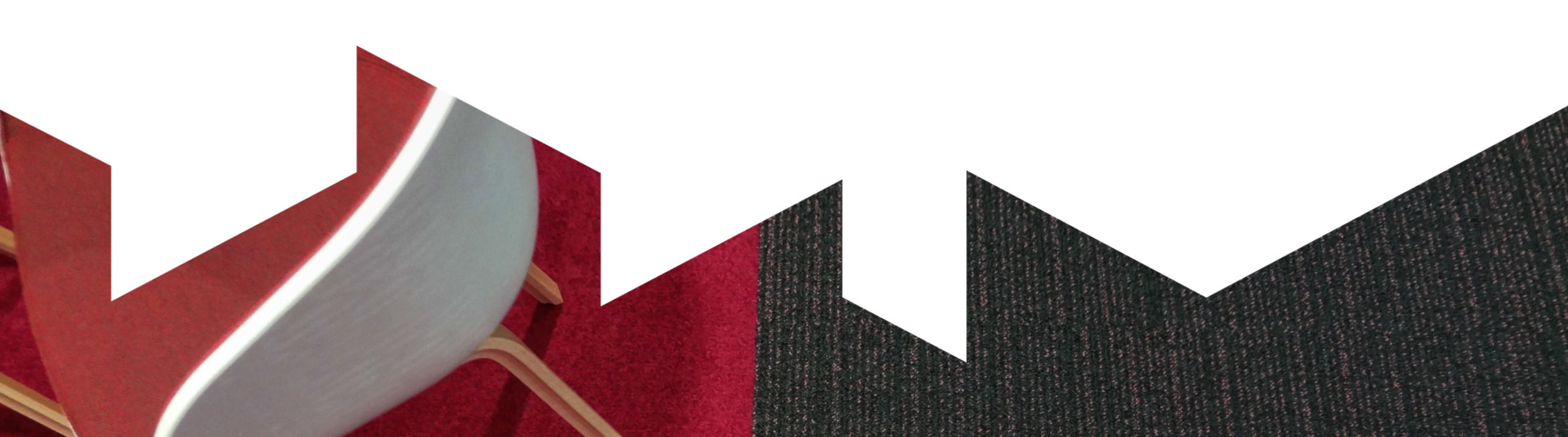
Even the carpets were used to denote area type, which areas were publicly accessible or private, and the locations of emergency exits.
Signage
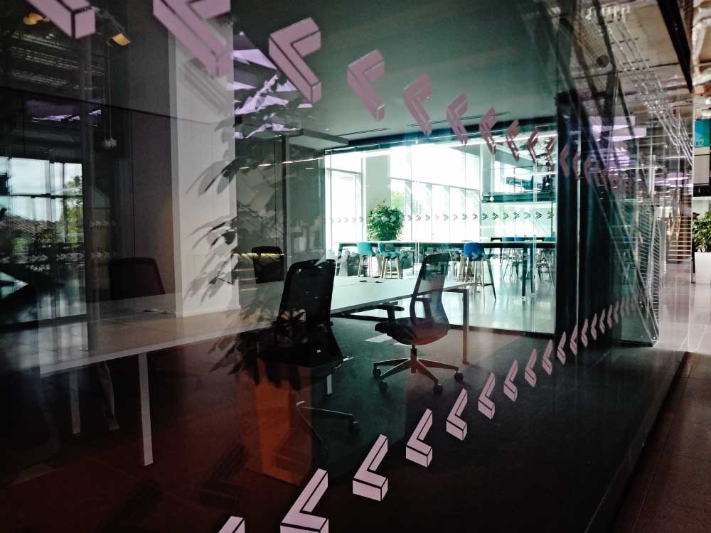
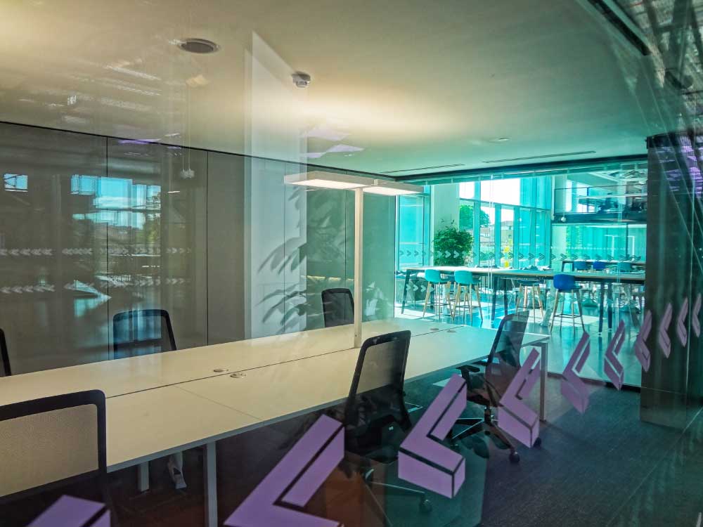
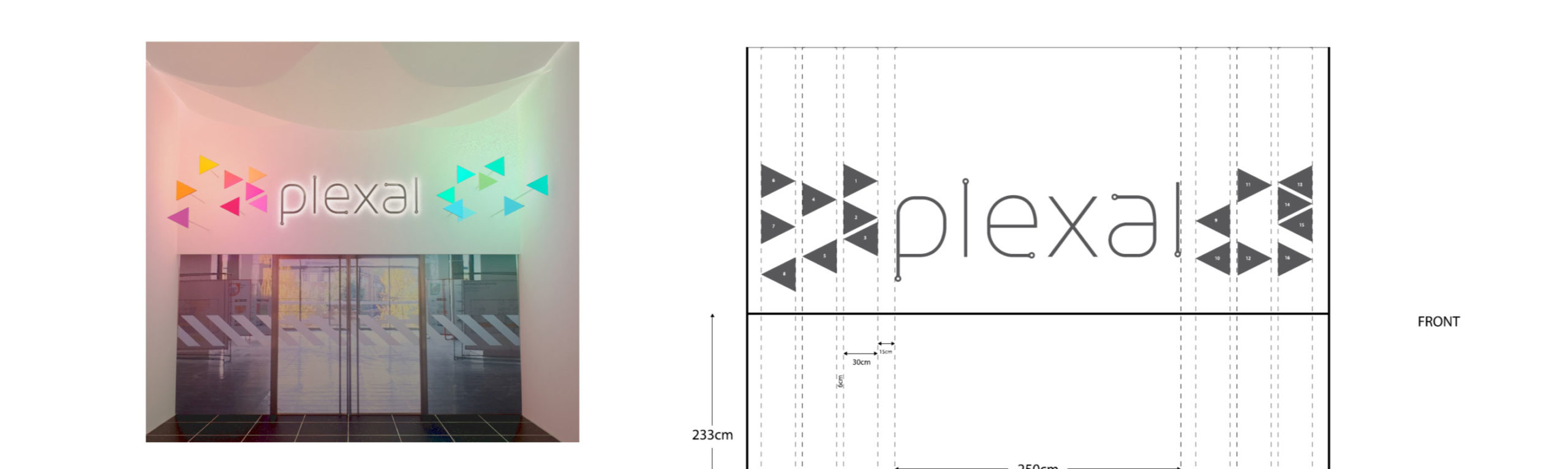
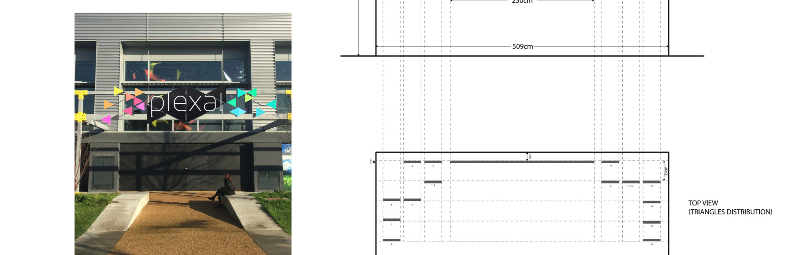
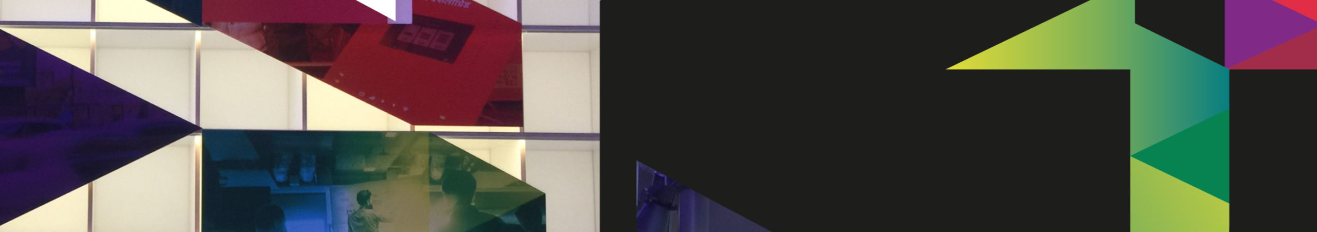
One detail of the brand was the fact that it was made up of individual entrepreneurs, small teams, and larger companies. This design language allowed us to use individual pixel assets to communicate what was happening, and what we wanted to happen, inside various spaces.
This started on the outside, with the pixels approaching the entrances individually, drawing together and ultimately connecting the closer they got to the ecosystem. Once inside, this design language extended to the unique lighting system, which splintered off down the central ‘high street’ reflecting the individual companies along the street, before combining in areas where the community beneath would come together.
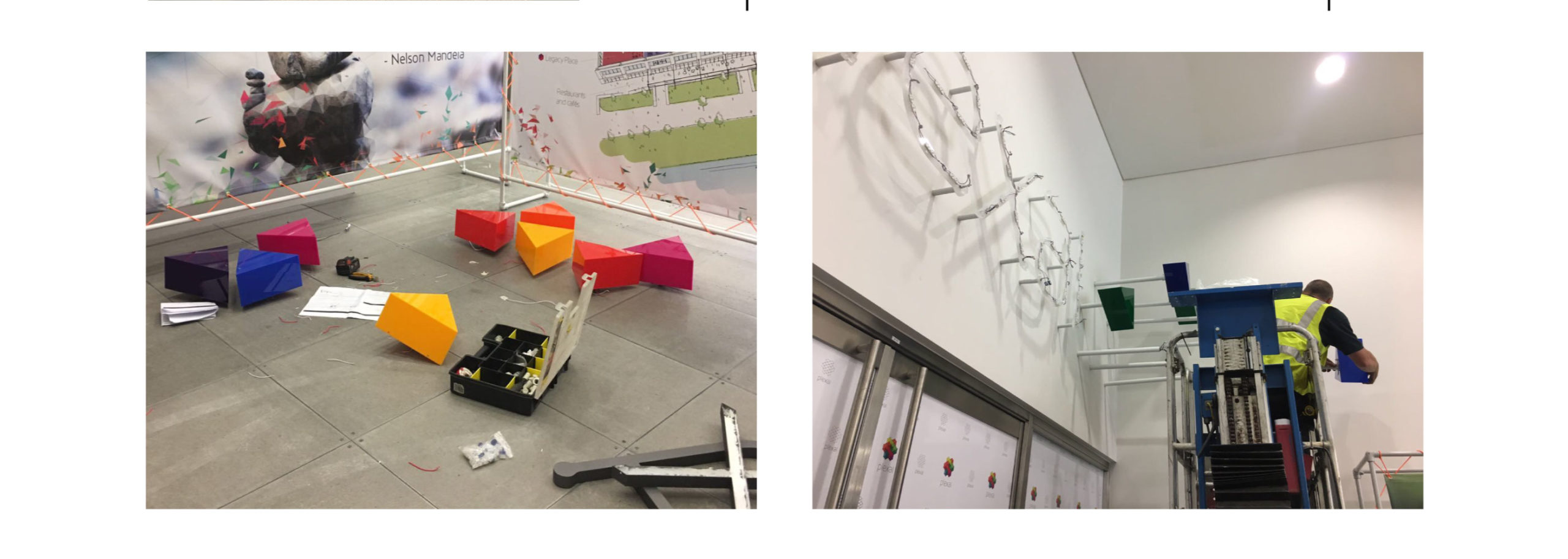
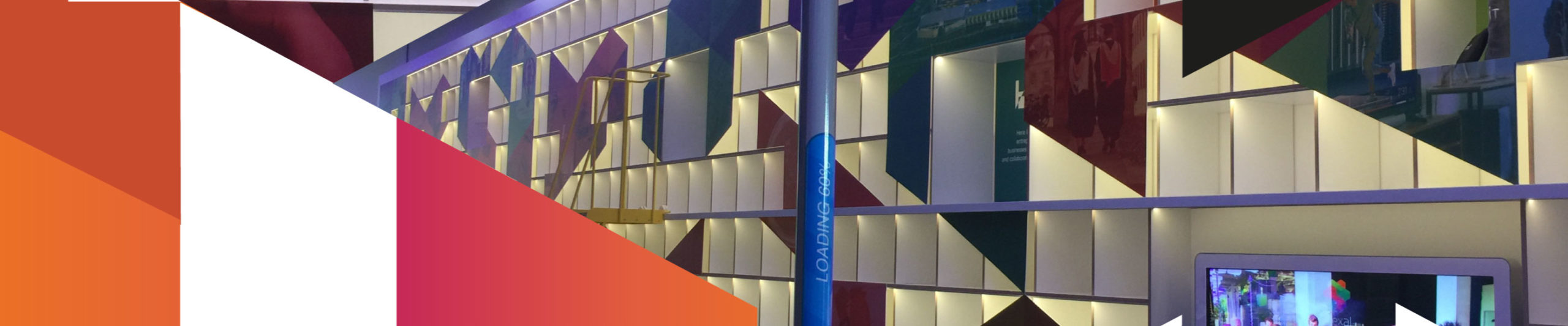
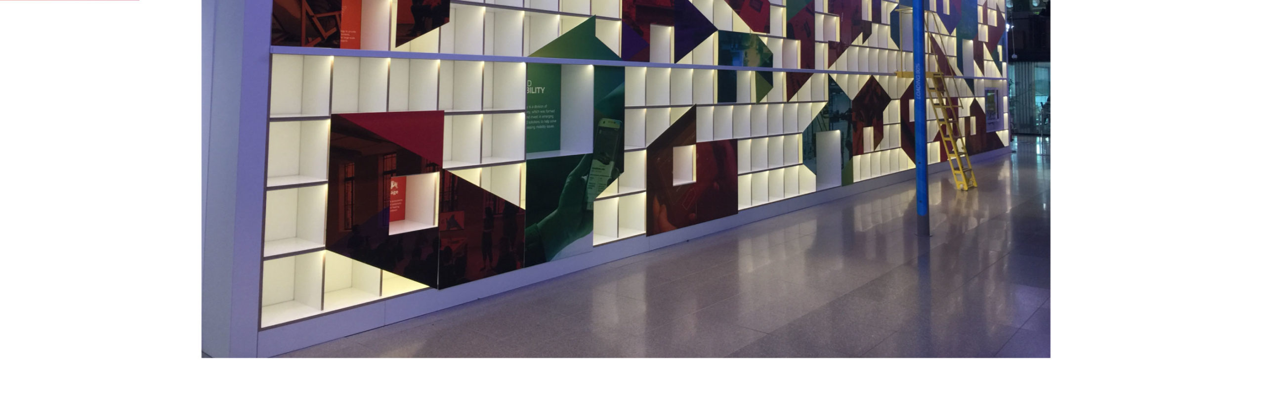
The wall of innovation
The ‘Wall of Innovation’ (originally the ‘Wall of Inspiration’) not only featured a range of the most innovative members, past and present, but also figures in the wider campus community, highlighting how they were innovating and most importantly the reason why.
In each box, members were asked to place an item representing something that inspired them on their startup journey, as well as an accompanying backstory, to foster deeper connection and to inspire one another in the process.
Challenge us.
Do you have an impossible naming challenge? A brand to create? A space to design? A story to be told? We’re Outfly, a design innovation agency built for disruptive startups, innovators and game changers.
Challenge us at hello@outfly.io