The Challenge
Eyrus had a problem. Their industry defining worker visibility software was getting dropped from construction sites and they didn’t know why. Through our initial workshops we worked out the reason. They had two completely different audiences: work teams and project owners.
The Solution: Brand
Clarifying the Message
Eyrus’ two audiences needed two clear, distinct messages, but before we got to that we had to fix the foundations of the parent brand.
The concept was strong, but the execution was missing some contrast and refinement. A more vibrant palette was established to serve as the basis for the entire brand and sub-brands to come.
i. Previous identity
ii. New identity

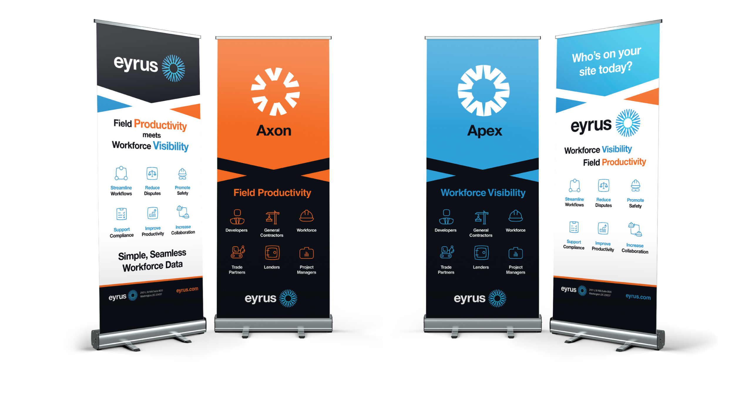
The Sub Brands
Initial Concepts
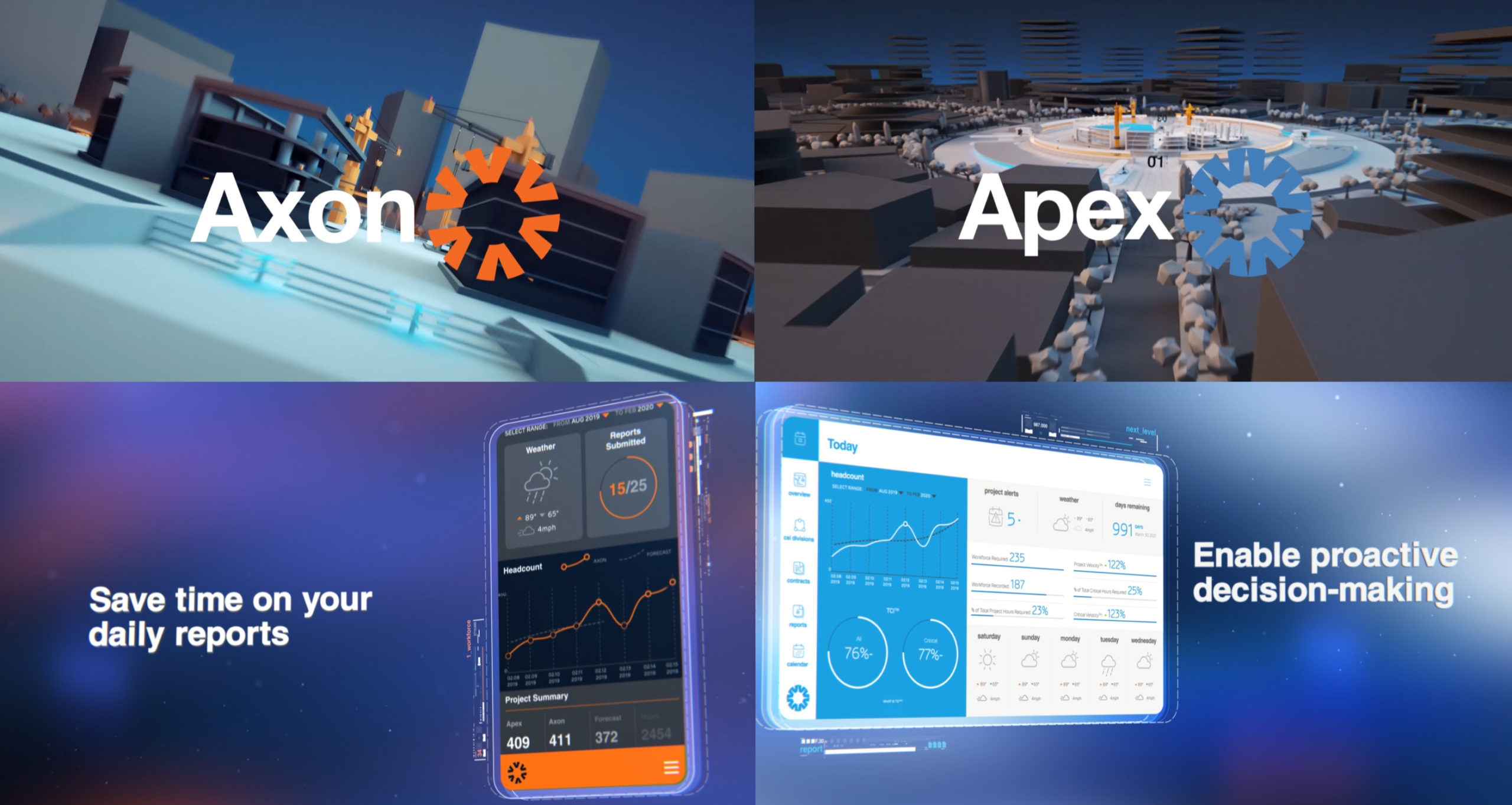
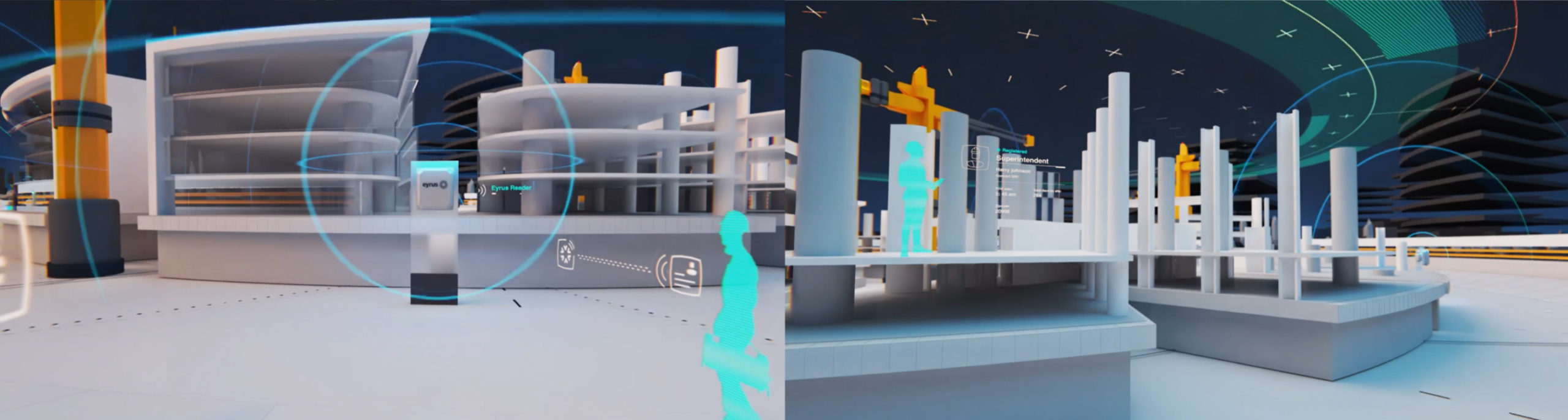
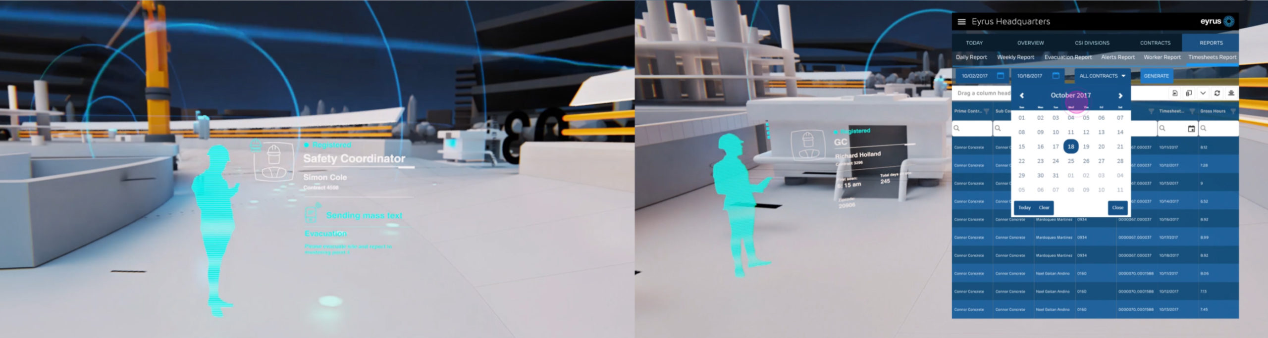
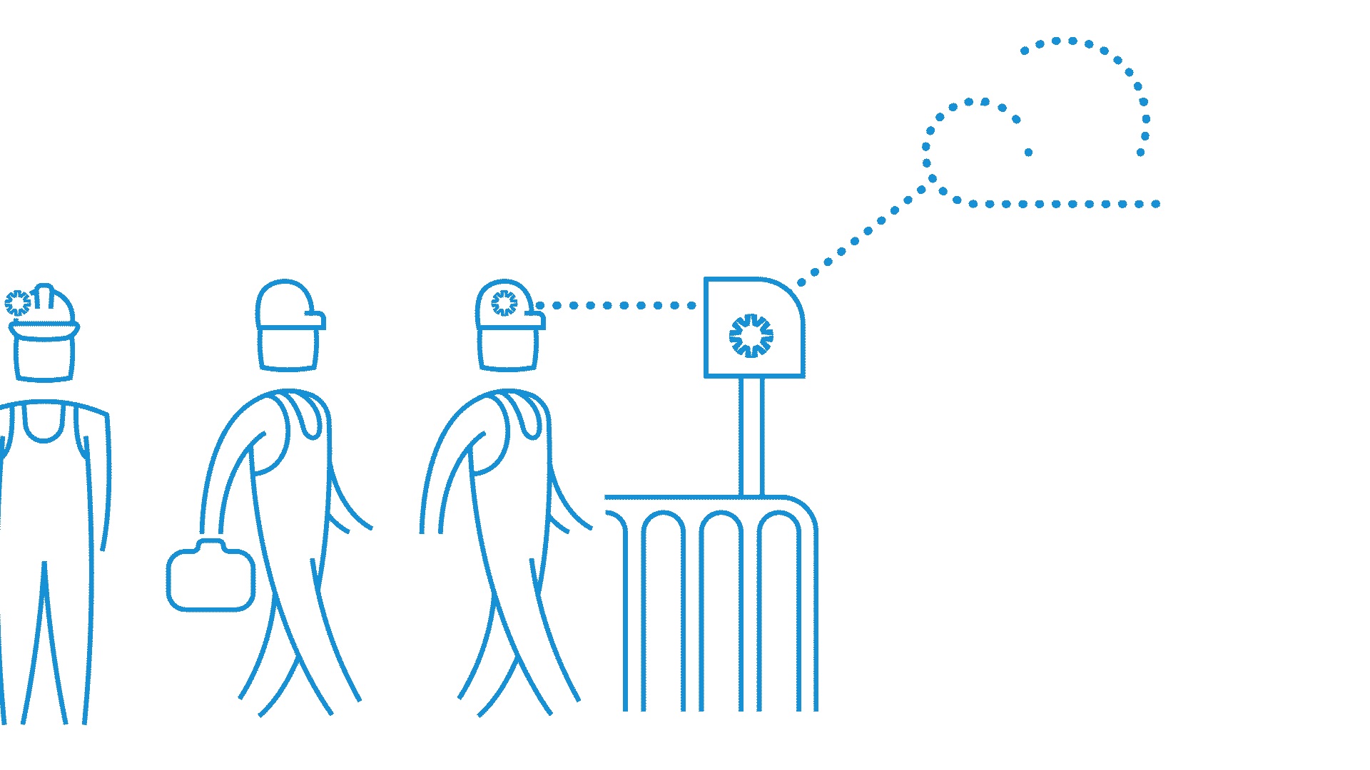
Eyrus’ flagship product gave project owners and managers visibility over their workforce, giving them insight into who’s onsite, where they are, and for how long, improving productivity and safety. Their second product gave teams the ability to record hours worked, submit logs, notes and safety violations.
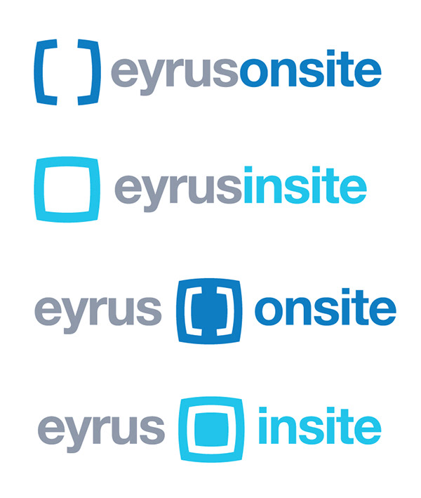
We began looking at the idea of splitting the product family along these ‘insite’ and ‘onsite’ lines, but found something much better.
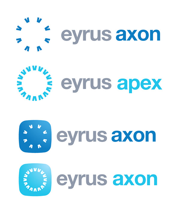
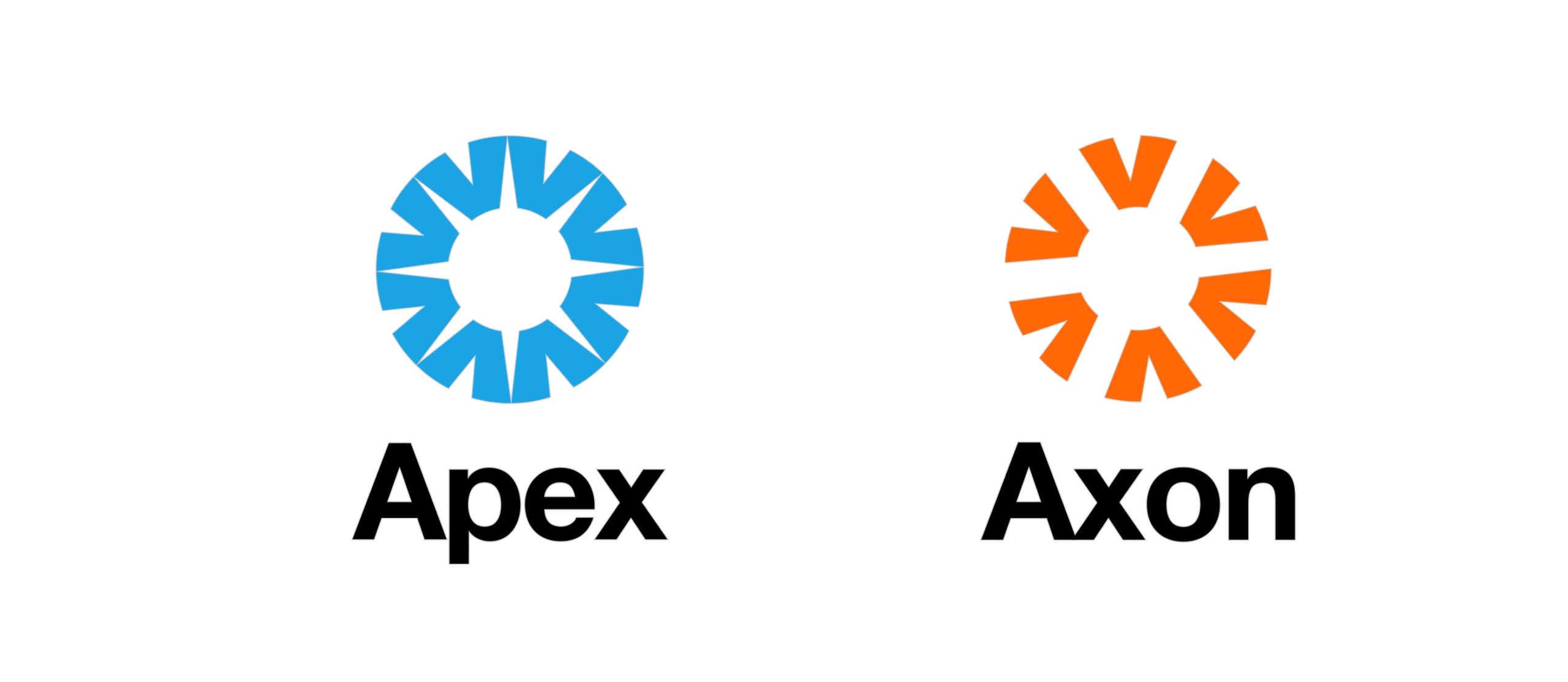
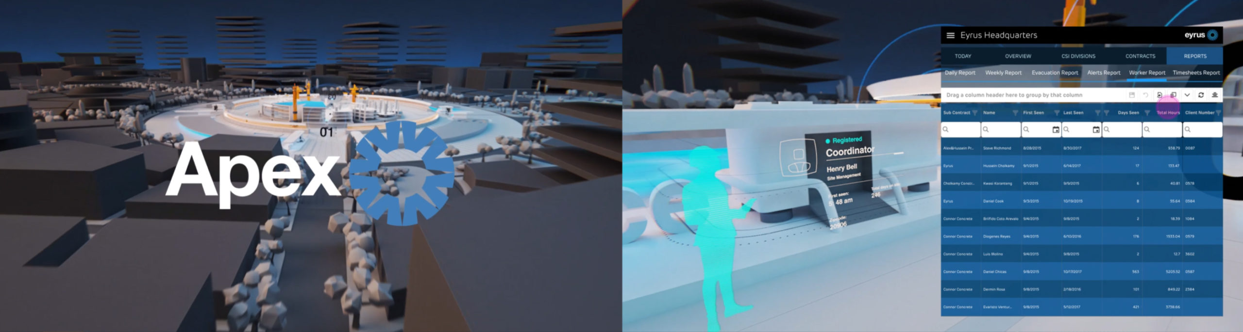
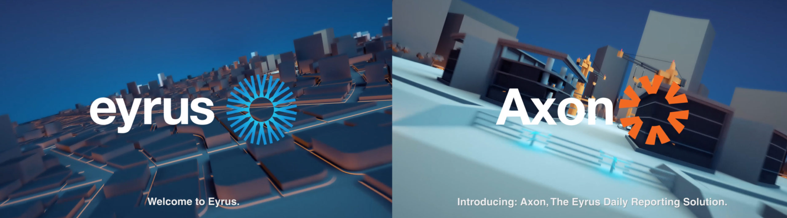
The words needed to be unique, ownable and masculine. They needed to speak to each other while being strong enough to stand on their own, we found them. An axon is a nerve that transmits information from the body back to the brain, while the apex of any landscape gives you the best visibility and a top-down view. Both words were strong, trademarkable and phonetically related, we had our sub-brands.
Distinction
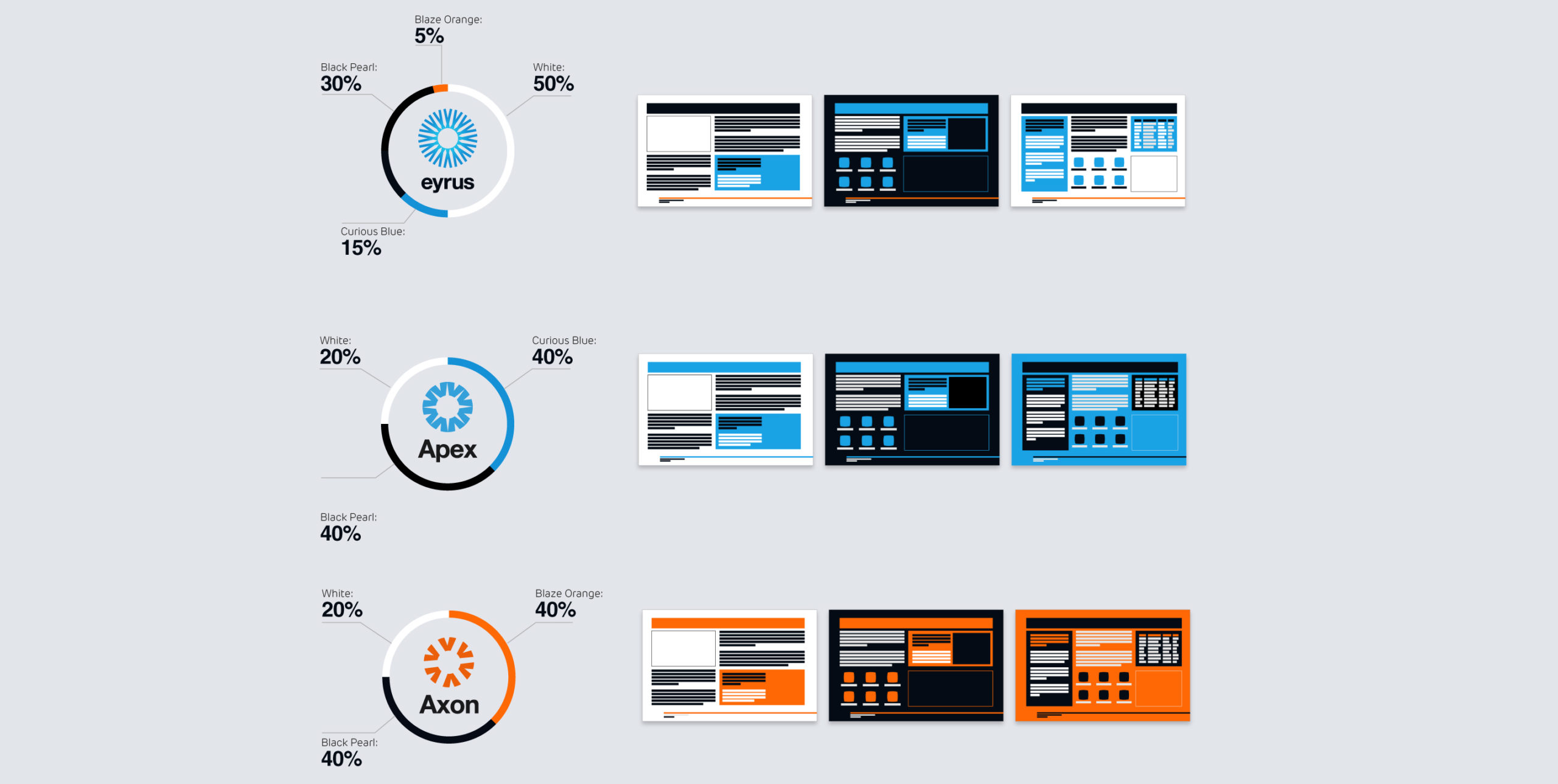
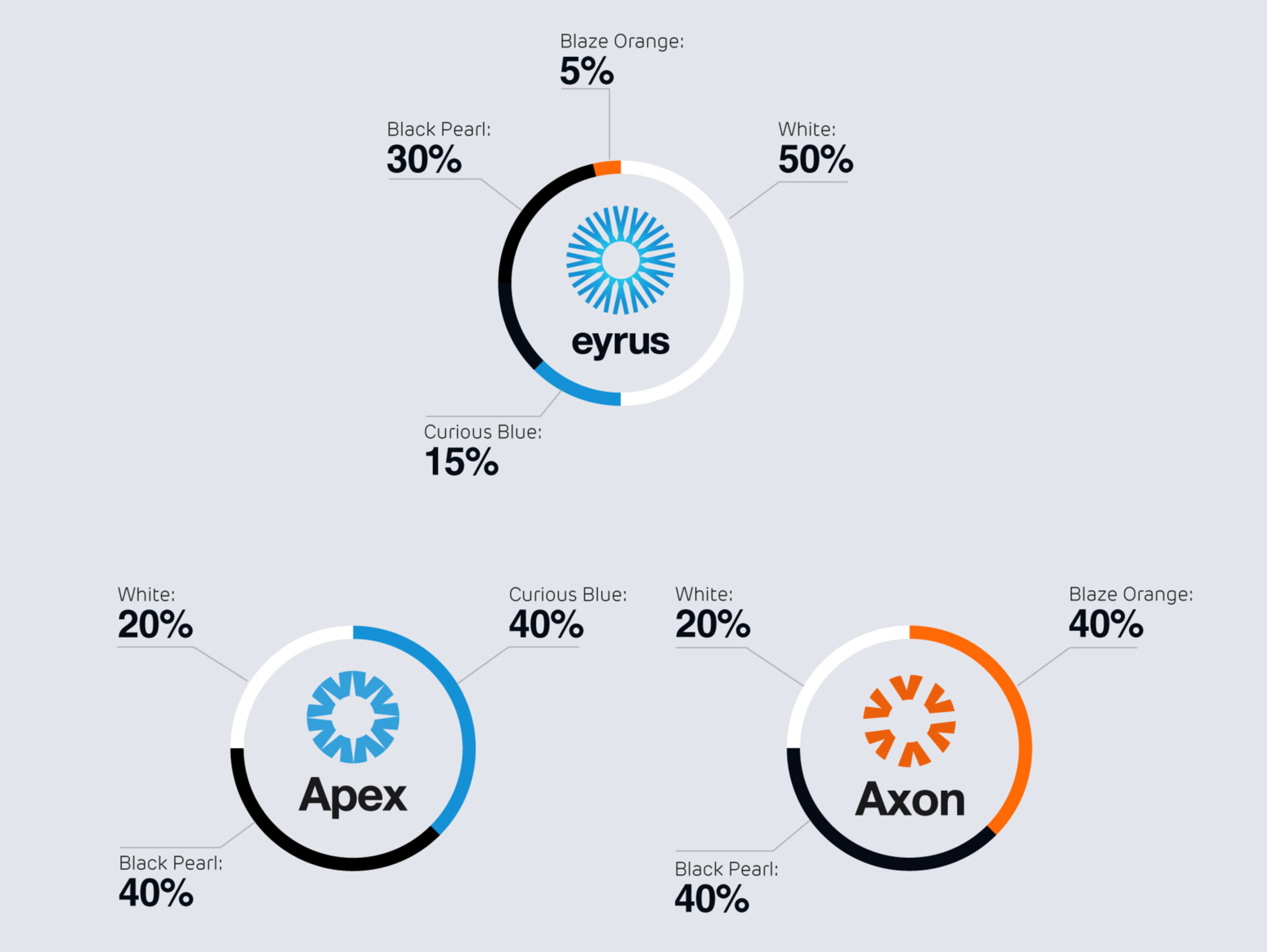
The brands needed to serve different purposes. Apex needed to appeal to corporate clients, investors and partners, while Axon needed to speak to the teams on the ground. By tying both icons back to the original Eyrus logo, we were able to use colour to differentiate and define these areas.
Apex became a subtle, light blend of blues and whites, while Axon blends in with the worksite environment, in a classic (but complimentary) orange and black.


Motion Graphics
This is easily our favourite bit. Sorry all other bits.
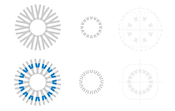
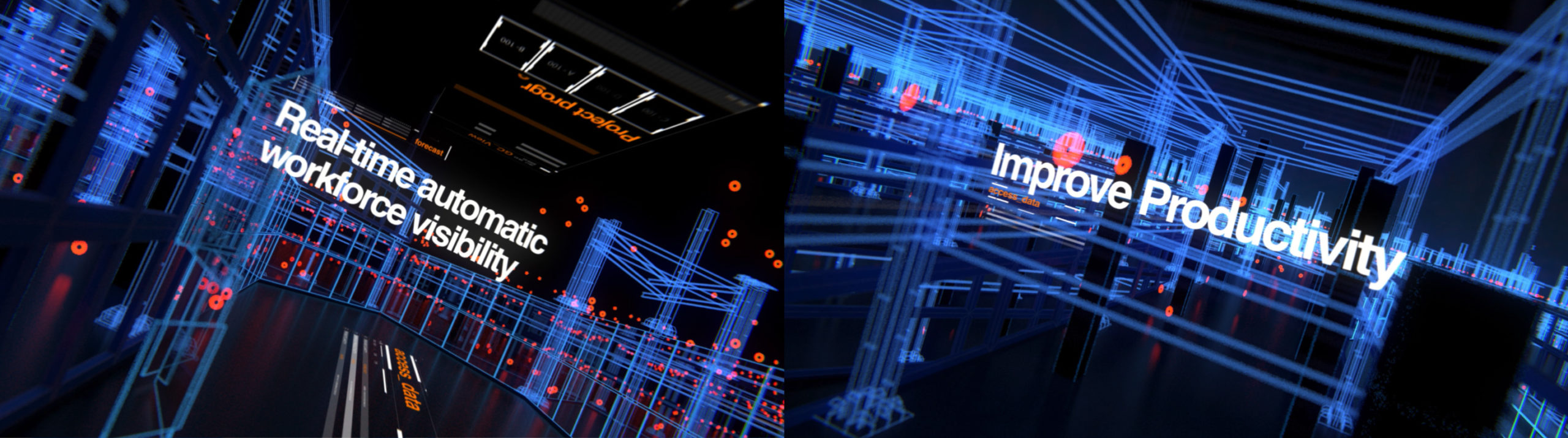
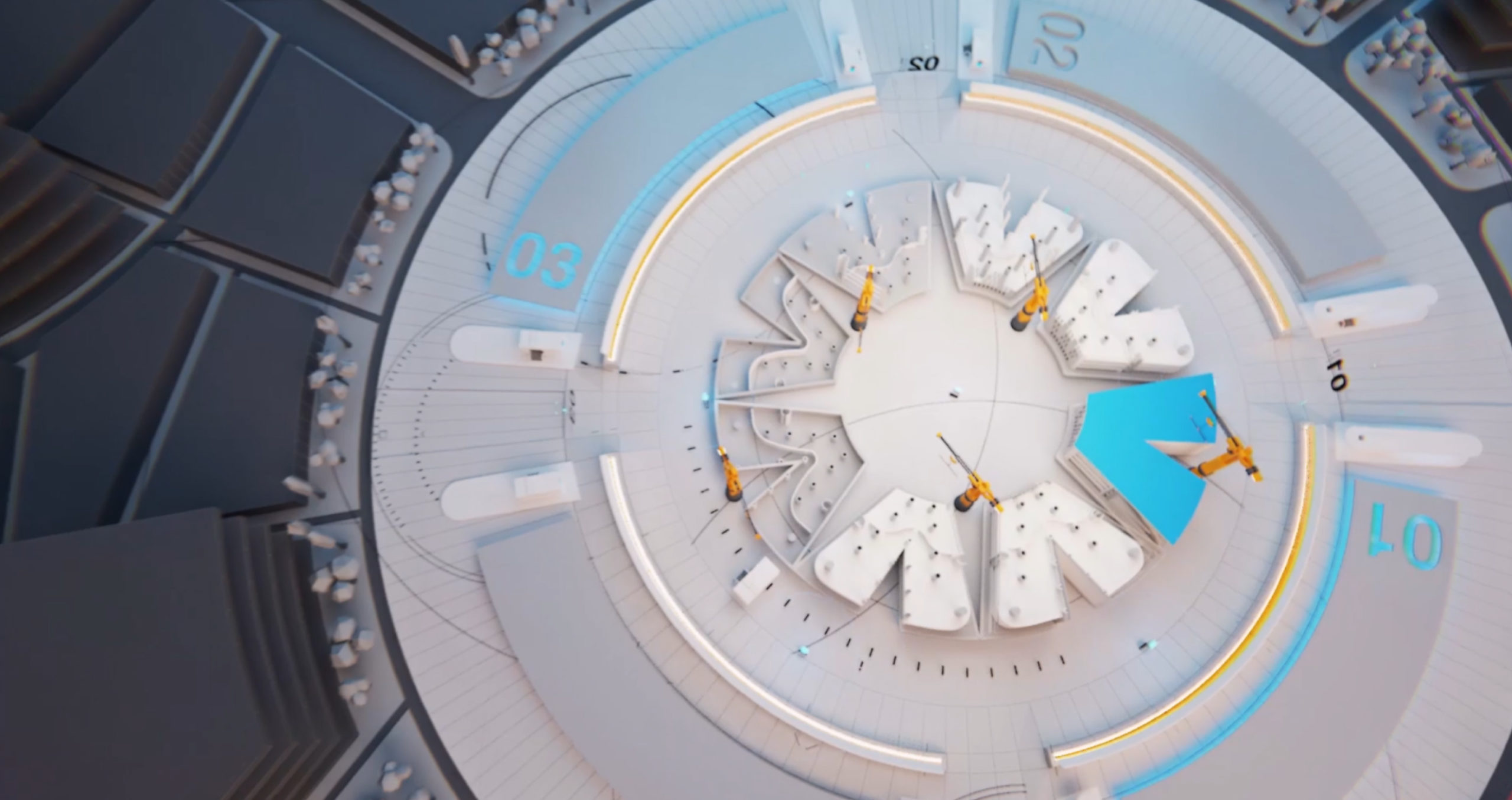
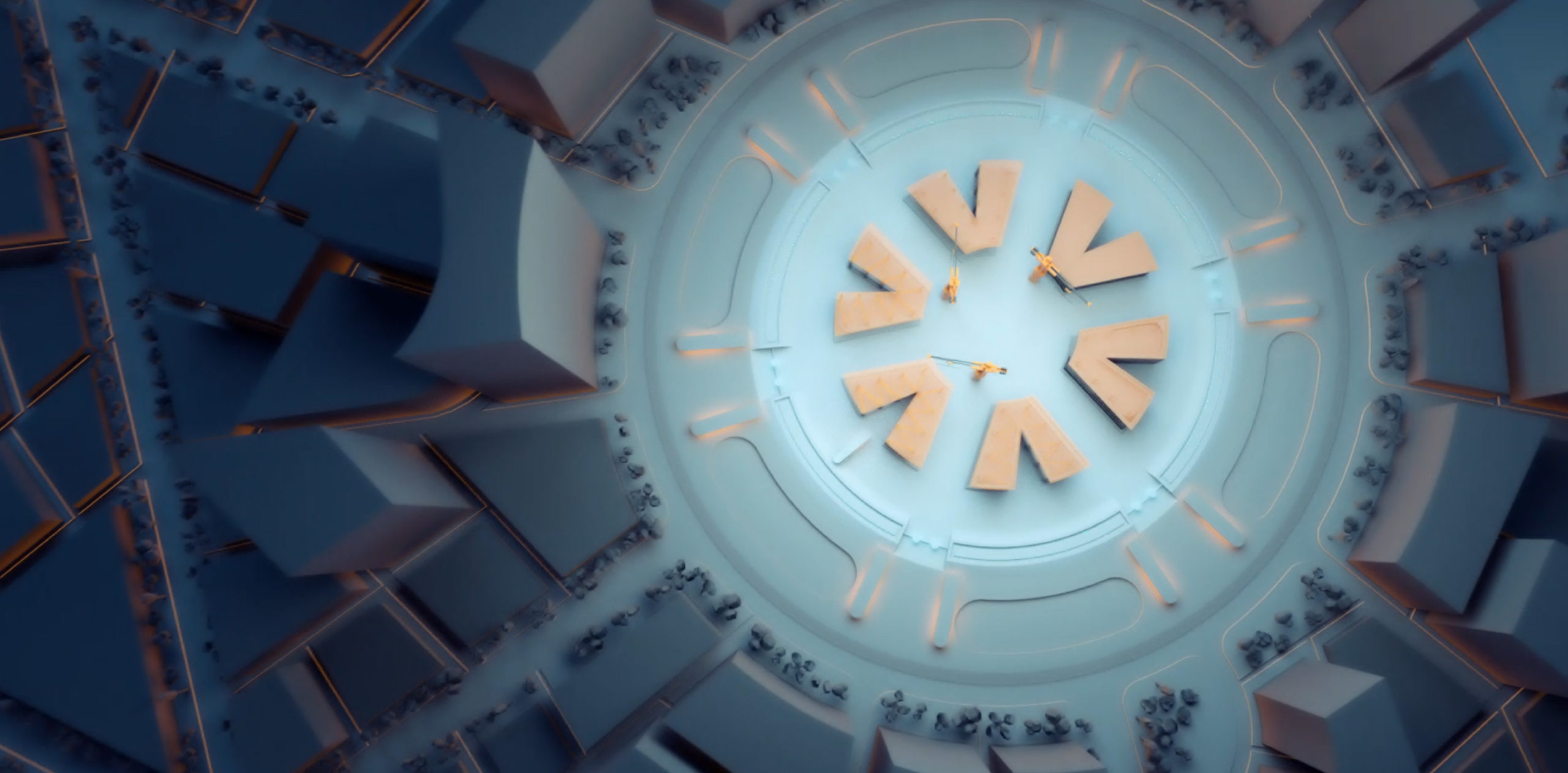
This is where the brand comes to life, and what a brand to work with. The Eyrus parent brand gave us an idea the first time we saw it. What if that ring wasn’t just an eye, but was also a construction site? As you fly through the world not only are you learning how to use Eyrus, but you’re seeing its use help in the construction of the logo itself.
We carried this concept through explainer videos, adverts and sub brands. We think it looks awesome.

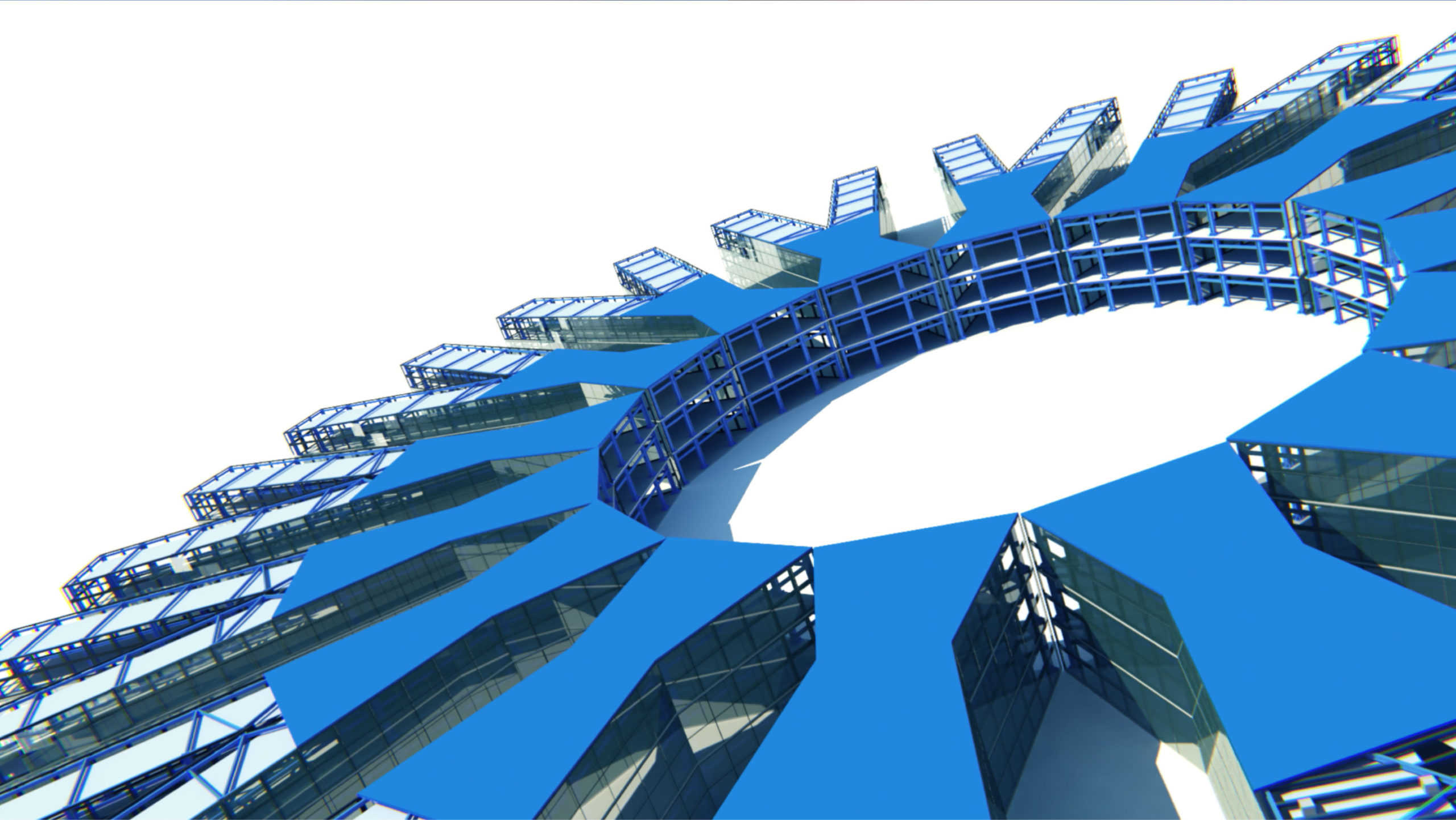
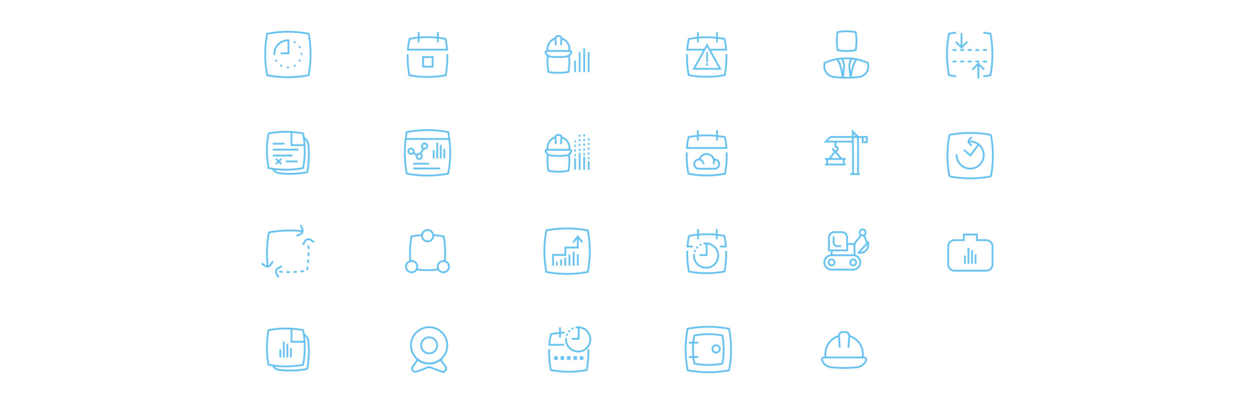
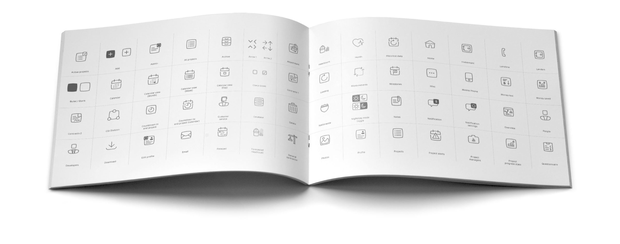
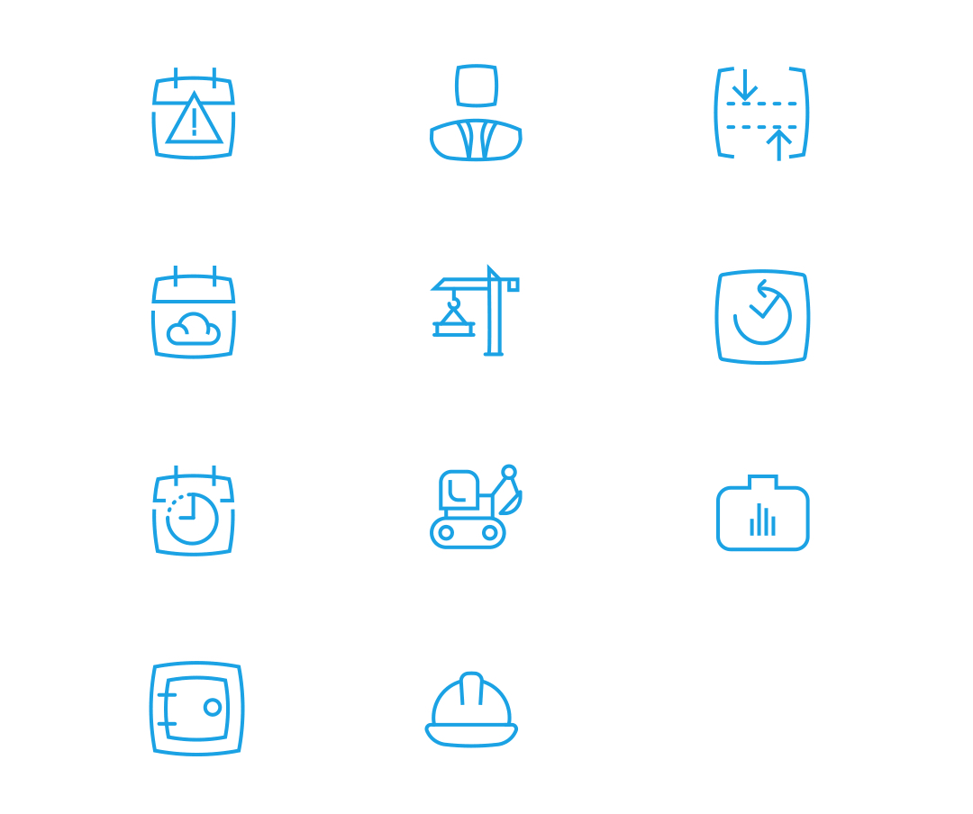
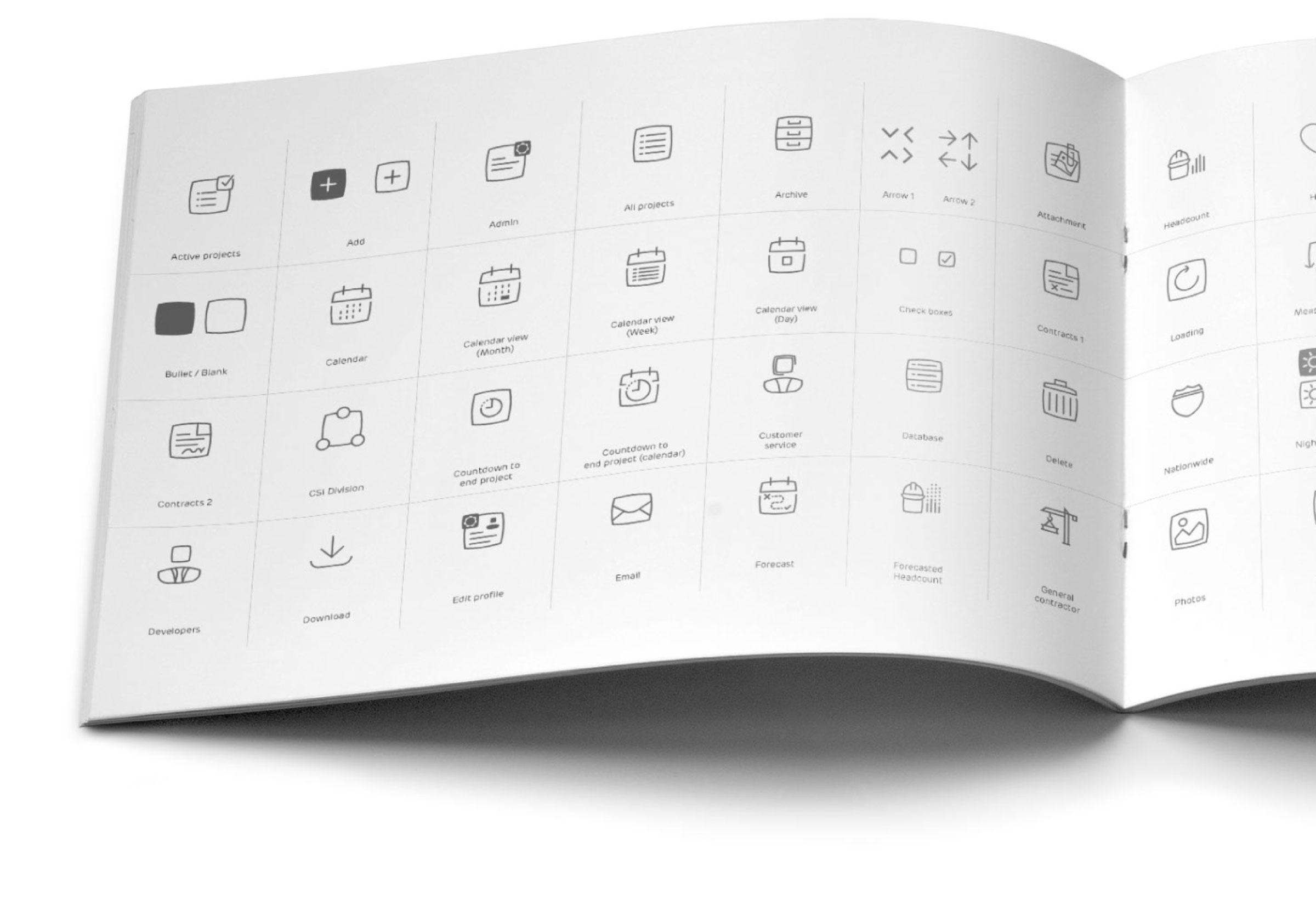
Iconography
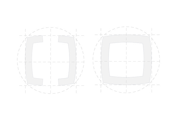
By this point we were really proud of what we’d made, so we went a step further, and created an entire bespoke icon set with rules for the creation of new asset, keeping the family strong, ‘soft-sharp’ and crucially – on brand.
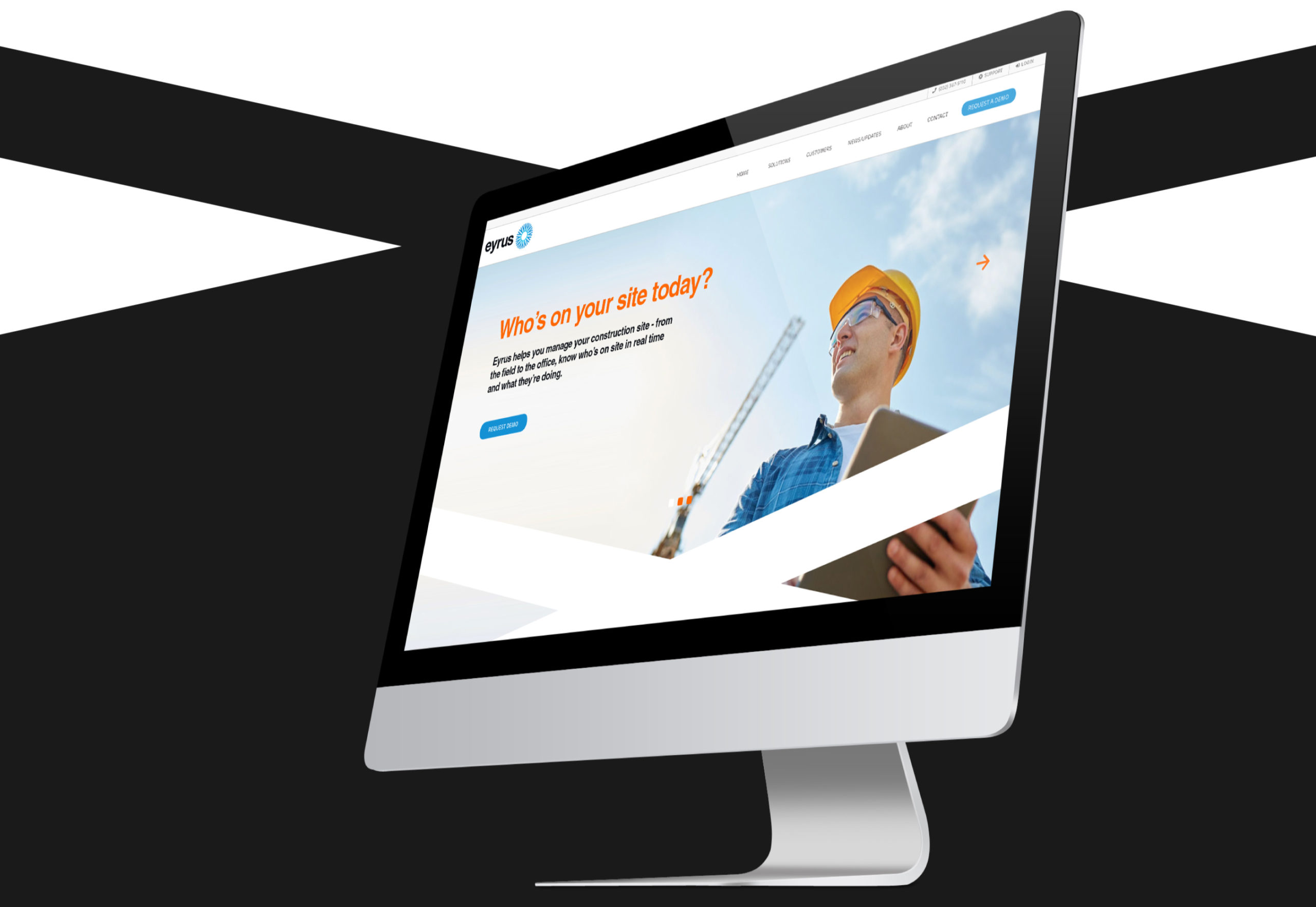
Website
Your website is usually the way your customers first interact with your brand, so it has to set the standard. With Eyrus, we had the added challenge of ensuring that people who searched Axon had an experienced tailored for them, and vice versa. Of course, the two sub brands had to sit together perfectly on the Eyrus homepage.
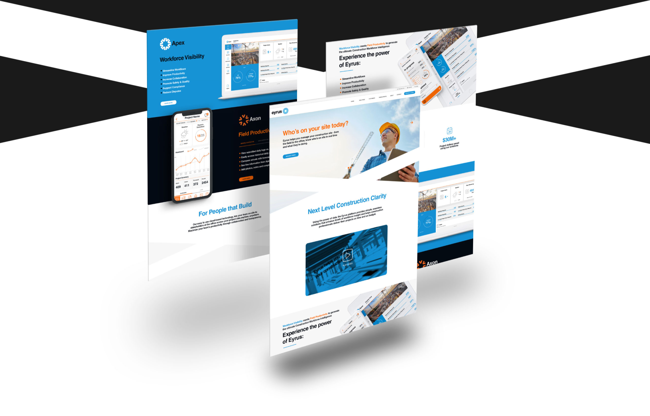
The Apps
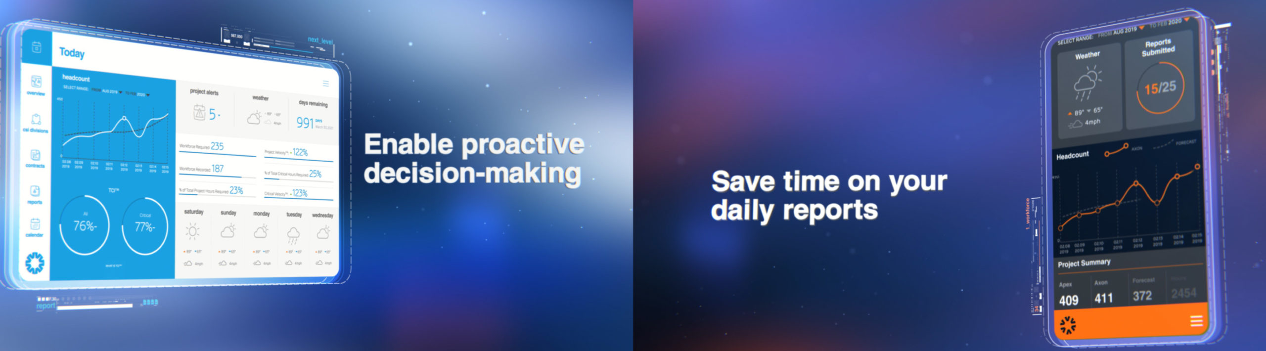
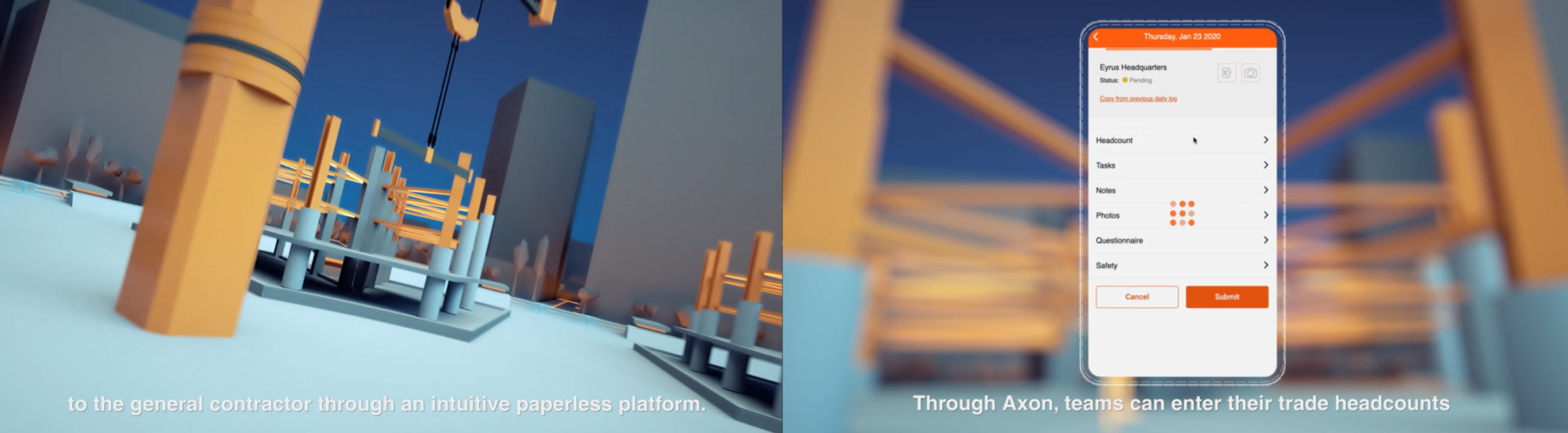
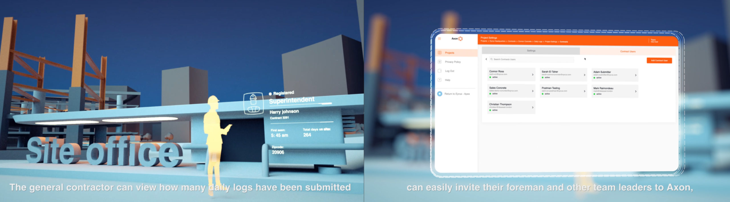
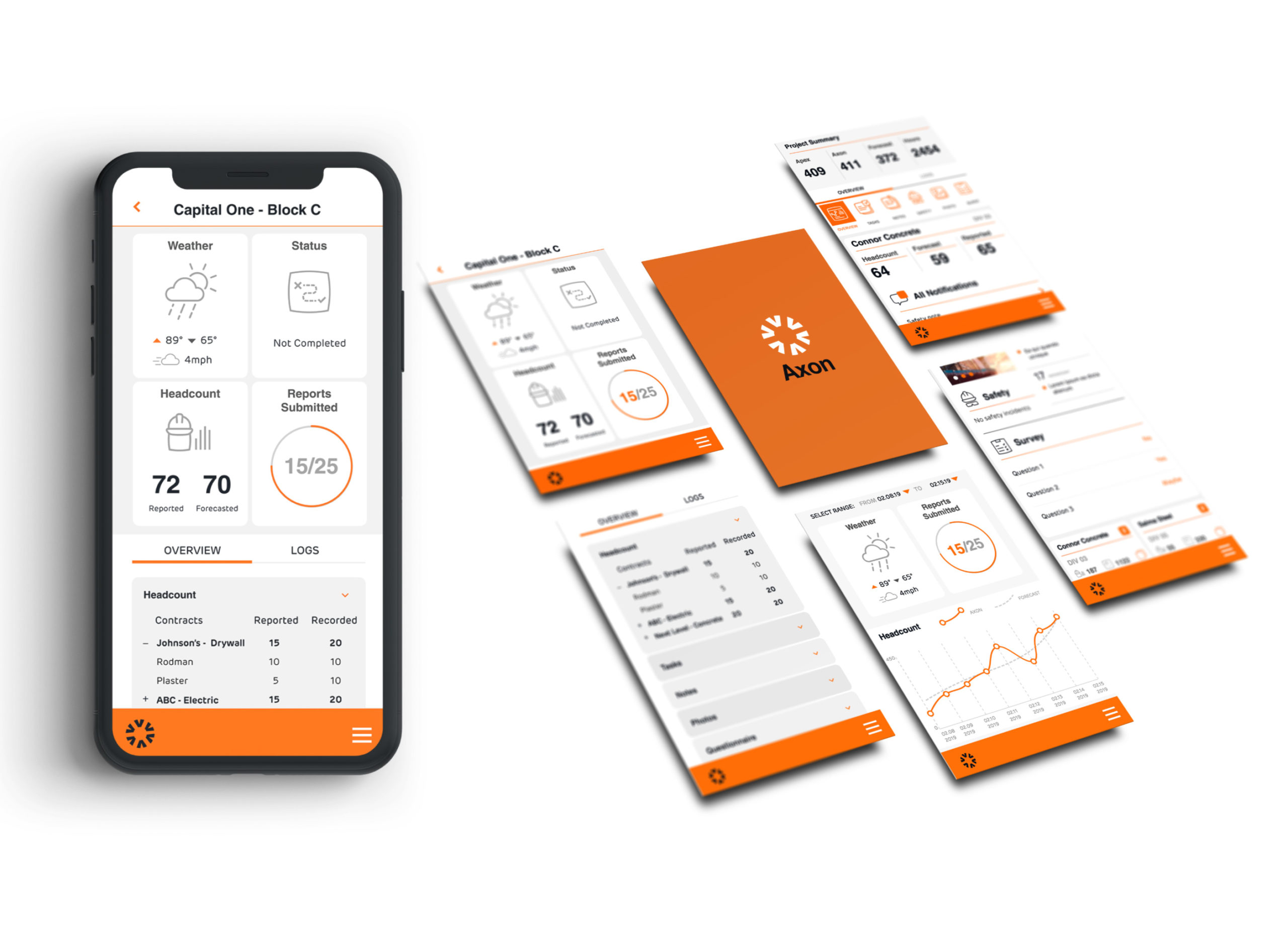
Streamlined Field Productivity
Axon helps streamline cross-team collaboration and improves productivity within a centralized platform. The UI of this app had to be clear and functional, while containing all of the building blocks for further UI/UX designs for subsequent digital products.
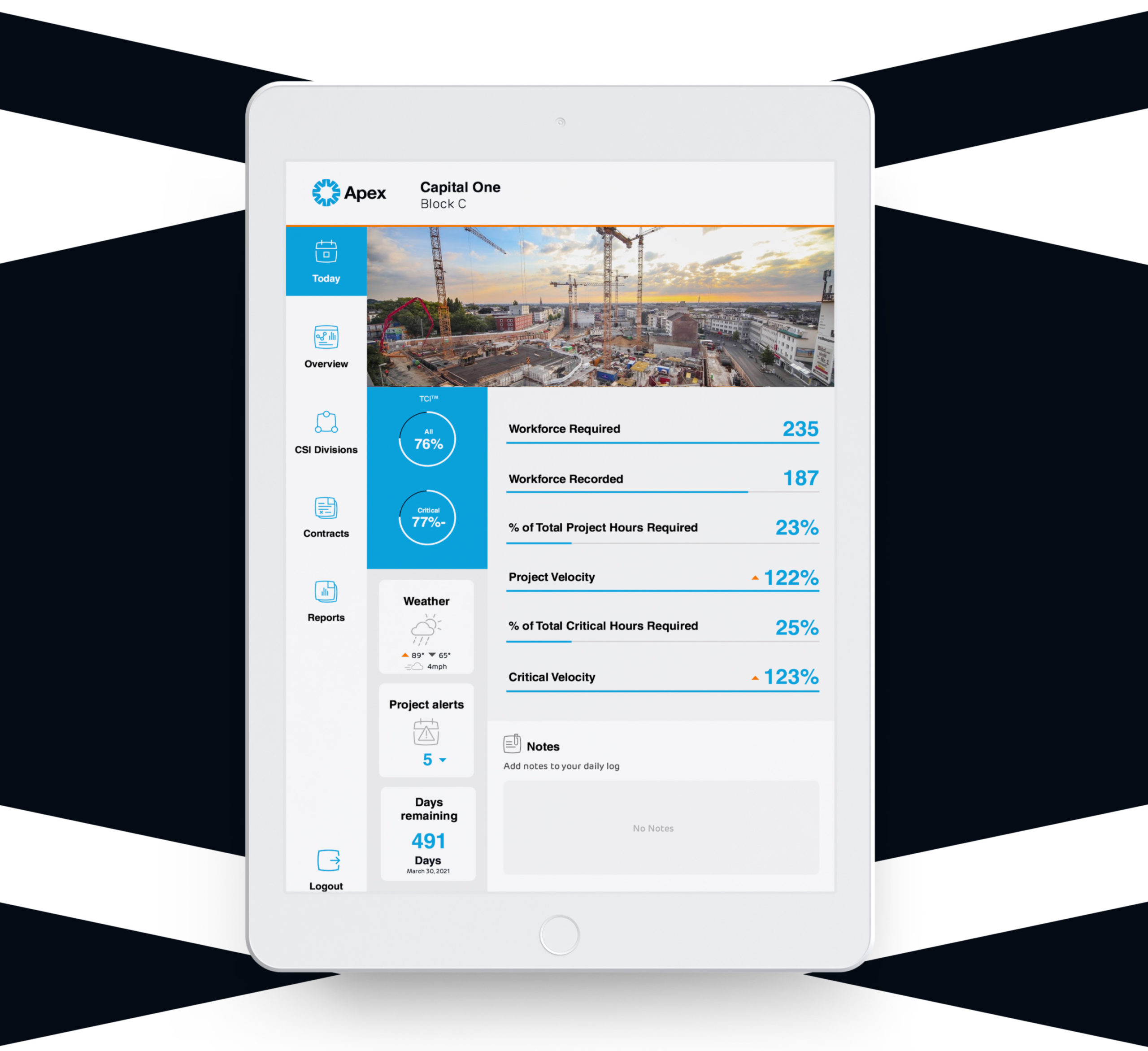
The Apex Dashboard
High Level Workforce Visibility
The Apex dashboard needed to present more complicated information, taking in all the information from the Axon logs and making forecasts and reports out of it, as well as showing site conditions and budget thresholds. We designed the two apps to work independently of one another, but to become super-charged when connected as a part of the full Eyrus ecosystem.
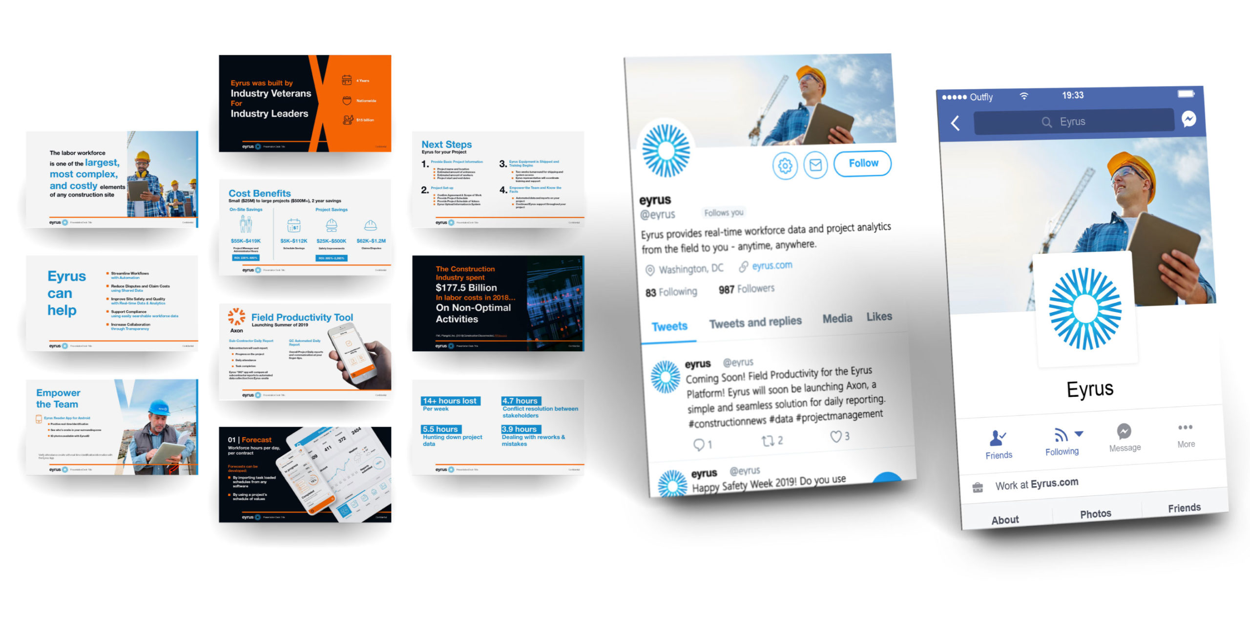
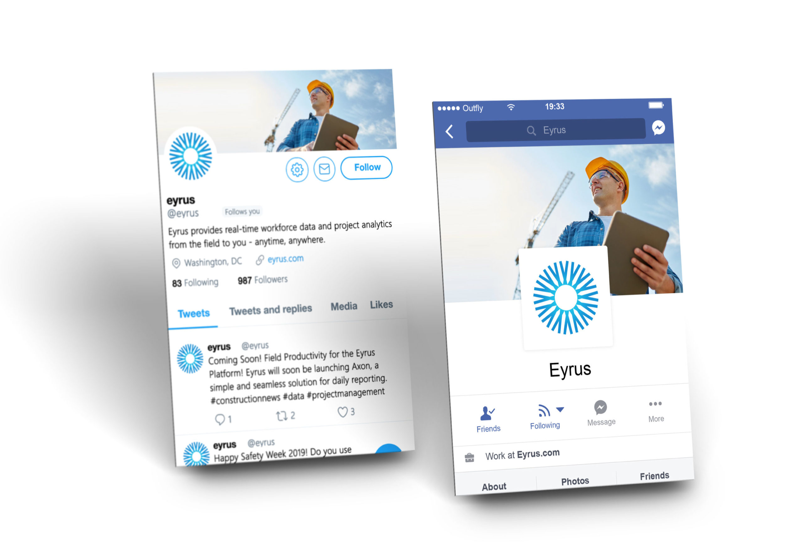
Social Media
Once you’ve got a strong brand, you need a strong social media presence. We built exemplar banners, icons and headers, then gave customisable templates and style guides for photography so that Eyrus would always stay on-brand.
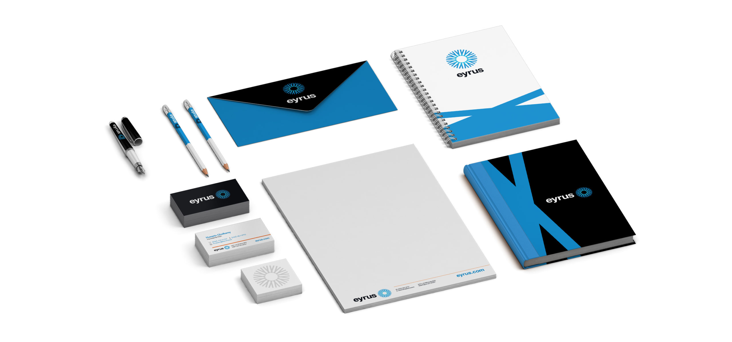
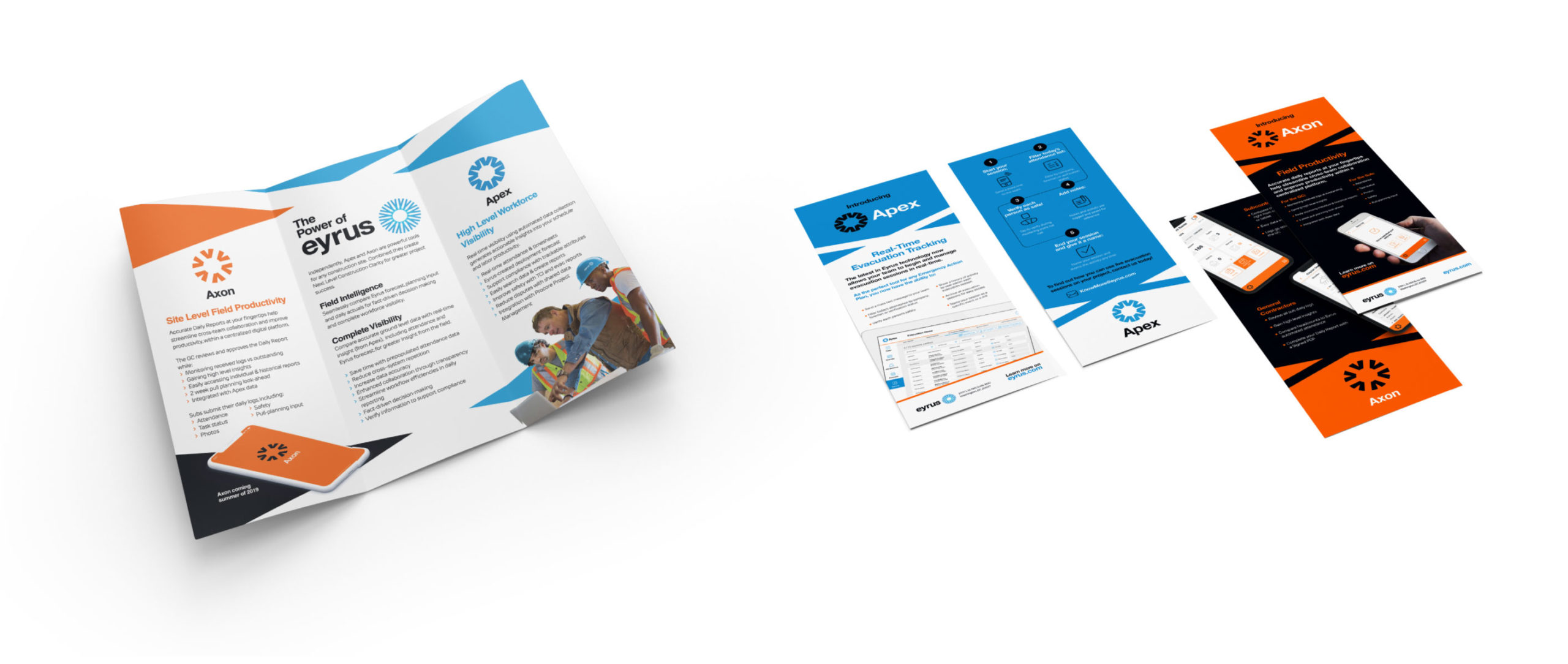
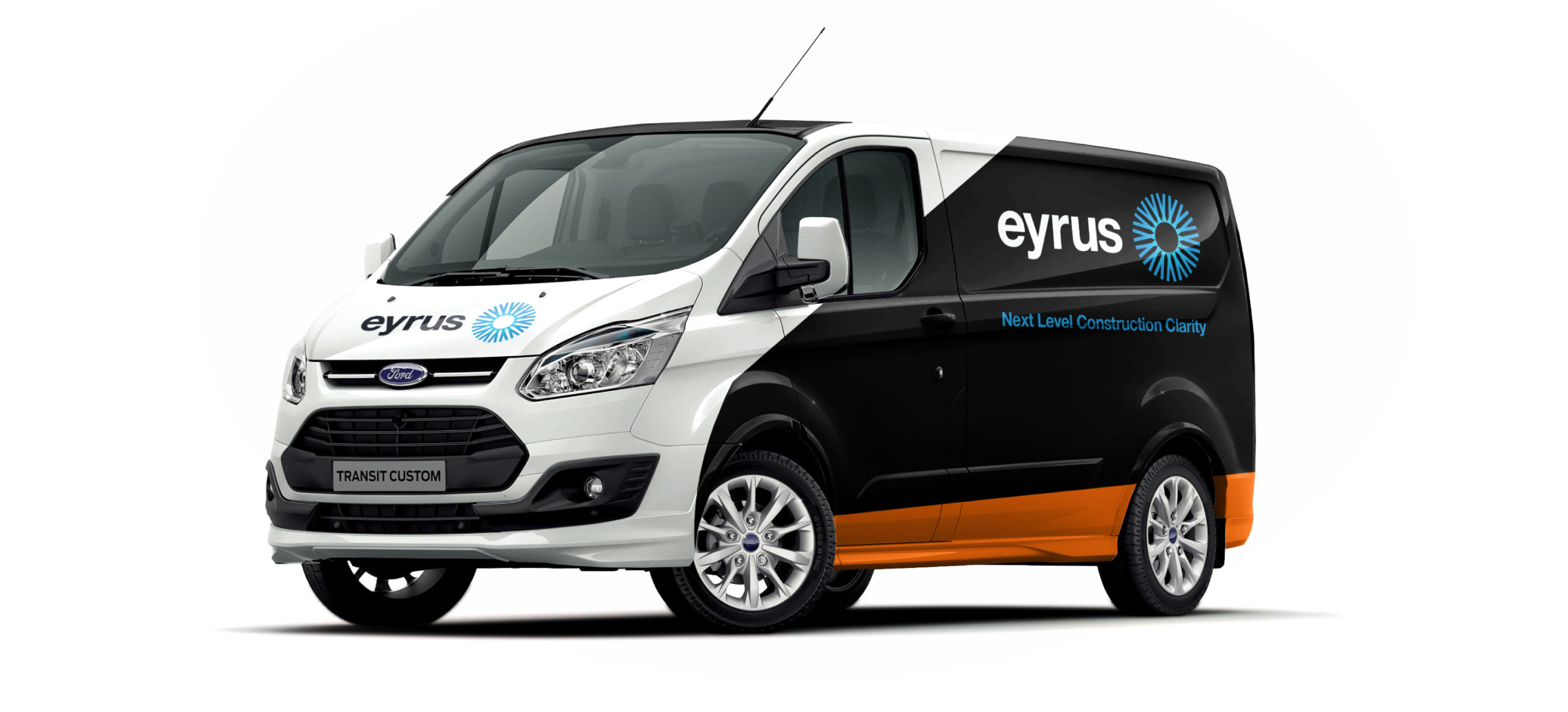
Print Collateral
We worked hard to make the Eyrus main brand, and both sub brands beautiful. Clear, clean, professional.
We’ll take any excuse to design cars, and vehicle wraps are always fun. We think this one brings together the three brands beautifully. Talking of wraps…
How do you align audiences with contradicting needs? Make a company both investor and worksite ready? The answer, as always, is brand.
Challenge us.
Do you have an audience to identify? A brand that needs updating? An app to reimagine or a story to be told? We’re Outfly, a design innovation agency built for disruptive startups, innovators and game changers.
Get in touch at hello@outfly.io